As a coder, my art foundation is weak. We can refer to some mature web PS tutorials to improve our design capabilities. To paraphrase a sentence, "If you are familiar with three hundred Tang poems, you can recite them even if you don't know how to compose them."
The tutorials in this series come from online PS tutorials, all from abroad, and all in English. I try to translate these excellent tutorials. Due to limited translation capabilities, the details of the translation still need to be worked out. I hope that netizens will give you some advice.
Convention:
1. The software used in this article is Photoshop CS5 version
2. The screenshots of the original tutorial are in English. I took them again based on the re-production. Chinese version of Figure
3. Some operations in the original text do not give parameters. I measured some parameters through repeated testing, which are shown in red text. For some wrong parameters, the correct parameters are displayed directly in red text
For example: (90, 22, 231, 77) , indicating that the coordinates of the upper left corner of the rectangle are (90, 22) , width 231, height 77
For example: (90,22), indicating that the coordinates of the upper left corner of the rectangle are (90,22), the other two parameters of the rectangle have been specified in the tutorial
4. My own experience will be attached at the end of the tutorial. Some are optimizations of some steps in the tutorial, etc.
For start open a new document and fill the background with the following color: #2b2b2b
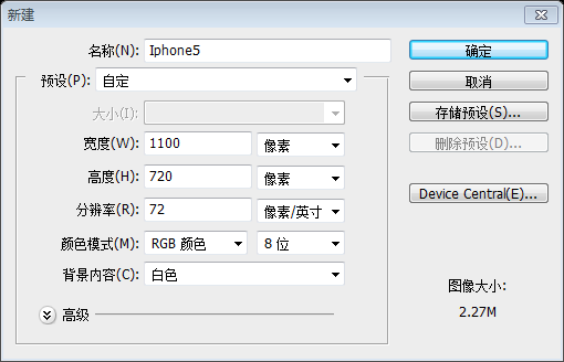
First, create a new document, Size: 1100px*720px, and fill the background with color: #2b2b2b

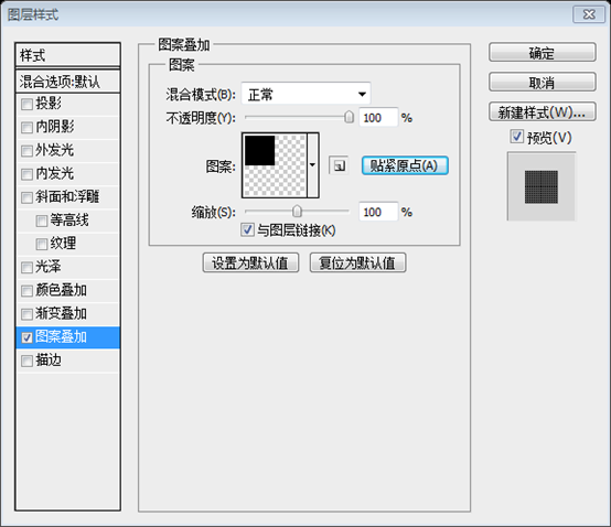
##The next step is to fill the background with a pattern. You can add the pattern via layer styles. Please note that this pattern can be found in the following pack of 815 Photoshop Pixel Patterns
Pencil Tool to add a 1px point. Then click: Edit > Define Pattern. Give it a name and click OK. You can then use this pattern in your Layer Styles panel
Use the
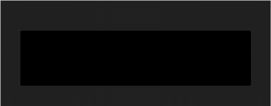
Create a rounded rectangle as shown below(80, 123, 940 , 226), color: #000000. Click on the image below to see it more clearly
On the left side i will create another small shape with the same tool.
Use Use the same tool to add another small rounded rectangle on the left
(32, 184, 70, 81)
Then i will add the following layer styles.
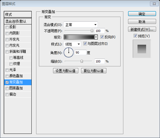
Then set the layer style as shown below
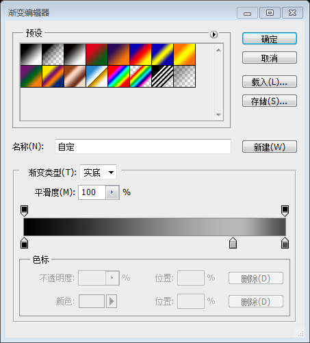
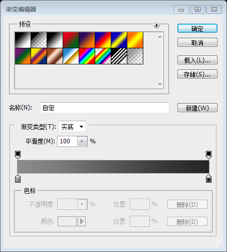
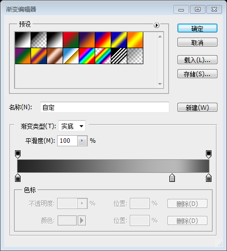
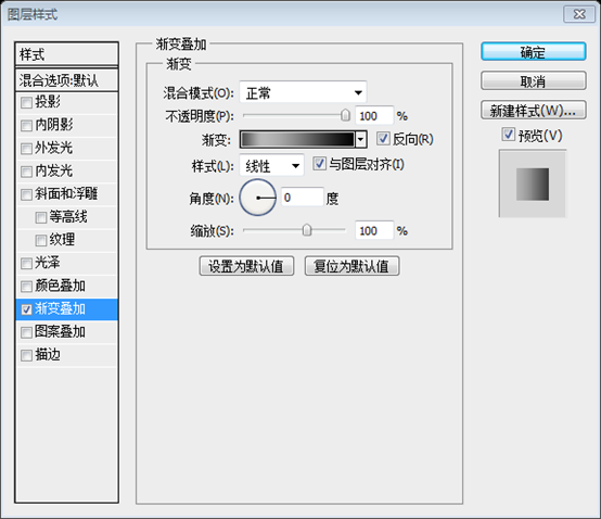 The color of the gradient editor: #010101, #b8b8b8, #4c4c4c
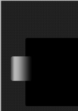
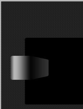
With the same tool i will create a new shape, then i will use perspective tool to modify the look. You can find the perspective tool in Edit > Transform > Perspective.
Use the same tool to create a new rounded rectangle(91, 182, 70, 85), and then use perspective Tools modify its appearance. You can find the perspective tool by clicking: Edit > Transform > Perspective.
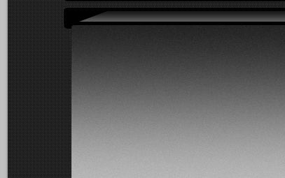
Add a gradient overlay style to this layer
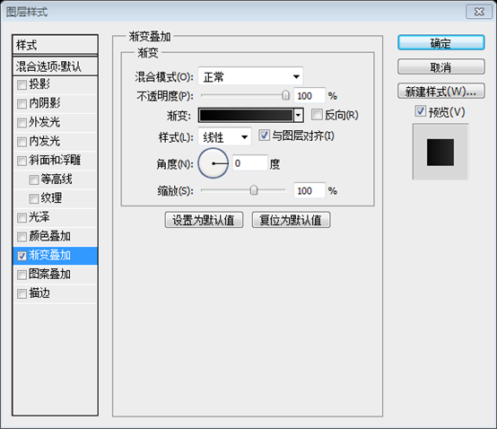
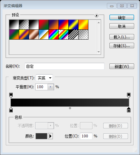
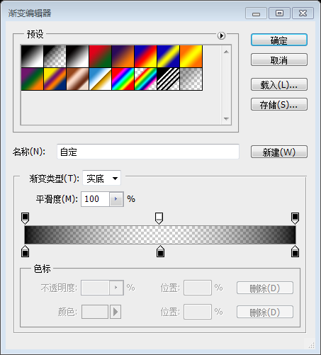
##Gradient editor color: #000000, #343434
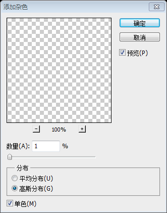
convert to a smart object, and then click: Filter> Noise. Change the blending options of this layer to Overlay. (You can find the blending options at the top of your layers panel - what you usually see is Normal. You can see Overlay when you click on the dropdown menu)
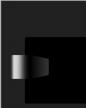
##With Line tool i will create two thin lines. Thin lines
Then i will duplicate both lines, and i will go to Filter > Blur > Gaussian Blur. You can play around with settings until you have the same result like mine. I can give you the exact values for the blur filter, but in this way you will not learn what this tool does.
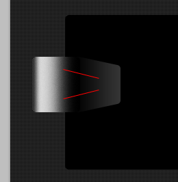 Then copy these lines and click:
. You can refer to the settings below until you get an effect similar to mine. I will give you some suitable blur filter parameters, but you do not have to strictly follow this step.
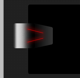
It took a lot of trouble to do this step, but I found that it is not possible to do it just by following his steps. This effect comes out. So, I corrected and added it myself.Do not copy these two straight lines, use the straight line tool, set the width to 3px, and draw two more red straight lines on the original straight lines
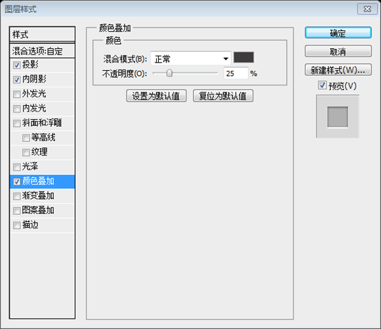
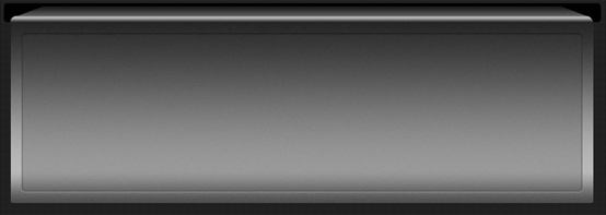
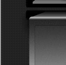
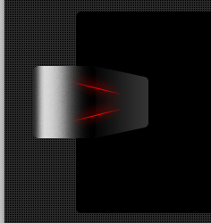
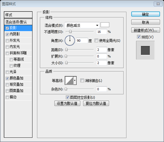
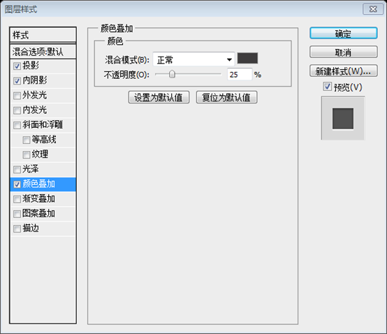
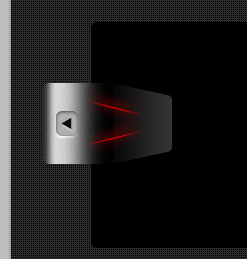
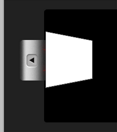
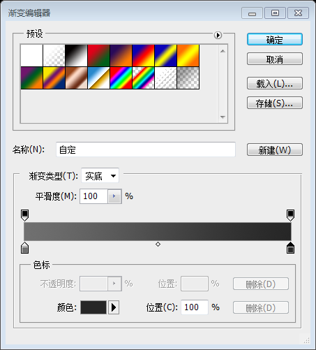
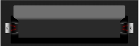
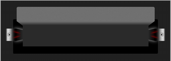
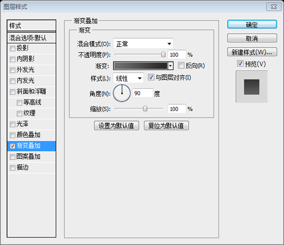
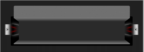
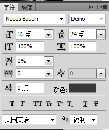
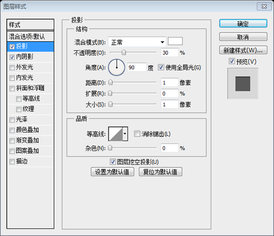
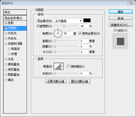
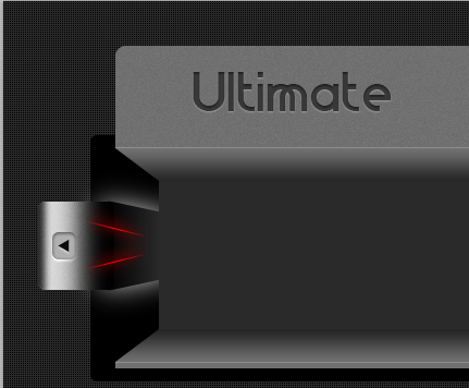
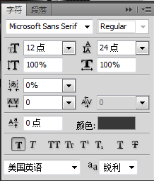
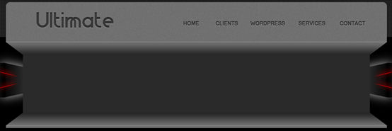
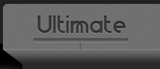
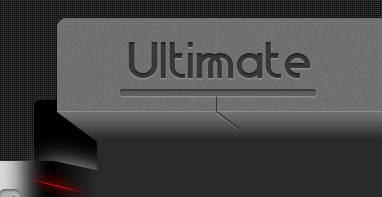
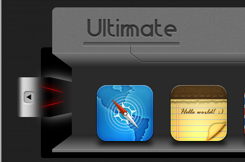
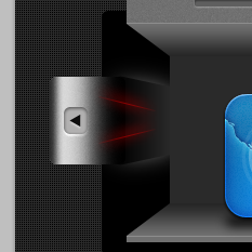
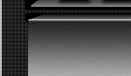
Merge the layers of the next two thick straight lines and rasterize them. And click: Filter > Blur > Gaussian Blur. And place the new layer below the original two thin straight lines Merge these three layers into a group, select the group , click: Layer> Layer Mask> Show All to add a layer mask. Select the gradient tool, set the gradient as shown below, and add a gradient to the group On the left side i will create a indented button. I will use Rounded rectangle Tool, and then i will add some layer styles. On the left side I will create an indented button. I used a rounded rectangle button (45, 212, 22, 25) , Color: #d7d7d7 and added some layer styles to it Use the Polygon ToolAdd a small triangle in the middle of the button, the color is black , the same style as the rounded rectangle Bellow you can see the layer styles. Please note that you can download here almost 18.000 Photosho Layer Styles. You can find included also this layer style. After you see the layer styles. Please note that you can download 18.000 Photosho Layer Styles here. You can find these layer styles here Here is my result so far. This is my result With pen tool i will create a simple white shape. After creating a new white rectangle, use perspective to change it into the following shape) I will use the Blur Filter, and then i will drag the layer under the previous ones. and adjust it to the appropriate size I will duplicate all the layer for the slideshow navigator, and i will place them n the right side. I will duplicate all the layer for the slideshow navigator, and i will place them to the right side. Merge these layers into a group and convert them into smart objects, then duplicate the layers, flip them horizontally and move them to the appropriate position on the right In the middle I will create a basic shape (rectangle) (142, 165, 816, 136), color: #2a2a2a With pen tool i will create a shape like this. Create the following shape If you are not good at using the pen tool, you can use the following method Use Rectangle ToolCreate a new one A rectangle (142, 135, 816, 30) Press Ctrl+T to freely transform, right-click to select perspective, and drag the upper left corner with the mouse Click 40px to the left (you can open the information panel at the same time to ensure that you drag 40px) For this layer i will add the following layer styles. Add the following layer styles to this layer Gradient editor colors: #707070 and #262626 Rounded Rectangle Tool to create a rounded rectangle as follows(102, 41, 896, 126), set the radius to 10px, and color: #707070 (You can use the rectangular marquee tool to select a rectangular selection, transform the selection, and adjust the Y value of the selection to 135) Duplicate this layer and click: Filter > Noise > Add Noise. Set the parameters you want to set the noise in the window, but don’t set too many With Line tool you can add a simple 1 pixel horizontal line. I will use the following color: #8d8d8d With the straight line tool you can add a 1px horizontal line(102,134,896,1), the color I used: #8d8d8d On the bottom of this slide show i will add another shape. It was made with Pen tool . Add another shape at the bottom of the image slider. I used the Pen Tool to directly copy the inverted trapezoid above, flip it vertically, move it to the appropriate position, and uncheck the reverse in the gradient overlay Then i will create a new shape. This last one was created with rectangle Tool. Then I'm going to use the Rectangle Tool to create a new rectangle (102, 331, 896, 6) with color: #707070. And use the straight line tool to add a horizontal line again (102, 331, 896, 1), color: #8d8d8d On the top i will add a simple text logo. I will create a simple text logo at the top.The original text does not introduce the font, so I found a similar font and color: #383838 In order to make the text look inline, add two layer styles to it On the right side of the header i will add a simple menu. A common menu should be added to the right of the header area. The font is as shown below, and the style is the same as the above LOGO Under each text menu i will add some simple lines. Under each text menu i will add some simple lines. Add some vertical straight lines below. The color of the straight lines is still: #383838 Then with Ellipse tool i will create a small circle on top of each line. The layer style is consistent with the menu text ##Also under the logo i will add a nice round shape. This was made with Rounded rectangle Tool, and i have used the indented layer style which i have used several times on this iPhone related layout. , and I used the built-in layer style, which I have used many times before on this iPhone sales website. Use the straight line tool to draw a slanted straight line, color: #383838, ΔX=24, ΔY=18, and move the straight line to the appropriate position. Give the line the same layer style as the menu text Duplicate the slanted line and flip it horizontally. Copy them multiple times and move them to the straight line below each menu text Use the to draw a horizontal line Straight lines, connect these straight lines, color: #383838 and add the same layer style as the slanted straight lines Add some simple shadows below each icon. Creating these shadows is very simple. Select the Rounded Rectangle Tool Create a dark shape and then add a blur filter Note: to After this step, I found that the originally made left and right buttons were too abrupt. So I modified it, changed the opacity of the red line to 45%, and reduced the white halo, as shown below: I can appreciate the benefits of smart objects here. Modify the left side and change the right side at the same time I will use one more time Rounded Rectangle Tool to create a simple dark shape. I used the Rounded Rectangle Tool again to create a dark rounded rectangle(80, 358, 940, 30), set the radius to 6px, and color: #010101 pen toolCreate a beautiful inverted trapezoid If you are not good at using the pen tool, you can follow the steps below Use the rectangle tool to create a new one A rectangle (142, 363, 816, 15) Press Ctrl+T to freely transform, right-click and select perspective, drag the lower left corner to make the width Change to 896 (91, 383, 918, 290) as shown below. Click on the image to see more clearly Gradient editor colors: #242424, #b8b8b8, #4c4c4c Convert to Smart Object, and add some noise For those who are not good at using the pen tool, you can refer to the following steps Use the Rounded Rectangle Tool to create a new rounded corner Make a rectangle with the radius set to 12px Right-click on the layer and select Rasterize Layer. Use the Rectangular Marquee Tool to select the lower half of the rounded rectangle, press the Delete key to delete it, and then press Ctrl+D to deselect it to add it Use the same layer style as the previous rounded rectangle, uncheck the reverse in the gradient style, and modify the color on the right side of the gradient editor to: #828282 After using my previous process, this step can be skipped . I'm going to use the same inline layer styles ##Here you have the layer styles one more time. Color Overlay color as you used multiple times: # 3e3c3d
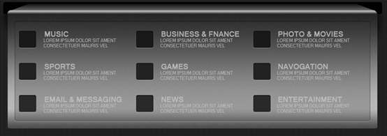
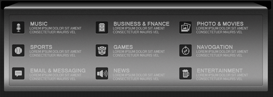
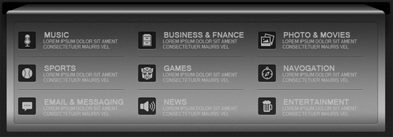
I will create a simple shadow. To create this shadow i recommend you to create a new layer, place it under the big shape, and then with Brush tool start drawing very smoothly until you are happy with the result. I'm going to create a simple shadow. To create a shadow, you can create a new layer, place it underneath the larger shape, and then use the Brush Tool to paint a smooth shadow until you're happy with it. I will add some dark shape, and some text. I will add some dark shape, and some text. The color of the rounded rectangle in the first line: #191919, the color of the text in the first line: #b0b0b0 The rounded rectangle in the second line Color: #222222, the color of the text in the second line: #b7b7b7 The color of the rounded rectangle in the third line: #292929, the color of the text in the third line: #bcbcbc Add each rectangle with the same layer style as the menu text Then i will add some icons. Then add some icons,Add a #b0b0b0 color overlay to the first row of icons, a #b7b7b7 color overlay to the second row of icons, and a #b7b7b7 color overlay to the third row of icons. #bcbcbc的Color Overlay Bellow you can see the icons placed on the right side, and in the same time you can see some lines between each category. You can see that the icons are placed in the correct places, and you can also see that there are some straight lines between each category Bellow you can see the final result. I hope you like this layout. The following is the final result you can see. I hope you will like this layout Postscript: I applaud this designer for his clever use of color to achieve 3D Effect. The designer used colors and PS skills as he pleased. The translator had to think carefully about some steps without the source files. Fortunately, he had experience in previously translated tutorials, so some steps could still be done. Restoration, or approximation to achieve it. For more PS web design tutorial XXIII - Creating a website for selling iPhone 5 applications, please pay attention to the PHP Chinese website for related articles! 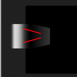









 And add a beautiful rounded rectangle below the LOGO, using the
  With some straight lines, I'm going to try to connect all the vertical straight lines.

 Now I'm going to add some of JackieTran's iPhone icons




 to the shape I just created.



 Set the Fill to 0%