
As a coder, my art foundation is weak. We can refer to some mature web PS tutorials to improve our design capabilities. To paraphrase a sentence, "If you are familiar with three hundred Tang poems, you can recite them even if you don't know how to compose them."
The tutorials in this series come from online PS tutorials, all from abroad, and all in English. I try to translate these excellent tutorials. Due to limited translation capabilities, the details of the translation still need to be worked out. I hope that netizens will give you some advice.
Convention:
1. The software used in this article is Photoshop CS5 version
2. The screenshots of the original tutorial are in English. I took them again based on the re-production. Chinese version of Figure
3. Some operations in the original text do not give parameters. I measured some parameters through repeated testing, which are shown in red text. For some wrong parameters, the correct parameters are displayed directly in red text
For example: (90, 22, 231, 77) , indicating that the coordinates of the upper left corner of the rectangle are (90, 22) , width 231, height 77
For example: (90,22), indicating that the coordinates of the upper left corner of the rectangle are (90,22), the other two parameters of the rectangle have been specified in the tutorial
4. My own experience will be attached at the end of the tutorial. Some are optimizations of some steps in the tutorial, etc.
Step 1: Mockup
Step 1: Sample
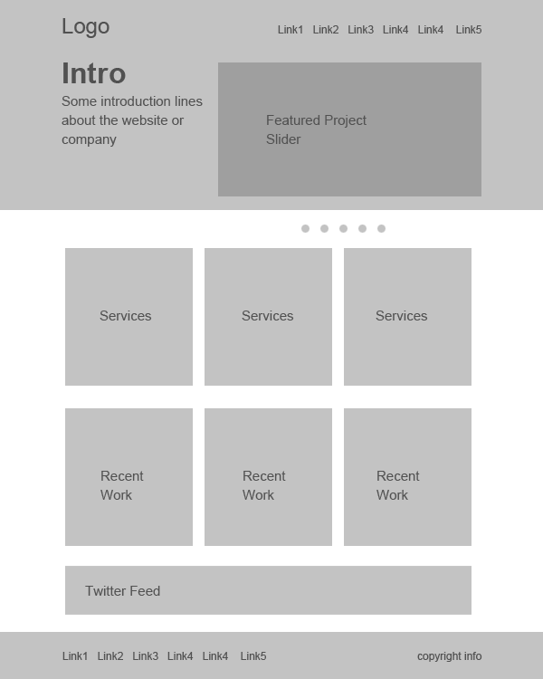
Before we start designing, we need to plan out the requirements, looks and the functionality. Then we need to fit these ideas into a layout to execute them visually. Mockups and wire frames are greatly useful to create layouts with lot of flexibility. It is a best practice and highly encouraged in the Industry.
Before starting the design, we need to plan the requirements, appearance and functionality. We then need to follow these ideas and execute them visually to complete the layout. Mockups and wireframes are very useful and have a lot of flexibility in creating layouts. This is best practice and highly encouraged in the industry.
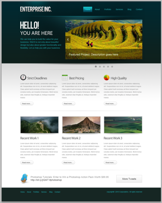
I put the below one together using only gray tones. That way we eliminate color from the scene at this point. So that we can concentrate on the layout as a whole and avoid messing up with colors. That gives much freedom to quickly alter and rearrange things. A mockup can be as detailed as you want. For this purpose I am going with the below one. Just briefly defining the layout and what goes where.
I laid out the PS web design tutorial XXVI - How to create a professional web layout in PS below, using only gray tones. This way we remove the color from the scene at this point. So, we can focus on the layout as a whole and avoid messing up the colors. This gives us a lot of freedom to be able to change and rearrange things quickly. As long as you want. A more detailed template can be made. For this purpose I placed the one below. Just simply define the layout and what we need to do.
Step 2: Set up the Canvas
Steps 2: Set up the canvas
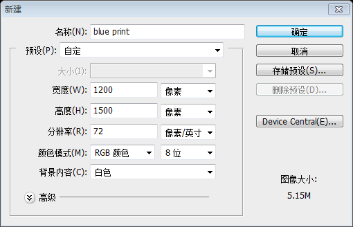
So we have a blue print for our layout. Let's actually put the design together! We are going to create a 960 pixel wide layout. Create a new document at 1200 x 1500.
Because we have a layout blueprint. Let’s actually design from the blueprint! We will create a layout that is 960 pixels wide. Create a new document at 1200x1500.
Ctrl+A to select the entire document.
This is a web layout that is 960 pixels wide, so we need to define the working area by adding guides. PressCtrl+A to select the entire document
Select> Transform Selection
. Shrink inward to 960 pixels wide. This is the working area for web page layout.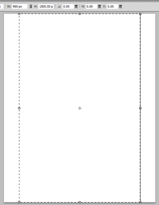
Add guide lines to the selection.
Add guide lines to the selection
Step 3: Create the Header
Step 3: Create the header area
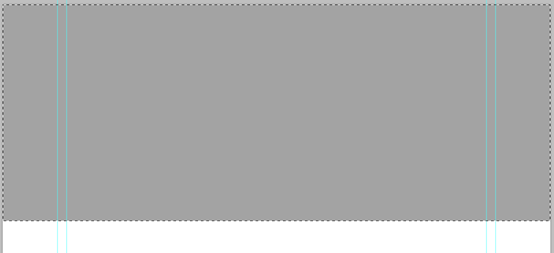
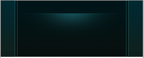
Let's create the header of the layout! Make a selection that is 465 pixels in height.Let's create the header area of the web page layout. Create a new selection with a height of 465 pixels.
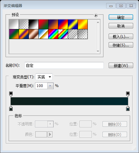
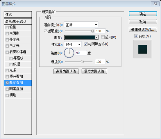
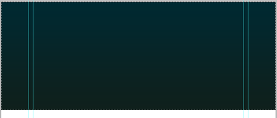
Gradient Overlay. Create a gradient with the following 2 colors (#0f201c and #002931) and set it up as shown below.
Ctrl+Alt+Shift+N . Pick a soft brush with a diameter of 600px. Pick #19535a for brush color. Just click once on the center of the header.
Next you need to add a highlight to the header area. PressCtrl+Alt+Shift+N to create a new layer. Choose a soft brush with a size of 600px. Set the soft brush color to #19535a. Click once in the header area
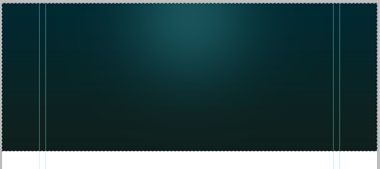
Make a selection from the top that is 110 pixels in height.
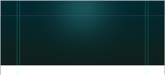 #Hit Delete key to delete the selected portion. It will look like this
Ctrl+T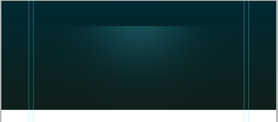 .
.
By pressing
Ctrl+TCollapse vertically. Maybe due to version reasons (or operation reasons), after pressing Ctrl+T, the area is different from the original PS web design tutorial XXVI - How to create a professional web layout in PS. You must first move the center point to 110px, then hold down the Alt key and drag the bottom edge to shrink vertically.
We need to make sure that the highlight spot is perfectly centered to the header. Select layers, header and highlight and press “V ” to switch to Move Tool. On the Options Panel select Align Horizontal Centers button.
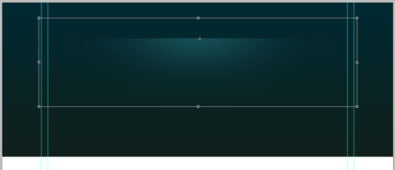 We want to make sure the highlight is in the middle of the head area. Select the layer, head area and highlight, and press V to switch to the
. Select the
Horizontal Center Alignbutton in the options panel.
Create a new layer, draw a one pixel highlight line using the Pencil Tool with color #01bfd2.Create a new layer, draw a one pixel highlight line using the Pencil Tool
Draw a bright straight line pixel wide, color: #01bfd2.Use
Straight line toolIt is more convenient to draw a straight line
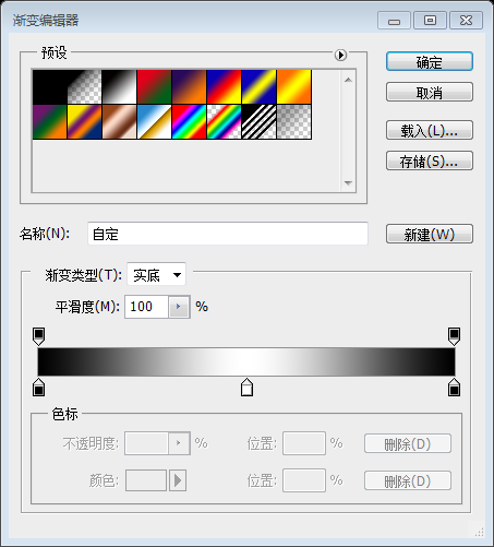
Hide the edges smoothly using a gradient mask. Pick the Gradient Tool, create the below gradient in the Options Panel.
Use the Gradient Mask to make the edges disappear smoothly. Select the  Gradient Tool
If you are using the
Straight Line Toolto draw a line, add the mask first, then add the
Gradient Tool##Add the gradient position between the left and right outer guide lines
Step 4: Create Texture Pattern

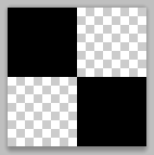
Now create a simple checker pattern and apply to the header. Pick the Pencil Tool, set the brush size to 2 pixels and add two dots that are touching each others corners. Turn off the background and select the dots. Choose Edit > Define Pattern.
Now create a simple checkerboard Pattern, suitable for the head area. Select the Pencil Tool, set the brush size to 2 pixels, and add two points, touching each corner. Close the background and select the point. Click:
Edit > Define pattern.
A more appropriate approach is to create a new 4px*4px document with a transparent background. Use thePencil Tool to create the following pattern. Click: Edit > Define Pattern, and then close the new document
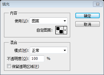
Create a new layer and place it below the highlight layer. Select the area we want to apply the pattern. Press Shift+F5 to load the Fill dialogue box . Choose the pattern that is just created. And OK.
Create a new layer and place it below the highlighted layer. Select the area where we want to add the pattern. Press Shift+F5 to open the Fill dialog box. Select the previously created pattern. and press OK
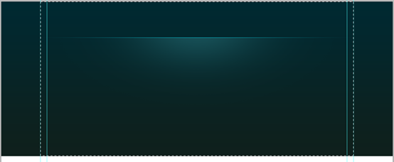
The selection is filled with the pattern. Take a closer look.
The selected area will be filled with patterns. Let’s take a closer look
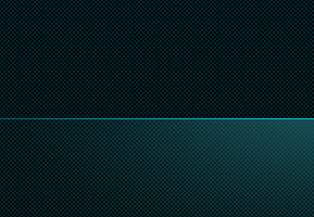
Blend the pattern smoothly into the header. Add a Layer Mask to the pattern layer . Pick a soft brush and paint with a large soft brush. Pick #ffffff for brush color. Reduce the brush Opacity to about 60% and paint. If you find it too strong then adjust the layer opacity inpidually.
Make the pattern smoother on the head area. Add a layer mask to the pattern layer. Choose a soft paintbrush and spray with a large soft brush. Set the brush color to #ffffff. Lower the brush opacity to about 60% and spray. If you feel it's too intense, adjust the opacity of the layer individually.

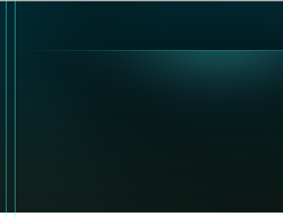
Nicely blended.
Good blending effect.
Step 5: Adding the Logotype
Step 5: Adding text LOGO
The background is pretty much completed. Now add the logo type. Before adding the type add a highlight that stays behind the logo. Pick a soft brush with #19535a. Add a spot .
The background is done perfectly. Now, add the text logo. Before adding text, add a highlight behind the logo. Choose a soft brush, color: #19535a. Add a point.
Add the Type. The font face I used is “Bebas”. Download it for free.
Add text. The font I use is Bebas. Download for free here
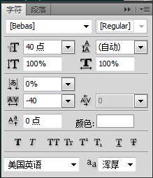

Apply subtle effects to the logo.
Add to the LOGO Subtle effect
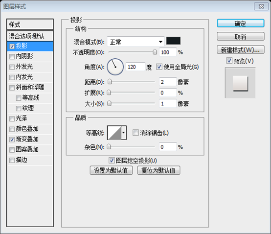
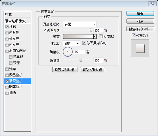
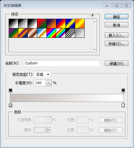
Gradient editor colors: #c9c0bb and #ffffff

Step 6 : Navigation
Step 6: Navigation bar
Add the navigation links.
Add navigation bar link
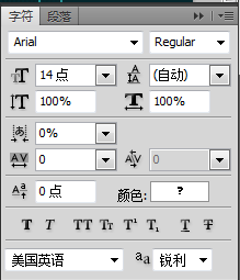

##The color of the text, the color of Home : #00ffff, the color of the remaining text: #1eafb5
Create the navigation button. Use Rectangular Marquee Tool. Fill any color. Then Lower the Fill Opacity to zero.Create navigation bar buttons. Use theRectangular Marquee Tool to create a rectangular selection (615, 40, 67, 40). Fill with any color. Then change the fill to 0
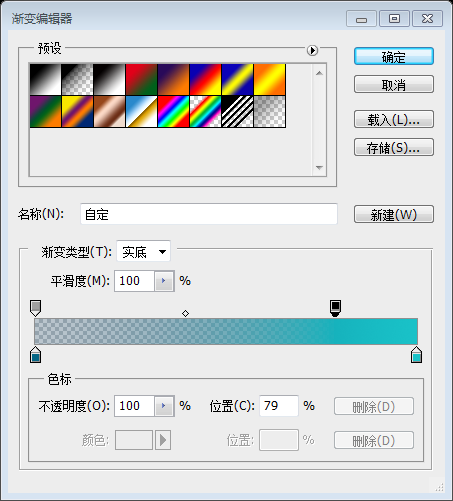
Double click on the layer thumbnail, select Gradient Overlay. Use these settings.Double click on the layer thumbnail, select Gradient Overlay. Set the colors of the gradient editor as shown below: #066685 and #19c2c8, with the opacity on the left at 50%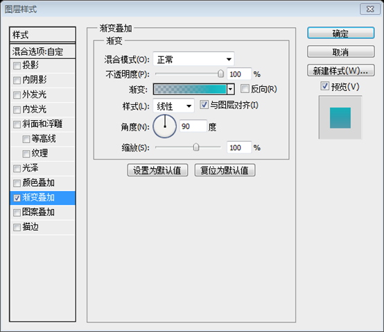
Step 7: Content Slider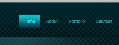
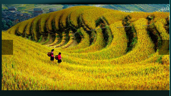
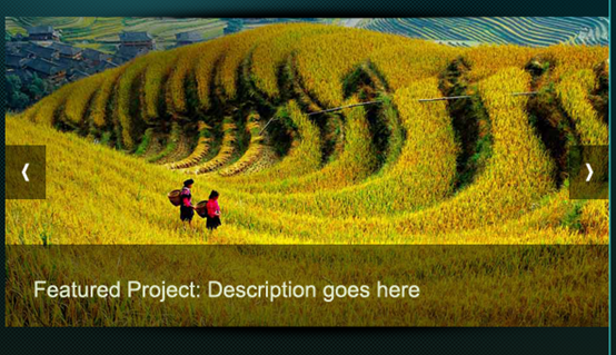
Make selection that is 580 x 295 pixels. Fill the selection with a gray tone. Bring in the PS web design tutorial XXVI - How to create a professional web layout in PS you want to use. Clip it to the base layer we created above.Create a 580*295 selection. Fill the selection with gray. Insert the PS web design tutorial XXVI - How to create a professional web layout in PS you want to use. Cut with the upper layer as the range.
A more appropriate approach is to use theRectangle Tool
to create a rectangle (4810, 137, 580, 297), place the picture above the rectangle, and right-click on the picture layer SelectCreate Clipping Mask
 #Now add shadow effect to the slider. Create a new layer. Select the Brush Tool, set the diameter to 400 pixels. Open the Brushes palette, decrease the roundness. Use the below settings.
Now add a shadow effect to the slider. Create a new layer. Select the Brush Tool and set the diameter to 400 pixels. Open the Brushes panel and reduce roundness. Use the settings below.
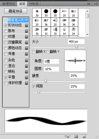
Set the brush color to #000000 and add spot.
Set the brush color to #000000 and add a spot.

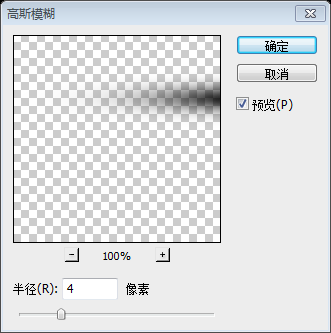


##Reposition the shadow just above the slider.
Move the shadow to the picture slide Above the bar

#I shrunk it vertically. Next align it centered to the slider. Select both layers and on the Options Panel click on the Align Horizontal Centers button.
I'll zoom out vertically. Next center align the sliding bar. Select both layers and click the "Align Horizontal Center" button on the options panel.
Actually change the width and left position of the shadow to be the same as the picture.

Duplicate the shadow and rotate it vertically. Place it on the bottom edge of the slider.
Duplicate the shadow layer and flip it vertically. Place it at the bottom edge of the sliding bar
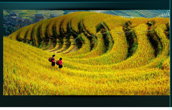
Create slider control buttons using Rectangular Marqee Tool. Fill #000000.
Use the Rectangular Marquee Tool to create the control buttons (480, 260, 39, 52) and (1021, 260, 39, 52) of the sliding bar. Fill #000000
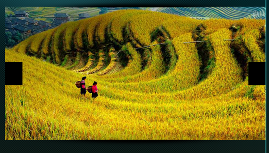
Lower the buttons Opacity to 50%
Set the buttons’ opacity to 50%
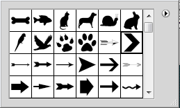
Open the auto shapes from the Options Panel and select this arrow. Add it to the buttons.
Open the auto shapes from the Options Panel and select this arrow. Add it to the button

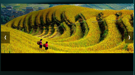
Add a strip. Fill with #000000.
Add bars (480, 355, 580, 79) at the bottom. Fill it with #000000
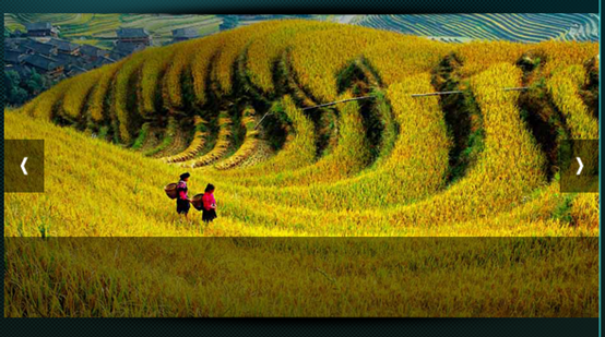
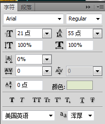
Color: #e0e9cc
Step 8: Add some Welcome Lines
Steps 8: Add some welcome text
A welcome and some description about the website goes here.Add welcome and description text of the website hereThe font of the first line of text is as follows,Color: #eef0f0
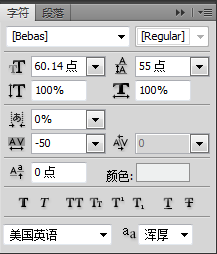
Color: #eef0f0
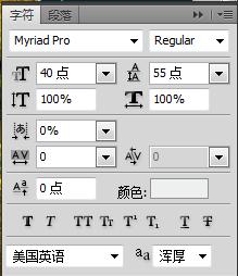
color: #1eafb5
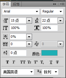
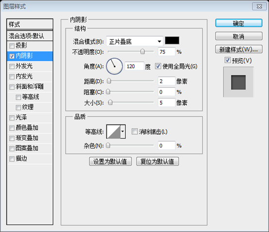
Add the following layer styles to the first and second lines of text
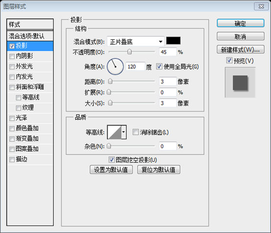

Step 9 : Finishing up the Header
Step 9: Finishing the header area
We almost finished the header. Let's add a subtle shadow effect to the finish things off! Create a shadow just as we created earlier using the brush tool.We are almost done with the header area. Let's add a subtle shadow effect to complete the head area! Create a shadow using the Brush Tool just like we created earlier.
Leave 1px gap between the header and the shadow.
There is a 1px gap between the header area and the shadow

Step 10: Apply Gradient to the Background
Step 10: Add gradient to the background
Create a light gray to white gradient.
Create a light gray to white gradient, gradient editor colors: #cfcfcf and #ffffff
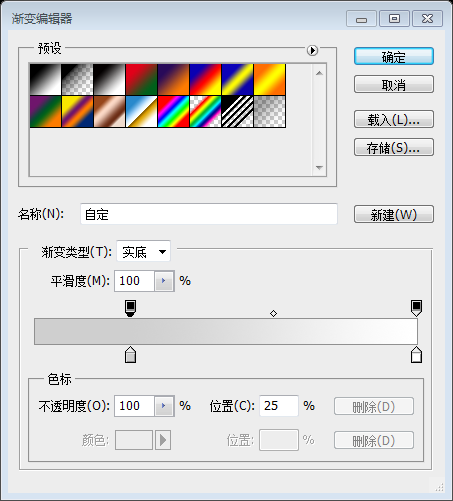
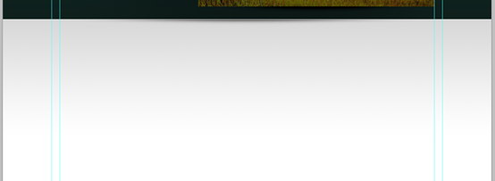
Create a new layer below the header and apply the gradient.
Create a new layer below the header area and add the previous gradient,From the middle of the picture to white part, the height of the picture part is almost the same as the height of the white part
Step 11: Add Slider Rotation Controls
Step 11: Add the control knob of the slider
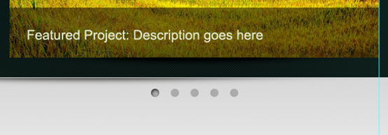
Create rotation controls.
Create the control knob,Use Ellipse ToolCreate 5 circles (702,483), (733,483), (764,483), (795,483), (826,483). The size is 13px*13px, color: #ababab

Step 12: Create the dividing line of the content
Select the Pencil Tool and draw 1 pixel line. Pick light gray (#aaaaaa).
Use
Pencil ToolDraw a straight line (140, 511, 920, 1). Choose a light gray color, #aaaaaa

Hide the edges smoothly using gradient mask.

Step 13: Adding the main content
It is time to get into the actual content part. This is a 3 column layout. We need to create 3 equal columns with some padding between them. I did a simple calculation and pided the available space into 3 equal width boxes with 25 pixels padding between them.
Now it’s time to make the actual content section. This is a 3 column layout. We need to create 3 equal width columns and fill them with some whitespace. I did a simple calculation and divided the available space into 3 equal-width rectangles and filled the space between them with 25 pixels.
The gray rectangle has a width of 290 and a spacing of 25px
Add guide lines to the boxes. Then remove the boxes. And these are the columns.
Add guide lines around the perimeter of the rectangle. Then delete these rectangles. These are the columns of the main content

Add some featured services. Drop in the icons from the Function icon set. Maintain distance between objects uniformly.
Add some functional services. Drag some icons from the Function icon set. Maintain uniform spacing between objects

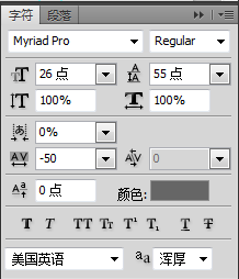
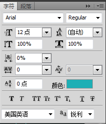
The font of the title is as follows, the color: #666666
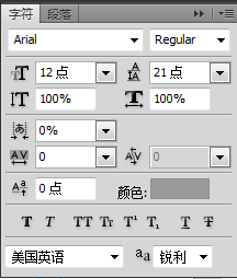
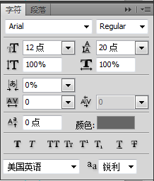
The font of the paragraph text is as follows, color: #9a9a9a
Rounded Rectangle ToolDraw a rounded rectangle (140, 752, 100, 28) with a radius of 20px. Make sure it is the shape layer
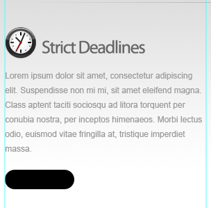
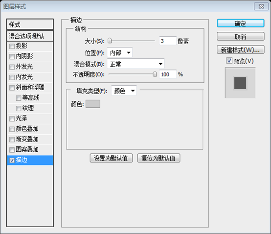
##Apply Gradient Overlay and Stroke to the button.
Add gradient overlay and stroke to the button
 ##Gradient editor, Color: #efefef and #ffffff
Stroke color: #cdcdcd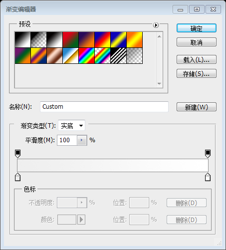

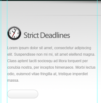
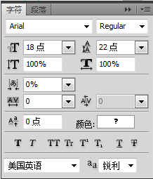
And add the Read More text to the button, with the following font and color: #666666
#
We will add some recent work items. I drew three PS web design tutorial XXVI - How to create a professional web layout in PS holder boxes and applied 3 pixel stroke .
We will add some recent work items. I drew three rectangles ((140,862), (455,862), (770,862), size: 290*129) and added a 3px stroke. Stroke color: #cbcbcb
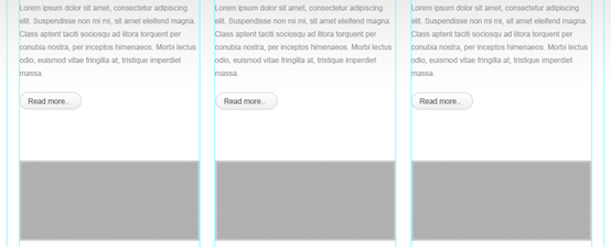


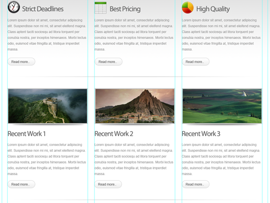
The title, paragraph font and color are consistent with the color above, and the size and style of the button are also consistent with the above
And create two horizontal dividing lines as in step 12 (140 , 820, 920, 1) and (140, 1264, 920, 1)

##Create a button for More Tweets.
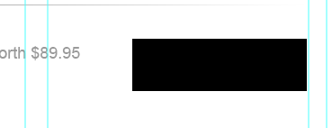
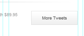
Create a rectangle for More Tweets (864, 1302, 194, 58)
Apply these styles.
Add the following styles
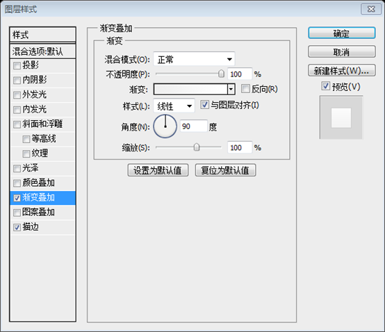 to the gradient editor colors: #efefef and #ffffff

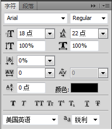
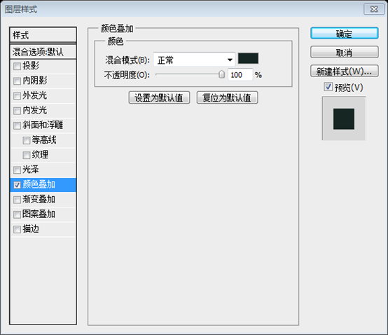
Add text. Add text, The font is as follows. Color: #000000 #Step 14: Creating Footer and Finishing Step 14: Create the footer and complete the layout Color: #162623 ##Finally add footer navigation and copyright info. Finally add the footer navigation bar and copyright information. The fonts are as follows.
photoshop PS web design tutorial XXVI - How to create a professional web layout in PS processing tutorial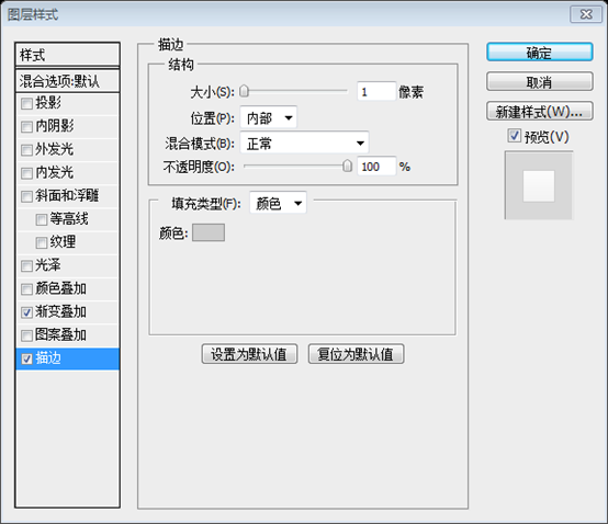



 Usage of urlencode function
 Computer is infected and cannot be turned on
 The performance of microcomputers mainly depends on
 How to solve the problem that Apple cannot download more than 200 files
 How to type the less than or equal symbol in Windows
 How to open ESP files
 Software for making Sudoku solvers
 What are the commonly used libraries in golang?


