
As a coder, my art foundation is weak. We can refer to some mature web PS tutorials to improve our design capabilities. To paraphrase a sentence, "If you are familiar with three hundred Tang poems, you can recite them even if you don't know how to compose them."
The tutorials in this series come from online PS tutorials, all from abroad, and all in English. I try to translate these excellent tutorials. Due to limited translation capabilities, the details of the translation still need to be worked out. I hope that the majority of netizens will give me some advice.
Convention:
1. The software used in this article is Photoshop CS5 version
2. The screenshots of the original tutorial are in English. I took them again based on the re-production. Chinese version of Figure
3. Some operations in the original text do not give parameters. I measured some parameters through repeated testing, which are shown in red text. For some wrong parameters, the correct parameters are displayed directly in red text
For example: (90, 22, 231, 77) , indicating that the coordinates of the upper left corner of the rectangle are (90, 22) , width 231, height 77
For example: (90,22), indicating that the coordinates of the upper left corner of the rectangle are (90,22), the other two parameters of the rectangle have been specified in the tutorial
4. My own experience will be attached at the end of the tutorial. Some are optimizations of some steps in the tutorial, etc.
This is an intermediate level tutorial and some may seem to be tricky, but why not have a try? Let's get the ball rolling
This is an intermediate level tutorial and may look tricky, but why not give it a try? Let's scroll our mouse wheel
Step 1
Step 1
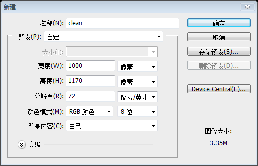
Let's start at the beginning. Just fire up your Photoshop and create a new document (CTRL+N). See the parameters below.
Let’s get started with the tutorial. Open your PS and create a new document (Ctrl + N) according to the parameters in the image below
Step 2
Step 2
Now you should add some pattern to your background.
Now add some patterns to your background
New 4px* 4px document, as shown below
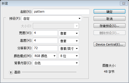
Use the Pencil Tool to color according to the picture below, from the upper left to the lower right diagonal Line color: #efeeef; Color of the diagonal line from top right to bottom left, top: #dfdddf, bottom: #e7e6e7
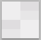
Click: Edit> Define pattern, define it as pattern

Use rectangle tool to create a new one A rectangle (0, 0, 1000, 1170)
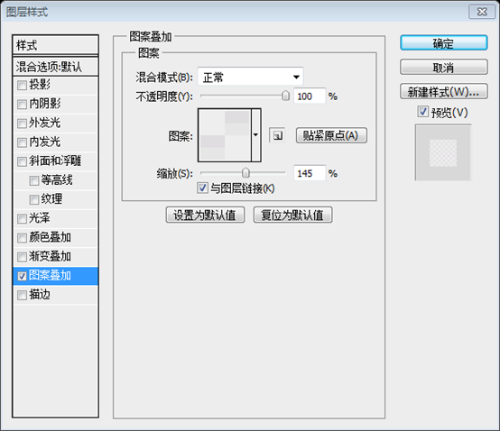
Layer Style -> Blending options-> Pattern Overlay. Look at the screenshots below:
Click: Layer> Layer Style> Blending Options> Pattern Overlay. Follow the screenshot settings below

##Step 3
Step 3
We want to create an awesome design, yeah? That's why we should use a grid system for designing. You can easily create a solid visual and structural balance of websites with grid-based designs.We're going to create a great design, aren't we? This is why we design using a grid system. You can easily create a website with a grid-based design for structural balance and realistic perspective.
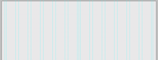
Put some grids to your design with intervals of 60px and 20px.
Add some guide lines to your design with intervals of 60px and 20px
The coordinates of the vertical reference lines are 20, 30, 90, 110, 170, 190, 250, 270, 330, 350, 410, 430, 490, 500, 510, 570, 590, 650, 670, 730 ,750,810,830,890,910,970,980
##Step 4
Step 4
So... now it is time to design the menu of your future website. Use the Rounded Rectangle tool to create it (radius - 3px). The width of your menu is 940px, the height is 34px.So… now it’s time to design the menu for your future web page. UseRounded Rectangle Tool to create a rounded rectangle (30, 53, 940, 34) (radius - 3px). The width of your menu is 940px and the height is 34px
I think that it is an easy task to create a website's menu. To be sure, look at the images below:I think it is a very simple process to create a menu for a web page. Please believe it, see the picture below: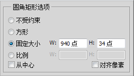

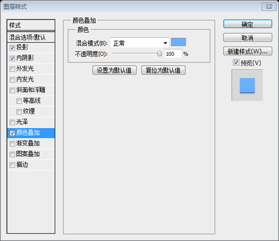
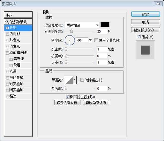
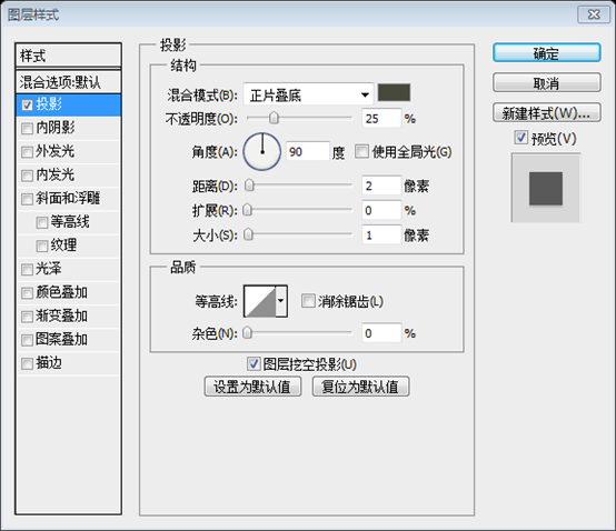
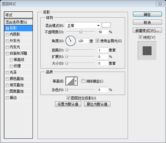
Blending Options> Drop Shadow. Set parameters according to the screenshot below, Color of projection: #47493c

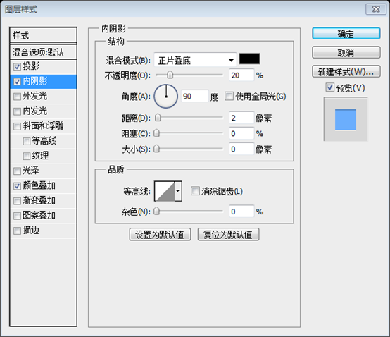
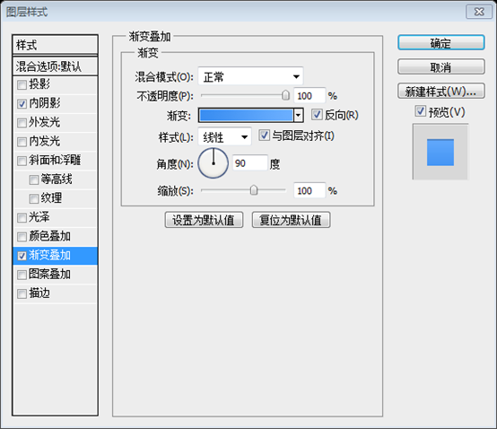
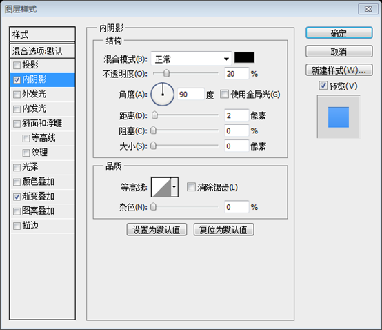
##Blending options-> Inner Shadow
Blending Options> Inner Shadow

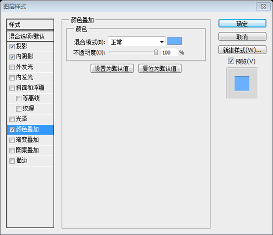
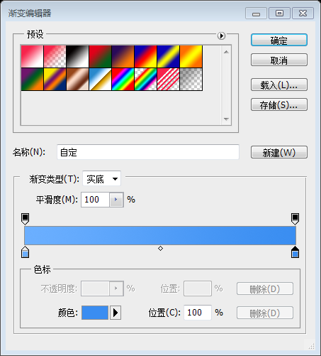
I chose the #6bafff color for this menu bar.
The color I chose for this menu: #6bafff

Step 5
Let's add some text to our menu. Use the Horizontal Type Tool for it.
Let's use
Horizontal text toolAdd text on the menu (respectively HOME, ABOUT, CONTACT, BLOG, PORTFOLIO)
You can create your design with any font you like. I used the Aller [bold] font. The size is 14px.
You can use any font you like in your design. The font I'm using here is Aller, bold. Font size: 14px

Add the following layer style and shadow color to the menu text: #010101

Step 6
Step 6
All the menu buttons are links and the designer should show how their hover state looks like. So, create are rectangle (the color that I've used for it is #5a90e5).
All menu buttons are links, and the designer should show what the menu's hover state looks like. . So, create rectangle (281, 53, 68, 34) (the color I used: #5a90e5)
and add the following layer style, inner shadow color: #312d20
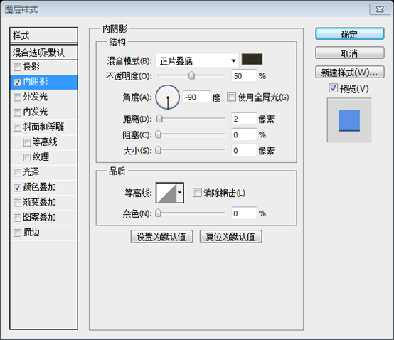
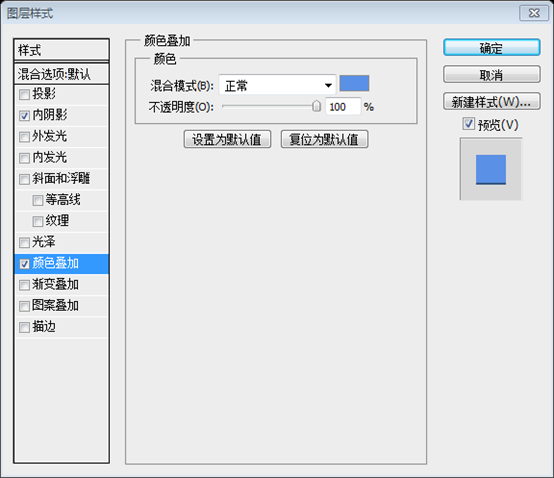

Step 7
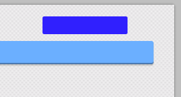
Every decent website has a search form. Let's create it too :)Every decent web page has a search form. We also create a
Use the Rounded Rectangle tool (radius - 3px) to create a search form with the following dimensions: 124px and 26px
Use the Rounded Rectangle tool (radius - 3px) (Radius: 3px) Create a search form
(808, 17, 124, 26), size: 124px*26px
##Add some inner shadow: Blending Options-> Inner Shadow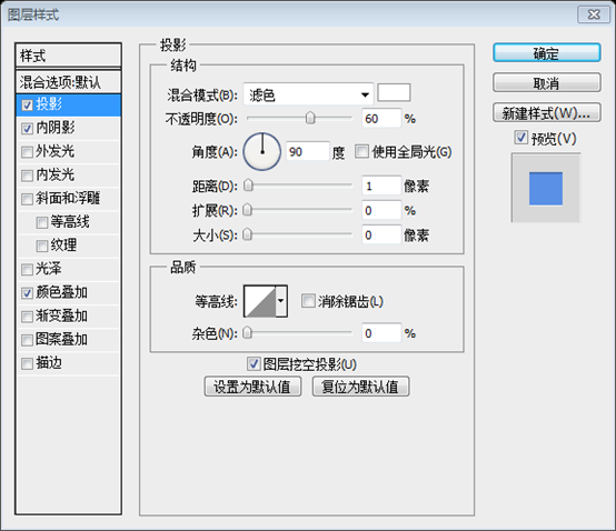
Blending Options> Inner Shadow
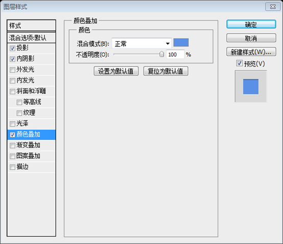
##Blending Options-> Color Overlay, color- #5a90e5
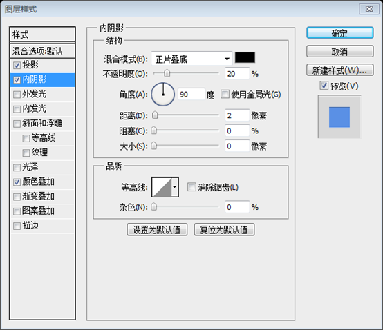
, Color: #5a90e5
##Use our favorite Photoshop tool one more time :) Create one rectangle with dimensions 41px and 32px
Use the historical tool in PS again to create a rounded rectangle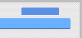 (929, 14, 41, 32)
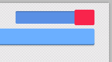
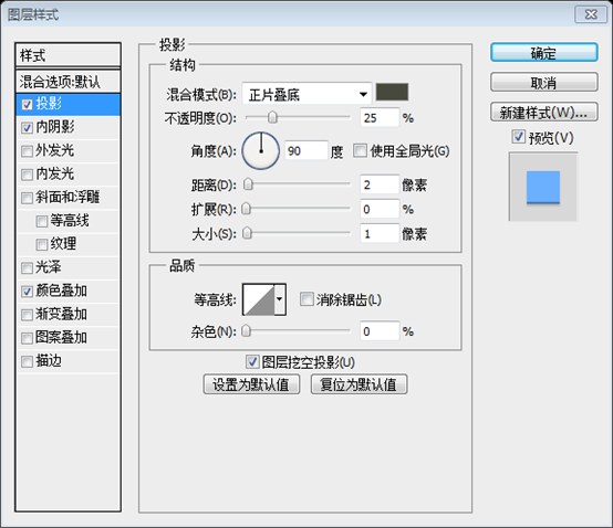
Blending Options -> Drop Shadow
Blending Options> Drop Shadow,Color: #47493c
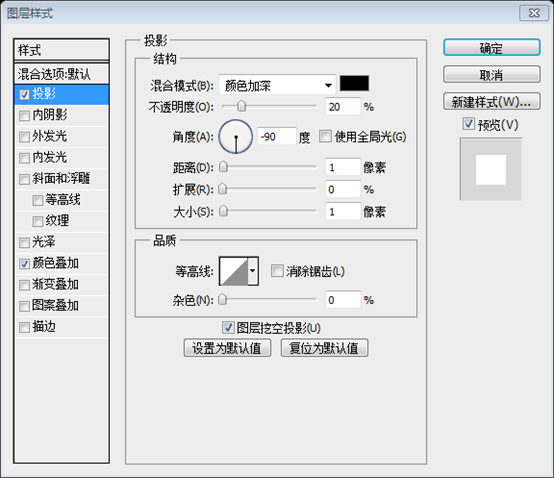
##Blending Options -> Inner Shadow
Blending Options> Inner Shadow

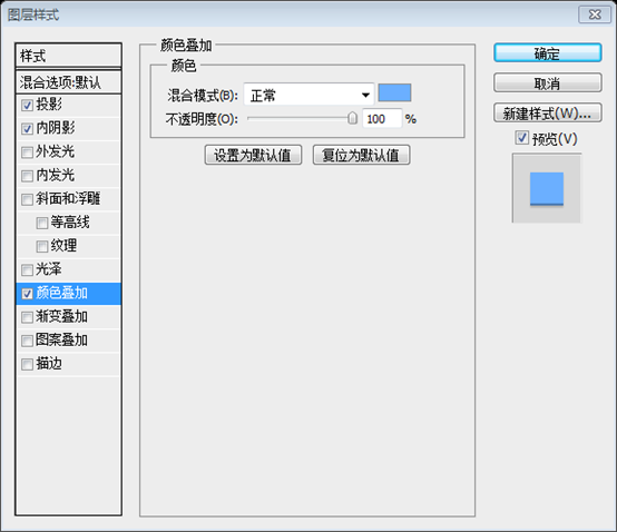
Blending Options> Color Overlay(color : #6bafff)
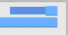
##Now it is time to use icons that we' ve downloaded at the beginning of this tutorial. Open the "Linecons Free - Vector Icons Pack and find the search icon there. Just apply some bells and whistles to it.
Now the icon downloaded before is used. Open Linecons Free - Vector Icons Pack, find the search icon and add some bells and whistles

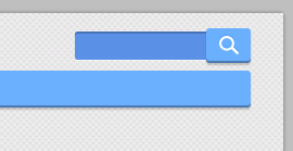
Here is our final result for the search form:
This is the final result for the search form:
Step 8
Social media connections are very useful and important for every website. That's why today we'll also learn how to create a simple Facebook button. Again with the help of the Rounded Rectangle tool (radius - 3px), we'll create a button
Social media links are very useful and important for every website. That’s why today we’ll also learn how to create a simple Facebook button. Use the
Rounded Rectangle Toolagain (Radius: 3px) to create a button (40, 16, 86, 26)
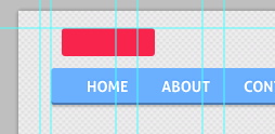
Then use the Rectangle tool (rounded) to create a square (holding the Shift button) with the following size – 16px
Then use the Rectangle tool (rounded) to create a square (holding the Shift button) with the following size – 16px
Rounded Rectangle Tool) Create a square (hold down the Shift key), size: 16px
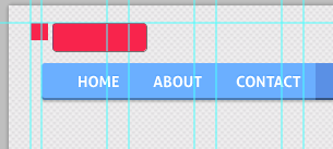 Choose the Pen Tool and cut off half of this square.
Select the Pen Tool and cut out half of this square. Note: This step is relatively simple using the Direct Selection Tool . Use the Direct Selection Tool to select the point in the lower right corner of the square, press the Delete key to delete, and you will get a triangle
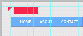
Edit-> Transform->Rotate to move this triangle and place it on the left side of the rectangle
Click: Edit> Transform> Rotate to rotate the triangle and move it to the left side of the rectangle
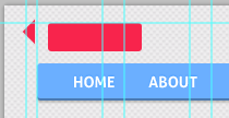
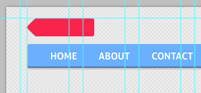
Add a drop shadow layer style to it

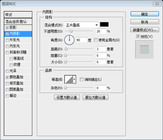
##Blending Options-> Inner Shadow:
Blending Options-> Inner Shadow
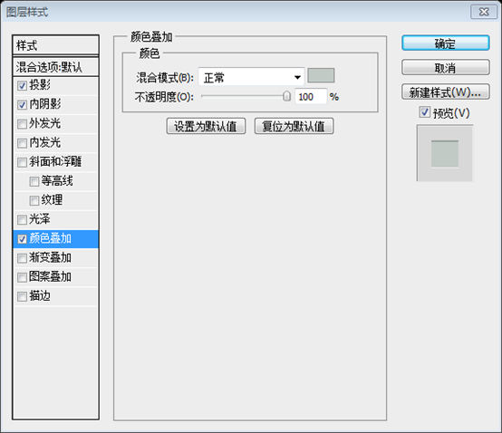
Blending Options> Color Overlay
(#c1cac5)
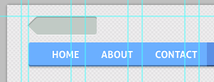 ##Now add the "follow" text to our Facebook button and play with its blending options.
Now add the "follow" text to our Facebook button and play with the following layer style.
Font: Aller bold, font size: 14px

##Try to create your Facebook logo for this button. For example, you can create the "F" letter, decorate it with a blue color (#5a90e5).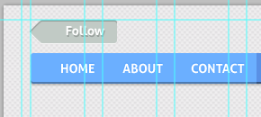
Play with Blending options (add a white shadow )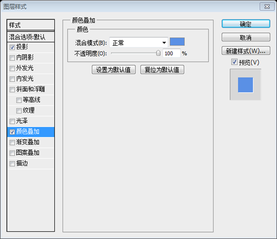

WOW! We did it :) Look at the final result of our menu bar:
Wow! We're done. Take a look at our final button bar

Step 9
Step 9
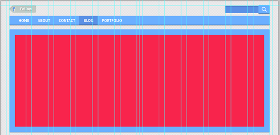
Create a new shape: width 940px, height 372px
Create a new shape (rounded rectangle, radius: 3px, (30, 102, 940, 372) ) : Width 940px, height 372px
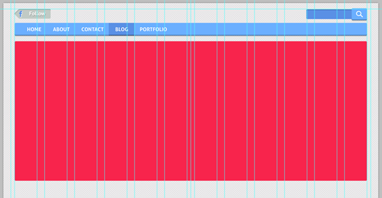
As always, add some shadow:
Similarly, add some shadow,Shadow Color: #47493c
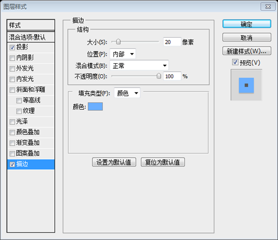
And add a border: Blending Options > Stroke (20px, color: #6bafff)
Step 10
Step 10
To create nice slider, we should add some images to it. With the help of the Ctrl+Alt+G shortcut, create a clipping mask.In order to create a beautiful sliding bar, we are going to add some pictures. Using the shortcut Ctrl + Alt + G, we create aclipping mask

Step 11
Step 11
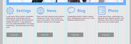
Use a bunch of free icons again. I've selected the following icons: "settings","bubble", "photo","world"Use that bunch of free icons again. I chose the following icons: settings, bubble, photo, world Add them to our design (don't forget to use the grid), distance – 180pxAdd them to our design (don’t forget to use guides), Distance: 180px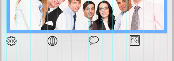
Step 12
Step 12
Add some text. You should use the same font that you used for your menu bar. Set the font size to 30px.Add some text. You can use the same font as the menu bar. Set the font size to 30px

and text
WOW! Look at this amazing result!oh! Look at this crazy result
Step 13
Step 13
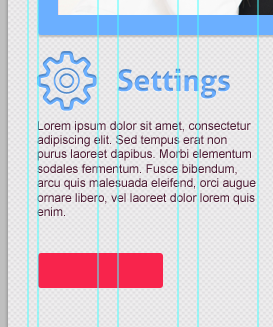
Fill these four columns (width of each - 240px) with some "loremipsum" text. It is better to add a different text to every column. loremipsum text. It's best if the text in each column is different.Text color: #4c1b33 and add drop shadow layer style

Step 14
Create a Read More button with the help of the tools that we've used before.Create a Read More button using the tool you used before (
Rounded Rectangle Tool)
(30,692,125,35)
 Blending options-> Inner Shadow, Drop Shadow, Color Overlay (#919392).
(#919392)

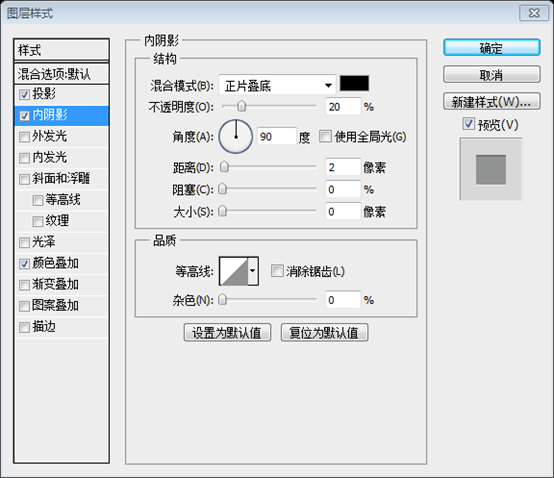
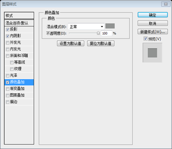 #Same , add another three buttons, namely (240, 692, 125, 35), (510, 692, 125, 35), (750, 692, 125, 35)
Step 15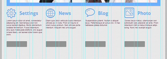
Step 15
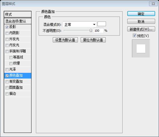
Add the Read more text to our button, and add a drop shadow and color overlay layer style

##Step 16
Now we should separate the Create a 1px line and add styles of your "read more" layout to it.Now we should separate the main content of our future website. Create a 1px straight line
(30, 747, 940, 1)and add the layer style of your Read more layer to it (
Paste Layer Style). In order to make the dividing line more obvious, add the inner shadow layer style

 Step 17
Step 17
Your next block can be a section entitled "Partners" or you may want to showcase your latest blog posts.Your next section could be a piece of content titled Partners or the latest blog posts you might want to showcase.
Use the Rounded Rectangle tool to create a square (hold down the Shift button).
Use the Rounded Rectangle tool to create a square (hold down the Shift button)
(30,768)Radius - 3px, width and height - 138px.
Radius: 3px, width and height: 138px
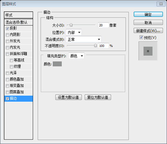
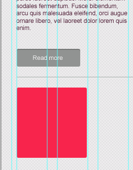 Go to Blending options -> Stroke to create a border with the settings below: Size- 20px, color #919392
Click:
Blending Options> Stroke, set the stroke according to the following parameters: size: 20px, color: #919392.
Add the projection style again.
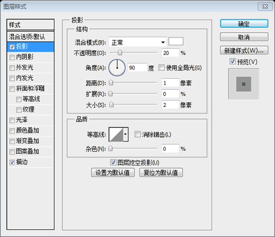
##Copy and paste this element 5 times : ) Place these squares with the interval of 20px.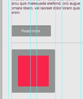
 Step 18
Step 18
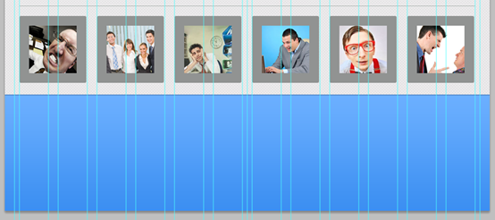
With the help of a clipping mask, insert the image into the square.
In order to create a clipping mask, insert the image into the square. Place
As you can see, you really can use this block for all sorts of purposes. Result:
As you can see, you can really use this block for all sorts of purposes. piece. Result:

Step 19
The footer of the website is as important as the header, if not more so. Ask yourself, "What do you want your visitors to do when they reach the bottom of the page?" The answer you come up with will be a great starting point for designing your website footer.
The footer and header area of a web page are equally important, period. Ask yourself, “What do you want your visitors to do when they reach the bottom of the page?”. Your answer is a great starting point for designing your footer. Now it is time to design a cool footer for our cute website layout. Let's make it bright :)It is time to design a cool footer for our cute website layout. Cool footer. Let's make it bright. 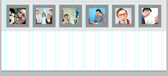
Step 20
We'll add three blocks into our footer: Quick links, About Us and Follow UsWe are going to add three blocks to the footer: Quick links, About Us and Follow Us
Use the Arial Regular font for titles (30px) and add styles as on the screenshots below:
Use Arial Regular font for the title (font size: 30px), and add layer style
(color: white) as shown in the screenshot
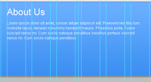
 Use the Arial Regular font for the text in the About Us section (12px).
Use the Arial Regular font for the About Us section (12px) Add text
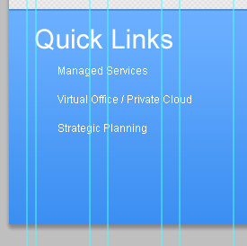
 The text for the Quick Links section - 22px.
The text for the Quick Links section (font size: 22px)
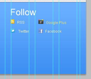
 Put some standard icons into the Follow section - RSS, Google Plus+ and Twitter
Add some standard icons into the Follow section: RSS , Google Plus+ and Twitter
Woohoo! We did it! The final result of our tutorial:
Oh! We're done! This is the final effect of our tutorial

Postscript:
The style of this webpage is refreshing, and no special technology is used. Just using some basic techniques (layer styles, clipping masks, etc.). But it is these simple combinations that create a different refreshing look. During the translation process, some modifications were made to some parameters to make it look more suitable for the overall style.
More PS web design tutorial XXVIII - How to create a clean web page layout in PS For related articles, please pay attention to the PHP Chinese website!


