
The concept of Matplotlib will not be introduced here
The editor has previously shared with you the line chart and pie chart effects achieved by python using matplotlib. Interested friends can also click to view, below Let’s take a look at how Python uses matplotlib to draw a histogram, as follows:
1. Basic histogram
import matplotlib.pyplot as plt

data = [5, 20, 15, 25, 10]

plt.bar(range(len(data)), data)
plt.show()

plt.bar function signature is:
bar(left, height, width=0.8, bottom=None, **kwargs)
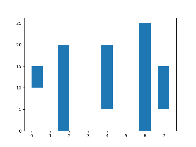
In fact, left, height, width, The four parameters of bottom determine the position and size of the cylinder. By default, left is the center position of the cylinder (the meaning of the left value can be changed through the align parameter), that is:
(left - width / 2, bottom) is the lower left corner position
(left + width / 2, bottom + height) is the upper right corner position
For example:
import matplotlib.pyplot as plt

data = [5, 20, 15, 25, 10]

plt.bar([0.3, 1.7, 4, 6, 7], data, width=0.6, bottom=[10, 0, 5, 0, 5])
plt.show()
##2. Set column style
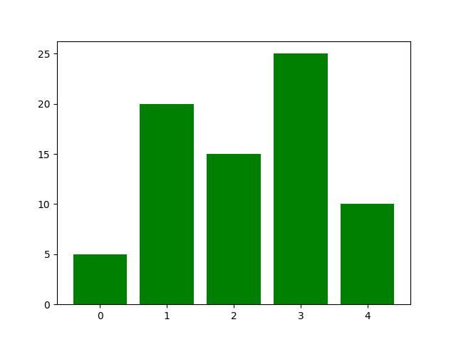
(1) ColorYou can set the cylinder color through the facecolor (or fc) keyword parameter, for example:import matplotlib.pyplot as plt data = [5, 20, 15, 25, 10] plt.bar(range(len(data)), data, fc='g') plt.show()
import matplotlib.pyplot as plt

data = [5, 20, 15, 25, 10]

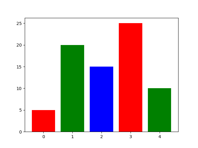
plt.bar(range(len(data)), data, color='rgb') # or `color=['r', 'g', 'b']`
plt.show()
import matplotlib.pyplot as plt

data = [5, 20, 15, 25, 10]

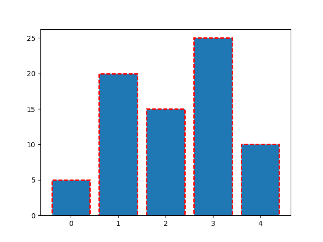
plt.bar(range(len(data)), data, ec='r', ls='--', lw=2)
plt.show()
(3) Fill
hatch keyword can be used to set the fill style, the possible values are: /, \, |, -, +, x, o, O, ., *. For example:
import matplotlib.pyplot as plt

data = [5, 20, 15, 25, 10]

plt.bar(range(len(data)), data, ec='k', lw=1, hatch='o')
plt.show()
3. Set tick label
import matplotlib.pyplot as plt

data = [5, 20, 15, 25, 10]
labels = ['Tom', 'Dick', 'Harry', 'Slim', 'Jim']

plt.bar(range(len(data)), data, tick_label=labels)
plt.show()

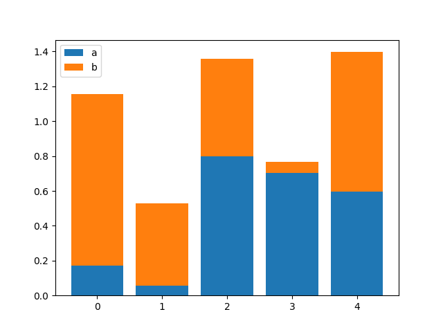
Through the bottom parameter, you can Draw a stacked column chart. For example:
import numpy as np
import matplotlib.pyplot as plt

size = 5
x = np.arange(size)
a = np.random.random(size)
b = np.random.random(size)

plt.bar(x, a, label='a')
plt.bar(x, b, bottom=a, label='b')
plt.legend()
plt.show()
##5. Side-by-side column chart
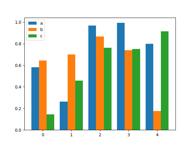
Drawing side-by-side histograms is similar to stacked histograms. They draw multiple groups of columns. You only need to control the position and size of each group of columns. For example:
import numpy as np
import matplotlib.pyplot as plt

size = 5
x = np.arange(size)
a = np.random.random(size)
b = np.random.random(size)
c = np.random.random(size)

total_width, n = 0.8, 3
width = total_width / n
x = x - (total_width - width) / 2

plt.bar(x, a, width=width, label='a')
plt.bar(x + width, b, width=width, label='b')
plt.bar(x + 2 * width, c, width=width, label='c')
plt.legend()
plt.show()
 ##6. Bar chart
Use the barh method to draw a bar chart. For example:
import matplotlib.pyplot as plt

data = [5, 20, 15, 25, 10]

plt.barh(range(len(data)), data)
plt.show()
The signature of the plt.barh method is: 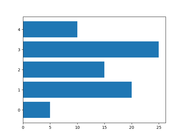
barh(bottom, width, height=0.8, left=None, **kwargs)
You can see that it is similar to the plt.bar method. Therefore, the drawing methods of stacked bar charts and side-by-side bar charts are similar to the previous ones and will not be described in detail.
7. Positive and Negative Bar ChartFor more Python tutorials on using matplotlib to draw histograms, please pay attention to the PHP Chinese website! import numpy as np
import matplotlib.pyplot as plt
a = np.array([5, 20, 15, 25, 10])
b = np.array([10, 15, 20, 15, 5])
plt.barh(range(len(a)), a)
plt.barh(range(len(b)), -b)
plt.show()
 How to turn off win10 upgrade prompt
 The difference between lightweight application servers and cloud servers
 CMD close port command
 The difference between external screen and internal screen broken
 How to jump with parameters in vue.js
 Cell sum
 How to intercept harassing calls
 virtual digital currency


