python draws commonly used charts
This article introduces how to use Python to draw different charts based on Excel table data. It is very detailed. Friends who have the same needs can refer to it.
This article introduces how to use Python to summarize commonly used Charts, compared with the click-and-click operation of Excel, drawing charts with python seems more cumbersome, especially in the processing of original data. However, the two have roughly the same idea in the process of drawing charts. Most of the work that can be done in Excel can also be done by Python. In order to explain more clearly the process of drawing charts using python, we annotate the code of the summary chart to explain the specific function of each line of code. At the end of the article, a corresponding table of custom fonts and chart colors is given.

Preparation
import numpy as np
import pandas as pd
#导入图表库以进行图表绘制
import matplotlib.pyplot as plt
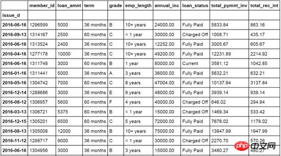
loandata=pd.DataFrame(pd.read_excel('loan_data.xlsx'))
##Line chart
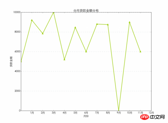
#设置日期字段issue_d为loandata数据表索引字段
loandata = loandata.set_index('issue_d')
#按月对贷款金额loan_amnt求均值,以0填充空值
loan_plot=loandata['loan_amnt'].resample('M').fillna(0)
#图表字体为华文细黑,字号为15
plt.rc('font', family='STXihei', size=15)
#创建一个一维数组赋值给a
a=np.array([1,2,3,4,5,6,7,8,9,10,11,12])
#创建折线图,数据源为按月贷款均值,标记点,标记线样式,线条宽度,标记点颜色和透明度
plt.plot(loan_plot,'g^',loan_plot,'g-',color='#99CC01',linewidth=3,markeredgewidth=3,markeredgecolor='#99CC01',alpha=0.8)
#添加x轴标签
plt.xlabel('月份')
#添加y周标签
plt.ylabel('贷款金额')
#添加图表标题
plt.title('分月贷款金额分布')
#添加图表网格线,设置网格线颜色,线形,宽度和透明度
plt.grid( color='#95a5a6',linestyle='--', linewidth=1 ,axis='y',alpha=0.4)
#设置数据分类名称
plt.xticks(a, ('1月','2月','3月','4月','5月','6月','7月','8月','9月','10月','11月','12月') )
#输出图表
plt.show()
#按用户等级grade字段对贷款金额进行求和汇总
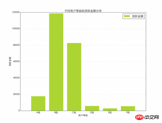
loan_grade=loandata.groupby('grade')['loan_amnt'].agg(sum)
#图表字体为华文细黑,字号为15
plt.rc('font', family='STXihei', size=15)
#创建一个一维数组赋值给a
a=np.array([1,2,3,4,5,6])
#创建柱状图,数据源为按用户等级汇总的贷款金额,设置颜色,透明度和外边框颜色
plt.bar([1,2,3,4,5,6],loan_grade,color='#99CC01',alpha=0.8,align='center',edgecolor='white')
#设置x轴标签
plt.xlabel('用户等级')
#设置y周标签
plt.ylabel('贷款金额')
#设置图表标题
plt.title('不同用户等级的贷款金额分布')
#设置图例的文字和在图表中的位置
plt.legend(['贷款金额'], loc='upper right')
#设置背景网格线的颜色,样式,尺寸和透明度
plt.grid(color='#95a5a6',linestyle='--', linewidth=1,axis='y',alpha=0.4)
#设置数据分类名称
plt.xticks(a,('A级','B级','C级','D级','E级','F级'))
#显示图表
plt.show()
#图表字体为华文细黑,字号为15
plt.rc('font', family='STXihei', size=15)
#创建一个一维数组赋值给a
a=np.array([1,2,3,4,5,6])
#创建条形图,数据源为分等级贷款金额汇总,设置颜色,透明度和图表边框
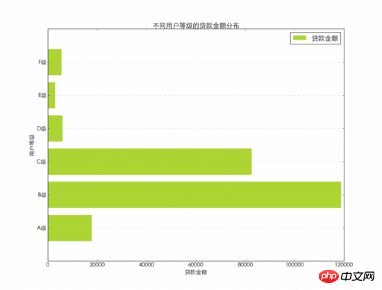
plt.barh([1,2,3,4,5,6],loan_grade,color='#99CC01',alpha=0.8,align='center',edgecolor='white')
#添加x轴标题
plt.xlabel('贷款金额')
#添加y轴标题
plt.ylabel('用户等级')
#添加图表标题
plt.title('不同用户等级的贷款金额分布')
#添加图例,并设置在图表中的显示位置
plt.legend(['贷款金额'], loc='upper right')
#设置背景网格线的颜色,样式,尺寸和透明度
plt.grid(color='#95a5a6',linestyle='--', linewidth=1,axis='y',alpha=0.4)
#设置数据分类名称
plt.yticks(a,('A级','B级','C级','D级','E级','F级'))
#显示图表
plt.show()
#图表字体为华文细黑,字号为15
plt.rc('font', family='STXihei', size=15)
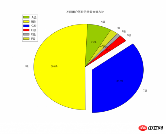
#设置饼图中每个数据分类的颜色
colors = ["#99CC01","#FFFF01","#0000FE","#FE0000","#A6A6A6","#D9E021"]
#设置饼图中每个数据分类的名称
name=['A级', 'B级', 'C级', 'D级', 'E级','F级']
#创建饼图,设置分类标签,颜色和图表起始位置等
plt.pie(loan_grade,labels=name,colors=colors,explode=(0, 0, 0.15, 0, 0, 0),startangle=60,autopct='%1.1f%%')
#添加图表标题
plt.title('不同用户等级的贷款金额占比')
#添加图例,并设置显示位置
plt.legend(['A级','B级','C级','D级','E级','F级'], loc='upper left')
#显示图表
plt.show()
 ## Dot chart
#按月汇总贷款金额,以0填充空值
loan_x=loandata['loan_amnt'].resample('M',how=sum).fillna(0)
#按月汇总利息金额,以0填充空值
loan_y=loandata['total_rec_int'].resample('M',how=sum).fillna(0)
#图表字体为华文细黑,字号为15
plt.rc('font', family='STXihei', size=15)
#创建散点图,贷款金额为x,利息金额为y,设置颜色,标记点样式和透明度等
plt.scatter(loan_x,loan_y,60,color='white',marker='o',edgecolors='#0D8ECF',linewidth=3,alpha=0.8)
#添加x轴标题
plt.xlabel('贷款金额')
#添加y轴标题
plt.ylabel('利息收入')
#添加图表标题
plt.title('贷款金额与利息收入')
#设置背景网格线的颜色,样式,尺寸和透明度
plt.grid(color='#95a5a6',linestyle='--', linewidth=1,axis='both',alpha=0.4)
#显示图表
plt.show()
Bubble chart
#按月汇总贷款金额及利息
loan_x=loandata['loan_amnt'].resample('M',how=sum).fillna(0)
loan_y=loandata['total_rec_int'].resample('M',how=sum).fillna(0)
loan_z=loandata['total_rec_int'].resample('M',how=sum).fillna(0)
#图表字体为华文细黑,字号为15
plt.rc('font', family='STXihei', size=15)
#设置气泡图颜色
colors = ["#99CC01","#FFFF01","#0000FE","#FE0000","#A6A6A6","#D9E021",'#FFF16E','#0D8ECF','#FA4D3D','#D2D2D2','#FFDE45','#9b59b6']
#创建气泡图贷款金额为x,利息金额为y,同时设置利息金额为气泡大小,并设置颜色透明度等。
plt.scatter(loan_x,loan_y,s=loan_z,color=colors,alpha=0.6)
#添加x轴标题
plt.xlabel('贷款金额')
#添加y轴标题
plt.ylabel('利息收入')
#添加图表标题
plt.title('贷款金额与利息收入')
#设置背景网格线的颜色,样式,尺寸和透明度
plt.grid(color='#95a5a6',linestyle='--', linewidth=1,axis='both',alpha=0.4)
#显示图表
plt.show()
Box plot
#图表字体为华文细黑,字号为15
plt.rc('font', family='STXihei', size=15)
#创建箱线图,数据源为贷款来源,设置横向显示
plt.boxplot(loandata['loan_amnt'],1,'rs',vert=False)
#添加x轴标题
plt.xlabel('贷款金额')
#添加图表标题
plt.title('贷款金额分布')
#设置背景网格线的颜色,样式,尺寸和透明度
plt.grid(color='#95a5a6',linestyle='--', linewidth=1,axis='both',alpha=0.4)
#显示图表
plt.show()
##Histogram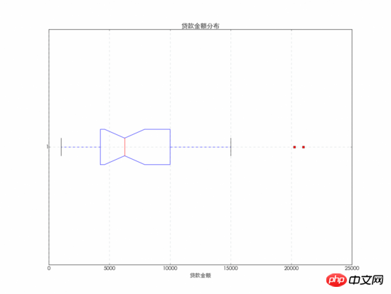
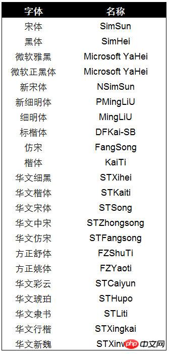
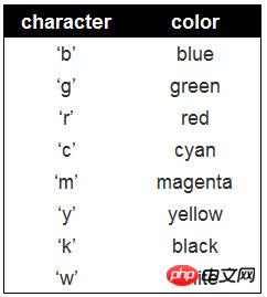
Custom fonts and colors The fonts used in the chart can be used Replace family= with the font name below to change the font displayed in the chart. #图表字体为华文细黑,字号为15
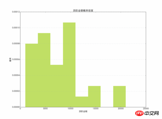
plt.rc('font', family='STXihei', size=15)
#创建直方图,数据源为贷款金额,将数据分为8等份显示,设置颜色和显示方式,透明度等
plt.hist(loandata['loan_amnt'],8,normed=1, histtype='stepfilled',facecolor='#99CC01', rwidth=0.9,alpha=0.6,edgecolor='white')
#添加x轴标题
plt.xlabel('贷款金额')
#添加y轴标题
plt.ylabel('概率')
#添加图表标题
plt.title('贷款金额概率密度')
#设置背景网格线的颜色,样式,尺寸和透明度
plt.grid(color='#95a5a6',linestyle='--', linewidth=1,axis='y',alpha=0.4)
#显示图表
plt.show()

Hot AI Tools

Undresser.AI Undress
AI-powered app for creating realistic nude photos

AI Clothes Remover
Online AI tool for removing clothes from photos.

Undress AI Tool
Undress images for free

Clothoff.io
AI clothes remover

Video Face Swap
Swap faces in any video effortlessly with our completely free AI face swap tool!

Hot Article

Hot Tools

Notepad++7.3.1
Easy-to-use and free code editor

SublimeText3 Chinese version
Chinese version, very easy to use

Zend Studio 13.0.1
Powerful PHP integrated development environment

Dreamweaver CS6
Visual web development tools

SublimeText3 Mac version
God-level code editing software (SublimeText3)

Hot Topics
 1664
1664
 14
14
 1423
1423
 52
52
 1318
1318
 25
25
 1269
1269
 29
29
 1248
1248
 24
24
 Python vs. C : Applications and Use Cases Compared
Apr 12, 2025 am 12:01 AM
Python is suitable for data science, web development and automation tasks, while C is suitable for system programming, game development and embedded systems. Python is known for its simplicity and powerful ecosystem, while C is known for its high performance and underlying control capabilities.
 The 2-Hour Python Plan: A Realistic Approach
Apr 11, 2025 am 12:04 AM
You can learn basic programming concepts and skills of Python within 2 hours. 1. Learn variables and data types, 2. Master control flow (conditional statements and loops), 3. Understand the definition and use of functions, 4. Quickly get started with Python programming through simple examples and code snippets.
 Python: Games, GUIs, and More
Apr 13, 2025 am 12:14 AM
Python excels in gaming and GUI development. 1) Game development uses Pygame, providing drawing, audio and other functions, which are suitable for creating 2D games. 2) GUI development can choose Tkinter or PyQt. Tkinter is simple and easy to use, PyQt has rich functions and is suitable for professional development.
 Python vs. C : Learning Curves and Ease of Use
Apr 19, 2025 am 12:20 AM
Python is easier to learn and use, while C is more powerful but complex. 1. Python syntax is concise and suitable for beginners. Dynamic typing and automatic memory management make it easy to use, but may cause runtime errors. 2.C provides low-level control and advanced features, suitable for high-performance applications, but has a high learning threshold and requires manual memory and type safety management.
 Python and Time: Making the Most of Your Study Time
Apr 14, 2025 am 12:02 AM
To maximize the efficiency of learning Python in a limited time, you can use Python's datetime, time, and schedule modules. 1. The datetime module is used to record and plan learning time. 2. The time module helps to set study and rest time. 3. The schedule module automatically arranges weekly learning tasks.
 Python vs. C : Exploring Performance and Efficiency
Apr 18, 2025 am 12:20 AM
Python is better than C in development efficiency, but C is higher in execution performance. 1. Python's concise syntax and rich libraries improve development efficiency. 2.C's compilation-type characteristics and hardware control improve execution performance. When making a choice, you need to weigh the development speed and execution efficiency based on project needs.
 Python: Automation, Scripting, and Task Management
Apr 16, 2025 am 12:14 AM
Python excels in automation, scripting, and task management. 1) Automation: File backup is realized through standard libraries such as os and shutil. 2) Script writing: Use the psutil library to monitor system resources. 3) Task management: Use the schedule library to schedule tasks. Python's ease of use and rich library support makes it the preferred tool in these areas.
 Learning Python: Is 2 Hours of Daily Study Sufficient?
Apr 18, 2025 am 12:22 AM
Is it enough to learn Python for two hours a day? It depends on your goals and learning methods. 1) Develop a clear learning plan, 2) Select appropriate learning resources and methods, 3) Practice and review and consolidate hands-on practice and review and consolidate, and you can gradually master the basic knowledge and advanced functions of Python during this period.


