
This article brings you a detailed introduction to the method of drawing line charts and scatter charts in Python (code examples). It has certain reference value. Friends in need can refer to it. I hope it will be helpful to you. help.
1. To draw line graphs and scatter plots, you need to use pylab under matplotlib, so we need to introduce it first, because we need to use array implementation and numpy. Then determine the data for the x-axis and y-axis, and finally present it.
import matplotlib.pylab as pyl
import numpy as np
x = [1, 3, 5, 6, 8, 13, 14, 16]
y = [5, 1, 6, 7, 9, 3, 2, 10]
pyl.plot(x, y)
pyl.show()
Such a simple line chart is drawn.
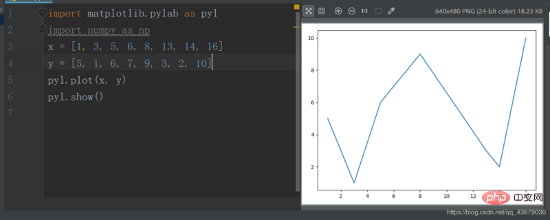
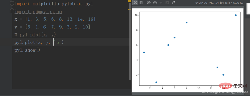
The plot() above has three parameters. The first parameter is the x-axis coordinate, the second parameter is the y-axis coordinate, and the third parameter is the x-axis coordinate. The first parameter determines the line type and is optional. If you want to change the above line chart into a scatter chart, just change the third parameter to 'o'.
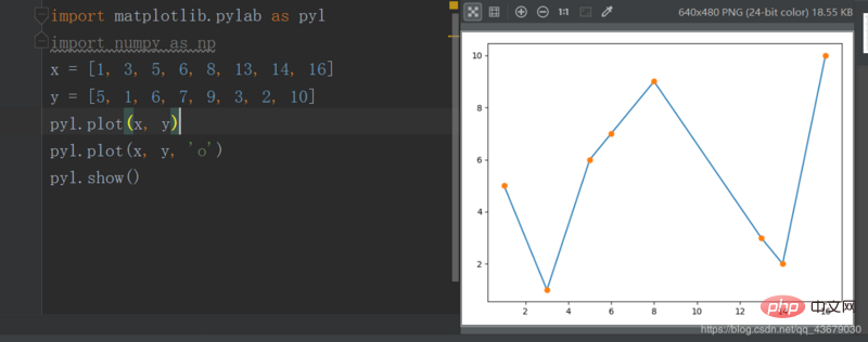
If you superimpose the line chart and the scatter chart, you can also highlight each point.
2. We can also change the color of the lines and points, just modify the third parameter of plot().
c--cyan--青色
r--red--红色
m--magente--品红
g--green--绿色
b--blue--蓝色
y--yellow--黄色
k--black--黑色
w--white--白色
The above parameters can be superimposed.
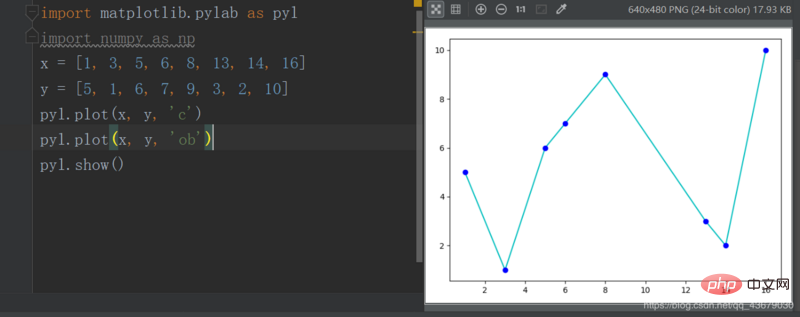
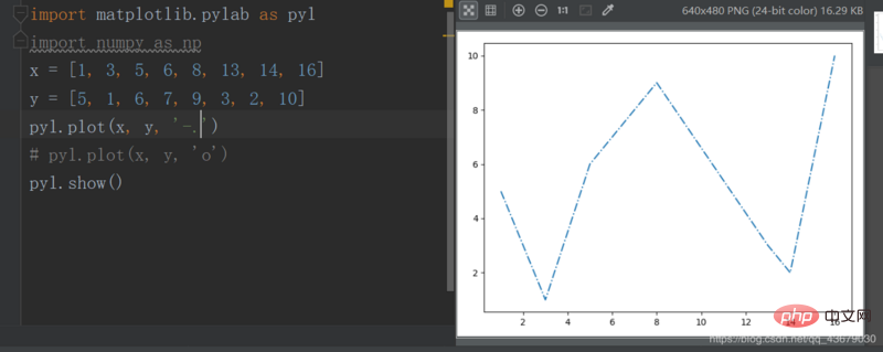
3. We can also change the line type, which is also the third parameter of the plot.
-   实线
--    虚线
-.    形式即为-.
:    细小的虚线
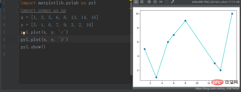
4. We can also change the point type, also by modifying the third parameter.
s--方形
h--六角形
H--六角形
*--*形
+--加号
x--x形
d--菱形
D--菱形
p--五角形
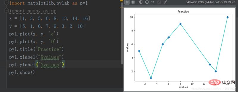
5. The graph we are currently drawing does not have an image name and a name for the horizontal and vertical axes. We need to add the following statements to the program
pyl.title()
pyl.xlabel()
pyl.ylabel()
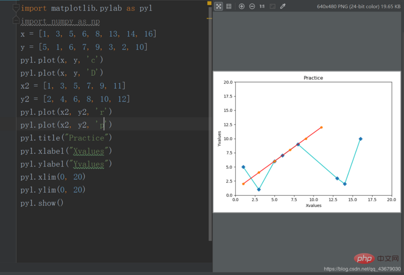
6. Now the range of the x and y axes of the drawing is automatically generated by the system. If we want to customize it, we need to add the following two statement, the value range is in brackets
pyl.xlim()
pyl.ylim()
7. If you want to draw multiple images in the same picture, just define two other variables before show()
The above is the detailed content of Detailed introduction to how to draw line charts and scatter plots in Python (code examples). For more information, please follow other related articles on the PHP Chinese website!