In the previous article " Sharing practical Excel skills: Do you know how to use these 5 shortcut keys? ", we learned about 5 star shortcut keys. Today we share an Excel chart tutorial, which can be said to be a very magical production method, you will never imagine it!

Forms are almost a must-have tool for every workplace person. The forms we make will be sent to leaders, employees or customers. It is especially important to create beautiful and easy-to-understand tables. Today I will teach you a stacked column chart with target horizontal lines and automatic color change.
1. Learning Objectives
The profit and growth rate of an existing product in the three years from 2015 to 2017 need to be produced as follows Bar chart. Horizontal lines are used to represent the set profit and growth rate goals, green columns represent completed goals, and red columns represent uncompleted goals. The main purpose of this bar chart is to highlight which profits and growth rates from 2015 to 2017 have achieved the target and which have not.
We need to meet the following requirements:
1. Each year needs to include two data, profit and growth rate, and they do not affect each other;
2. There is a target horizontal line for each column bar;
3. For profit and growth rate column bars, if it exceeds or just reaches the target horizontal line, it will appear green. Otherwise it is red;
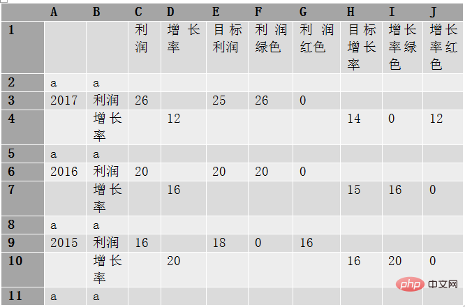
The original data is as follows:

## 2. Initial approach
Basically, the initial idea is to select the A1:C4 data, insert the clustered column chart, and get the following picture, which has a certain gap with the target picture: 1. The target value is missing, It is impossible to know from the picture whether the plan has been realized; 2. The legend has been added, making the entire composition not compact enough, and readers need to scan left and right, distracting attention; 3. Profit and growth The rate does not change color depending on whether the plan is completed;
3. Solution
(1) Processing of original data
In order to achieve the target histogram, the original data needs to be processed and certain auxiliary data added.
=IF(C3>=E3,C3,0)
=IF(C3
=IF(D4>=H4,D4,0)
=IF(D4
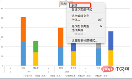


(2) Processing objectives Profit and target growth rate data
Select the "Planned Profit" legend on the right side of the chart, right-click and select "Change Chart Type", change the chart type to XY (scatter chart);


What we need is a horizontal line, and the vertical error bars need to be deleted. Select the vertical error bars, right-click and select "Format Error Bars", click and set the vertical error bars to no lines.


Select the horizontal error bar, set the direction of the horizontal error bar to "Both", the wireless end, the error amount is fixed at 0.5, the color is blue, and the width is 1.5 pound.


Follow the above steps and perform the same operations on the planned growth rate data (change to scatter plot, delete vertical error bars, change Horizontal error bar format), the final effect is as shown in the chart below.

(3) Beautify the chart
Further beautify the obtained chart, mainly including:
Change data a in placeholder rows 2, 5, 8, and 11 to a space (delete a and enter a space). Be careful not to clear the data, otherwise the abscissa will not be centered;
Select the right Side legend "Planned Profit", right-click, select Format Data Series, select  , click Mark, select "Data Marking Options", select "None", operate similarly for "Planned Growth Rate";


Select the "Growth Rate Red" legend, right-click, and select "Format Data Series" in the pop-up window. Set the gap width in the data series format of the column chart to 50%. This will be applied to all column bars in the chart, making the width of all column bars wider;


Click  , click the "Fill" option, fill the growth rate (green) and profit (green) with green, the growth rate (red) and profit (red) is red. This needs to be set once for each series;

Select the legend and press delete to delete the legend; select the column bar, right-click and select Add Data Label for each Add data labels to each series;
#Because in our auxiliary data, there are several useless "0"s that are also regarded as cartographic data. After adding data labels, it is displayed Out. So we can delete them manually. Click twice on the "0" tag that needs to be deleted. When the selected state shown below appears, click "delete" to delete it.
Click on the vertical axis, after selecting it, press "delete" to delete the vertical axis;
Select the horizontal axis, single Right-click and select "Format Axis". Click 
IV. Key Points Review
A qualified chart can reflect the professionalism of the producer. Allow readers to quickly grasp the key points. The target profit and target growth rate horizontal lines have been added to the column chart created this time, so you can see at a glance whether the plan has been completed. There are also some difficult points in this article that require everyone to think carefully before they can draw inferences and apply them to their daily work.1. Original data is not equal to cartographic data. In most cases, mapping data needs to be obtained after processing the original data, sometimes splitting the data, and sometimes adding auxiliary data. Because the colors of profit and growth rate here are different, and the target data shows horizontal lines, they must be separated;
2. How to make error bars.
5. Follow-up Thoughts
Although the final bar chart is not bad, if the annual profits can be put together, the annual profits Growth rates, taken together, can better show changes over time. Please think about how to process the original data and create the following column chart.
Related learning recommendations: excel tutorial
The above is the detailed content of Excel chart learning: Create a multi-series multi-condition histogram with target values. For more information, please follow other related articles on the PHP Chinese website!
 Compare the similarities and differences between two columns of data in excel
 excel duplicate item filter color
 How to copy an Excel table to make it the same size as the original
 Excel table slash divided into two
 Excel diagonal header is divided into two
 Absolute reference input method
 java export excel
 Excel input value is illegal


