Now more and more frameworks have entered our development world. In this article, we will share with you several responsive frameworks suitable for web programmers. We hope that you can find many frameworks that suit you through the content of this article.
As HTML5 and CSS3 continue to become more popular, responsive design frameworks are becoming more and more popular, becoming more and more popular among webmasters and designers. However, the public has different attitudes and views on responsive frameworks. Some people think that a professional designer who understands HTML5 and CSS3 should write the framework himself so that he can create a unique website; others think that responsive design frameworks can It is convenient for designers to quickly and effectively build a practical and beautiful website, which is indispensable in saving time and energy. Regarding this argument, Xiaofei still supports the latter point of view. Xiaofei believes that even experienced Web front-end developers should study the responsive framework. It can provide us with some reference and a lot of convenience. In today's era of rapid development, designers have to write frameworks to build websites ( Properly arrange grid, layout, and media queries ) is just too time consuming. In addition, designers can also give full play to their creativity when using responsive frameworks, customize some features, and create innovative websites. Today I will introduce some responsive frameworks that are commonly used by designers. You can choose to use them based on your actual needs.
Bootstrap

Foundation
 ##Foundation is based on a flexible grid and uses the latest technology to become an advanced Responsive front-end framework. Its overall framework design concept is mobile-first, so one of its outstanding features is that it performs better on mobile devices such as mobile phones. At the same time, Foundation supports users to use customized services (defining grids, colors, font sizes, etc.), provides a variety of Web UI components, such as forms, buttons, etc., and is flexible enough in operation and use.
. Compared with Bootstrap, which is widely used, Foundation is relatively low-key in China due to the lack of Chinese-language documents and tutorials. However, many webmasters believe that there are too many people using the Bootstrap framework to build websites, and the websites they create all look like one. It is impossible to make your website stand out among competitors if it is carved out of a mold. At this time, you will be more inclined to use Foundation to create a tall and unique website. However, this framework also has its own shortcomings, that is, compatibility issues. Foundation
4 has given up compatibility with IE8. In the domestic browser environment, whether Foundation's behavior is good or bad, Xiaofei cannot easily make a conclusion.
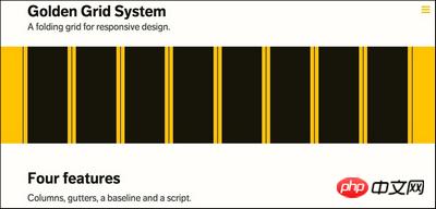
 If you are interested in grid systems, Golden Grid
System must be your best choice. It initially appears as a 16-column grid, but you can also collapse it, shrinking the viewport to an 8- or 4-column layout for tablet and mobile browsing. In summary, it is a foldable grid designed to increase web design compatibility and has four obvious characteristics: columns, cross-pages, bottom lines, and scripts. Use Golden
The grid system framework has many advantages when building a website. For example, it can help establish clear and regular layout and increase the readability of web pages; it can serve as a bridge between web designers and front-end developers to facilitate their communication; it can implement responsiveness and change the layout. Adapt to different screen sizes. With so many benefits, aren’t you excited yet?
Less
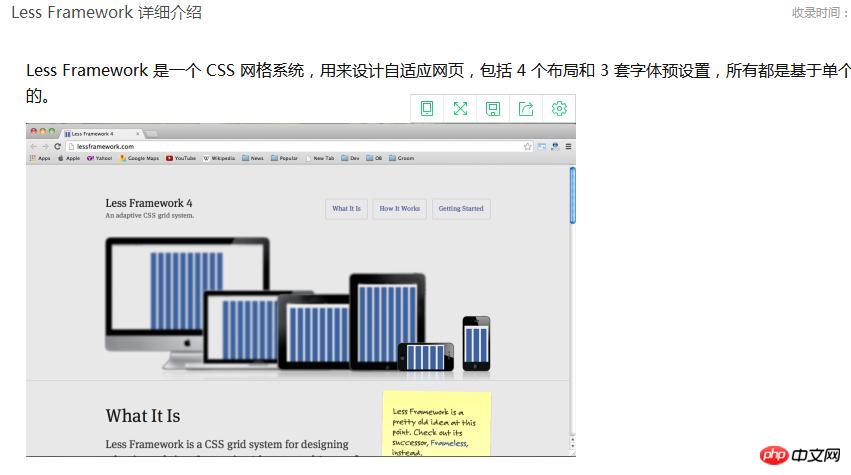
Framework is one of the classic responsive frameworks. It is an adaptive CSS grid system that covers 4 layouts and 3 font presets to meet the needs of different windows such as computers, tablets, and mobile phones. Less
Framework works based on a single grid, changing the number of layout columns and the width of the outer edge to make different layouts. As a non-programming language, CSS is difficult for many designers. The emergence of Less solves this problem. It greatly simplifies the writing of CSS code, reduces the maintenance cost of web pages, and allows designers to Make better websites with less code. This echoes its name less. No wonder so many designers fall in love with this framework. Gumby If you are new to responsive website design, the Gumby framework is for you It's definitely a good place to get started.
Gumby is a responsive CSS framework based on SASS (a CSS extension language parser). It comes with templates and Web
UI toolkit, with various beautiful buttons, tables, navigation, labels, JS files, and fast response speed. It also supports no-coding design. Even if you don’t understand technology, it is very simple to operate, easy to get started, and there are no obstacles in later maintenance. 320 and UP This framework is first oriented to small screens and uses a small screen style sheet, which includes some settings such as color and layout, to ensure that the website Content priority. It adapts well to small screens, and there is no problem on large screens. 1140px CSS Grid System A responsive website does not only mean meeting the needs of small resolution devices, but also needs to display well on ordinary computer screens. Adapt layout to larger resolutions. The 1140 grid frame is able to do this, and it can fit perfectly into a 1280 resolution display. On smaller displays, it becomes fluid based on the width of the browser and adapts to the browsing window. The above content is about these commonly used web responsive frameworks. Different frameworks have their own advantages and disadvantages. It is important to find a framework that suits you. I hope the sharing of this article can help everyone. Related recommendations: Several useful HTML5 mobile development frameworks
 Introduction to the framework used by vscode
 What is the encoding used inside a computer to process data and instructions?
 What is a registration-free virtual host?
 vscode Chinese setting method
 What should I do if the secondary web page cannot be opened?
 How to solve 0xc000409 error
 How to use fusioncharts.js
 How to make a round picture in ppt


