 headlines
 Recommended flex layout video tutorials: 5 latest flex elastic layout video tutorials in 2021
Recommended flex layout video tutorials: 5 latest flex elastic layout video tutorials in 2021
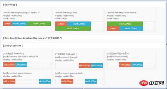
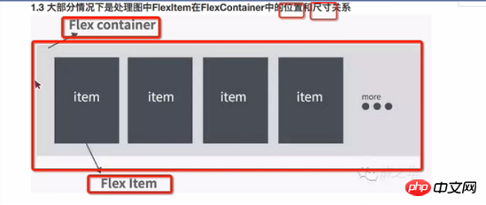
What does flex mean? What is flex layout? Flex is the abbreviation of Flexible Box. Flex layout means "flexible layout", which is used to provide maximum flexibility for the box-shaped model. Any container can be designated as Flex layout. Today, the php Chinese website is here to recommend the latest 2021 to you. 5 flex layout free video tutorials, everyone is welcome to learn!
The latest video course recommendation:
《Playing with Flexbox Flexbox Layout》

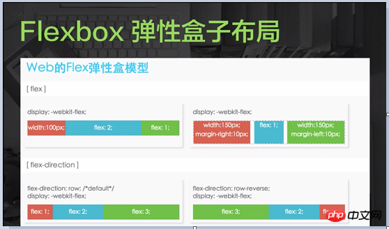
php Chinese website 2021 original new course: Experience the latest Flexbox flexible box layout method, you can realize the layout of various complex pages with just a few lines of code , simple and elegant!
For graphic tutorials, please refer to: What is Flex layout? Understand Flex layout in 15 minutes
Learning the "flex flexible box model" video tutorial allows students to have a basic understanding of the flex flexible box model. The main function is that we can use this attribute Quickly set and operate the layout of its child elements, and you can easily achieve center, left, right, aligned on both sides, vertical center, and horizontal center effects.
##The "Flexbox Flexible Box Layout" video tutorial gives students a basic introduction to how flex layout is laid out and the basic usage of flex layout.3.《FlexBox layout on the top》《FlexBox layout on the bottom 》
The "FlexBox Layout Up and Down" video tutorial can help students understand what FlexBox layout is? What scenarios can FlexBox layout be applied to? Well worth a look.4. "Layout - Flexbox"
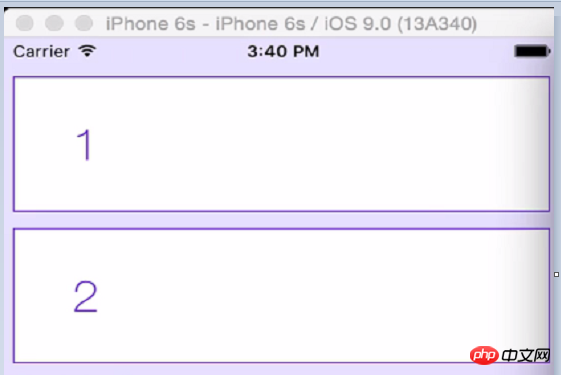 ##For studying the "Layout - Flexbox" video tutorial, you can understand how to perform Flexbox layout and explain examples of flex layout.
CSS3 Elastic Scaling Layout [Part 1]》《CSS3 Elasticity Scalable Layout [Part 2]》《CSS3 Flexible Scalable Layout[Part 2]》
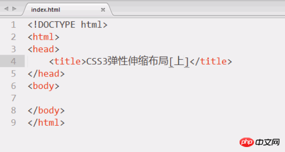 The video tutorial "CSS3 Elastic Scaling Layout [Part 1] [Middle] [Part 2]" can learn the basic knowledge of flex layout and give students a certain understanding of flex layout.
The above are the 5 latest flex elastic layout videos recommended by php Chinese website in 2021. The 5 flex elastic layouts recommended in this article The video tutorial is sufficient for learning flex layout, and students can learn directly by clicking on the link.
related suggestion:

Hot AI Tools

Undresser.AI Undress
AI-powered app for creating realistic nude photos

AI Clothes Remover
Online AI tool for removing clothes from photos.

Undress AI Tool
Undress images for free

Clothoff.io
AI clothes remover

AI Hentai Generator
Generate AI Hentai for free.

Hot Article

Hot Tools

Notepad++7.3.1
Easy-to-use and free code editor

SublimeText3 Chinese version
Chinese version, very easy to use

Zend Studio 13.0.1
Powerful PHP integrated development environment

Dreamweaver CS6
Visual web development tools

SublimeText3 Mac version
God-level code editing software (SublimeText3)

Hot Topics
 1377
1377
 52
52
 Guide to solving misalignment of WordPress web pages
Mar 05, 2024 pm 01:12 PM
Guide to solving misaligned WordPress web pages In WordPress website development, sometimes we encounter web page elements that are misaligned. This may be due to screen sizes on different devices, browser compatibility, or improper CSS style settings. To solve this misalignment, we need to carefully analyze the problem, find possible causes, and debug and repair it step by step. This article will share some common WordPress web page misalignment problems and corresponding solutions, and provide specific code examples to help develop
 How to implement responsive layout using Vue
Nov 07, 2023 am 11:06 AM
Vue is a very excellent front-end development framework. It adopts the MVVM mode and achieves a very good responsive layout through two-way binding of data. In our front-end development, responsive layout is a very important part, because it allows our pages to display the best effects for different devices, thereby improving user experience. In this article, we will introduce how to use Vue to implement responsive layout and provide specific code examples. 1. Use Bootstrap to implement responsive layout. Bootstrap is a
 What are the commonly used Flex layout properties?
Feb 25, 2024 am 10:42 AM
What are the common properties of flex layout? Specific code examples are required. Flex layout is a powerful tool for designing responsive web page layouts. It makes it easy to control the arrangement and size of elements in a web page by using a flexible set of properties. In this article, I will introduce the common properties of Flex layout and provide specific code examples. display: Set the display mode of the element to Flex. .container{display:flex;}flex-directi
 How to center a div in html
Apr 05, 2024 am 09:00 AM
There are two ways to center a div in HTML: Use the text-align attribute (text-align: center): For simpler layouts. Use flexible layout (Flexbox): Provide more flexible layout control. The steps include: enabling Flexbox (display: flex) in the parent element. Set the div as a Flex item (flex: 1). Use the align-items and justify-content properties for vertical and horizontal centering.
 How to implement irregular grid layout through CSS Flex layout
Sep 28, 2023 pm 09:49 PM
How to implement irregular grid layout through CSSFlex elastic layout. In web design, it is often necessary to use grid layout to achieve page segmentation and layout. Usually grid layout is regular, and each grid is the same size. Sometimes we may need to implement some irregular grid layout. CSSFlex elastic layout is a powerful layout method that can easily implement various grid layouts, including irregular grid layouts. Below we will introduce how to use CSSFlex elastic layout to achieve different
 A guide to CSS flexible layout properties: position sticky and flexbox
Oct 27, 2023 am 10:06 AM
A Guide to CSS Flexible Layout Properties: positionsticky and flexbox Flexible layout has become a very popular and useful technique in modern web design. It can help us create adaptive web page layouts so that web pages can display and respond well on different devices and screen sizes. This article will focus on two flexible layout properties: position:sticky and flexbox. We'll discuss their usage in detail, with concrete code examples
 How to beautify the page with css
Apr 25, 2024 pm 06:36 PM
CSS (Cascading Style Sheets) beautifies web pages by changing text, background, layout and other visual elements. Beautification techniques include: 1. Controlling text; 2. Adding backgrounds; 3. Customizing layouts; 4. Using shadows and borders; 5. Animating elements. The beautification advantages of using CSS include enhanced aesthetics, improved user experience, search engine optimization, cross-platform compatibility, and ease of maintenance.
 What does display mean in css
Apr 28, 2024 pm 04:00 PM
The display attribute in CSS controls the layout of elements on the web page. Its meaning: inline: elements are arranged inline, flowing with the text. block: Elements are arranged at a block level, occupying an exclusive row and occupying the width. inline-block: combines the inline and block features, arranges inline but can set the size. none: hide the element. Flex: Use flexible layout to automatically adjust the size and position of elements. grid: Use grid layout to precisely control element position and size.


