What are the layout methods of css?
css layout method: 1. Single-column layout, including single-column layout with equal width of header, content, and footer, and single-column layout with header and footer filling the screen width and slightly narrower content; 2. Two-column adaptive layout; 3. Three-column layout, including Holy Grail layout and double-wing layout.
The operating environment of this tutorial: Windows 7 system, CSS3&&HTML5 version, Dell G3 computer.
1. Single-column layout
There are two common single-column layouts:
Single-column layout with equal widths for header, content, and footer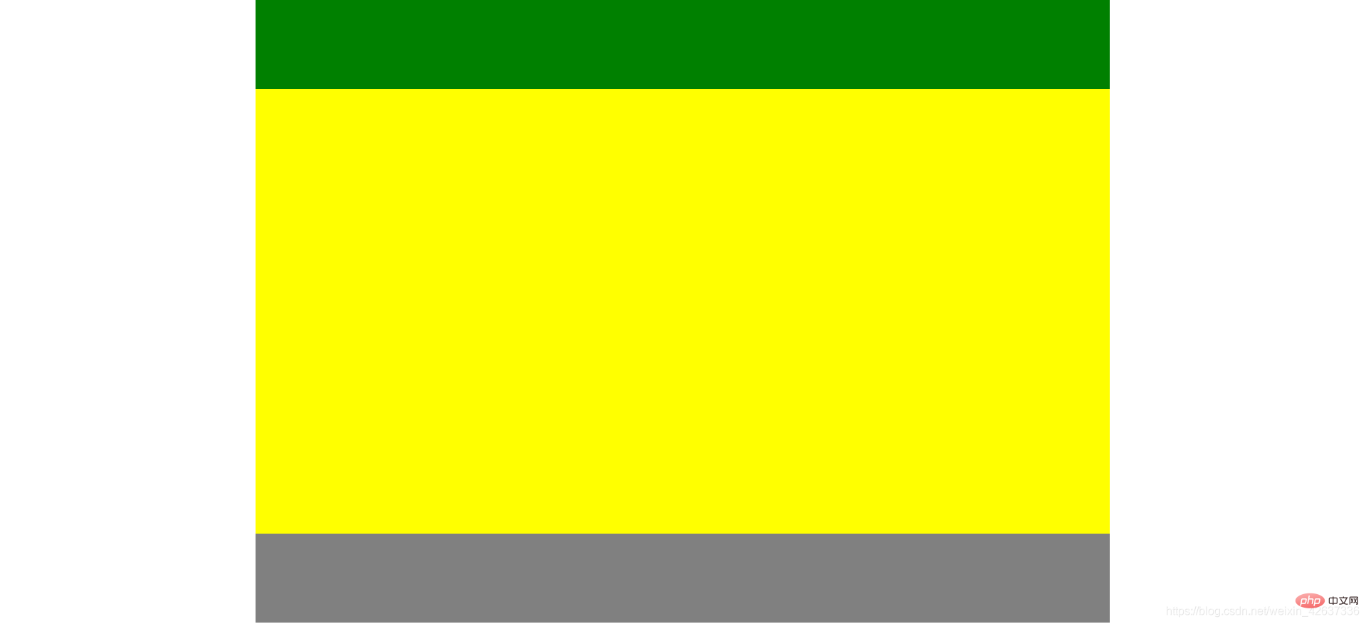
Implementation:
Use width or max-width to set the same width for header, content, and footer width (when the screen is smaller than the set width, the former will have a scroll bar, and the latter will display the actual width of the screen), and then use margin:0 auto; to achieve horizontal centering.
html part: 
css part: 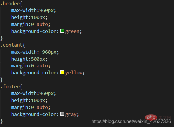
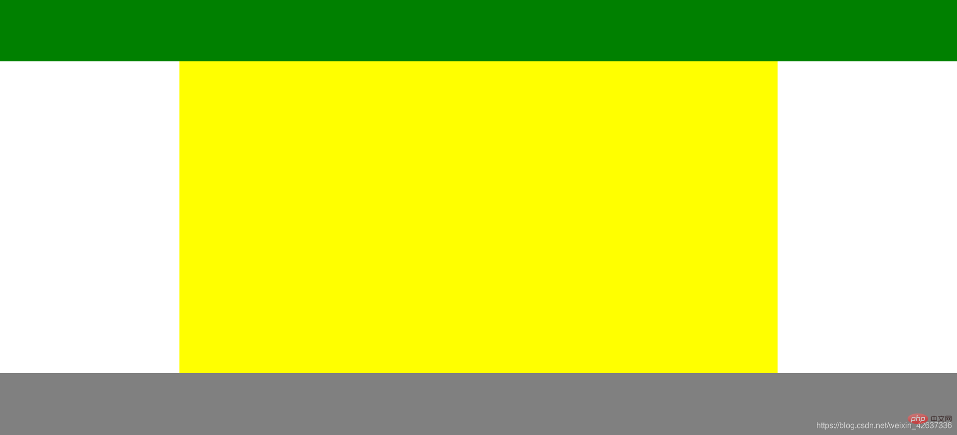
Header and footer occupy the screen width, and the content is slightly narrower single-column layout
 Implementation:
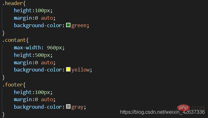
Do not set the width of header and footer. Block-level elements will fill the screen width. Use width or max- for content. width sets the same width (the difference is the same as above), and then uses margin:0 auto; to achieve horizontal centering.
html part is the same as above
css part:
2. Two-column adaptive layout
Two-column adaptive layout refers to a layout method in which one column is stretched by the width of the content, and the remaining column fills the remaining width of the screen.

Use float overflow:hidden to achieve
The adaptive two-column layout mainly triggers BFC (formatting context, yes) through overflow:hidden The CSS rendering mode of the box model layout in the web page refers to an independent rendering area or an isolated independent container.) to implement, one of the characteristics of BFC is not overlapping floating elements.
html part: 
css part: 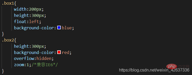
Use flex layout to achieve
Flex layout is also called flexible box layout , which can easily implement the layout method. The disadvantage is that it is not compatible with IE10 or below.
The html part is the same as above.
css part: 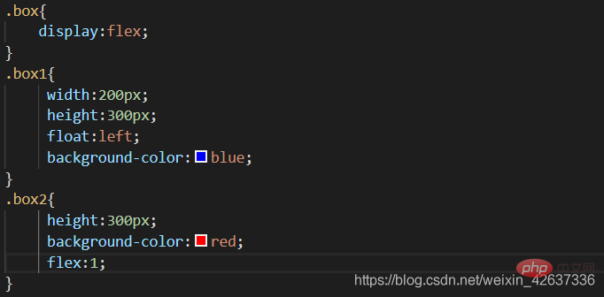
Flex is flex-grow (defining the method proportion of the item), flex-shrink (defining the abbreviation proportion of the item), flex-basis (defining the method of allocating excess space before , the abbreviation of the main axis space occupied by the project), flex:1 is equivalent to flex-grow:1;flex-shrink:1;flex-basis:0;
Use grid layout to implement
Grid layout is a two-dimensional grid-based layout system used to optimize user interface design.
The html part is the same as above.
css part: 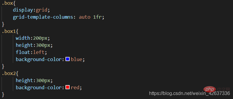
Three-column layout
Three-column layout It refers to the fixed width of the columns on both sides and the adaptive width of the middle column. This article mainly introduces the Holy Grail layout and the double flying wing layout.
Holy Grail Layout
Features: The DOM structure must first write the middle column part, so that the middle column can be loaded first.
html part:

css implementation steps:
1. Set all three column parts to left floating, Set the width of the middle column to 100% to achieve middle adaptation. At this time, left and right will be squeezed to the next row.
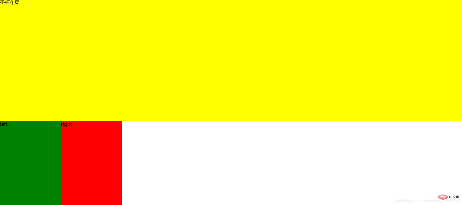
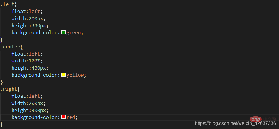
2. Set the value of margin-left to a negative value for both left and right, so that left and right can be returned to the same line as center. 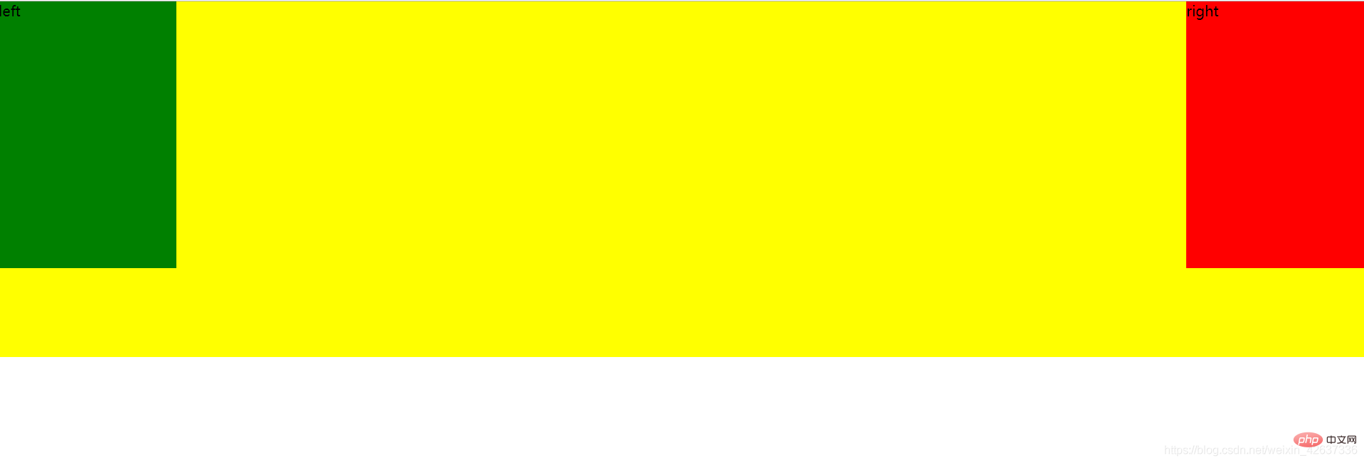
3. Set the padding-left and padding-right of the parent element container to make space for the left column part and the right column part. 
4. Set the left column part and the right column part to relative positioning, and set their left and right attributes. 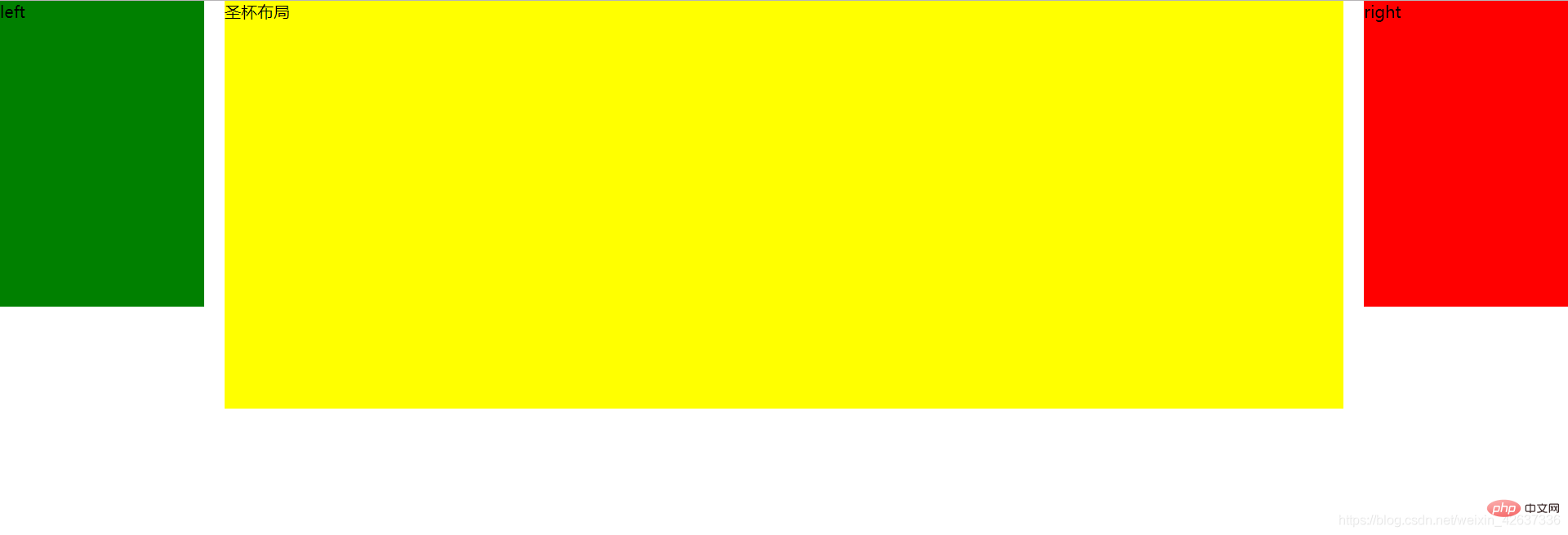
Complete css code: 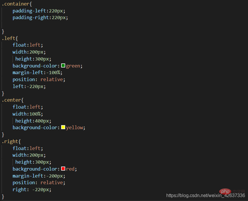
Disadvantages
There is a minimum width. When the page is smaller than the minimum width, the layout will be messed up. So it's best to set a min-width for the body. This min-width definitely cannot be determined by testing. How to calculate it? It is left-width * 2 right-width. As for why, simply put: "Because relative positioning is set, when the original position of left overlaps the position of right, a line will wrap if it cannot fit due to floating." . So the layout is disrupted. This problem can be avoided by using a double flying wing layout.
Double Flying Wing Layout
It is similar to the Holy Grail layout, but the Double Flying Wing layout changes the DOM document structure.
html part: 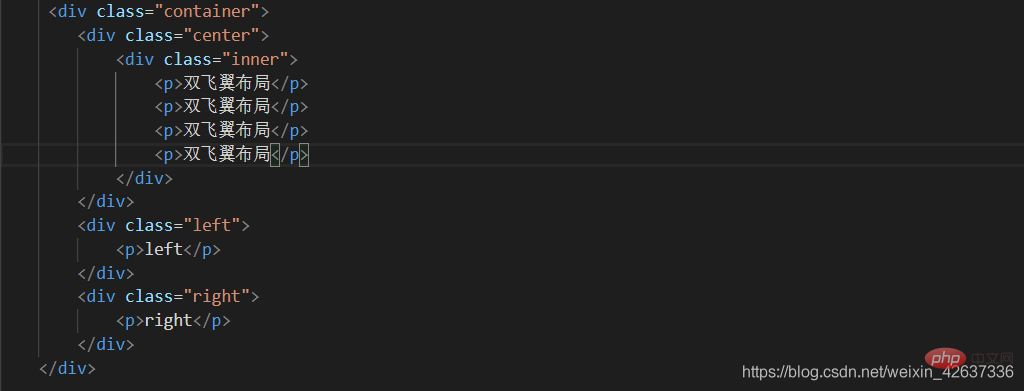
css implementation steps:
1. Set the float of left, right, and center to left, and then set the width of center to 100% .
2. Set the margin-left of left to -100%, and set the margin-left of right to the negative value of its width.
3. Set the margin attribute value of inner in center.
Complete css code: 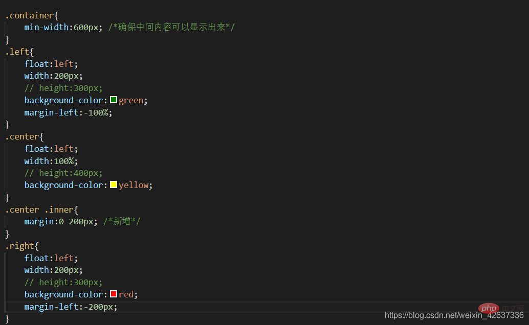
Effect: 
##Comparison of two three-column layouts: 1. Both layouts put the mainstream documents at the front, so that the main column is loaded first.
2. The double-wing layout has one less relative positioning than the Holy Grail layout, and the css structure is simpler. But the Holy Grail's html layout may be even more clear in one step.
3. Both layouts have a fixed width on the left and a right, and an adaptive layout structure in the middle width. They both use negative margin-left values for positioning.
Programming Video! !
The above is the detailed content of What are the layout methods of css?. For more information, please follow other related articles on the PHP Chinese website!

Hot AI Tools

Undresser.AI Undress
AI-powered app for creating realistic nude photos

AI Clothes Remover
Online AI tool for removing clothes from photos.

Undress AI Tool
Undress images for free

Clothoff.io
AI clothes remover

Video Face Swap
Swap faces in any video effortlessly with our completely free AI face swap tool!

Hot Article

Hot Tools

Notepad++7.3.1
Easy-to-use and free code editor

SublimeText3 Chinese version
Chinese version, very easy to use

Zend Studio 13.0.1
Powerful PHP integrated development environment

Dreamweaver CS6
Visual web development tools

SublimeText3 Mac version
God-level code editing software (SublimeText3)

Hot Topics
 1664
1664
 14
14
 1423
1423
 52
52
 1321
1321
 25
25
 1269
1269
 29
29
 1249
1249
 24
24
 How to use bootstrap in vue
Apr 07, 2025 pm 11:33 PM
Using Bootstrap in Vue.js is divided into five steps: Install Bootstrap. Import Bootstrap in main.js. Use the Bootstrap component directly in the template. Optional: Custom style. Optional: Use plug-ins.
 Understanding HTML, CSS, and JavaScript: A Beginner's Guide
Apr 12, 2025 am 12:02 AM
WebdevelopmentreliesonHTML,CSS,andJavaScript:1)HTMLstructurescontent,2)CSSstylesit,and3)JavaScriptaddsinteractivity,formingthebasisofmodernwebexperiences.
 The Roles of HTML, CSS, and JavaScript: Core Responsibilities
Apr 08, 2025 pm 07:05 PM
HTML defines the web structure, CSS is responsible for style and layout, and JavaScript gives dynamic interaction. The three perform their duties in web development and jointly build a colorful website.
 How to write split lines on bootstrap
Apr 07, 2025 pm 03:12 PM
There are two ways to create a Bootstrap split line: using the tag, which creates a horizontal split line. Use the CSS border property to create custom style split lines.
 How to insert pictures on bootstrap
Apr 07, 2025 pm 03:30 PM
There are several ways to insert images in Bootstrap: insert images directly, using the HTML img tag. With the Bootstrap image component, you can provide responsive images and more styles. Set the image size, use the img-fluid class to make the image adaptable. Set the border, using the img-bordered class. Set the rounded corners and use the img-rounded class. Set the shadow, use the shadow class. Resize and position the image, using CSS style. Using the background image, use the background-image CSS property.
 How to set up the framework for bootstrap
Apr 07, 2025 pm 03:27 PM
To set up the Bootstrap framework, you need to follow these steps: 1. Reference the Bootstrap file via CDN; 2. Download and host the file on your own server; 3. Include the Bootstrap file in HTML; 4. Compile Sass/Less as needed; 5. Import a custom file (optional). Once setup is complete, you can use Bootstrap's grid systems, components, and styles to create responsive websites and applications.
 How to resize bootstrap
Apr 07, 2025 pm 03:18 PM
To adjust the size of elements in Bootstrap, you can use the dimension class, which includes: adjusting width: .col-, .w-, .mw-adjust height: .h-, .min-h-, .max-h-
 How to use bootstrap button
Apr 07, 2025 pm 03:09 PM
How to use the Bootstrap button? Introduce Bootstrap CSS to create button elements and add Bootstrap button class to add button text


