This article brings you related operations to complete a creative animation of an orange cat's mood changes through vite scss. I hope it will be helpful to everyone.

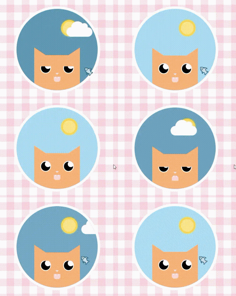
In this issue, we use vite scss to complete a creative animation of the orange cat’s mood changes. We will not use any js code for the logic here, and only rely on css to complete it, so , through the animation in this issue, you can learn some CSS animation and drawing techniques.

It’s rather cute. When the mouse (fish) moves in and out, the orange becomes dull and listless. But when the mouse (fish) moves in, the orange immediately becomes happy when he sees his favorite fish, and even the weather gets better. Yes, this orange is so greedy, and there is a reason why he turned into a fat orange.
Okay, we are about to enter the main text. We will understand the process of making this animation from the basic construction, drawing and animation of the sun, clouds and cats.
yarn add vite sass sass-loader
We use vite and sass to complete the construction of the project and write the style, so we install them first.
<div id="app">
    <div class="warrper">
        <div class="sun"></div>
        <div class="cloud"></div>
        <div class="cat">
            <div class="eye left"><div class="eye-hide"></div></div>
            <div class="eye right"><div class="eye-hide"></div></div>
            <div class="nose"></div>
            <div class="mouth"></div>
        </div>
    </div>
</div>In html we first write the structure. div#app serves as the main interface to fill a screen, and div.warrper serves as the display area for the main content, which is the circle. Then, in the circle, we put the sun div.sun, the clouds div.cloud, and the cat div.cat. Of course, the cat also has eyes, nose, and mouth. As for the cat’s ears, we use two pseudo-classes to make triangles.
$cat:rgb(252, 180, 125);
:root{
    --bgColor:rgb(81, 136, 168);
    --eyeHideTop:0px;
    --cloudLeft:45%;
    --mouthRadius:10px 10px 0 0;
}
#app{
    width: 100%;
    height: 100vh;
    position: relative;
    display: flex;
    justify-content: center;
    align-items: center;
    background-image: repeating-linear-gradient(0deg, hsla(340,87%,75%,0.2) 0px, hsla(340,87%,75%,0.2) 30px,transparent 30px, transparent 60px),repeating-linear-gradient(90deg, hsla(340,87%,75%,0.2) 0px, hsla(340,87%,75%,0.2) 30px,transparent 30px, transparent 60px),linear-gradient(90deg, rgb(255,255,255),rgb(255,255,255));
}
.warrper{
    width: 320px;
    height: 320px;
    border-radius: 50%;
    border: 10px solid white;
    position: relative;
    overflow: hidden;
    background-color: var(--bgColor);
    transition: background-color 1s linear;
    cursor:url("./assets/fish.png"),default;
    &:hover{
        --bgColor:rgb(178, 222, 247);
        --eyeHideTop:-20px;
        --cloudLeft:100%;
        --mouthRadius:0 0 10px 10px;
    }
}We first define the main color of the cat, and some colors and distances that need to be changed, because we will change these attributes through css3 to achieve a certain Implementation of some animations.
What we expect is that when the mouse moves into the circle, the sky becomes clear, the clouds disperse, and the cat is happy and full of energy. Therefore, bgColor: sky color, eyeHideTop cat’s eyelid y-axis distance, cloudLeft cloud x-axis offset Distance, mouthRadius The rounded corner value of the cat's mouth. Currently, these values will change when the mouse moves into div.warrper. In addition, I customized the mouse icon to move into the circle and turn it into a fish (i.e. cursor:url (picture address)). The values after hover here are calculated by me in advance. If you develop other animations again, you can calculate them as you go.
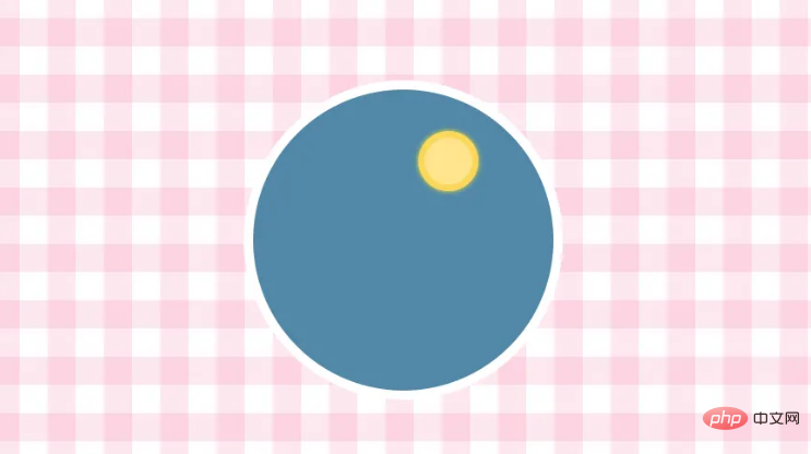
.sun{
    width: 50px;
    height: 50px;
    position: absolute;
    background-color: rgb(255, 229, 142);
    border:7px solid rgb(253, 215, 91);
    border-radius: 50%;
    left: 55%;
    top: 14%;
    box-shadow: 0 0 6px rgb(255, 241, 48);
}For the sun, we draw a circle to determine its position, and then use box-shadow projection to achieve a little glowing effect.

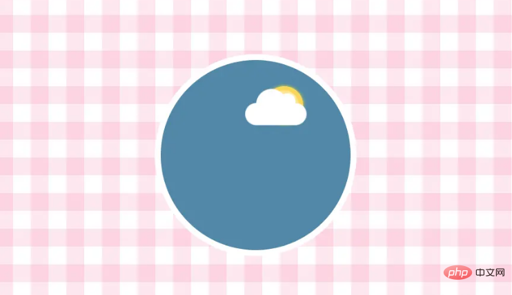
Then, we start drawing clouds~
.cloud{
    width: 100px;
    height: 36px;
    background-color: white;
    position: absolute;
    transition: left .6s linear;
    left: var(--cloudLeft);
    top: 23%;
    border-radius: 36px;
    animation: bouncy 2s ease-in-out infinite;
    &::before{
        content: '';
        width: 50px;
        height: 50px;
        background-color: white;
        border-radius: 50%;
        position: absolute;
        top: -23px;
        left: 18px;
    }
    &::after{
        content: '';
        width: 26px;
        height: 26px;
        background-color: white;
        border-radius: 50%;
        position: absolute;
        top: -16px;
        left: 56px;
    }
}
@keyframes bouncy {
    0% {
      transform: scale(1);
    }
    50% {
        transform: scale(1.05);
    }
    100% {
        transform: scale(1);
    }
}Clouds are very simple, we just draw a rounded rectangle, and then use two pseudo-classes to draw one When the big circle and the small circle are stacked together, they look very much like clouds. In addition, we add an animation to make them grow bigger and smaller, giving a feeling of movement.

4. Orange Cat and Animation
.cat{
    width: 180px;
    height: 160px;
    background-color: $cat;
    position: absolute;
    bottom: -20px;
    left: 50%;
    margin-left: -90px;
    animation: wait 2s ease-in-out infinite;
    &::after,
    &::before{
        content: '';
        display: block;
        border-style: solid;
        border-width: 20px 30px;
        position: absolute;
        top: -30px;
    }
    &::after{
        right: 0;
        border-color: transparent $cat $cat transparent;
    }
    &::before{
        left: 0;
        border-color: transparent transparent $cat $cat;
    }
    .eye{
        width: 42px;
        height: 42px;
        border-radius: 50%;
        position: absolute;
        top: 30px;
        background:white;
        overflow: hidden;
        display: flex;
        justify-content: center;
        align-items: center;
        .eye-hide{
            height: 20px;
            position: absolute;
            top: var(--eyeHideTop);
            left: -2px;
            right:-2px;
            background-color: $cat;
            transition: top .5s ease-in-out;
            z-index: 2;
        }
        &::before{
            content: "";
            height: 36px;
            width: 36px;
            background-color:black;
            border-radius: 50%;
        }
        &::after{
            content: "";
            width: 24px;
            height: 24px;
            background-color: white;
            border-radius: 50%;
            position: absolute;
            right: 0px;
            top: 0px;
        }
        &.left{
            left: 24px;
        }
        &.right{
            right: 24px;
        }
    }
    .nose{
        width: 0;
        height: 0;
        border-top: 7px solid rgb(248, 226, 226);
        border-left: 7px solid transparent;
        border-right: 7px solid transparent;
        position: absolute;
        left: 50%;
        margin-left: -7px;
        top: 70px;
    }
    .mouth{
        width: 26px;
        height: 20px;
        background-color: rgb(255, 217, 217);
        position: absolute;
        top: 85px;
        left: 50%;
        margin-left: -13px;
        border-radius: var(--mouthRadius);
        transition: border-radius .2s linear;
        overflow: hidden;
        &::after,
        &::before{
            content: "";
            position: absolute;
            display: block;
            top: 0;
            border-top: 7px solid white;
            border-left: 2px solid transparent;
            border-right: 2px solid transparent;
        }
        &::after{
            right: 5px;
        }
        &::before{
            left: 5px;
        }
    }
}
@keyframes wait{
    0% {
        bottom: -20px;
    }
    50% {
        bottom: -25px;
    }
    100% {
        bottom: -20px;
    }
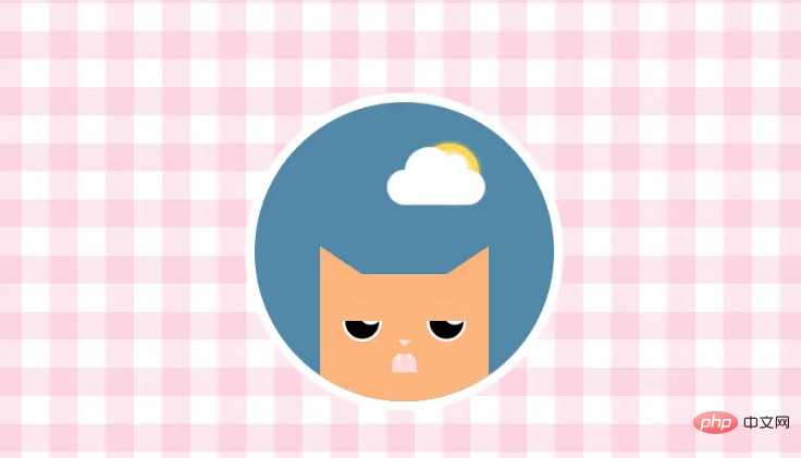
}We can decompose ears (pseudo-class), a pair of eyes, a nose and a mouth (including two canines) = cat.
It is not difficult to see from the above code that it is mainly done using absolute positioning to place facial organs. Most of them are implemented using basic CSS code. The only thing that can be noted is the triangle of the ear. We implement it through pseudo-classes. We do not set the width and height of it, but mainly use the border-width boder-color technique to draw the triangle. It is a little CSS trick. The nose at the back and the fangs in the mouth are all realized with this little trick.
In addition, I want to talk about the pair of eyes. We first fill in the white background and then use pseudo-classes to realize the black background circle and the white small circle inside. Some students must have asked why not using border. With a white circle frame, there is no need to waste a pseudo-class to complete the black background circle? Because we used overflow: hidden, its redundant hidden content is the elements below the border, and the border border can be lossless, so its pseudo-class cannot cover its border. In this way, the circle where the eyelids droop is still very large and unnatural. So we created another pseudo-class to implement its black bottom, so that the outer circle does not use borders.
The only thing left is to make a waiting animation for the cat to move up and down to achieve the effect of continuous breathing.

This completes the listless orange cat. Because in the first part, we have already calculated the variables changed after moving in. Now move the mouse in and the effect will appear~
Conclusion
At this point we have completed the animation, and I have to say, he was so excited when he saw the food that he deserved to be called Fat Orange!
(Learning video sharing: css video tutorial)
The above is the detailed content of An example of using css to realize the joy of Fat Orange (example sharing). For more information, please follow other related articles on the PHP Chinese website!