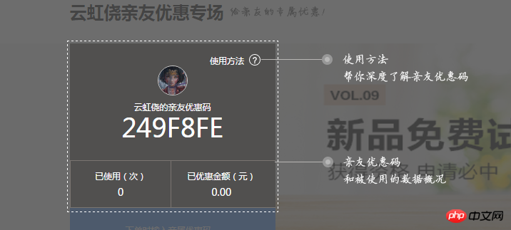
How to make the area in the middle that is brighter than the surrounding areas?
人生最曼妙的风景,竟是内心的淡定与从容!
.mask {
  position: fixed;
  z-index: 10000;
  left: 50%;
  top: 50%;
  -webkit-transform: translate(-50%, -50%);
  transform: translate(-50%, -50%);
  width: 300px;
  height: 100px;
  outline: 1000px solid rgba(0, 0, 0, 0.5);
}

<p class="mask"></p>
The demo made with background color is as follows
https://codepen.io/jackpan/pe...
The demo made with box-shadow or outline is as follows: https://codepen.io/jackpan/pe...
box-shadow
outline
The correct way is to use box-shadow, such as: box-shadow: 0 0 0 2560px rgba(0,0,0,0.8)
box-shadow: 0 0 0 2560px rgba(0,0,0,0.8)
I think there are two methods: 1. Use 4 p’s to create a darker area around it. 2. Mask 1 p on the background image to make a darker place, then put the same background image into the top p and position it at the appropriate position.
filter: brightness(1.3);or backgournd-color: rgba(0, 0, 0, 0.5);
Both methods are available
<p>//绝对定位
    <p>//背景图
    </p>
    <p>//相对定位 遮罩层
    </p>
    <p>//相对定位 横向光亮盒子
    </p>
    <p>//相对定位 纵向盒子
    </p>
</p>
As much as designers can solve the problem, try not to use css to write it
Purple, use absolute and z-index][1]
The demo made with background color is as follows
https://codepen.io/jackpan/pe...
The demo made with
box-shadoworoutlineis as follows:https://codepen.io/jackpan/pe...
The correct way is to use
box-shadow, such as:box-shadow: 0 0 0 2560px rgba(0,0,0,0.8)I think there are two methods:
1. Use 4 p’s to create a darker area around it.
2. Mask 1 p on the background image to make a darker place, then put the same background image into the top p and position it at the appropriate position.
filter: brightness(1.3);
or
backgournd-color: rgba(0, 0, 0, 0.5);
Both methods are available
As much as designers can solve the problem, try not to use css to write it
Purple, use absolute and z-index
 ][1]
][1]