<!DOCTYPE html>
<html>
<head>
<meta charset="utf-8">
<title>translateZ测试</title>
<style>
*{margin: 0; padding: 0;}
/*父级p和子级p的样式*/
.fa{width: 200px; height: 200px;
    border: 2px solid #000;
    margin: 100px auto;
    perspective: 800px;

}
.son{width: 100%; height: 100%;
    background: lime;
    font-size: 20px;  text-align: center;
    -webkit-transform:  translateZ(300px) rotateY(55deg);
}
</style>
</head>
<body>
    <p class="fa">
        <p class="son">rotateY</p>
    </p>
</body>
</html>
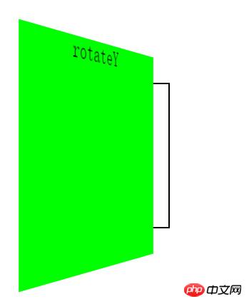
当先执行rotateY,后执行translateZ时,
(-webkit-transform: translateZ(300px) rotateY(55deg);)
截图:
当先执行translateZ,后执行rotateY时,
(-webkit-transform: rotateY(55deg) translateZ(300px);)
截图:
请问为什么translateZ和rotateY书写顺序不同,结果也不同,这其中的原理是什么呢?
我看了《图解CSS3》,也百度了相关内容,但还是不知道为什么。请知道的朋友给讲讲,谢谢!
I just read this part a few days ago and have been studying it for a long time. It should be that the z-axis is always perpendicular to the plane figure. If the angle is changed first, the direction of the z-axis will also change accordingly.
Constructing an XYZ axis in your mind or drawing one, and then gesturing with your hands, I think is the best and most convenient way to understand
Very simple:
and
The locations you arrive at are different
What I understand is: when no transformation is done, the elements are at the origin of the x, y, and z axes of the translate3d three-dimensional world. The coordinate system will not change regardless of any transformation. The first case is to first rotate 55 degrees along the axis. Pan to 300px with z (similar to twisting and walking forward 300px); and the second case is to pan out first Then rotate around the Y axis of the coordinates (similar to making a circular motion with a radius of 300)