
目前有如下结构
<p class="book-list">
    <p class="cover"></p>
    <p class="cover"></p>
    <p class="cover"></p>
    <p class="cover"></p>
    <p class="cover"></p>
</p>
我通过flex布局,只能做出如下效果,
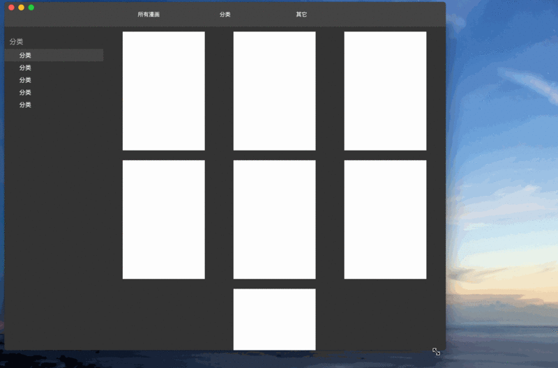
有没有在不改变dom结构的情况下,
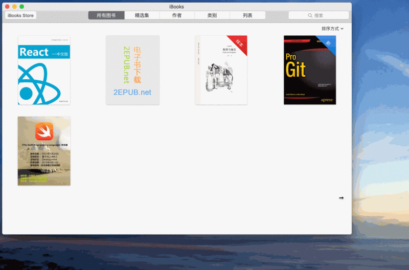
让最后一行如果不与其它行数目一样,只能靠左显示,如同iBook一样。
如果不行,也请提供其它更好的方案
不用考虑兼容问题!


![[Web front-end] Node.js quick start](https://img.php.cn/upload/course/000/000/067/662b5d34ba7c0227.png)


flex-flow: row wrap
justify-content: flex-start
You can try it. I use something similar in my project, but I am not in front of the computer now. Only remember so much. It seems that there is an alignment issue with your pictures
I came back tonight and tried it to see if it works:
http://codepen.io/charleyw/pen/vLXQRM
Still using the same idea, add the same number of elements to the last row so that the automatic scaling of flex can take effect. But instead of using JS, we added enough additional elements when we first created the DOM. How many elements are enough depends on how many elements you can display in one line. For example, on the largest screen, you If 20 can be displayed, then you add 19 empty elements. This way, no matter how the width changes, it can be guaranteed that the last row (not counting empty elements) will always have the same number of elements as the previous row, and the flex style will be the same. of.
Go to the demo