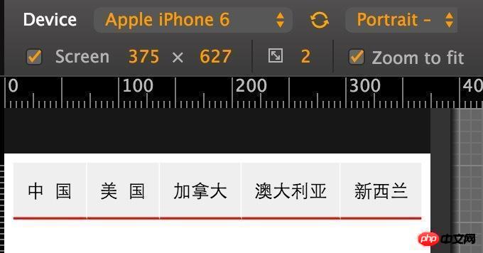
If you just change the css, I don’t think there is a method that is suitable for your current text spacing. However, you can achieve visual comfort through some style adjustments, as shown below:
Use letter-spacing to solve it! The letter-spacing property increases or decreases the space between characters (character spacing).
Similar to the following effect: //
CSS style: <style type="text/css"> .hotsearch dd{ float: left; line-height: 24px; margin-right : 30px; overflow: hidden; text-align: center; width: 4em; /This value is based on the longest number of texts that can be displayed, such as x, then x em/ } .hotsearch dd a{ display:block; } .w2{ letter-spacing:2em; /if you need y words Align both ends, then it is (x-y)/(y-1), here is (4-2)/(2-1)=2em / ...
It seems that CSS does not have such a powerful function, and the word count of each element is different, and the calculated spacing will be inconsistent. The questioner can also try the method of aligning both ends
If you just change the css, I don’t think there is a method that is suitable for your current text spacing. However, you can achieve visual comfort through some style adjustments, as shown below:
Add a light background;
Add 1 pixel spacer between each content...
In addition, there is the following method with the same interval on both sides:
Just change one line of code

United States // Use
overflow: hidden hides excess text.
Use letter-spacing to solve it!
The letter-spacing property increases or decreases the space between characters (character spacing).
Similar to the following effect:

//
CSS style:
<style type="text/css">
.hotsearch dd{
float: left;
line-height: 24px;
margin-right : 30px;
overflow: hidden;
text-align: center;
width: 4em; /This value is based on the longest number of texts that can be displayed, such as x, then x em/
}
.hotsearch dd a{
display:block;
}
.w2{
letter-spacing:2em; /if you need y words Align both ends, then it is (x-y)/(y-1), here is (4-2)/(2-1)=2em /
...
It seems that CSS does not have such a powerful function, and the word count of each element is different, and the calculated spacing will be inconsistent.
The questioner can also try the method of aligning both ends
Those with more than three fonts are distributed evenly

Set the corresponding flex-grow according to the number of words