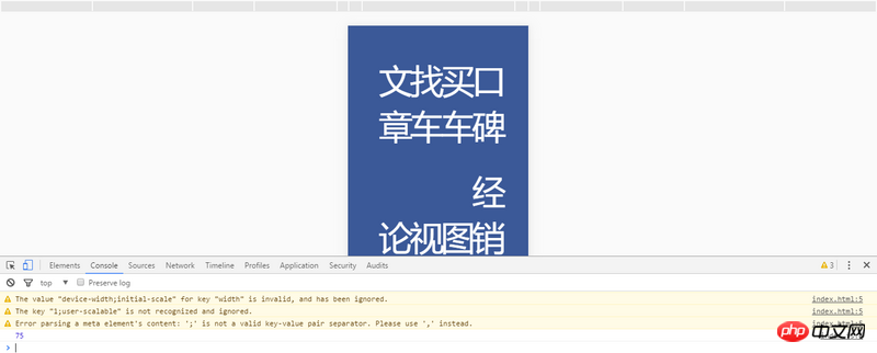
写的第一个移动端页面,想在chrome上调试一下,模拟手机的时候成这样了 为什么?下面打印的75是获取屏幕的宽度想设置rem? 为什么是75? 模拟IP6不应该是IP6的宽吗? 是因为分辨率的原因吗?怎么解决?
可能我问题没有说清楚,补充一下:我用chrome调试移动端页面,html:{font-size:12px},页面文字为1.5rem,然后我用chrome模拟IP6结果就像图上边那样了- -?(如果不模拟手机单纯拉窄屏幕是可以正常显示的)
Thank you for the invitation. I feel that the viewport is not written, which causes the mobile and PC terminals to have abnormal px parsing
I don’t quite understand your question, but since it’s a resolution issue, I guess it’s because “the actual resolution of the phone ≠ the logical resolution of the web page”
Why is the logical resolution of iPhone 6 Plus 414x736?
Add <meta name=viewport ... to the head
<meta name=viewport ...


![[Web front-end] Node.js quick start](https://img.php.cn/upload/course/000/000/067/662b5d34ba7c0227.png)


Thank you for the invitation. I feel that the viewport is not written, which causes the mobile and PC terminals to have abnormal px parsing
I don’t quite understand your question, but since it’s a resolution issue, I guess it’s because “the actual resolution of the phone ≠ the logical resolution of the web page”
Why is the logical resolution of iPhone 6 Plus 414x736?
Add
<meta name=viewport ...to the head