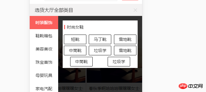
如图最好那两个怎么让他左对齐?
人生最曼妙的风景,竟是内心的淡定与从容!
You don’t need space-around, just use flex-start. Be sure to add flex-wrap:wrap
In this situation, I think it is better to use float layout. If you still use flex, I agree with the above statement.
What the person above said is right, this direct percentage calculation is enough, there is no need for flex. http://runjs.cn/code/3nq7qacp
Then let me calculate it. Thank you
If the width of each item is the same, you can add a few blank placeholder items and keep the number of columns in each row the same
flex is used with percentages.
If justify-content: space-around;, you need to add a blank placeholder element.
justify-content: space-around;
If justify-content: flex-start;, no additional elements are needed.
justify-content: flex-start;
item internal text-align: center; implements centering.
text-align: center;


![[Web front-end] Node.js quick start](https://img.php.cn/upload/course/000/000/067/662b5d34ba7c0227.png)


You don’t need space-around, just use flex-start. Be sure to add flex-wrap:wrap
In this situation, I think it is better to use float layout. If you still use flex, I agree with the above statement.
What the person above said is right, this direct percentage calculation is enough, there is no need for flex.
http://runjs.cn/code/3nq7qacp
Then let me calculate it. Thank you
If the width of each item is the same, you can add a few blank placeholder items and keep the number of columns in each row the same
flex is used with percentages.
If
justify-content: space-around;, you need to add a blank placeholder element.If
justify-content: flex-start;, no additional elements are needed.item internal
text-align: center;implements centering.