ios - 求解决一个的四叶草布局效果
迷茫
迷茫 2017-04-18 09:18:26
0
4
423

效果如图6和6p 看起来很容易,我实现了后比较复杂,并且在3.5 上有问题

最好用autolayout xib 实现。
masonry 也可以。

需求

  1. margin 边缘间距均一致,按钮整体位于屏幕的位置要舒适(视觉均分)

  2. 高宽比例要保持

  3. 4个矩形,尽量位于一个View中

  4. 6p上不能拉伸图片

2x 素材

自己实现了,效果如图,期待简单思路中。

迷茫
迷茫

业精于勤,荒于嬉;行成于思,毁于随。

reply all(4)
迷茫
    UIView *containerView = [UIView new];

    UIView *subView0 = [[UIImageView alloc] initWithImage:[UIImage imageNamed:@"four"]];
    UIView *subView1 = [[UIImageView alloc] initWithImage:[UIImage imageNamed:@"four"]];
    UIView *subView2 = [[UIImageView alloc] initWithImage:[UIImage imageNamed:@"four"]];
    UIView *subView3 = [[UIImageView alloc] initWithImage:[UIImage imageNamed:@"four"]];

    [containerView addSubview:subView0];
    [containerView addSubview:subView1];
    [containerView addSubview:subView2];
    [containerView addSubview:subView3];


    [self.view addSubview:containerView];

#define kPadding 16

    [containerView mas_makeConstraints:^(MASConstraintMaker *make) {
         make.top.left.greaterThanOrEqualTo(@50).priorityHigh();
         make.right.bottom.greaterThanOrEqualTo(@-50).priorityHigh();
         make.center.equalTo(self.view);
     }];
    for(UIView *view in containerView.subviews) {
        [view setContentCompressionResistancePriority:10 forAxis:UILayoutConstraintAxisVertical];
        [view setContentCompressionResistancePriority:10 forAxis:UILayoutConstraintAxisHorizontal];
    }
    [subView0 mas_makeConstraints:^(MASConstraintMaker *make) {
         make.left.top.equalTo(@0);
         UIImage *image = [UIImage imageNamed:@"four"];
         if((image.size.width > 0) && (image.size.height > 0)) {
             make.height.equalTo(subView0.mas_width).multipliedBy(image.size.height/image.size.width).priorityHigh();
         }
     }];

    [subView1 mas_makeConstraints:^(MASConstraintMaker *make) {
         make.right.top.equalTo(@0);
         make.left.equalTo(subView0.mas_right).offset(kPadding);
     }];

    [subView2 mas_makeConstraints:^(MASConstraintMaker *make) {
         make.left.bottom.equalTo(@0);
         make.top.equalTo(subView0.mas_bottom).offset(kPadding);
     }];

    [subView3 mas_makeConstraints:^(MASConstraintMaker *make) {
         make.top.equalTo(subView1.mas_bottom).offset(kPadding);
         make.left.equalTo(subView2.mas_right).offset(kPadding);

         make.right.bottom.equalTo(@0);

         make.height.equalTo(@[subView0, subView1, subView2]);
         make.width.equalTo(@[subView0, subView1, subView2]);
     }];

Ty80

Using masonry is easy,
1. Create a big View named bigView;
2. Create four buttons and add them to bigView;
3. Use masonry,

buttonOne的约束{
    距top的距离;
    距left的距离;
    据right的距离;
    宽度写成比例(100/375.0*KScreenWidth);
    高度写成比例(150/667.0*KScreenHeight);
}
buttonTwo的约束{
    距top的距离;
    距left的距离;
    据right的距离;
    宽度等于buttonOne;
    高度等于buttonOne;
}
buttonThree的约束{
    距top的距离;
    距left的距离;
    据right的距离;
    宽度等于buttonOne;
    高度等于buttonOne;
}
buttonFour的约束{
    距top的距离;
    距left的距离;
    据right的距离;
    宽度等于buttonOne;
    高度等于buttonOne;
}
Peter_Zhu

I don’t quite understand your needs. Do you mean to make the layout proportions of these 4 buttons the same on 6 and 6P?
You can get the screen width value width, and load other width, height, spacing, etc. according to the width
let width = UIScreen.mainScreen().bounds.width

迷茫

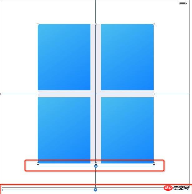
The key point is the ratio to the parent view, as shown below:
Latest Downloads
More>
Web Effects
Website Source Code
Website Materials
Front End Template