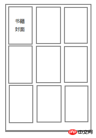
If you feel like writing it to death, you have to calculate the distance between the left and right margins of each cover. You should be able to calculate it using calc in css
If you don’t write it to death, using display:flex should be the easiest to implement
If you want to hard-code it, put a container with a width of 33.3% outside each book. If the inner width is fixed, use margin:auto. Use calc to save one layer of containers, and you can also use viewport units~ Don’t hard-code it, flex It can be achieved, and the percentage width and viewport unit can also be changed


![[Web front-end] Node.js quick start](https://img.php.cn/upload/course/000/000/067/662b5d34ba7c0227.png)


If you feel like writing it to death, you have to calculate the distance between the left and right margins of each cover. You should be able to calculate it using calc in css
If you don’t write it to death, using display:flex should be the easiest to implement
Write words to death. . Is the rem adaptation considered hard-coded?
If I don’t write it down, it’s the flex mentioned above.
If you want to hard-code it, put a container with a width of 33.3% outside each book. If the inner width is fixed, use margin:auto. Use calc to save one layer of containers, and you can also use viewport units~
Don’t hard-code it, flex It can be achieved, and the percentage width and viewport unit can also be changed