
This article mainly introduces the WeChat appletViewThe detailed explanation of the container component and the relevant information of the example code. Here is a detailed introduction to the basic knowledge and a simple example code. Friends in need can refer to it. Next
Detailed explanation of the view container component of the WeChat applet:
There are three view container components given by the applet: , scroll-view> and :
1, view container
is equivalent to html The
tag has four attributes:
##hover and hover- class is related to the click effect: hover sets whether to enable the click effect, while hover-class sets the click effect.
hover-start-time and hover-stay-time are related to the time of the click effect: hover-start-timeAfter setting the click The delay time for the click effect to appear. hover-stay-time sets the duration of the click effect. The unit is milliseconds.
Create a project to test: ##<view class="container"> <view class="flex-item bc_green" hover="true" hover-class="green_hover">1</view> <view class="flex-item bc_red" hover="true" hover-class="red_hover" hover-start-time="400" hover-stay-time="1000">2</view> <view class="flex-item bc_blue">3</view> </view>
.flex-item{
 width: 100%;
 height: 100px;
 box-sizing: border-box;
}
.bc_green{
 background-color: green;
}
.bc_red{
 background-color: red;
}
.bc_blue{
 background-color: blue;
}
.green_hover{
 border: 5px solid black;
}
.red_hover{
 border: 5px solid black;
}The effect is as follows:
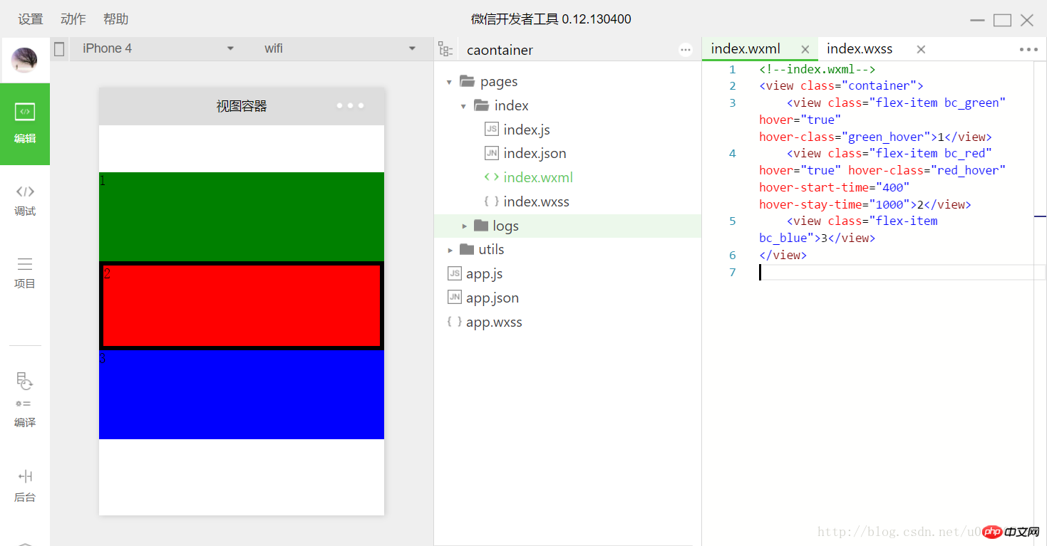 Set the click effects of the first and second subviews. The time of these two click effects is different. The delay of the second click is longer and the duration is longer. . The third one has no other click effect, so it is the default value used, which has no click effect by default.
has two types: horizontal scrolling and vertical scrolling. has the following attributes:
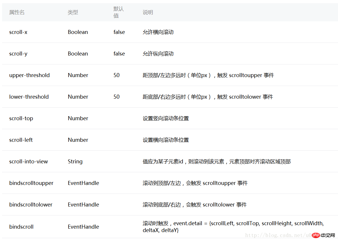 Similarly, we create a project to understand the use of the above attributes.
<view class="container">
 <scroll-view class="srcoll_view" scroll-y="true" lower-threshold="100" bindscrolltolower="lower" scroll-top="{{scrollTop}}" scroll-into-view="{{toView}}">
 <view id="green" class="flex-item bc_green">1</view>
 <view id="red" class="flex-item bc_red">2</view>
 <view id="blue" class="flex-item bc_blue">3</view>
 <view id="yellow" class="flex-item bc_yellow">4</view>
 </scroll-view>
 <view class="clickItem" bindtap="clickAdd">点击向下滚动</view>
 <view class="clickItem" bindtap="clickTo">点击滚动到下一个子view</view>
</view>.srcoll_view{
height: 200px;
}
.flex-item{
width: 100%;
height: 100px;
box-sizing: border-box;
}
.bc_green{
background-color: green;
}
.bc_red{
background-color: red;
}
.bc_blue{
background-color: blue;
}
.bc_yellow{
background-color: yellow;
}
.clickItem{
margin-top: 20px;
background-color: grey;
height: 20px;
border-radius: 5px;
}var app = getApp();
var order = ['green','red', 'blue','yellow','green'];
Page({
data: {
scrollTop: 0,
toView:"green"
},
onLoad: function () {
},
lower: function(e) {
console.log(e)
},
clickAdd:function(){
 this.setData({
  scrollTop: this.data.scrollTop+20
 });
 console.log("this.data.scrollTop:" + this.data.scrollTop);
 },
clickTo: function(e) {
for (var i = 0; i < order.length; i++) {
if (order[i] === this.data.toView) {
this.setData({
toView: order[i + 1]
})
break
}
}
},
})The page effect is as follows:
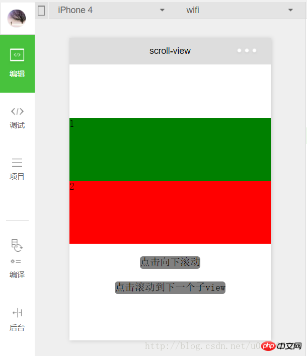
First we set scroll-y="true" of , also It is vertical scrolling. The height is set to 200px in index.wxss, and the height of each sub-child is 100px, which can exactly accommodate two complete sub-child . If scroll- is set. x="true" means horizontal scrolling.
scroll-top and scroll-left##scroll-top are vertical scroll bar positions. , the default is 0; similarly scroll-left is the position of the horizontal scroll bar. In the above program, scroll-top="{{scrollTop}}" is set, and scrollTop is obtained from the data for better display. , bind a function
to a new :<view class="clickItem" bindtap="clickAdd">点击向下滚动</view>
clickAdd:function(){
this.setData({
scrollTop: this.data.scrollTop+20
});
console.log("this.data.scrollTop:" + this.data.scrollTop);
},##. scroll-into-view
scroll-into-view的值为某个子元素的id,表明滚动到该元素,元素顶部对齐滚动区域顶部。上述程序中设置了scroll-into-view="{{toView}}",toView从数据中获取。
新建一个并绑定一个函数:
<view class="clickItem" bindtap="clickTo">点击滚动到下一个子view</view>
1
函数的功能为按顺序滚动到对应的子元素:
clickTo: function(e) {
 for (var i = 0; i < order.length; i++) {
 if (order[i] === this.data.toView) {
 this.setData({
  toView: order[i + 1]
 })
 break
 }
 }
},var order = ['green','red', 'blue','yellow'];
bindscrolltolower和bindscrolltoupper
bindscrolltolower和bindscrolltoupper为事件绑定:bindscrolltolower是滚动到底部/右边时触发;bindscrolltoupper是滚动到顶部/左边时触发。另外还有一个bindscroll是只要滚动时就会触发。
以bindscrolltolower为例,bindscrolltolower表示滚动到底部或右边时触发,这个底部或右边是如何定义的呢?这时就需要用到lower-threshold,lower-threshold表示距底部/右边多远时(单位px),触发 scrolltolower 事件,默认值为50,上述代码中我们定义了lower-threshold="100",由于子的高度就是100px,所以正好出现最后一个子时就会触发事件:
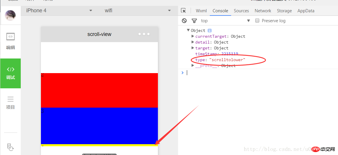
3、 滑块视图容器
其实就是微信小程序封装的幻灯片轮播功能,并给出了几个可供开发者设置的属性:
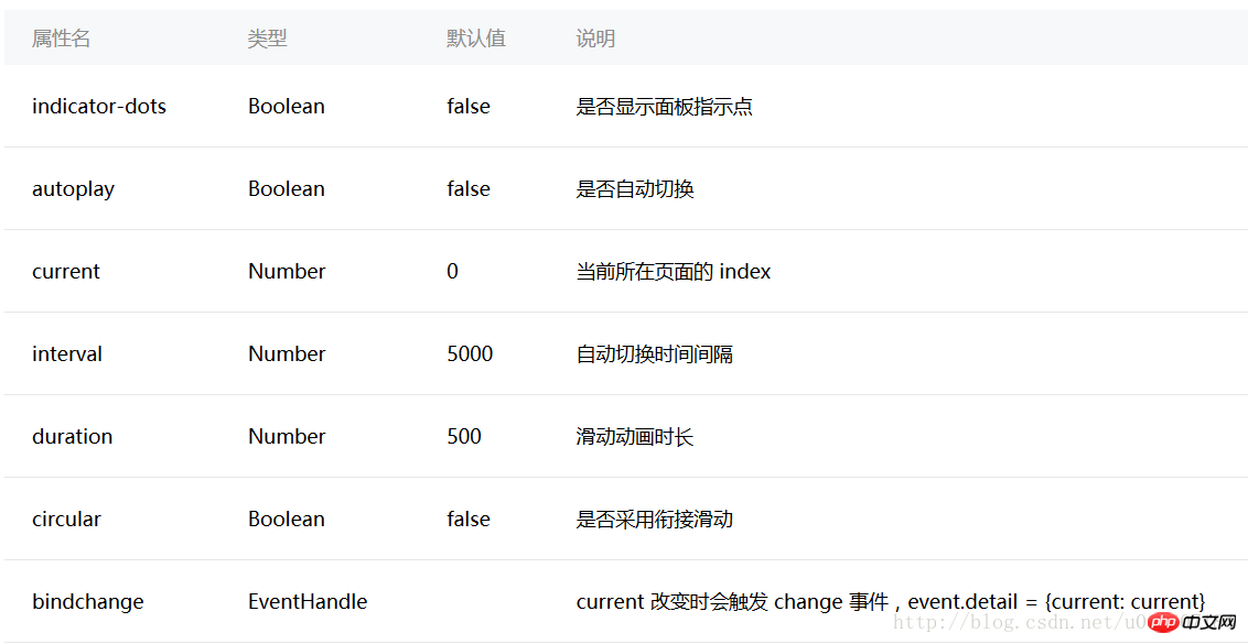
用户可以根据自己需求设置相应的属性值即可,示例代码如下:
swiper.wxml
<view class="container">
 <swiper indicator-dots="{{indicatorDots}}"
 autoplay="{{autoplay}}" interval="{{interval}}" duration="{{duration}}" circular="{{circular}}" bindchange="change">
 <block wx:for="{{imgUrls}}">
  <swiper-item>
  <image src="{{item}}" />
  </swiper-item>
 </block>
 </swiper>
</view>swiper.wxss
swiper{
 height: 150px;
 width:100%;
}swiper.js
Page({
 data: {
 imgUrls: [
 'http://img02.tooopen.com/images/20150928/tooopen_sy_143912755726.jpg',
 'http://img06.tooopen.com/images/20160818/tooopen_sy_175866434296.jpg',
 'http://img06.tooopen.com/images/20160818/tooopen_sy_175833047715.jpg'
 ],
 indicatorDots: true,
 autoplay: true,
 interval: 2000,
 duration: 500,
 circular:true
 },

 change:function(e){
 console.log(e);
 }

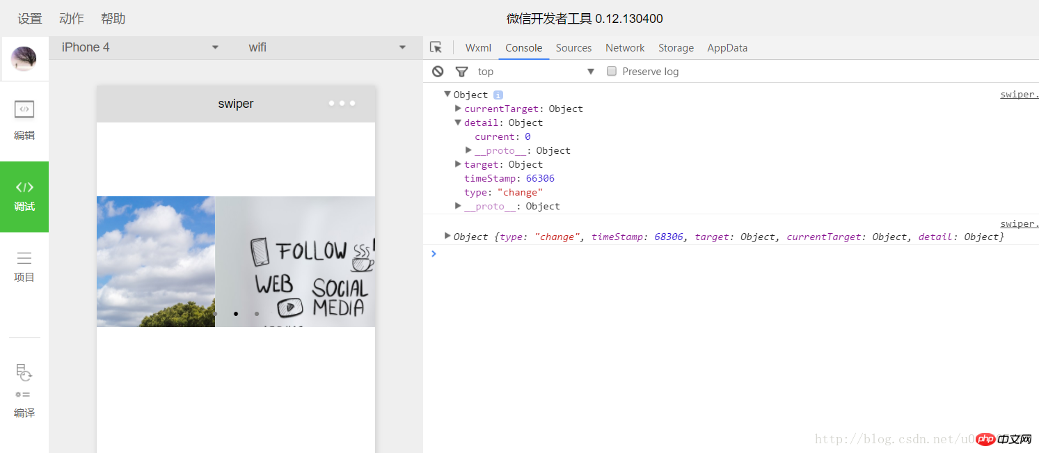
})由于绑定了change函数,所以每次切换时,都会触发change事件:
感谢阅读,希望能帮助到大家,谢谢大家对本站的支持!
The above is the detailed content of Detailed explanation of the example code of the WeChat applet view container component. For more information, please follow other related articles on the PHP Chinese website!


