
This article mainly introduces relevant information that summarizes the UI layout skills of WeChat mini program development. Now whether it is an APP or various software, UI layout is still very important. User experience comes first. Here is a summary of WeChat mini programs. For the UI layout of the program, friends who need it can refer to the summary of
WeChat Mini Program UI design specifications:
WeChat Mini Program is a brand new application form. WeChat Mini Program The program platform is a platform that allows you to use applications without downloadinginstallation. WeChat applet realizes the dream of having applications "at your fingertips". Users can open applications by scanning or searching.
It also embodies the concept of “use and go”, users don’t have to worry about installing too many applications. Applications will be everywhere and available at any time, but there will be no need to install or uninstall them.
Summary
Based on the brisk characteristics of WeChat mini programs, we have formulated mini program interface design guidelines and suggestions. The design guidelines are based on fully respecting the user's right to know and operate. It aims to establish a friendly, efficient and consistent user experience within the WeChat ecosystem, while maximizing adaptability and support for different needs and achieving a win-win situation between users and mini program service providers.
Friendly and polite
In order to prevent users from being distracted by the complex surrounding environment when using mini program services in WeChat, mini programs should be designed to reduce the impact of irrelevant design elements on user goals. Interference, politely show users the services provided by the program, and guide users to operate in a friendly manner.
Key points
Each page should have a clear focus, so that users can quickly understand the content of the page every time they enter a new page. Under the premise of determining the key points, Try to avoid other distracting items on the page that may affect users' decisions and operations.
Counterexample
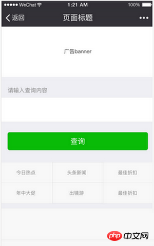
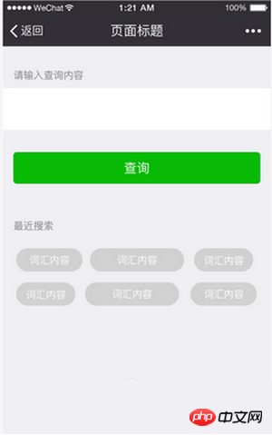
The theme of this page is Query, but it adds many business entries that are not related to the query, which is inconsistent with the user’s expectations and can easily cause users to get lost. .
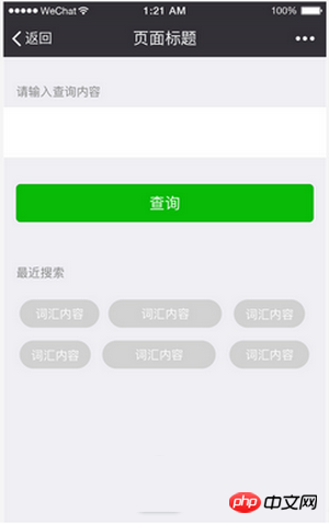
controls Provide help content that is helpful to the user's goals, such as recent searched words, commonly used search terms, etc.
 ## Counterexample instructions
Operations have no priority, leaving users with no choice
## Correction instructions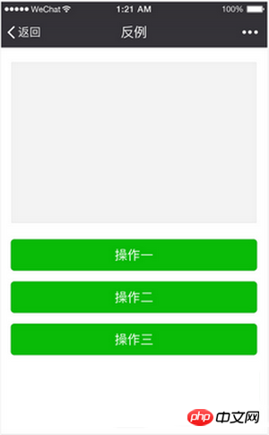
Clear process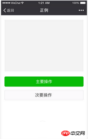
Clear and clear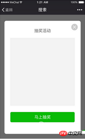
safe
pleasant experience. Clear, easy to come and goNavigation is the most critical factor to ensure that users do not get lost when browsing and jumping on the web page. Navigation needs to tell users where I am, where I can go, how to get back, etc. First of all, all pages of all mini programs in the WeChat system will have their own navigation bar provided by WeChat, which can uniformly solve the problem of where I am and how to get back. Maintaining a consistent experience in WeChat-level navigation helps users form a unified experience and interactive perception within WeChat, without the need to add learning costs or change usage habits when switching between mini programs and WeChat.
WeChat Navigation Bar
WeChat Navigation Bar is directly inherited from the client. Apart from the color of the navigation bar, developers do not need to and cannot customize the content. . However, developers need to specify the jump relationship between each page of the mini program so that the navigation system can work in a reasonable manner.
The WeChat navigation bar is divided into navigation area, title area and operation area. The navigation area controls the program page process. Currently, the navigation bar is divided into two basic colors: dark and light.
Navigation area (iOS)
The navigation area usually has only one operation, which is to return to the previous level interface.
Navigation area (Android)
Like iOS, the navigation area only has one function to return to the previous page. operation, and clicking the hardware return key that comes with the Android phone also has the same effect.
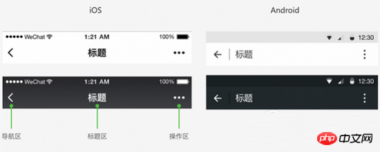
WeChat navigation bar custom color rules (iOS and Android)
The mini program navigation bar supports basic background color customization functions. The selected color needs to be Under the premise of meeting usability, the two sets of main navigation bar icons provided by WeChat are harmoniously matched. It is recommended to refer to the following color selection effects:
Color selection scheme examples

Navigation within the page
Developers can design according to their own functional needs Add your own navigation to the page. And keep navigation consistent between different pages. However, due to the limitation of the mobile phone screen size, the navigation of the mini program page should be as simple as possible. If it is only for general linear browsing, it is recommended to only use the WeChat navigation bar.
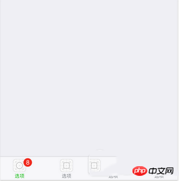
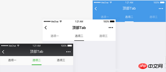
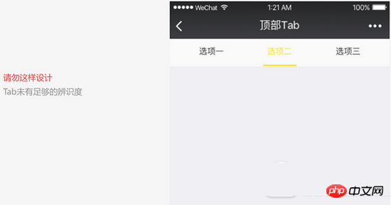
Developers can choose to add tags Page (Tab) navigation to the mini program page. The tab paging bar can be fixed at the top or bottom of the page, making it easier for users to switch between different tabs. The number of tags should not be less than 2 and the maximum number should not be more than 5. To ensure the clickable area, it is recommended that the number of tags should not exceed 4 items. A page should not have more than one set of tabbed pagination bars.
Among them, the mini program homepage can choose the native bottom tab paging style provided by WeChat. This style is only used on the mini program homepage. During development, you can customize the icon style, label copy, copy color, etc. For specific settings, please refer to the development documentation.
The color of the top tab paging bar can be customized. In custom color selections, it is important to take care to maintain the usability, visibility, and operability of the pagination bar labels.

Reduce waiting and provide timely feedback
Long waiting for the page will cause bad emotions for users, so use The technology provided by the WeChat mini program project has been able to shorten the waiting time to a great extent. Even so, when loading and waiting inevitably occur, timely feedback needs to be given to relieve the user's bad mood of waiting.
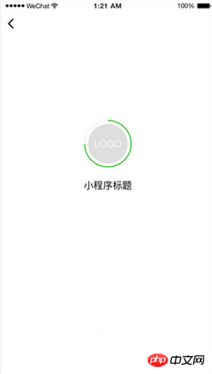
Launch page loading
The Mini Program startup page is one of the pages where the Mini Program displays brand features in WeChat content to a certain extent. This page will highlight the mini program’s brand features and loading status . Except for the brand logo display on the startup page, all other elements on the page, such as loading progress indicators, are uniformly provided by WeChat and cannot be changed, and do not require developer development.
Page pull-down refresh loading
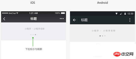
Within the WeChat applet, WeChat provides standard page pull-down refresh loading capabilities and styles.
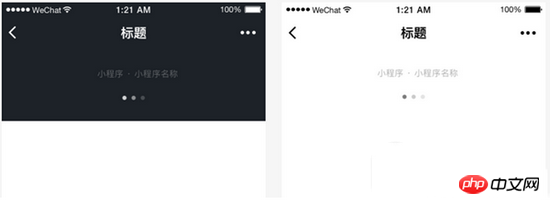
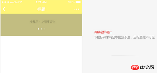
Developers can customize pages that need to be refreshed through drop-down interactions. WeChat will provide standard capabilities and styles for such interactions. In terms of style, the colors of the refresh icon and drop-down logo have been bundled, and are divided into two sets of dark and light solutions. When using them, developers should pay attention to the harmony and unity of the header text, drop-down logo and refresh icon. When the user makes a drop-down interaction on this type of page, the WeChat applet page standard loading animation will appear. Developers do not need to develop their own styles

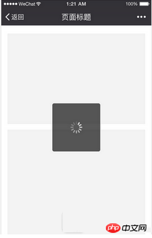
The progress barshows the progress of loading.
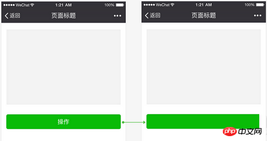
During the loading process, the animation effect should be maintained; loading without animation effects can easily give people the illusion that the interface is stuck. Don’t use more than one loading animation on the same page at the same time. Result feedback In addition to providing timely feedback while the user is waiting, clear feedback is also required on the results of the operation. Depending on the actual situation, different result feedback styles can be selected. For local operations on the page, direct feedback can be given in the operation area. For page-level operation results, pop-up prompts (Toast), modal dialog boxes or result pages can be used to display. Feedback on partial operation results on the page For partial operations on the page, direct feedback can be given in the operation area, for example, as shown below before and after clicking on the multi-select control. For commonly used controls, WeChat Design Center will provide a control library, and the controls in it will provide completeoperation feedback.
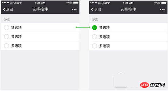
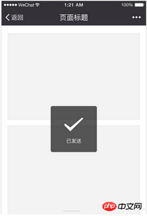
Page global operation results - pop-up prompt (Toast)
Pop-up prompt (Toast) is suitable for lightweight success prompts and will automatically disappear after 1.5 seconds. , does not interrupt the process, has less impact on users, and is suitable for operation reminders that do not need to emphasize the success status. Please note that this form does not apply to error reminders.
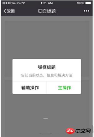
Page global operation results - modal dialog box
For the operation result status that needs to be clearly known to the user, the modal dialog box can be used to prompt and Instructions for next steps can be included.
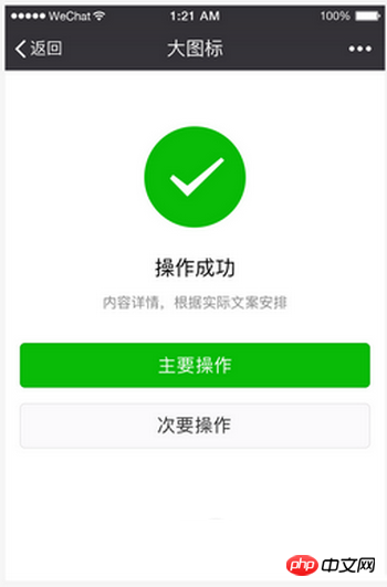
Page global operation results—result page
For situations where the operation result is the end of the current process, you can use the operation result page to provide feedback. This method is the strongest and clearest way to inform the user that the operation has been completed, and can provide guidance for the next step based on the actual situation.
Exceptions are controllable and there is a way out
When designing any tasks and processes, abnormal states and processes are often easily overlooked, and these exceptions Scenarios are often when users are most frustrated and in need of help. Therefore, special attention needs to be paid to the design of abnormal states. When exceptions occur, users should be given necessary status prompts and informed of solutions so that they have a way out.
It is necessary to prevent the situation where the user is stuck on a certain page under abnormal conditions and has nowhere to go. The pop-up windows and result pages mentioned in 2.2 can be used as reminders of abnormal status. In addition, on form pages, especially pages with many form items, the error items should be clearly pointed out so that users can modify them.
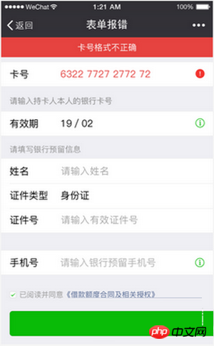
Abnormal status - form error
When the form reports an error, inform the cause of the error at the top of the form, and identify the error field to prompt the user to modify it
Convenient and Elegant
From the physical keyboard and mouse in the PC era to fingers in the mobile era, although the input devices are greatly simplified, the accuracy of finger operations is much less accurate than that of the keyboard and mouse. In order to adapt to this change, developers need to make full use of mobile phone features during the design process to provide users with a convenient and elegant control interface.
Reducing input
Since the mobile phone keyboard area is small and dense, input is difficult and it is easy to cause input errors. Therefore, when designing the mini program page, the user input is minimized and the existing ## is used. #Interface Or some other easy-to-operate selection controls to improve the user input experience.
Reduce input and use interfaces skillfully For example, in the picture below, when adding a bank card, the camera recognition interface is used to help the user input. In addition, the WeChat team has also opened up various WeChat mini program interfaces such as the geographical location interface. Making full use of these interfaces will greatly improve the efficiency and accuracy of user input, thereby optimizing the experience.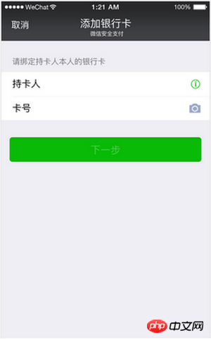
Because on mobile phones we touch the screen with our fingers to control the interface, the accuracy of finger clicks is far inferior to that of a mouse. Therefore, when designing controls that need to be clicked on the page, we need to fully consider their hot zone area to avoid clickable areas. Too small or too dense causing misoperation. When the interface originally used on the computer screen is simply transplanted directly to the mobile phone without any adaptation, such problems are often prone to occur. Since the screen resolutions of mobile phones are different, the optimal click pixel size is not entirely consistent, but when converted into physical size, it is roughly between 7mm-9mm. In the standard component library provided by WeChat, various control elements have taken into account the page click effect and adaptation to different screens, so it is again recommended to use or imitate standard control sizes for design.
Using interfaces to improve performance
WeChat Design Center has launched a set of web standard control libraries, including Sketch design control library and Photoshop design control library, which will be improved in the future. Mini program components, these controls have fully considered the characteristics of mobile pages, ensuring their usability and operational performance on mobile pages; at the same time, the WeChat development team is constantly improving and expanding the WeChat mini program interface, and providing WeChat public Library, using these resources can not only provide users with faster services, but also greatly improve the performance of the page, which invisibly improves the user experience.
Unification and Stability
In addition to the various principles mentioned above, it is recommended that mini programs connected to WeChat should also always pay attention to the unity and continuity between different pages, and try to use them on different pages. Consistent controls and interactions.
A unified page experience and continuous interface elements will help achieve usage goals with the least learning cost and reduce the discomfort caused by page jumps. Because of this, mini programs can use the standard controls provided by WeChat as needed to achieve uniformity and stability.
Visual specifications
To facilitate designers to design, WeChat provides a set of basic control libraries that can be used in web design and small programs; it also provides resources that are convenient for developers to call.
Font specifications
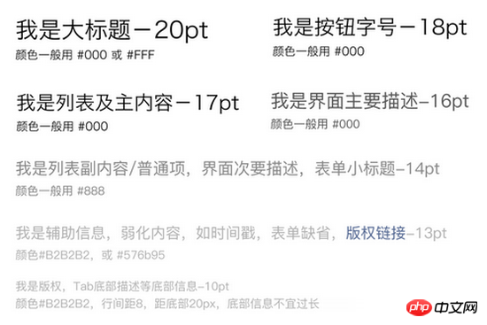
The use of fonts in WeChat is consistent with the system fonts it is running on. Common font sizes are 20, 18, 17, 16,14 13, 11 (pt), and the usage scenarios are specific. As follows:
Font color

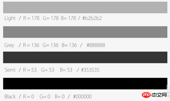
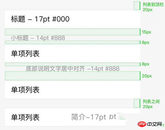
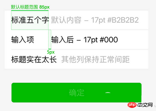
Main content Black, secondary content Gray;Time stamp With the form default value Light gray; large paragraphs of description content and are the main content use Semi black;
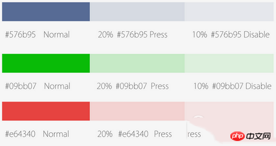
Blue is the color of the link, green is the completion word Color, red is the wrong color. Press and Disable states reduce the transparency to 20% and 10% respectively;
List visual specifications
Visual specifications for form input
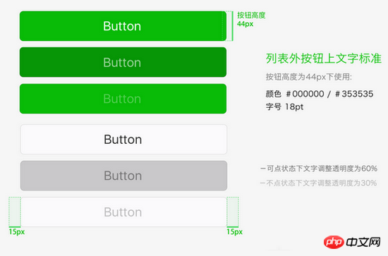
##ButtonUsage principles
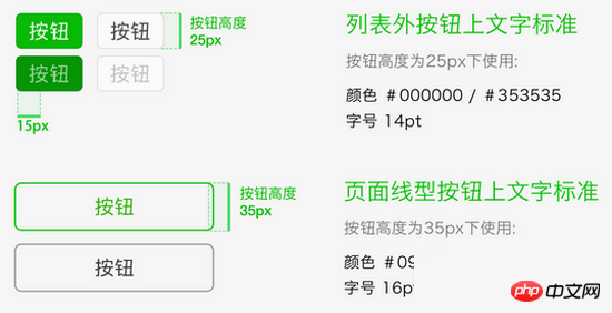
Text standards for buttons outside the list When the button height is 44px, use: color #000000 / #353535 font size 18pt. When the text can be clicked, adjust the transparency to 60%. When the text cannot be clicked, adjust the transparency to 30%.
Icon usage principles
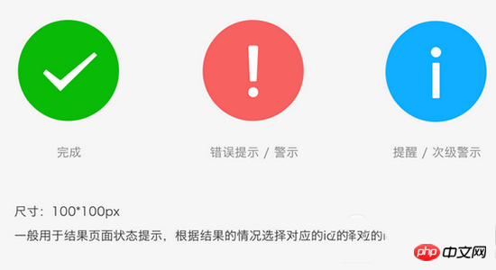
Note: If you want to make a beautiful UI, it is essential to follow the official websiteAPI !
Thank you for reading, I hope it can help everyone, thank you for your support of this site!
The above is the detailed content of Summary of UI layout techniques for WeChat mini program development. For more information, please follow other related articles on the PHP Chinese website!


