How should WeChat mini programs be laid out?
1: Flex layout
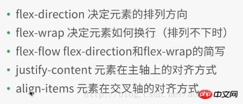
Flex layout is shown in Figure 1

Figure 1
1.1 Flex container properties
##1.2 Flex Element attributes in the container
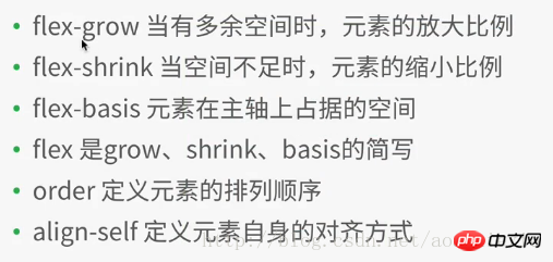
If aligned is defined, it will overwrite the attributes set by justify-content and align-items in the container attributes
In the WeChat applet development project, create a new file layout, and then create various files (named after layout),
in layout.wxml Add the following code:
<view class="container1">
 <view class="item1">
 1
 </view>
<view class="item1">
 2
 </view>
 <view class="item1">
 3
 </view>
 <view class="item1">
 4
 </view>
</view>
Add the following code to layout.wxss:
.container1{
    height: 100%;
    width:100%;
    background-color:beige;
}
.item1{
    height:100rpx;
    width:100rpx;
    background-color:cyan;
    border: 1px solid #fff
}Compile and run as shown in Figure 2
Note: In the above code, 4 sub-elements view(item1) are added to the container1 container. In the style file of item1, the width and height of each item1 are set to a fixed value: 100rpx, rpx is the same as the screen size. The relevant scaling unit is different from the fixed px. The side of each item1 is 1px, solid line (soliod), white (#fff)
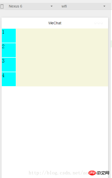
Figure 2
Modify .container1 as follows: (Add display:flex;) Compile and run as shown in Figure 3: It can be seen that the flex layout is the default horizontal arrangement of elements
.container1{
    height: 100%;
    width:100%;
    background-color:beige;
    display:flex;
}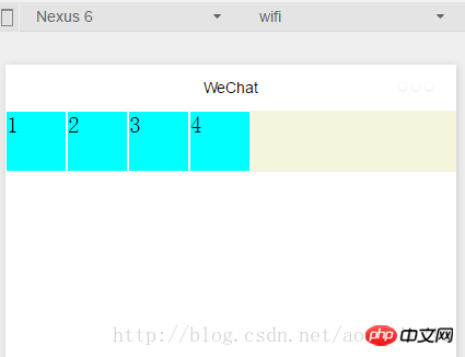
Figure 3
##1.1.1 Container properties: flex-direction
Add the following code to .container1: Set the flex layout to arrange the elements vertically (from left to right as the cross axis, from top to bottom as the main axis), as shown in Figure 2. (row: flex layout arranges elements horizontally --- from left to right as the main axis, from top to bottom as the cross axis) flex-direction:column
1.1.2 Container attributes: flex- wrap
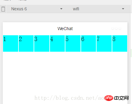
Add the following code to .container1: At the same time, copy the element code in layout.wxml to the 8 element views, compile and run, the effect is shown in Figure 4, you can see The original height and width are 100rpx, and the square view has been transformed into a rectangle.flex-wrap:nowrap
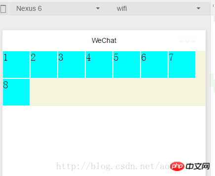
If modified to the following code: Compile and run as shown in Figure 5: Make sure that each subview is a square, and then put the 8th subview that cannot fit into the next row
flex-wrap:wrap
 ##Figure 5
1.1.3容器属性:
flex-flow
Compile and run results: As shown in Figure 5, flex-flow is equivalent to flex-direction The combination of the two attributes with flex-wrap1.1.4容器属性:justify-content
in the above code, it is equivalent to the main axis being from left to right, so the 8th element that cannot be displayed on one line is displayed in the center of the next line. , and the first seven subviews are also displayed in the middle of a row, with blank margins on the left and right sidesjustify-content:center
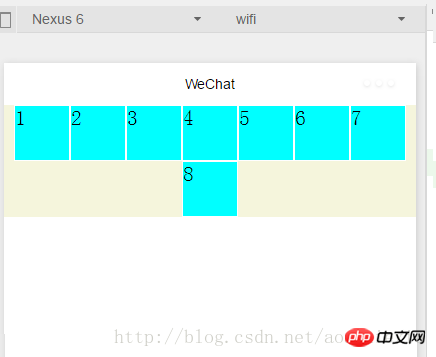 Figure 6
justify-content:flex-end (主轴为左到右情况下:右对齐)
编译运行效果如图7所示:
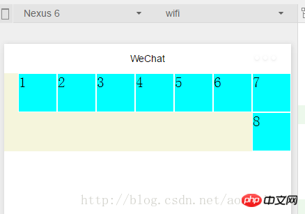
图7
justify-content:flex-start (主轴为左到右情况下:左对齐)不举例显示了
justify-content:space-around---效果如图8所示,每个子view左右都有留边
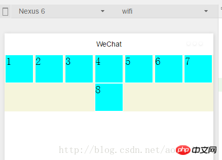
图8
justify-content:space-between---
效果如图9所示,每个子view左右都有留边,但是首尾两个view各自左右对齐不留边
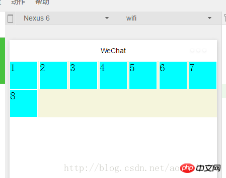
图9
1.1.5容器属性:align-items
上面已经很详细讲解主轴上的对齐方式,这里关于这个交叉轴上的对齐方式同理很简单,就不详细展开了。
1.2.1 容器内元素属性:flex-grow
layout.wxml中修改代码如下:增加i3
 <view class="item1 i3">
 3
 </view>
layout.wxss中修改代码如下:在item1中增加: flex-grow: 1,增加i3,表示在一行中如果有剩余空间的话,i3之外的子view占1份空间,而i3子view占2份空间,编译运行效果如图10所示:可以看出i3view所占据的空间比其余3个子view大,但是没有到2倍
.item1{
    height:100rpx;
    width:100rpx;
    background-color:cyan;
    border: 1px solid #fff;
    flex-grow: 1
}
.i3{
    flex-grow: 2
}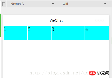
图10
1.2.2容器内元素属性:flex-shrink
layout.wxml再增加4个子view
layout.wxss中修改代码如下:i3的flex-shrink为0,其余子view为1,这表示当空间不足时所有子view都等比缩小,但是i3的view保持大小不变,编译运行,效果如图11所示
.item1{
    height:100rpx;
    width:100rpx;
    background-color:cyan;
    border: 1px solid #fff;
    flex-shrink: 1
}
.i3{
    flex-shrink: 0
}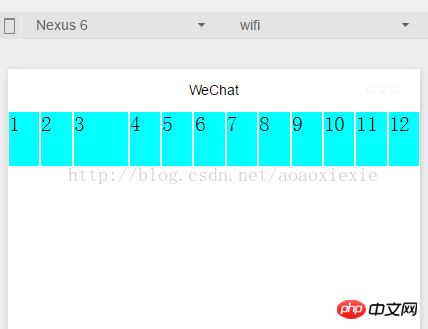
图11
1.2.3容器内元素属性:
flex-basis
layout.wxss中修改代码如下:其他代码保持不变不变,编译运行,效果如图12所示
.i3{    flex-shrink: 0;    flex-basis: 200rpx
}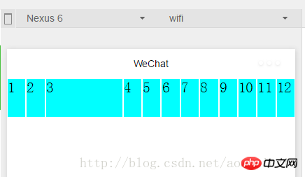
图12
1.2.4容器内元素属性:
flex
flex是grow,shink,basis几个属性的合并,layout.wxss中修改代码如下:其他代码保持不变不变,编译运行,效果和图12保持一样
.i3{    flex:0 0 200rpx}
1.2.5容器内元素属性:orderlayout.wxml中修改代码如下:设置每个view的order属性为其显示的顺序,编译运行
<view class="container1">
 <view class="item1" style="order:4">
 1
 </view>
<view class="item1" style="order:3">
 2
 </view>
 <view class="item1 i3" style="order:2">
 3
 </view>
 <view class="item1" style="order:1">
 4
 </view>
</view>
相信看了本文案例你已经掌握了方法,更多精彩请关注php中文网其它相关文章!
推荐阅读:
The above is the detailed content of How should WeChat mini programs be laid out?. For more information, please follow other related articles on the PHP Chinese website!

Hot AI Tools

Undresser.AI Undress
AI-powered app for creating realistic nude photos

AI Clothes Remover
Online AI tool for removing clothes from photos.

Undress AI Tool
Undress images for free

Clothoff.io
AI clothes remover

Video Face Swap
Swap faces in any video effortlessly with our completely free AI face swap tool!

Hot Article

Hot Tools

Notepad++7.3.1
Easy-to-use and free code editor

SublimeText3 Chinese version
Chinese version, very easy to use

Zend Studio 13.0.1
Powerful PHP integrated development environment

Dreamweaver CS6
Visual web development tools

SublimeText3 Mac version
God-level code editing software (SublimeText3)

Hot Topics
 1653
1653
 14
14
 1413
1413
 52
52
 1304
1304
 25
25
 1251
1251
 29
29
 1224
1224
 24
24
 Is the company's security software causing the application to fail to run? How to troubleshoot and solve it?
Apr 19, 2025 pm 04:51 PM
Troubleshooting and solutions to the company's security software that causes some applications to not function properly. Many companies will deploy security software in order to ensure internal network security. ...
 What is the difference between H5 page production and WeChat applets
Apr 05, 2025 pm 11:51 PM
H5 is more flexible and customizable, but requires skilled technology; mini programs are quick to get started and easy to maintain, but are limited by the WeChat framework.
 Ouyi Exchange app domestic download tutorial
Mar 21, 2025 pm 05:42 PM
This article provides a detailed guide to safe download of Ouyi OKX App in China. Due to restrictions on domestic app stores, users are advised to download the App through the official website of Ouyi OKX, or use the QR code provided by the official website to scan and download. During the download process, be sure to verify the official website address, check the application permissions, perform a security scan after installation, and enable two-factor verification. During use, please abide by local laws and regulations, use a safe network environment, protect account security, be vigilant against fraud, and invest rationally. This article is for reference only and does not constitute investment advice. Digital asset transactions are at your own risk.
 How to solve the problem of JS resource caching in enterprise WeChat?
Apr 04, 2025 pm 05:06 PM
Discussion on the JS resource caching issue of Enterprise WeChat. When upgrading project functions, some users often encounter situations where they fail to successfully upgrade, especially in the enterprise...
 The difference between H5 and mini-programs and APPs
Apr 06, 2025 am 10:42 AM
H5. The main difference between mini programs and APP is: technical architecture: H5 is based on web technology, and mini programs and APP are independent applications. Experience and functions: H5 is light and easy to use, with limited functions; mini programs are lightweight and have good interactiveness; APPs are powerful and have smooth experience. Compatibility: H5 is cross-platform compatible, applets and APPs are restricted by the platform. Development cost: H5 has low development cost, medium mini programs, and highest APP. Applicable scenarios: H5 is suitable for information display, applets are suitable for lightweight applications, and APPs are suitable for complex functions.
 What should I do if the company's security software conflicts with applications? How to troubleshoot HUES security software causes common software to fail to open?
Apr 01, 2025 pm 10:48 PM
Compatibility issues and troubleshooting methods for company security software and application. Many companies will install security software in order to ensure intranet security. However, security software sometimes...
 How to choose H5 and applets
Apr 06, 2025 am 10:51 AM
The choice of H5 and applet depends on the requirements. For applications with cross-platform, rapid development and high scalability, choose H5; for applications with native experience, rich functions and platform dependencies, choose applets.
 What are the development tools for H5 and mini program?
Apr 06, 2025 am 09:54 AM
H5 development tools recommendations: VSCode, WebStorm, Atom, Brackets, Sublime Text; Mini Program Development Tools: WeChat Developer Tools, Alipay Mini Program Developer Tools, Baidu Smart Mini Program IDE, Toutiao Mini Program Developer Tools, Taro.


