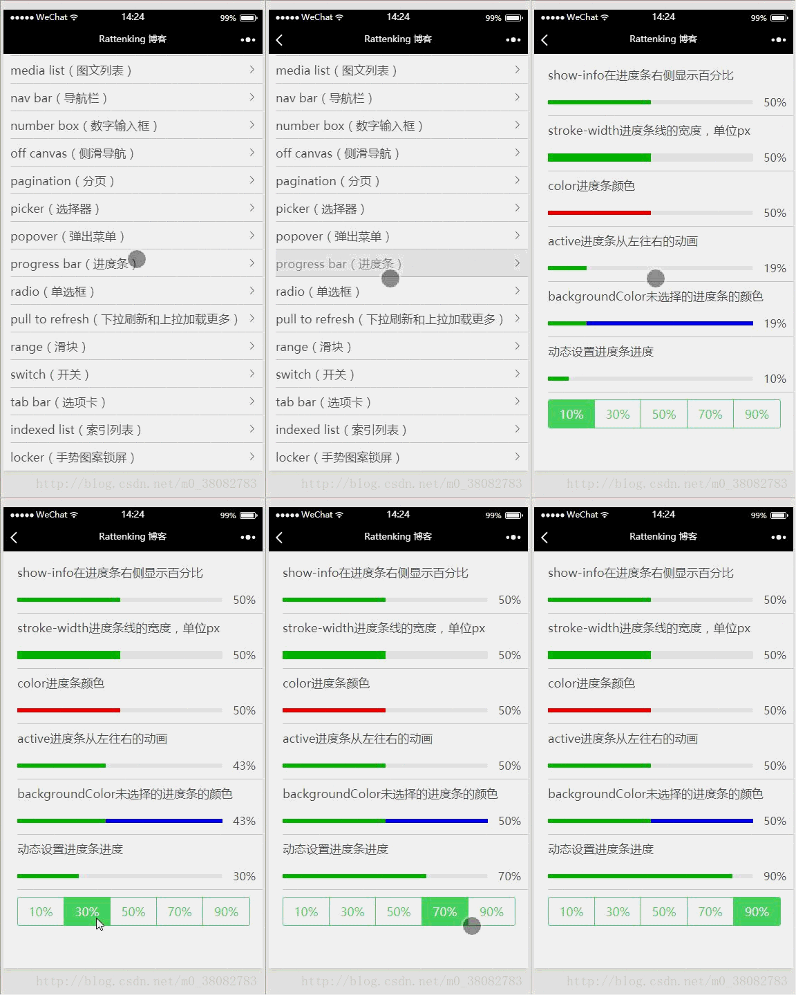
This article mainly introduces the use of the progress component of the WeChat applet in detail. It has certain reference value. Interested friends can refer to it.
This article shares the progress component of the WeChat applet for everyone. How to use the component is for your reference. The specific content is as follows
Rendering

WXML
<view class="tui-content">
<view class="tui-menu-list">
<text>show-info在进度条右侧显示百分比</text>
<progress percent="50" show-info />
</view>
<view class="tui-menu-list">
<text>stroke-width进度条线的宽度,单位px</text>
<progress percent="50" stroke-width="12" show-info/>
</view>
<view class="tui-menu-list">
<text>color进度条颜色</text>
<progress percent="50" color="red" show-info/>
</view>
<view class="tui-menu-list">
<text>active进度条从左往右的动画</text>
<progress percent="50" active show-info/>
</view>
<view class="tui-menu-list">
<text>backgroundColor未选择的进度条的颜色</text>
<progress percent="50" backgroundColor="blue" active show-info/>
</view>
<view class="tui-menu-list">
<text>动态设置进度条进度</text>
<progress percent="{{index}}" show-info/>
</view>
<view class="tui-tabbar-content">
<view class="tui-tabbar-group">
<text data-id="10" bindtap="changeTabbar" class="tui-tabbar-cell {{index == 10 ? 'tui-active' : ''}}">10%</text>
<text data-id="30" bindtap="changeTabbar" class="tui-tabbar-cell {{index == 30 ? 'tui-active' : ''}}">30%</text>
<text data-id="50" bindtap="changeTabbar" class="tui-tabbar-cell {{index == 50 ? 'tui-active' : ''}}">50%</text>
<text data-id="70" bindtap="changeTabbar" class="tui-tabbar-cell {{index == 70 ? 'tui-active' : ''}}">70%</text>
<text data-id="90" bindtap="changeTabbar" class="tui-tabbar-cell {{index == 90 ? 'tui-active' : ''}}">90%</text>
</view>
</view>
</view>JS
Page({
 data: {
  index: 10
 },
 changeTabbar(e){
  this.setData({ index: e.currentTarget.dataset.id})
 }
})progress attribute
percent: the percentage of initialization
show- info: Whether to display the percentage of the progress bar on the right side of the progress bar
stroke-width: The width of the progress bar, in px, the default is 6
color: The color of the progress bar
activeColor: The color of the selected progress bar
backgroundColor: The color of the unselected progress bar
active: The animation of the progress bar from left to right
active-mode: backwards: The animation starts from the beginning; forwards: The animation continues from the last end point
The above is the entire content of this article. I hope it will be helpful to everyone's study. For more related content, please pay attention to the PHP Chinese website!
Related recommendations:
Introduction to the use of the new drag component movable-view in WeChat Mini Program
WeChat Mini Program Simple usage of the picker component in the program
Introduction to the use of the WeChat applet button component
The above is the detailed content of Introduction to the use of progress component of WeChat mini program. For more information, please follow other related articles on the PHP Chinese website!
 How to restore normal printing when the printer is offline
 Which is more difficult, c language or python?
 What is the difference between php5 and php7
 How pycharm runs python files
 What should I do if my QQ account is stolen?
 Window.setInterval() method
 The role of server network card
 How to convert html files to pdf files


