This article mainly introduces the relevant information on the development of the navigation column at the bottom of the WeChat applet. I wanted to have a beautiful navigation column at the bottom of the WeChat applet, but I didn’t know how to make it, so Baidu found this article and shared it with everyone. , Friends in need can refer to
Development of the bottom navigation column of WeChat applet
Let’s take a look at the renderings first

Here, we have added three navigation icons, because we have three pages, and the WeChat applet can add up to 5.
Then how do they appear and how are they colored? Done in two steps!
1. Icon preparation
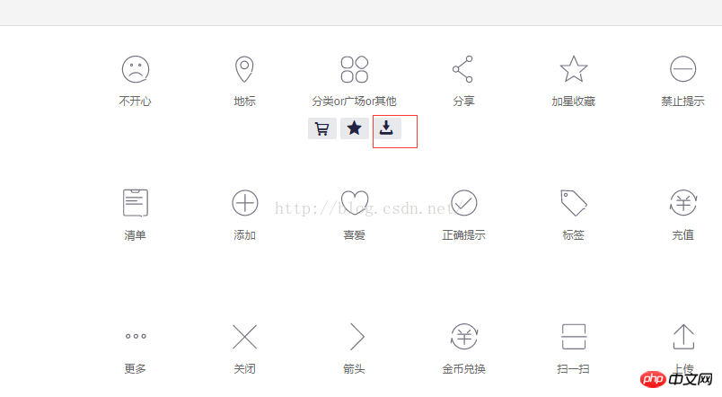
Alibaba icon library http://www.iconfont.cn/collections/show/29
We enter the website, slide the mouse over an icon you like and click the download button below

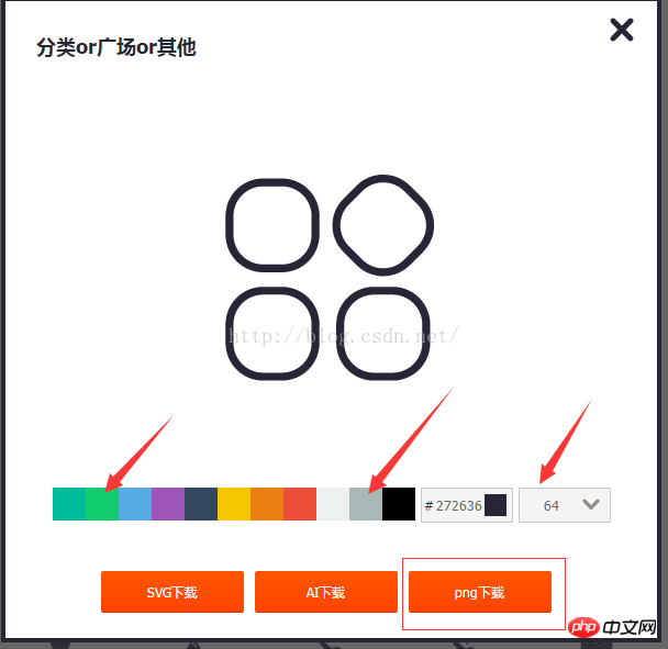
Select two icons of different colors in the pop-up box Just select the 64px size, I chose png and then download it and give it an alias

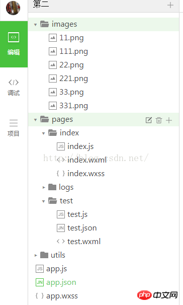
Save the icon with the above name to the mini program project directory. In the created images folder, preparations are done

2. Change the configuration file
We found Add the following configuration information to the configuration file app.json in the project root directory
"tabBar": {
  "color": "#a9b7b7",
  "selectedColor": "#11cd6e",
  "borderStyle":"white",
  "list": [{
   "selectedIconPath": "images/111.png",
   "iconPath": "images/11.png",
   "pagePath": "pages/index/index",
   "text": "首页"
  }, {
   "selectedIconPath": "images/221.png",
   "iconPath": "images/22.png",
   "pagePath": "pages/logs/logs",
   "text": "日志"
  }, {
   "selectedIconPath": "images/331.png",
   "iconPath": "images/33.png",
   "pagePath": "pages/test/test",
   "text": "开心测试"
  }]
},Explain the corresponding attribute information
tabBar refers to the navigation at the bottom Configuration properties
color The color of the bottom navigation text when not selected
selectedColor The color of the bottom navigation text when selected
borderStyle The sample color of the bottom navigation border (note that if there is no writing here Entering the style will cause the default light gray line to appear on the upper border of the navigation box)
list Navigation configuration array
selectedIconPath Icon path when selected
iconPath Icon path when not selected
pagePath Page access address
text Text below the navigation icon
If you want to change the more detailed style, please refer to
https://mp.weixin.qq .com/debug/wxadoc/dev/framework/config.html#tabBar
The above is the entire content of this article. I hope it will be helpful to everyone’s study. For more related content, please pay attention to the PHP Chinese website !
Related recommendations:
WeChat applet implements MUI number input box effect
About WeChat applet implementing top tab Introduction to (swiper)
The use of input forms, redio and drop-down lists in WeChat mini programs
The above is the detailed content of About the development of the navigation bar at the bottom of the WeChat mini program. For more information, please follow other related articles on the PHP Chinese website!


