This article mainly introduces the relevant information on the detailed explanation of the WeChat Mini Program modal pop-up component, and attaches simple examples. Friends in need can refer to it
WeChat Mini Program modal:
Here the MODAL components in the WeChat Mini Program have been analyzed in detail. I want to develop a small partner of the WeChat Mini Program. Here I record the main points of MODAL.
#modal
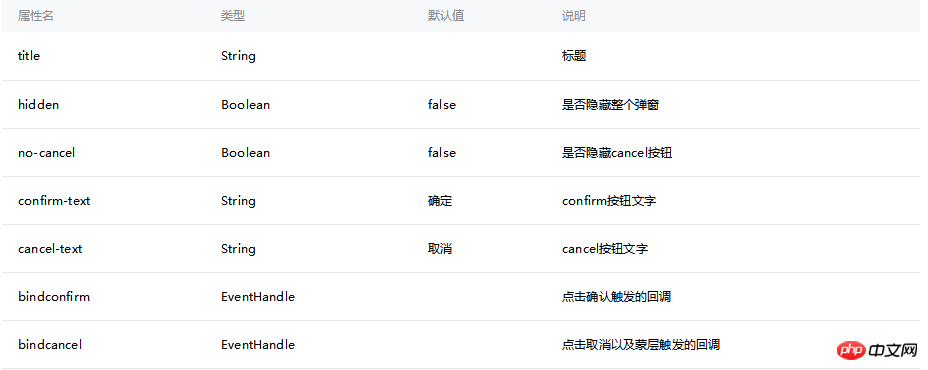
modal is similar to the confirm pop-up box in javascript. By default, it is a pop-up box with confirmation and cancellation. However, the pop-up box will not appear after clicking cancel. To automatically hide, you need to control the hidden attribute by triggering an event and calling a function.
Official Document

##.wxml
<modal hidden="{{hidden}}" title="这里是title" confirm-text="自定义确定按钮" cancel-text="自定义取消按钮" bindcancel="cancel" bindconfirm="confirm" no-cancel="{{nocancel}}">
  这是对话框的内容。
</modal>
.js
Page({
  data:{
    hidden:false,
    nocancel:false
  },
  cancel: function(){
    this.setData({
       hidden: true
    });
  },
  confirm: function(){
    this.setData({
       nocancel: !this.data.nocancel
    });
    console.log("clicked confirm");
  }
})
About the implementation of pop-up boxes and modal boxes in WeChat mini programs
WeChat mini program image Analysis of the difference between component binderror usage example and onerror in js
Introduction to WeChat applet slider
The above is the detailed content of Introduction to WeChat Mini Program modal pop-up component. For more information, please follow other related articles on the PHP Chinese website!


