

網頁設計製作改進超級連結效果_HTML/Xhtml_網頁製作

超連結可以讓訪客從一個頁面跳到另一個頁面,或從一個網站跳到另一個網站。但是,這種頻繁的跳躍可能會使人們產生焦慮。
To help users browse with confidence, links should be absolutely clear and explicit.
為了方便用戶更好的瀏覽頁面,超連結必須絕對的簡潔明了。
Principles
法則
1. Text hyperlinks should be clearly distinguishable from normal text. 超連結文字必須與普通的內容文字相區別
2. Any mouseover behaviour should have a highlighting effect.
滑鼠移動到超連結時必須顯示突出效果
3.Hyperlink content should be as short as possible, yet long enough to identify either:
超言蒅
· Where you'll go [Where you'll go [
]
· 🎜>希望取得什麼內容]
· What you>產生什麼效果]
4. Hyperlinks with different targets should be clearly distinguishable.
指向不同目標的超連結指向不同目標的超連結
5. Hyperlinks should give an indication of any unanticipated consequences, e.g.: 對點擊超連結後會出現的特殊情況加以解釋,如:
· Links to files [Links to files [連結至一個檔案
]
· Links that open or close windows [g點選連結後會開啟或關閉視窗]
What do you make a link?
想想這個超連結的目的。
Hyperlink content example: Amapproved.com超連結內容舉例:
Amapproved.com
A site for locating approved Aston Martins, and it's good on the whole. This is the search results screen. Guess how you get from search results to see the details on a 3ve hive. model (in the Vehicle summary column). 這個案例是Aston Martins [阿斯頓馬丁 >汽車的網站。可以這樣說,它的整體外觀設計堪稱經典。這是一個搜尋結果顯示頁面。那麼現在,你想像一下,該如何透過搜尋結果的方式來查閱有關車輛的詳細介紹。這裡僅有的超連結就是關於「Vehicle summary column [車輛基本清單]」中的「vehicle model[車輛模型]」。
The first, and biggest problem, is that you can't distinguish the hyperlinks, breaking Principle 1. You don't know where to click to get more information: you have to guess.
首先所面臨的最大問題就是,你不能區分那個是超連結。這違反了法則1,即:你不知道該點擊那裡來獲取更多的信息,因此,你必須先考慮這個問題
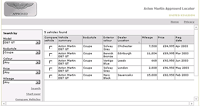
The second problem is: The links look the same although they point to completely different targets (each one is a different used Aston Martin). This breaks Prinple 4. Becav 4. (the vehicle model), it's even less obvious that they might be the link.
第二個問題是:儘管這些連結指向完全不同的目標(每個不同的連結都使用了名稱「Aston Martin」),但它們看起來幾乎一樣,這就違反了上述的法則4;再加上所有的鏈接都包含了相同的內容 (vehicle model [車輛類型]),這就使得超連結更加不明顯。
If I click on "Aston Martin DB7 GT", I would expect to get general information about the Aston Martin DB7 GT car. This breaks Principle 3, because the link is not accurately describing accif I click it.
如果我點擊“Aston Martin DB7 GT”這個鏈接,希望獲取關於“Aston Martin DB7 GT」型汽車的大致資訊。但是,我發現最終獲取的資訊和連結的描述存在出入。那麼,這就違反了法則3。
What should they do?
網站該如何改進?
The "thing you get" is the information about a particular car. The thing that represents the particular car is the entire table row. There is no other unique identifier for the car (mileage, price crice a. t necessarily unique). Therefore, the whole row should be the clickable hyperlink. (It would also be helpful if the row changed colour/tone on mouseover).
「thing you get [你所取得的資料]」應該是與一輛汽車相關的信息,這些代表特定車型的信息應該佔據整個表格列;同時,因為這裡沒有包含具體車型信息(如:英里數、價格等)的確認對象,所以,表格的整列必須作為可點擊的超鏈接對象。 (如果滑鼠移至超連結上能夠產生變色效果的話,將更有助於辨認)。
Expressing size in hyperlinks
描述超連結物件的尺寸大小描述超連結物件的尺寸大小
It's quite common to find computers putting out this kind of information to set user's expectations when linking to a file: 當鏈接到一個文件時,我們通常會發現超鏈接上包含一段關於檔案大小尺寸的描述,這有助於使用者決定自己的意願(即:是否點擊該檔案連結)。 如:
PDF (46,764 bytes) Thinking about the user's goals, 🎜> Thinking about the user's goals, suser's snow the koughfly how long the download will take: will it be a few seconds, or minutes? That's generally as accurate as it needs to be. 好好思考一下需要知道下載需要花去多久:是幾秒鐘,還是幾分鐘?因此,我們應該對其作出盡可能精準的描述。 What should it be?應該怎麼描述上述的檔案尺寸呢?
There's no benefit at all in showing more than two significant figures in file sizes. Above should be 47KB. Also, only ever use kilobytes or megates for filefilesizes online. run: 4.7KB, 47KB, 470KB, 4.7MB etc.)
對檔案尺寸的描述最好不要超過兩位有效數字。上述文件尺寸應寫成
47KB。因此,網路上應盡可能使用千字節(kb)或兆位元組(mb
)對檔案進行描述。 (我們建議的2位元數字描述法如下:4.7KB, 47KB, 470KB, 4.7MB等等)等等)等等)等等)等等)等等)等等)等等)等等)等等) Formatting hyperlinks對超連結定義格式對超連結定義格式 If we have to differentiate text hyperlinks from other text, should this be done with colour or formatting such as underlining/emboldening?
如果我們需要在一個文本中區分不同的文字連結,我們應該對超連結的部分使用不同於普通文字的顏色,或是對超鏈的文字加上下劃線,或是加粗。
The de facto convention has been that hyperlinks are rendered in blue with underlines, that they turn red when clicked, and that visited links are purple.
的顏色變化是:起初,超連結是藍色的,並帶有下劃線;當點擊時,它會變成紅色;訪問過的超連結將會以紫色顯示。
The most readable way to render most text is black on a white background, and making text hyperlinks blue (#
最常用的增加超鏈接可讀性的方法是:整體頁面為黑字白底,文字超鏈接為藍色(#
超鏈結的顏色可以有灰色替代藍色,帶不帶有下劃線均可。
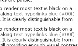
It's appropriate to ask if differentiating by colour alone will work for people who are colourblind. The image above is a screen capture of this page, totally saturated. It soo thatoboents sooooly sooally, sooent音al sooent音al soopents, soo. between black and blue to make the hyperlink clear. The underlined version is a little bit clearer, but showing underline on hover would serve a similar purpose.
Should hypelinks be underlined?
超連結是否需要有底線?
Underlining works okay for occasional inline links. 對於不常使用的內建超連結可以加上底線。
It makes the link stand out a little more than colour alone.
透過對超連結使用下劃線(與僅對超連結進行顏色變化)更能起到突顯超連結的作用。
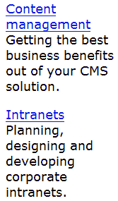
In this example, the underlining works well to distinguish article titles from the sub-title.
在這個案例中,底線可以清楚分主標題和二分主區級標題。
I think underlining becomes unhelpful when there are numerous inline links in paragraphs, in lists of links, and when there are lots of sets of links on a page.
Here are a couple of examples of collections of hyperlinks, showing the original (underlined) and the same with underlines removed.
下面兩組超連結效果的對比。左邊的超連結包含底線,右邊則不包含底線,具體如下:
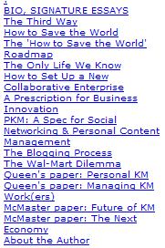
Notice how it's quicker and easier to read the non-underlined blocks of text.
請注意:如果像上面這樣的連結列表,那麼不使用下劃線將更有助於快速、簡單地閱讀。
In this second example, I have also adjusted the line spacing to make the related words clearer.
在第二個案例中,我還調整了單字之間的間距使其看起來更加清晰。
Consistency
一致一致一致
一致
一致
It is important that hyperlink formats behave consistently across pages.
還有一點很重要,就是所有頁面的超連結格式最好保持一致。 Obviously, where some text links are on different backgrounds, such as in navigation bars, they may need to use special colours or treatments. 很顯然,當超連結位於不同的背景時,如:位於導航條內,那麼我們將對其使用特別的顏色和效果。
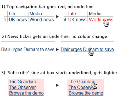
The above snippets are taken from the Guardian Online homepage
上面的片段來自於上面的片段來自於上面的片段來自於的首頁。
While most links look similar (#036, mainly not underlined, there are several very different styles applied on the hover, when the mouse pointer moves over the active link. 的超連結格式看起來基本上相同(字型顏色#036,超連結基本上不帶下劃線,當滑鼠經過超連結時產生的效果各不相同)。 >
The psychological effect is disconcerting: you are left doubting whether all links will do similar things (i.e. go to another page on this site), or ory amay swhiwlywly 集...... ic behaviour weakens the brand experience, as well as diminishing usability.
從心裡學角度講,這樣的效果處理會讓人感到不安;同時,你會對此留有疑慮:是否所用的鏈接全是這樣(包括其它頁面);是否會連結到一個出乎意料的地方。我認為,這種讓人感到精神分裂的效果處理方法將削弱用戶對該網站品牌的映像,同時,網站的可用性也將大打折扣。
There is no good reason to treat all the hyperlinks differently. The third example also breaks the second principle, because its colour change makes it weaker, less noticeable, whichich s. >
我們不可以對所有的超連結都使用不同的效果。上面的第三個案例違反了第二個法則;因為不同的顏色變化使超變得毫無重點,根本起不到突出的作用
Conclusion
結論
結論
結論
結論
On balance, it seems that the predominant convention in the industry is to keep #00f 或 #00c (slightly darker) 和 for 🎜>00c (slightly darker) 和 for 🎜>, to link darker) 和 linkly red and (optionally) underlined on hover. 總而言之,最具特點的超鏈接顏色效果變化是:使用 #
I think that this provides the best balance of functionality when applied consistently to inline hyperlinks and grouped hyperlinks.
我認為:對所有超組使用的連結和群組相同的效果變化能夠在其功能性中保持最佳的平衡。

熱AI工具

Undresser.AI Undress
人工智慧驅動的應用程序,用於創建逼真的裸體照片

AI Clothes Remover
用於從照片中去除衣服的線上人工智慧工具。

Undress AI Tool
免費脫衣圖片

Clothoff.io
AI脫衣器

Video Face Swap
使用我們完全免費的人工智慧換臉工具,輕鬆在任何影片中換臉!

熱門文章
熱工具

記事本++7.3.1
好用且免費的程式碼編輯器

SublimeText3漢化版
中文版,非常好用

禪工作室 13.0.1
強大的PHP整合開發環境

Dreamweaver CS6
視覺化網頁開發工具

SublimeText3 Mac版
神級程式碼編輯軟體(SublimeText3)


 用戶遭遇罕見故障 三星 Watch 智慧手錶突現白螢幕問題
Apr 03, 2024 am 08:13 AM
用戶遭遇罕見故障 三星 Watch 智慧手錶突現白螢幕問題
Apr 03, 2024 am 08:13 AM
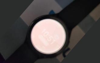
你可能遇到過智慧型手機螢幕出現綠色線條的問題,即使沒看過,也一定在網路上看過相關圖片。那麼,智慧手錶螢幕變白的情況你有遇見過嗎? 4月2日,CNMO從外媒了解到,一名Reddit用戶在社群平台上分享了一張圖片,展示了三星Watch系列智慧手錶螢幕變白的情況。該用戶寫道:"我離開時正在充電,回來時就這樣了,我嘗試重啟,但重啟過程中屏幕還是這樣。"三星Watch智能手錶屏幕變白這位Reddit用戶並未指明這款智能手錶的具體型號。不過,從圖片上看,應該是三星Watch5。此前,另一位Reddit用戶也報告
 Edge瀏覽器怎麼將網頁用捷徑傳送到桌面?
Mar 14, 2024 pm 05:22 PM
Edge瀏覽器怎麼將網頁用捷徑傳送到桌面?
Mar 14, 2024 pm 05:22 PM
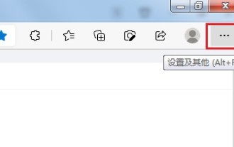
Edge瀏覽器怎麼將網頁用捷徑傳送到桌面?我們很多用戶為了方便直接打開訪問頁面,想要將經常使用的網頁以快捷方式的形式顯示在桌面,但是不知道應該如何操作,針對這個問題,本期小編就來和廣大用戶們分享解決方法,一起來看看今日軟體教學分享的內容。 Edge瀏覽器將網頁傳送到桌面捷徑方法: 1、開啟軟體,點選頁面中的「...」按鈕。 2、在下拉式選單選項中選擇「應用」中的「將此網站作為應用程式安裝」。 3、最後在彈出的視窗中將其
 115://開頭的連結怎麼下載?下載方法介紹
Mar 14, 2024 am 11:58 AM
115://開頭的連結怎麼下載?下載方法介紹
Mar 14, 2024 am 11:58 AM
最近有很多用戶都在問小編,115://開頭的連結怎麼下載?想要下載115://開頭的連結需要藉助115瀏覽器,大家下載好115瀏覽器後,再來看看下面小編整理好的下載教學。 115://開頭的鏈接下載方法介紹 1、登入115.com,下載115瀏覽器並安裝。 2、在115瀏覽器網址列輸入:chrome://extensions/,進入擴充中心,搜尋Tampermonkey,安裝對應插件。 3、在115瀏覽器網址列輸入: 油猴腳本:https://greasyfork.org/en/
 如何取得微信影片號連結?微信影片號碼怎麼加入商品連結?
Mar 22, 2024 pm 09:36 PM
如何取得微信影片號連結?微信影片號碼怎麼加入商品連結?
Mar 22, 2024 pm 09:36 PM
微信視訊號作為微信生態系統的一部分,已逐漸成為內容創作者和商家的重要推廣工具。在這個平台上獲取視頻號連結對於分享和傳播內容至關重要。下文將詳細介紹如何獲取微信視頻號鏈接,以及如何在視頻號中添加商品鏈接,提升內容的傳播效果。一、如何取得微信影片號連結?在微信視頻號中發布影片後,系統會自動建立一個影片連結。作者可以在發布後複製該鏈接,方便進行分享和傳播。登入微信影片號碼後,您可以瀏覽自己的影片號碼首頁。在主頁上,每個視頻都附有相應的鏈接,方便您直接複製或分享。 3.搜尋影片號碼:在微信搜尋框中輸入影片號名
 crystaldiskmark是什麼軟體? -crystaldiskmark如何使用?
Mar 18, 2024 pm 02:58 PM
crystaldiskmark是什麼軟體? -crystaldiskmark如何使用?
Mar 18, 2024 pm 02:58 PM
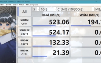
CrystalDiskMark是一款適用於硬碟的小型HDD基準測試工具,可快速測量順序和隨機讀取/寫入速度。接下來就讓小編為大家介紹一下CrystalDiskMark,以及crystaldiskmark如何使用吧~一、CrystalDiskMark介紹CrystalDiskMark是一款廣泛使用的磁碟效能測試工具,用於評估機械硬碟和固態硬碟(SSD)的讀取和寫入速度和隨機I/O性能。它是一款免費的Windows應用程序,並提供用戶友好的介面和各種測試模式來評估硬碟效能的不同方面,並被廣泛用於硬體評
 foobar2000怎麼下載? -foobar2000怎麼使用
Mar 18, 2024 am 10:58 AM
foobar2000怎麼下載? -foobar2000怎麼使用
Mar 18, 2024 am 10:58 AM
foobar2000是一款能隨時收聽音樂資源的軟體,各種音樂無損音質帶給你,增強版本的音樂播放器,讓你得到更全更舒適的音樂體驗,它的設計理念是將電腦端的高級音頻播放器移植到手機上,提供更便捷高效的音樂播放體驗,介面設計簡潔明了易於使用它採用了極簡的設計風格,沒有過多的裝飾和繁瑣的操作能夠快速上手,同時還支持多種皮膚和主題,根據自己的喜好進行個性化設置,打造專屬的音樂播放器支援多種音訊格式的播放,它還支援音訊增益功能根據自己的聽力情況調整音量大小,避免過大的音量對聽力造成損害。接下來就讓小編為大
 網頁圖片載入不出來怎麼辦? 6種解決辦法
Mar 15, 2024 am 10:30 AM
網頁圖片載入不出來怎麼辦? 6種解決辦法
Mar 15, 2024 am 10:30 AM
有網友發現打開瀏覽器網頁,網頁上的圖片遲遲加載不出來,是怎麼回事?檢查過網路是正常的,那是哪裡出現了問題呢?下面小編就來跟大家介紹一下網頁圖片載入不出來的六種解決方法。網頁圖片載入不出來: 1、網速問題網頁顯示不出圖片有可能是因為電腦的網路速度比較慢,電腦中開啟的軟體比較多, 而我們造訪的圖片比較大,這就可能因為載入逾時,導致圖片顯示不出來, 可以將比較佔網速的軟體將關掉,可以去任務管理器查看一下。 2、造訪人數過多 網頁顯示不出圖片還有可能是因為我們造訪的網頁,在同時段造訪的
 BTCC教學:如何在BTCC交易所綁定使用MetaMask錢包?
Apr 26, 2024 am 09:40 AM
BTCC教學:如何在BTCC交易所綁定使用MetaMask錢包?
Apr 26, 2024 am 09:40 AM
MetaMask(中文也叫小狐狸錢包)是一款免費的、廣受好評的加密錢包軟體。目前,BTCC已支援綁定MetaMask錢包,綁定後可使用MetaMask錢包進行快速登錄,儲值、買幣等,且首次綁定還可獲得20USDT體驗金。在BTCCMetaMask錢包教學中,我們將詳細介紹如何註冊和使用MetaMask,以及如何在BTCC綁定並使用小狐狸錢包。 MetaMask錢包是什麼? MetaMask小狐狸錢包擁有超過3,000萬用戶,是當今最受歡迎的加密貨幣錢包之一。它可免費使用,可作為擴充功能安裝在網絡
