
今天您將學習 CSS 定位的重點。
CSS 定位是 Web 開發中的基本概念,可讓您控制網頁上元素的佈局和位置。
在本指南中,我們將探討 CSS 中五種主要的定位類型:靜態、相對、絕對、固定和黏性。
在我的網站:antondevtips.com 我已經有關於 CSS 的部落格。
訂閱更多內容。
靜態定位是所有 HTML 元素的預設定位。
當元素靜態定位時,它被放置在正常的文檔流中,並且其位置由HTML結構和應用的任何邊距或填充確定。
<!DOCTYPE html>
<html lang="en">
<head>
    <style>
        * {
            text-align: center;
        }

        .static-box {
            width: 100px;
            height: 100px;
            background-color: lightblue;
            margin-bottom: 10px;
        }
    </style>
</head>
<body>
    <div class="static-box">Box 1</div>
    <div class="static-box">Box 2</div>
    <div class="static-box">Box 3</div>
</body>
</html>

相對定位允許您將元素從其在正常文件流中的原始位置偏移。
偏移量不會影響其他元素的位置,元素原來佔用的空間被保留。
可以使用 top、right、bottom 和 left 屬性來移動元素。
<!DOCTYPE html>
<html lang="en">
<head>
    <style>
        .relative-box {
            display: inline-block;
            width: 100px;
            height: 100px;
            background-color: lightgreen;
            margin-bottom: 10px;
        }

        .box-2 {
            position: relative;
            top: 50px;
            left: 50px;
            background-color: coral;
        }
    </style>
</head>
<body>
    <div class="relative-box">Box 1</div>
    <div class="relative-box box-2">Box 2</div>
    <div class="relative-box">Box 3</div>
</body>
</html>

在此範例中,「Box 2」元素具有相對位置,並且從其原始位置的左上角移動 50 px。
如您所看到的,「Box 2」不會佔用「Box 3」的空間,儘管「Box 2」的位置已更新,但其空間仍保留。
絕對定位會從正常文件流中刪除元素,並且不會在頁面佈局中為該元素建立空間。
該元素相對於其最近定位的祖先進行定位。
如果不存在這樣的祖先,則它相對於初始包含區塊(通常是視口)定位。
<!DOCTYPE html>
<html lang="en">
<head>
    <style>
        * {
            text-align: center;
        }

        .relative-container {
            position: relative;
            width: 200px;
            height: 200px;
            background-color: lightgray;
        }

        .absolute-box {
            position: absolute;
            top: 30px;
            left: 30px;
            width: 100px;
            height: 100px;
            background-color: lightcoral;
        }

        .absolute-outside-box {
            position: absolute;
            top: 230px;
            left: 110px;
            width: 100px;
            height: 100px;
            background-color: bisque;
        }
    </style>
</head>
<body>
    <div class="relative-container">
        <div class="absolute-box">Absolute inside</div>
    </div>
    <div class="absolute-outside-box">Absolute outside</div>
</body>
</html>
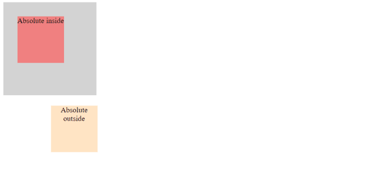
在這裡,您可以看到兩個具有絕對位置的元素:一個位於容器內,另一個位於根主體層級。
內部框根據其相對元素定位,外部框位於視窗內。
固定定位會從正常文件流中刪除元素,並且不會在頁面佈局中為該元素建立空間。
元素相對於視口定位,這意味著即使頁面滾動它也保持在相同的位置。
這對於建立固定頁首、頁尾或側邊欄非常有用。
<!DOCTYPE html>
<html lang="en">
<head>
    <style>
        .content-1 {
            height: 700px;
            background-color: burlywood;
        }

        .content-2 {
            height: 700px;
            background-color: darkseagreen;
        }

        .content-3 {
            height: 700px;
            background-color: lavender;
        }

        .fixed-box {
            position: fixed;
            bottom: 0;
            width: 100%;
            height: 50px;
            background-color: lightseagreen;
            color: white;
            text-align: center;
            line-height: 50px;
        }
    </style>
</head>
<body>
    <div class="content-1">Content 1</div>
    <div class="content-2">Content 2</div>
    <div class="content-3">Content 3</div>
    <div class="fixed-box">Fixed Footer</div>
</body>
</html>
在此範例中,您可以看到網頁底部放置了固定頁腳。

向下捲動時,內容會捲動,但無論捲動位置為何,頁腳仍然可見。


黏性定位是相對定位和固定定位的混合體。
具有黏性位置的元素的行為類似於相對定位的元素,直到它穿過指定的閾值(頂部、右側、底部或左側),此時它會固定在其包含區塊內。
<!DOCTYPE html>
<html lang="en">
<head>
    <style>
        * {
            text-align: center;
        }

        .sticky-header-1 {
            position: sticky;
            top: 0;
            width: 100%;
            height: 50px;
            background-color: darkgray;
            text-align: center;
            line-height: 50px;
        }

        .sticky-header-2 {
            position: sticky;
            top: 0;
            width: 100%;
            height: 50px;
            background-color: darkslateblue;
            text-align: center;
            line-height: 50px;
        }

        .sticky-header-3 {
            position: sticky;
            top: 0;
            width: 100%;
            height: 50px;
            background-color: mediumvioletred;
            text-align: center;
            line-height: 50px;
        }

        .content-1 {
            height: 700px;
            background-color: lightgray;
        }

        .content-2 {
            height: 700px;
            background-color: lightblue;
        }

        .content-3 {
            height: 700px;
            background-color: lightpink;
        }
    </style>
</head>
<body>
    <div class="sticky-header-1">Sticky Header 1</div>
    <div class="content-1">Content 1</div>

    <div class="sticky-header-2">Sticky Header 2</div>
    <div class="content-2">Content 2</div>

    <div class="sticky-header-3">Sticky Header 3</div>
    <div class="content-3">Content 3</div>
</body>
</html>
在此範例中,您可以看到網頁頂部放置了一個黏性標題。

向下捲動頁面時可以看到固定 HTML 元素和黏性 HTML 元素之間的差異。
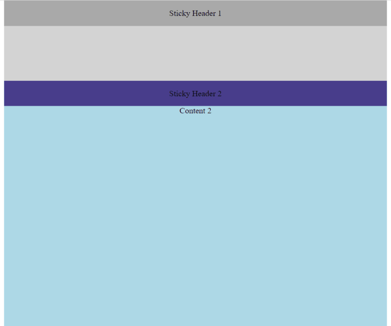
到達第二個黏性標題後,第一個黏性標題就會從螢幕上消失:

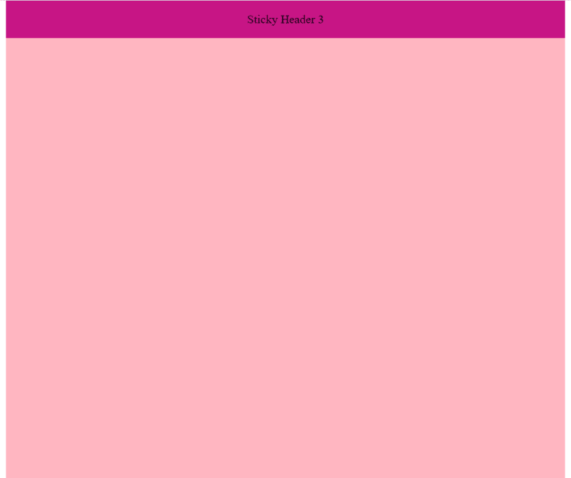
這也適用於第三個黏性標題:
希望您覺得這篇文章有用。快樂編碼!
在我的網站:antondevtips.com 我已經有關於 CSS 的部落格。
訂閱更多內容。
以上是CSS 定位基礎知識:實用指南的詳細內容。更多資訊請關注PHP中文網其他相關文章!


