

如何使用 CSS 建立倒數計時器

作者:卡洛斯·穆庫霍✏️
倒數計時器是許多網站上的熱門功能,可增強活動、銷售和用戶參與度的功能。雖然 JavaScript 通常用於網路上的動態行為,但也可以只使用 CSS 建立功能強大且視覺上吸引人的倒數計時器。
在本教程中,我們將探索這兩種方法,從基本的 JavaScript 倒數計時器開始,然後轉向純 CSS 倒數計時器。最後,我們將使用 Chrome DevTools 來比較兩種方法的效能,並討論它們各自的優缺點。
建立一個基本的 JavaScript 倒數計時器
我們將首先建立一個每秒更新一次的簡單倒數計時器。計時器將包括一個開始和暫停按鈕來控制其操作。
建立目錄結構
在創建 JavaScript 倒數計時器之前,我們需要建立一個目錄來儲存我們將在本教程中建立的應用程式。
開啟終端機窗口,導覽至適合您的專案的目錄,然後使用以下命令建立名為 countdown-timer 的目錄:
mkdir countdown-timer
然後,導覽至此目錄:
cd countdown-timer
建立兩個名為 javascript-countdown 和 css-only-countdown 的子目錄,並在每個子目錄中建立一個名為 public 的子目錄:
mkdir javascript-countdown && mkdir javascript-countdown/public
mkdir css-only-countdown && mkdir css-only-countdown/public
創建應用程式伺服器
接下來,導覽到 javascript-countdown 子目錄,使用預設設定初始化一個新的節點項目,並安裝 Express 套件:
cd javascript-countdown
npm init -y
npm install express
打開您最喜歡的文字編輯器,建立一個名為 server.js 的文件,並在其中添加以下程式碼:
const express = require('express');
const app = express();
const port = 3001

app.use(express.static('public'));
app.listen(port, () => {
  console.log(`Javascript countdown app server started on port ${port}`);
});
上面的程式碼建立了一個 Express 伺服器,用於為連接埠 3001 中的 JavaScript 倒數計時應用程式提供服務。
HTML結構
仍在文字編輯器中,在 javascript-countdown 目錄內的 public 子目錄中建立以下檔案:
- HTML 程式碼的index.html
- CSS 程式碼的 styles.css
- JavaScript 程式碼的index.js
將以下程式碼加入index.html:
<!DOCTYPE html>
<html lang="en">
<head>
  <meta charset="UTF-8">
  <meta name="viewport" content="width=device-width, initial-scale=1.0">
  <link rel="stylesheet" href="styles.css">
  <title>Javascript Countdown Timer</title>
</head>

<body>
  <div class="container">
    <div class="controls">
      <button id="startBtn">Start</button>
      <button id="pauseBtn">Pause</button>
    </div>
    <div class="countdown-container">
      <div class="countdown"></div>
    </div>
  </div>
  <script src="index.js"></script>
</body>

</html>
此 HTML 檔案設定了一個基本結構,其中包含一個包含控制按鈕的容器和一個倒數顯示區域。
使用 JavaScript 實作倒數邏輯
接下來,我們將新增 JavaScript 來管理倒數邏輯。在index.js中加入以下程式碼:
window.addEventListener("load", () => {
  const startBtn = document.getElementById('startBtn');
  const pauseBtn = document.getElementById('pauseBtn');
  const countdownView = document.getElementsByClassName('countdown')[0];

  let totalTime = 10;
  let timeLeft;
  let countDownIntervalID;
  let isPaused = false;

  pauseBtn.style.display = 'none';
});
在此程式碼區塊中,我們透過各自的 ID 和類別來初始化 startBtn、pauseBtn 和 countdownView 元素。我們也設定了一些初始變數:totalTime、timeLeft、countDownIntervalID 和 isPaused。此外,我們將暫停按鈕設為最初隱藏。
現在,讓我們為開始和暫停按鈕新增事件偵聽器:
startBtn.addEventListener('click', startOrStopTimer);
pauseBtn.addEventListener('click', pauseOrResumeTimer);
這些行將點擊事件偵聽器附加到開始和暫停按鈕。稍後定義函數startOrStopTimer 和pauseOrResumeTimer 來處理按鈕點選。
加入以下程式碼來定義startOrStopTimer函數:
function startOrStopTimer() {
  startBtn.innerHTML = startBtn.innerHTML === 'Start' ? 'Stop' : 'Start';
  if (countDownIntervalID === undefined && !isPaused) {
    timeLeft = totalTime;
    startTimer();
    pauseBtn.style.display = 'inline';
  } else {
    stopTimer();
    countdownView.innerHTML = '';
    pauseBtn.style.display = 'none';
    isPaused = false;
    pauseBtn.innerHTML = 'Pause';
  }
}
在此函數中,我們在「開始」和「停止」之間切換開始按鈕文字。如果倒數計時未運行且未暫停,我們將 timeLeft 初始化為totalTime 並啟動計時器。否則,我們停止計時器並重置視圖。
現在,定義 startTimer 函數:
function startTimer() {
  countDownIntervalID = setInterval(() => {
    countdownView.innerHTML = timeLeft;

    if (timeLeft === 0) {
      stopTimer();
      startBtn.innerHTML = 'Start';
      pauseBtn.style.display = 'none';
      countdownView.innerHTML = '';
    } else {
      timeLeft = timeLeft - 1;
    }
  }, 1000);
}
此函數設定每秒更新倒數計時的間隔。如果 timeLeft 達到零,我們將停止計時器,重置開始按鈕文本,並隱藏暫停按鈕。
接下來,加入stopTimer函數:
function stopTimer() {
  if (countDownIntervalID !== undefined) {
    clearInterval(countDownIntervalID);
    countDownIntervalID = undefined;
  }
}
此函數清除倒數間隔並重設 countDownIntervalID。最後加入pauseOrResumeTimer函數:
function pauseOrResumeTimer() {
  isPaused = !isPaused;
  pauseBtn.innerHTML = isPaused ? 'Resume' : 'Pause';

  if (countDownIntervalID !== undefined) {
    stopTimer();
  } else {
    startTimer();
  }
}
在此函數中,我們在「暫停」和「恢復」之間切換暫停狀態和按鈕文字。如果倒數計時正在運行,我們就停止計時器;否則,我們重新開始。
CSS 樣式
現在,讓我們使用 CSS 設定倒數計時器的樣式。將以下程式碼加入 styles.css:
body {
  background-color: black;
  font-family: Arial, sans-serif;
  height: 100%;
}

.container {
  display: flex;
  flex-direction: column;
  justify-content: center;
  align-items: center;
}

.controls {
  width: 20%;
  margin-top: 10%;
  display: flex;
  justify-content: space-between;
  flex-direction: row;
  flex-wrap: wrap;
}

.countdown-container {
  position: relative;
  width: 20vw;
  height: 20vw;
  margin-top: 2%;
  border: 0.4em solid #9b51e0;
}

button {
  font-size: 1.5em;
  border: none;
  padding: 0.3em;
  background-color: #9b51e0;
  border-radius: 0.4em;
  color: white;
}

.countdown {
  position: relative;
  width: 100%;
  height: 100%;
  list-style: none;
  padding: 0;
  margin: 0;
  display: flex;
  justify-content: center;
  align-items: center;
  font-size: 5em;
  color: #9b51e0;
}
此 CSS 定義了倒數計時器介面的樣式。正文背景設定為黑色,我們使用 Arial 作為主要字體。 .container 類別的樣式使其內容居中並在元素之間提供間距。 .controls 類別設定用於啟動和暫停計時器的按鈕的樣式,確保它們均勻分佈且響應靈敏。 .countdown-container 類別定義倒數計時顯示的大小和外觀,包括邊框和邊距。
返回終端並執行以下命令開始提供 JavaScript 倒數計時應用程式:
node server.js
Open a new tab in your browser, navigate to http://localhost:3001, and you should see something similar to the following: 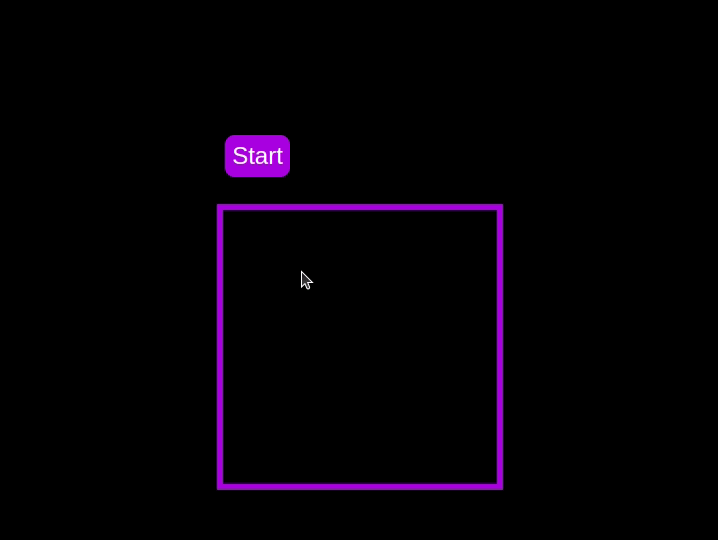 Test out the countdown timer and once you are done, terminate the server application and move to the next step.
Adding a circular progress indicator
To enhance the user experience of our countdown timer, let’s add a circular progress indicator to give the user a visual representation of the time remaining.
First, we need to modify our HTML code to include the circular progress element. In index.html, we add a span element with a class of circular-progress inside the countdown-container div. This span element will be used to create the circular progress indicator:
<div class="countdown-container">
  <span class="circular-progress"></span>
  <div class="countdown"></div>
</div>
Next, we need to define the CSS for the circular progress indicator. In styles.css, we add the following code:
.countdown-container {
  ...
  /* border : 0.4em solid #9b51e0; */
}
.circular-progress {
  width: 20vw;
  height: 20vw;
  border-radius: 50%;
  display: flex;
  justify-content: center;
  align-items: center;
  position: absolute;
  transition: 0.5s;
  background-color: #13171f;
}

.circular-progress::before {
  width: 18.5vw;
  height: 18.5vw;
  content: "";
  position: absolute;
  border-radius: 50%;
  background-color: black;
}
This code first removes the border from the countdown-container div, then sets the dimensions and shape of the circular progress indicator, as well as its position and background color. We also add a ::before pseudo-element to create the inner circle of the progress indicator.
Now we need to add the JavaScript code to animate the circular progress indicator.
Add the following code in the variables initialization block:
const circularProgressEl = document.getElementsByClassName("circular-progress")[0];
let circularProgress;
let circularProgressIntervalID;
This code initializes the circularProgressEl variable to target the circular progress element and creates two new variables, circularProgress and circularProgressIntervalID, that will be used to animate the progress indicator.
Add the following code below the pauseOrResumeTimer() function:
function startCircularProgressAnimation() {
  let start = totalTime - timeLeft;
  let degreesPerSecond = 360 / totalTime;
  let degreesPerInterval = degreesPerSecond / 20;
  circularProgress = degreesPerSecond * start;

  circularProgressIntervalID = setInterval(() => {
    if (Math.round(circularProgress) === 360) {
      clearInterval(circularProgressIntervalID);
    } else {
      circularProgress = circularProgress + degreesPerInterval;
      circularProgressEl.style.background = `conic-gradient(#9b51e0 ${circularProgress}deg, #13171f 0deg)`;
    }
  }, 50);
}
This code defines the startCircularProgressAnimation function, which calculates the starting point and degree of rotation for the circular progress indicator, and sets up an interval to animate the progress indicator.
Add the following code below the startCircularProgressAnimation:
function resumeCircularProgressAnimation() {
  startCircularProgressAnimation();
}

function pauseCircularProgressAnimation() {
  clearInterval(circularProgressIntervalID);
}

function stopCircularProgressAnimation() {
  clearInterval(circularProgressIntervalID);
  circularProgressEl.style.background = `conic-gradient(#9b51e0 0deg, #13171f 0deg)`;
}
This code defines the resumeCircularProgressAnimation, pauseCircularProgressAnimation, and stopCircularProgressAnimation functions, which are used to start, pause, and stop the circular progress animation.
Finally, we need to modify the startOrStopTimer and pauseOrResumeTimer functions to start and stop the circular progress animation along with the timer:
function startOrStopTimer() {
  // ...
  if (countDownIntervalID === undefined && !isPaused) {
    // ...
    startCircularProgressAnimation();
  } else {
    // ...
    stopCircularProgressAnimation();
  }
}

function pauseOrResumeTimer() {
  // ...
  if (countDownIntervalID !== undefined) {
    stopTimer();
    pauseCircularProgressAnimation();
  } else {
    startTimer();
    resumeCircularProgressAnimation();
  }
}
With these modifications, our countdown timer now includes a circular progress indicator that animates along with the timer.
Return to your terminal and run the following command to start serving the JavaScript countdown application:
node server.js
Go back to the tab in your browser where you visited the http://localhost:3001 URL, refresh the page, and you should see something similar to the following: 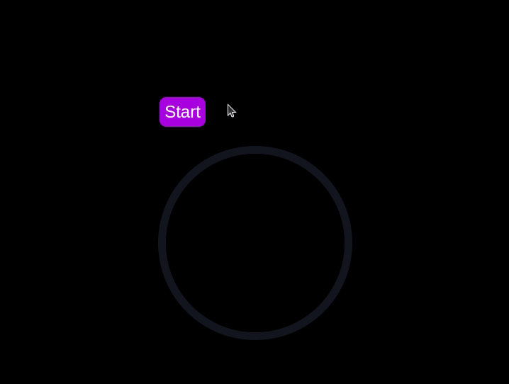
Implementing a CSS-only countdown timer
In this section, we'll dive into creating a countdown timer that updates every second and is made using only CSS. Our timer will be simple yet functional, featuring start and pause buttons to control its operation.
Creating the application server
Navigate to the css-only-countdown subdirectory, initialize a new node project, and install the express package:
cd ../css-only-countdown
npm init -y
npm install express
Then, return to your text editor, create a file named server.js, and add the following code to it:
const express = require('express');
const app = express();
const port = 3002
app.use(express.static('public'));

app.listen(port, () => {
  console.log(`Css-only countdown app server started on port ${port}`);
});
The code above creates an express server that will be used to serve the JavaScript countdown application in port 3002.
HTML structure
Still in your text editor, create the following files in the public subdirectory:
- index.html for the HTML code
- styles.css for the CSS code
Add the following code to the index.html file:
<!DOCTYPE html>
<html lang="en">
<head>
  <meta charset="UTF-8">
  <meta name="viewport" content="width=device-width, initial-scale=1.0">
  <link rel="stylesheet" href="styles.css">
  <title>CSS Countdown Timer</title>
</head>
<body>
  <div class="container">
    <div class="controls">
      <input type="checkbox" id="startBtn" class="checkbox-wrapper">
      <label for="startBtn" id="startLabel">
        <span>Stop</span>
        <span>Start</span>
      </label>
      <input type="checkbox" id="pauseBtn" class="checkbox-wrapper">
      <label for="pauseBtn" id="pauseLabel">
        <span>Resume</span>
        <span>Pause</span>
      </label>
      <div class="countdown-container">
        <ul class="countdown">
          <li>10</li>
          <li>9</li>
          <li>8</li>
          <li>7</li>
          <li>6</li>
          <li>5</li>
          <li>4</li>
          <li>3</li>
          <li>2</li>
          <li>1</li>
        </ul>
      </div>
    </div>
  </div>
</body>
</html>
This code sets up the basic structure of our countdown timer. It includes a container div that holds the controls for starting and pausing the timer, as well as the countdown display itself. The controls div contains two checkboxes with labels that will serve as our start and pause buttons. These buttons toggle their respective states using CSS, thanks to the checkbox hack.
The countdown-container div holds an unordered list (ul) of list items (li) representing the countdown numbers from 10 to one. These numbers will be displayed one by one as the timer counts down.
CSS styling
Now, let's style the countdown timer using CSS. Add the following code to styles.css:
body {
  background-color: black;
  font-family: Arial, sans-serif;
  height: 100%;
}

.container {
  display: flex;
  flex-direction: column;
  justify-content: center;
  align-items: center;
}

.controls {
  width: 20%;
  margin-top: 10%;
  display: flex;
  justify-content: space-between;
  flex-direction: row;
  flex-wrap: wrap;
}

.countdown-container {
  position: relative;
  width: 20vw;
  height: 20vw;
  margin-top: 12%;
  border : 0.4em solid #9b51e0;
}

#startLabel span {
  display: none;
}

label {
  cursor: pointer;
  font-size: 1.5em;
  padding: 0.3em;
  background-color: #9b51e0;
  border-radius: 0.4em;
  color: white;
}

#startBtn:checked~#startLabel span:nth-child(1) {
  display: inline;
}

#startBtn:not(:checked)~#startLabel span:nth-child(2) {
  display: inline;
}

#startBtn:not(:checked)~#pauseLabel,
#pauseBtn {
  display: none;
}

#pauseLabel span {
  display: none;
}

#pauseBtn:checked~#pauseLabel span:nth-child(1) {
  display: inline;
}

#pauseBtn:not(:checked)~#pauseLabel span:nth-child(2) {
  display: inline;
}

.checkbox-wrapper {
  display: none;
}
In this CSS file, we start by setting some basic styles for the body and container. The body has a black background and uses the Arial font. The container is centered using flexbox and has a margin to push it down from the top of the viewport.
The controls div is styled to be responsive and to ensure that the buttons are spaced out evenly. The countdown-container div is styled with a border, which will later be replaced by the circular progress indicator.
We use the checkbox hack to toggle the visibility of the labels for the start and pause buttons. Depending on whether the checkboxes are checked or not, different spans within the labels are displayed. This allows the labels to show different text (Start or Stop, Pause or Resume) based on the state of the checkboxes.
Now, add the following code to the bottom of the styles.css file:
.countdown {
  position: relative;
  width: 100%;
  height: 100%;
  list-style: none;
  padding: 0;
  margin: 0;
  display: flex;
  justify-content: center;
  align-items: center;
  font-size: 5em;
  color: #9b51e0;
}

.countdown li {
  position: absolute;
  opacity: 0;
  transition: opacity 1s linear;
}

#startBtn:checked~.countdown-container .countdown li:nth-child(1) {
  animation-delay: 0s;
}

#startBtn:checked~.countdown-container .countdown li:nth-child(2) {
  animation-delay: 1s;
}

#startBtn:checked~.countdown-container .countdown li:nth-child(3) {
  animation-delay: 2s;
}

#startBtn:checked~.countdown-container .countdown li:nth-child(4) {
  animation-delay: 3s;
}

#startBtn:checked~.countdown-container .countdown li:nth-child(5) {
  animation-delay: 4s;
}

#startBtn:checked~.countdown-container .countdown li:nth-child(6) {
  animation-delay: 5s;
}

#startBtn:checked~.countdown-container .countdown li:nth-child(7) {
  animation-delay: 6s;
}

#startBtn:checked~.countdown-container .countdown li:nth-child(8) {
  animation-delay: 7s;
}

#startBtn:checked~.countdown-container .countdown li:nth-child(9) {
  animation-delay: 8s;
}

#startBtn:checked~.countdown-container .countdown li:nth-child(10) {
  animation-delay: 9s;
}

@keyframes countdownAnimation {
  0%,
  10% {
    opacity: 1;
  }
  11%,
  100% {
    opacity: 0;
  }
}

#startBtn:checked~.countdown-container .countdown li {
  animation: countdownAnimation 10s steps(10) forwards;
}

#pauseBtn:checked~.countdown-container .countdown li {
  animation-play-state: paused;
}
With this code, we style the countdown list. The countdown class is positioned absolutely within the countdown-container, and its list items are initially hidden with opacity: 0.
We then use keyframes and the animation property to create the countdown effect. The list items are displayed one by one with a delay using the animation-delay property. The countdownAnimation keyframes control the visibility of each list item, making them visible for a short period before hiding them again.
We also pause the animation when the pause button is checked, using the animation-play-state property.
Go back to your terminal and run the following command to start serving the CSS-only countdown application:
node server.js
Open a new tab in your browser, navigate to http://localhost:3002 URL, and you should see something similar to the following: 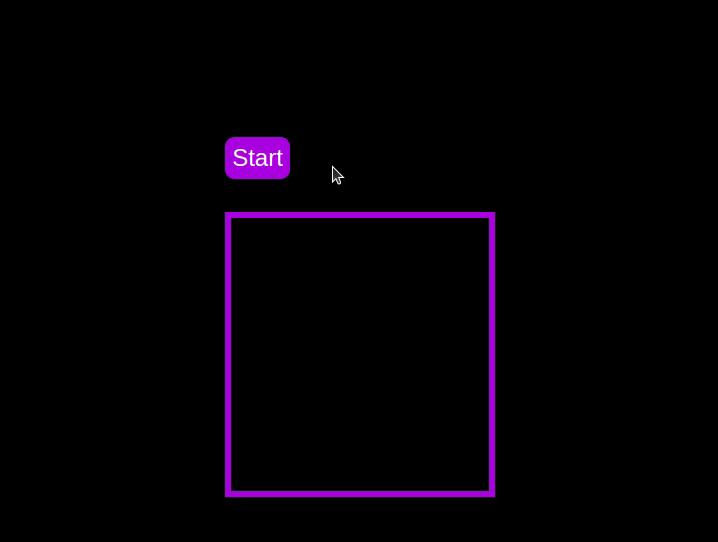 Test out the countdown timer and once you are done, terminate the server application and move to the next step.
Adding a circular progress indicator
To make the countdown timer more visually appealing, we can add a circular progress indicator that shows the remaining time. To do this, we will modify the HTML and CSS code as follows:
First, replace the countdown-container div in the index.html file with the following code:
<div class="countdown-container">
  <span class="circular-progress">
  </span>
  <ul class="countdown">
    <li>10</li>
    <li>9</li>
    <li>8</li>
    <li>7</li>
    <li>6</li>
    <li>5</li>
    <li>4</li>
    <li>3</li>
    <li>2</li>
    <li>1</li>
  </ul>
</div>
In this code, we add a span element with a class of circular-progress inside the countdown-container div.
Next, add the following code to the styles.css file:
.countdown-container {
  ...
  /* border : 0.4em solid #9b51e0; */
}

.circular-progress {
  width: 20vw;
  height: 20vw;
  border-radius: 50%;
  display: flex;
  justify-content: center;
  align-items: center;
  position: absolute;
  transition: 0.5s;
  background: conic-gradient(#9b51e0 var(--angle), #13171f 0deg);
}

.circular-progress::before {
  width: 18.5vw;
  height: 18.5vw;
  content: "";
  position: absolute;
  border-radius: 50%;
  background-color: black;
}

@keyframes circularProgressAnimation {
  to {
    --angle: 360deg;
  }
}

@property --angle {
  syntax: "<angle>";
  initial-value: 0deg;
  inherits: false;
}

#startBtn:checked~.countdown-container .circular-progress {
  opacity: 1;
  animation: circularProgressAnimation 10s linear;
}

#pauseBtn:checked~.countdown-container .circular-progress {
  animation-play-state: paused;
}
In this code, we first remove the border from the countdown-container div, and then add styles for the circular-progress class. The circular progress indicator is a span element that is absolutely positioned within the countdown-container. It uses a conic gradient to create the circular progress effect.
We also define a keyframe animation, circularProgressAnimation, that animates the progress indicator from 0 to 360 degrees over the duration of the countdown. The --angle CSS property is used to control the angle of the gradient.
Finally, we use the checkbox hack to start and pause the circular progress animation along with the countdown numbers. The animation is applied to the circular-progress span when the start button is checked and paused when the pause button is checked.
With these modifications, our countdown timer now includes a circular progress indicator that animates along with the timer.
Go back to your terminal and run the following command to start serving the CSS-only countdown application:
node server.js
Return to the tab in your browser where you visited the http://localhost:3002 URL, refresh the page, and you should see something similar to the following: 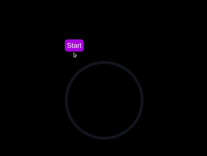
Using Chrome DevTools to compare timer performance
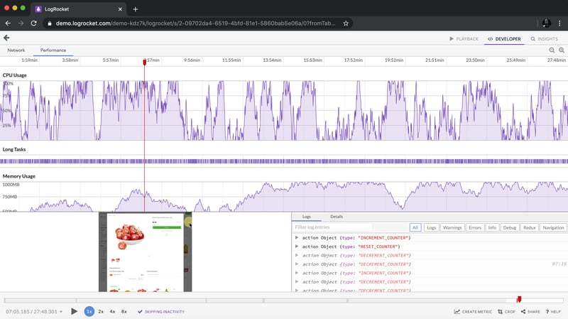
Now that we have implemented both the CSS-only and JavaScript countdown timers, let's compare their performance using Chrome DevTools.
To get started, open the Chrome browser and navigate to the webpage containing the countdown timers. Right-click anywhere on the page and select Inspect to open Chrome DevTools.
In the DevTools window, click on the Network tab and then refresh both the JavaScript and CSS-only countdown pages. This tab allows you to monitor all network requests made by the page, including HTML, CSS, JavaScript, and other resources: 
By analyzing the requests, you can determine how many resources are being loaded, their sizes, and the overall impact on page load time:
| CSS-only countdown timer | JavaScript countdown timer | |
|---|---|---|
| Number of requests | 2 | 3 |
| Total size | 4.5 KB | 4.7 KB |
| Page load | 24 ms | 27 ms |
從這些結果中,我們可以看到,與 JavaScript 倒數計時器相比,純 CSS 倒數計時器需要更少的請求,並且總大小略小。這會導致純 CSS 版本的頁面載入時間稍微加快,使其在初始載入方面更有效率。
現在,在 DevTools 視窗中,導覽至 Performance 選項卡,然後按一下 Record 按鈕啟動錄製工作階段。若要評估 JavaScript 倒數計時器,請按一下對應頁面上的 開始 按鈕,並允許計時器運作。計時器停止後,在效能標籤中停止錄製。
對僅 JS 和 CSS 倒數計時頁面執行此過程,以收集每個實現的效能資料。 效能 標籤提供頁面運行時效能的全面分析,包括腳本編寫、渲染和繪製時間。透過分析這些指標,您可以找出可能需要最佳化的區域,以增強 Web 應用程式的效能:
| CSS-only countdown timer | JavaScript countdown timer | |
|---|---|---|
| Scripting | 2 ms | 49 ms |
| Rendering | 510 ms | 103 ms |
| Painting | 275 ms | 55 ms |
解釋這些結果時,我們發現純 CSS 倒數計時器的腳本編寫時間明顯低於 JavaScript 倒數計時器,這表示執行開銷最小。然而,純 CSS 倒數計時器的渲染和繪製時間更長。這是因為 CSS 動畫有時需要瀏覽器付出更多努力來渲染,尤其是對於複雜的樣式或過渡。
相較之下,JavaScript 倒數計時器由於更新倒數計時器涉及的邏輯而顯示出更高的腳本編寫時間,但它受益於較低的渲染和繪製時間。這表明雖然 JavaScript 在腳本執行方面增加了一些開銷,但它在更新 DOM 和渲染更改方面可以更有效。
總體而言,對於最小化腳本執行時間至關重要的場景,純 CSS 倒數計時器更加高效,而 JavaScript 計時器在渲染和繪製時間是主要關注點的情況下可能表現更好。
每種方法的優缺點
探索了純 CSS 和 JavaScript 倒數計時器後,讓我們權衡它們的優缺點,以確定哪種方法最適合您的需求。
僅 CSS 倒數計時器
純CSS倒數計時器利用純CSS實現倒數效果,提供輕量且簡單的解決方案。
它的優點包括以下幾點:
- 最小的腳本開銷:正如我們的效能分析所示,僅 CSS 計時器需要很少的腳本,從而導致腳本執行的 CPU 使用率較低。這有利於增強整體頁面效能,特別是在處理能力有限的設備上
- 簡化的程式碼庫:透過利用 CSS 進行動畫,程式碼保持更乾淨且更易於維護。這種方式降低了實現的複雜度,可以讓開發者更容易理解和管理程式碼
這種方法的缺點包括:
- 更高的渲染和繪畫時間:僅 CSS 計時器往往具有更高的渲染和繪畫時間。這是由於 CSS 動畫的性質決定的,它對瀏覽器的渲染引擎的要求更高。這可能會影響具有多個動畫或複雜佈局的頁面的效能
- 互動性有限:CSS 動畫本質上不如 JavaScript 靈活。實現更多的互動功能,例如動態更新或條件邏輯,可能具有挑戰性,並且可能需要額外的 JavaScript,部分否定了簡單性優勢
JavaScript 倒數計時器
另一方面,JavaScript 倒數計時器使用 JavaScript 來管理倒數邏輯和 DOM 更新。這種方法提供了更好的控制和靈活性。
這種方法的優點包括:
- 增強的控制和靈活性:JavaScript 提供對倒數邏輯和 DOM 操作的細粒度控制。這允許更複雜的互動、條件行為和動態更新,使其適合更複雜的應用程式
- 高效的渲染和繪畫:正如我們的性能分析所示,JavaScript 計時器受益於較低的渲染和繪畫時間。 JavaScript 可以優化 DOM 的更新,從而在頻繁更新的場景中實現更流暢的動畫和更好的效能
缺點包括:
- 更高的腳本開銷:JavaScript 倒數計時器的主要缺點是增加了腳本編寫時間。 JavaScript 邏輯引入了額外的 CPU 開銷,這可能會影響效能,特別是在處理能力較低的裝置或腳本使用量較大的頁面上
- 複雜度增加:實作 JavaScript 倒數計時器需要編寫和管理更多程式碼,這會增加專案的複雜性。這種增加的複雜性會使程式碼庫更難維護和調試
純 CSS 計時器輕量且易於理解,使其成為使用最少腳本進行簡單倒數計時的好選擇。然而,它可能難以處理更複雜的動畫和互動功能。另一方面,JavaScript 計時器提供了更好的控制和靈活性,允許更動態的互動。這是以更高的腳本開銷和增加的複雜性為代價的。
最終,兩種方法之間的選擇取決於您專案的特定需求以及您願意接受的權衡。
結論
在本教學中,我們探索了兩種建立倒數計時器的方法:使用 JavaScript 和僅使用 CSS。我們從基本的 JavaScript 倒數計時器開始,添加了功能和樣式,使其用戶友好且具有視覺吸引力。然後,我們實作了一個純 CSS 倒數計時器,展示了 CSS 創建簡單而有效的動畫的強大功能。
無論您選擇純 CSS 方法(因其簡單性)還是 JavaScript 方法(因其靈活性),您現在都擁有實現適合您專案需求的倒數計時器的工具和知識。
您的前端是否佔用了使用者的 CPU?
隨著 Web 前端變得越來越複雜,資源貪婪的功能對瀏覽器的要求越來越高。如果您有興趣監控和追蹤生產中所有使用者的客戶端 CPU 使用情況、記憶體使用情況等,請嘗試 LogRocket。
LogRocket 就像是網路和行動應用程式的 DVR,記錄網路應用程式、行動應用程式或網站中發生的所有情況。您無需猜測問題發生的原因,而是可以匯總和報告關鍵前端效能指標、重播用戶會話以及應用程式狀態、記錄網路請求並自動顯示所有錯誤。
現代化偵錯 Web 和行動應用程式的方式 - 開始免費監控。
以上是如何使用 CSS 建立倒數計時器的詳細內容。更多資訊請關注PHP中文網其他相關文章!

熱AI工具

Undresser.AI Undress
人工智慧驅動的應用程序,用於創建逼真的裸體照片

AI Clothes Remover
用於從照片中去除衣服的線上人工智慧工具。

Undress AI Tool
免費脫衣圖片

Clothoff.io
AI脫衣器

Video Face Swap
使用我們完全免費的人工智慧換臉工具,輕鬆在任何影片中換臉!

熱門文章
熱工具

記事本++7.3.1
好用且免費的程式碼編輯器

SublimeText3漢化版
中文版,非常好用

禪工作室 13.0.1
強大的PHP整合開發環境

Dreamweaver CS6
視覺化網頁開發工具

SublimeText3 Mac版
神級程式碼編輯軟體(SublimeText3)


 如何使用HTML,CSS和JavaScript創建動畫倒計時計時器
Apr 11, 2025 am 11:29 AM
如何使用HTML,CSS和JavaScript創建動畫倒計時計時器
Apr 11, 2025 am 11:29 AM
您是否曾經在項目上需要一個倒計時計時器?對於這樣的東西,可以自然訪問插件,但實際上更多

 為什麼Flex佈局中的紫色斜線區域會被誤認為是'溢出空間”?
Apr 05, 2025 pm 05:51 PM
為什麼Flex佈局中的紫色斜線區域會被誤認為是'溢出空間”?
Apr 05, 2025 pm 05:51 PM
關於Flex佈局中紫色斜線區域的疑問在使用Flex佈局時,你可能會遇到一些令人困惑的現象,比如在開發者工具(d...
 如何通過CSS選擇第一個類名為item的子元素?
Apr 05, 2025 pm 11:24 PM
如何通過CSS選擇第一個類名為item的子元素?
Apr 05, 2025 pm 11:24 PM
在元素個數不固定的情況下如何通過CSS選擇第一個指定類名的子元素在處理HTML結構時,常常會遇到元素個數不�...
 我們如何創建一個在SVG中生成格子呢模式的靜態站點
Apr 09, 2025 am 11:29 AM
我們如何創建一個在SVG中生成格子呢模式的靜態站點
Apr 09, 2025 am 11:29 AM
格子呢是一塊圖案布,通常與蘇格蘭有關,尤其是他們時尚的蘇格蘭語。在Tartanify.com上,我們收集了5,000多個格子呢

 為什麼在Safari中自定義樣式表能在本地網頁生效,但在百度頁面上卻無法生效?
Apr 05, 2025 pm 05:15 PM
為什麼在Safari中自定義樣式表能在本地網頁生效,但在百度頁面上卻無法生效?
Apr 05, 2025 pm 05:15 PM
在Safari中使用自定義樣式表的問題探討今天我們來探討一個關於Safari瀏覽器的自定義樣式表應用問題。前端新手...
