
Recommended reading: Bootstrap introductory book: (Zero) Introduction to Bootstrap
Bootstrap uses Helvetica Neue, Helvetica, Arial and sans-serif as its default font stack.
Using Bootstrap’s typography features, you can create headings, paragraphs, lists, and other inline elements.
1. Title
The way to use titles in Bootstrap is the same as in regular HTML: arrange the title elements from large to small from
The font color and font style are inherited from the parent element, the font weight is 500, and the line height is all set to 1.1 (that is, 1.1 times the font-size)
{ font-family: inherit;
font-weight: 500;
line-height: 1.1;
color: inherit;
}The differences between titles of different sizes are as follows:
In Bootstrap, the font sizes for different levels of titles are set to: h1=36px, h2=30px, h3=24px, h4=18px, h5=14px and h6=12px.
Reset the values of margin-top and margin-bottom. The reset values of h1~h3 are all 20px; the reset values of h4~h6 are all 10px.
In addition, in order to use the same style for non-title elements and titles in Bootstrap, six class names .h1~.h6 are also specially defined. As shown below:
In Bootstrap, the following code displays the same effect.
<!--Bootstrap中的标题-->
<h1>Bootstrap标题一</h1>
<h2>Bootstrap标题二</h2>
<h3>Bootstrap标题三</h3>
<h4>Bootstrap标题四</h4>
<h5>Bootstrap标题五</h5>
<h6>Bootstrap标题六</h6>
<!--Bootstrap中让非标题元素和标题使用相同的样式-->
<div class="h1">Bootstrap标题一</div>
<div class="h2">Bootstrap标题二</div>
<div class="h3">Bootstrap标题三</div>
<div class="h4">Bootstrap标题四</div>
<div class="h5">Bootstrap标题五</div>
<div class="h6">Bootstrap标题六</div>
Because in actual applications, we may often encounter a situation where in addition to the main title, there is a subtitle immediately afterwards. Bootstrap humanistically sets up such an effect for us. The method of use is also very simple, as follows:
<h1>Bootstrap标题一<small>我是副标题</small></h1>
Of course, this setting will work from
The line heights are all set to 1, the font weight is changed to regular (not bold), and the color is set to gray ( #999 ).
The size of the tag text within h1~h3 is set to 65% of the current font size; while the font size within h4~h6 is set to 75% of the current font size;
2. Main text
The global text style in Bootstrap is as follows:
Font size is 14px
The line height is 1.42867143 (approximately equal to 20px)
The font color is #333
There is a bottom margin of 10 pixels outside the p tag margin-bottom:10px;
Of course, you can set the reset style yourself. ^_^
3. Emphasis
Font style related
<p class="lead">lead</p><!-- 字体变大,行高变大,下外边距变大 -->
<i>i</i><!--无特殊意义, 斜体 -->
<small>small</small><!-- 小号字体-->
<strong>strong</strong><!-- 语气强烈的强调,粗体 -->
<em>em</em><!-- 强调,斜体 -->
Emphasis on relevant classes
A series of such classes are defined in Bootstrap, which are used in different scenarios. In addition to text, there are also bg (background color) and so on. The usage is similar, except that the previous text has been changed! so. Remember these 6 words
<p class="text-muted">提示,使用浅灰色(#999)</p>
<p class="text-primary">主要,使用蓝色(#428bca)</p>
<p class="text-success">成功,使用浅绿色(#3c763d)</p>
<p class="text-info">通知信息,使用浅蓝色(#31708f)</p>
<p class="text-warning">警告,使用黄色(#8a6d3b)</p>
<p class="text-danger">危险,使用褐色(#a94442)</p>
4. Text alignment style
<p class="text-left">我居左</p>
<p class="text-center">我居中</p>
<p class="text-right">我居右</p>
<p class="text-justify">我两端对齐</p>
In Bootstrap, in order to simplify the operation and facilitate use, the above four classes are used to correspond to the text-align we often use in CSS to set the text alignment style.
5. List
The list settings in Bootstrap are basically the same as the native HTML. Things to note are:
Have 10px bottom margin between lists
In nested lists, there is no bottom margin
Of course Bootstrap will not just make a little modification, it defines some classes about lists for us to use.
Go to list .list-unstyled
.list-unstyled {
padding-left: 0;
list-style: none;
}From the source code, we can see this information. In addition to removing the item number, it also clears the default left margin.
<ol>
<li class="list-unstyled">
项目列表
<ul class="list-unstyled">
<li>带有项目编号</li>
<li>带有项目编号</li>
</ul>
</li>
</ol>
In such a piece of code, the three list items will be neatly arranged together, and none of them have bullets
Inline list .list-inline
In addition to removing point lists, Bootstrap can also implement inline lists by adding the class name ".list-inline". To put it simply, it is to replace the vertical list with a horizontal list, and remove the bullets (numbering), keeping Display horizontally. It can also be said that inline lists are born for making horizontal navigation.
Horizontal definition list .dl-horizontal
The existing code is as follows:
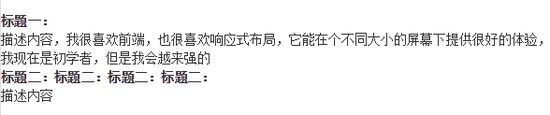
<dl class="dl-horizontal">
<dt>标题一:</dt>
<dd>描述内容,我很喜欢前端,也很喜欢响应式布局,它能在个不同大小的屏幕下提供很好的体验,我现在是初学者,但是我会越来强的</dd>
<dt>标题二:标题二:标题二:标题二:</dt>
<dd>描述内容</dd>
</dl>
在浏览器全屏显示中可以看到效果如下:

我们来把屏幕大小进行改变,在遇到一个临界值时(小屏),水平定义列表将回复到原始的状态,如下改变:
这是为什么呢?我们去看看源码吧!
原来在这里添加了一个媒体查询,只有 屏幕大于768px 的时候,添加类名 .dl-horizontal 才具有水平定义列表效果。其实现主要方式:
将dt设置了一个左浮动,并且设置了一个宽度为160px
将dd设置一个margin-left的值为180px,达到水平的效果
当标题宽度超过160px时,将会显示三个省略号
现在再看看上面的效果是不是和这里的描述都是一样的呢?答案当然是肯定的 ^ ^
6. 代码
在Bootstrap主要提供了三种代码风格:
使用 来显示单行内联代码——针对于 单个单词或单个句子 的代码
使用
直接来看效果吧!
代码如下:(需要注意的是,**不管使用哪种代码风格,在代码中碰到小于号( < )和大于号( > )都需要使用转义字符来替代)
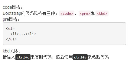
code风格:
<div>Bootstrap的代码风格有三种:<code><code></code>、<code><pre class="brush:php;toolbar:false"></code>和<code><kbd></code></div>
pre风格:
<div>
<pre class="brush:php;toolbar:false">
<ul>
<li>...</li>
</ul>
kbd风格:
<div>请输入<kbd>ctrl+c</kbd>来复制代码,然后使用<kbd>ctrl+v</kbd>来粘贴代码</div>
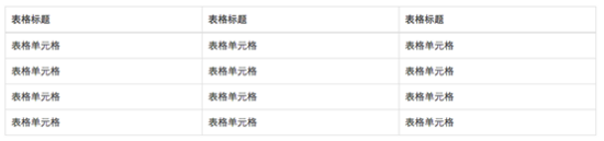
 元素一般用于显示大块的代码,并保证原有格式不变。但有时候代码太多,而且不想让其占有太大的页面篇幅,就想控制代码块的大小。Bootstrap也考虑到这一点,你只需要在 pre标签 上添加类名 .pre-scrollable ,就可以控制代码块区域 最大高度为340px ,一旦超出这个高度,就会在 Y轴(纵向)出现滚动条。</p>
<p>当然,你也可以进行自定义配置,例如:只需要在自定义的css中,对于该类添加一个 word-wrap: normal; ,这样的话,在代码块边框横向宽度小于内部代码横向长度时,就会出现横向滚动条。</p>
<p><span style="color: #0000ff"><strong>7. 表格</strong></span></p>
<p>表格是Bootstrap的一个基础组件之一,Bootstrap为表格提供了 1种基础样式 和 4种附加样式 以及 1个支持响应式的表格 。</p>
<p>对应上面所说的,Bootstrap为表格不同的样式风格提供了不同的类名,主要包括:</p>
<p>.table 基础表格<br />
.table-striped 斑马线表格<br />
.table-bordered 带边框的表格<br />
.table-hover 鼠标悬停高亮的表格<br />
.table-condensed 紧凑型表格<br />
.table-responsive 响应式表格</p>
<p>.table 主要有三个作用:</p>
<p>给表格设置了margin-bottom:20px以及设置单元内距<br />
在thead底部设置了一个2px的浅灰实线<br />
每个单元格顶部设置了一个1px的浅灰实线<br />
具体大家可以在源码中查看,后几种附加的样式在这里也不多说,但是下面说一些 注意事项:</p>
<p>后几种表格附加样式,必须在基础样式 .table 之后,例如 <table class="table table-bordered table-hover"><br />
响应式表格:其原理是在表格 外部添加容器 把普通表格 包裹 起来,下面进行详细说明:</p>
<div class="jb51code">
<div class="code" style="position:relative; padding:0px; margin:0px;"><pre class='brush:php;toolbar:false;'>
<div class="table-responsive"><!-- 关键!容器包裹后实现响应式 -->
<table class="table table-bordered"><!-- 设置表格样式,带边框的表格 -->
<thead><!-- 一个表格应该有表头,若直接写tr>td这样的结构,浏览器会自动创建一个tbody包裹 -->
</thead>
<tbody><!--与上同理,即使你不创建,浏览器也会自动添加tbody包裹你的代码 -->
</tbody>
</table>
</div>
下面是寬螢幕的效果(和普通的表格無差別):
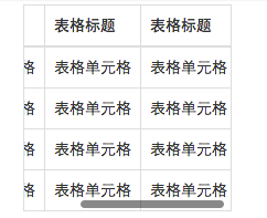
此處是窄螢幕的效果(可以看到滾動條的出現):
表格行的類,表格情境
在上面已經說到了在Bootstrap中,為不同的情景做了不一樣的顏色,用於不同的資訊展示。只是在類別名稱上做了一些小小的改變。下面就可以看到:

只需要在
除此之外,透過原始碼可以看到,在這些顏色設定之外,Bootstrap還單獨設定了 hover效果(懸浮狀態) 的 顏色加深 效果(它對於不同的情況單獨進行了顏色設定)。
實作也特別簡單,只需要像


