

loading 动画效果(收藏起来以后留着慢慢用)_html/css_WEB-ITnose

动画效果一:
html代码:
CSS代码:
.spinner {
margin : 100px auto ;
width : 50px ;
height : 60px ;
text-align : center ;
font-size : 10px ;
}
.spinner > div {
background-color : #67CF22 ;
height : 100% ;
width : 6px ;
display : inline- block ;
-webkit-animation: stretchdelay 1.2 s infinite ease-in-out;
animation: stretchdelay 1.2 s infinite ease-in-out;
}
.spinner .rect 2 {
-webkit-animation-delay: -1.1 s;
animation-delay: -1.1 s;
}
.spinner .rect 3 {
-webkit-animation-delay: -1.0 s;
animation-delay: -1.0 s;
}
.spinner .rect 4 {
-webkit-animation-delay: -0.9 s;
animation-delay: -0.9 s;
}
.spinner .rect 5 {
-webkit-animation-delay: -0.8 s;
animation-delay: -0.8 s;
}
@-webkit-keyframes stretchdelay {
0% , 40% , 100% { -webkit-transform: scaleY( 0.4 ) }
20% { -webkit-transform: scaleY( 1.0 ) }
}
@keyframes stretchdelay {
0% , 40% , 100% {
transform: scaleY( 0.4 );
-webkit-transform: scaleY( 0.4 );
} 20% {
transform: scaleY( 1.0 );
-webkit-transform: scaleY( 1.0 );
}
}
动画效果二:
HTML代码:
CSS代码:
.spinner {
width : 60px ;
height : 60px ;
background-color : #67CF22 ;
margin : 100px auto ;
-webkit-animation: rotateplane 1.2 s infinite ease-in-out;
animation: rotateplane 1.2 s infinite ease-in-out;
}
@-webkit-keyframes rotateplane {
0% { -webkit-transform: perspective( 120px ) }
50% { -webkit-transform: perspective( 120px ) rotateY( 180 deg) }
100% { -webkit-transform: perspective( 120px ) rotateY( 180 deg) rotateX( 180 deg) }
}
@keyframes rotateplane {
0% {
transform: perspective( 120px ) rotateX( 0 deg) rotateY( 0 deg);
-webkit-transform: perspective( 120px ) rotateX( 0 deg) rotateY( 0 deg)
} 50% {
transform: perspective( 120px ) rotateX( -180.1 deg) rotateY( 0 deg);
-webkit-transform: perspective( 120px ) rotateX( -180.1 deg) rotateY( 0 deg)
} 100% {
transform: perspective( 120px ) rotateX( -180 deg) rotateY( -179.9 deg);
-webkit-transform: perspective( 120px ) rotateX( -180 deg) rotateY( -179.9 deg);
}
}
动画效果三:
HTML代码:
CSS代码:
.spinner {
width : 60px ;
height : 60px ;
position : relative ;
margin : 100px auto ;
}
.double-bounce 1 , .double-bounce 2 {
width : 100% ;
height : 100% ;
border-radius: 50% ;
background-color : #67CF22 ;
opacity: 0.6 ;
position : absolute ;
top : 0 ;
left : 0 ;
-webkit-animation: bounce 2.0 s infinite ease-in-out;
animation: bounce 2.0 s infinite ease-in-out;
}
.double-bounce 2 {
-webkit-animation-delay: -1.0 s;
animation-delay: -1.0 s;
}
@-webkit-keyframes bounce {
0% , 100% { -webkit-transform: scale( 0.0 ) }
50% { -webkit-transform: scale( 1.0 ) }
}
@keyframes bounce {
0% , 100% {
transform: scale( 0.0 );
-webkit-transform: scale( 0.0 );
} 50% {
transform: scale( 1.0 );
-webkit-transform: scale( 1.0 );
}
}
动画效果四:
HTML代码:
CSS代码:
.spinner {
margin : 100px auto ;
width : 32px ;
height : 32px ;
position : relative ;
}
.cube 1 , .cube 2 {
background-color : #67CF22 ;
width : 30px ;
height : 30px ;
position : absolute ;
top : 0 ;
left : 0 ;
-webkit-animation: cubemove 1.8 s infinite ease-in-out;
animation: cubemove 1.8 s infinite ease-in-out;
}
.cube 2 {
-webkit-animation-delay: -0.9 s;
animation-delay: -0.9 s;
}
@-webkit-keyframes cubemove {
25% { -webkit-transform: translateX( 42px ) rotate( -90 deg) scale( 0.5 ) }
50% { -webkit-transform: translateX( 42px ) translateY( 42px ) rotate( -180 deg) }
75% { -webkit-transform: translateX( 0px ) translateY( 42px ) rotate( -270 deg) scale( 0.5 ) }
100% { -webkit-transform: rotate( -360 deg) }
}
@keyframes cubemove {
25% {
transform: translateX( 42px ) rotate( -90 deg) scale( 0.5 );
-webkit-transform: translateX( 42px ) rotate( -90 deg) scale( 0.5 );
} 50% {
transform: translateX( 42px ) translateY( 42px ) rotate( -179 deg);
-webkit-transform: translateX( 42px ) translateY( 42px ) rotate( -179 deg);
} 50.1% {
transform: translateX( 42px ) translateY( 42px ) rotate( -180 deg);
-webkit-transform: translateX( 42px ) translateY( 42px ) rotate( -180 deg);
} 75% {
transform: translateX( 0px ) translateY( 42px ) rotate( -270 deg) scale( 0.5 );
-webkit-transform: translateX( 0px ) translateY( 42px ) rotate( -270 deg) scale( 0.5 );
} 100% {
transform: rotate( -360 deg);
-webkit-transform: rotate( -360 deg);
}
}
动画效果五:
HTML代码:
CSS代码:
.spinner {
margin : 100px auto ;
width : 90px ;
height : 90px ;
position : relative ;
text-align : center ;
-webkit-animation: rotate 2.0 s infinite linear;
animation: rotate 2.0 s infinite linear;
}
.dot 1 , .dot 2 {
width : 60% ;
height : 60% ;
display : inline- block ;
position : absolute ;
top : 0 ;
background-color : #67CF22 ;
border-radius: 100% ;
-webkit-animation: bounce 2.0 s infinite ease-in-out;
animation: bounce 2.0 s infinite ease-in-out;
}
.dot 2 {
top : auto ;
bottom : 0px ;
-webkit-animation-delay: -1.0 s;
animation-delay: -1.0 s;
}
@-webkit-keyframes rotate { 100% { -webkit-transform: rotate( 360 deg) }}
@keyframes rotate { 100% { transform: rotate( 360 deg); -webkit-transform: rotate( 360 deg) }}
@-webkit-keyframes bounce {
0% , 100% { -webkit-transform: scale( 0.0 ) }
50% { -webkit-transform: scale( 1.0 ) }
}
@keyframes bounce {
0% , 100% {
transform: scale( 0.0 );
-webkit-transform: scale( 0.0 );
} 50% {
transform: scale( 1.0 );
-webkit-transform: scale( 1.0 );
}
}
动画效果六:
HTML代码:
CSS代码:
.spinner {
margin : 100px auto 0 ;
width : 150px ;
text-align : center ;
}
.spinner > div {
width : 30px ;
height : 30px ;
background-color : #67CF22 ;
border-radius: 100% ;
display : inline- block ;
-webkit-animation: bouncedelay 1.4 s infinite ease-in-out;
animation: bouncedelay 1.4 s infinite ease-in-out;
/* Prevent first frame from flickering when animation starts */
-webkit-animation-fill-mode: both ;
animation-fill-mode: both ;
}
.spinner .bounce 1 {
-webkit-animation-delay: -0.32 s;
animation-delay: -0.32 s;
}
.spinner .bounce 2 {
-webkit-animation-delay: -0.16 s;
animation-delay: -0.16 s;
}
@-webkit-keyframes bouncedelay {
0% , 80% , 100% { -webkit-transform: scale( 0.0 ) }
40% { -webkit-transform: scale( 1.0 ) }
}
@keyframes bouncedelay {
0% , 80% , 100% {
transform: scale( 0.0 );
-webkit-transform: scale( 0.0 );
} 40% {
transform: scale( 1.0 );
-webkit-transform: scale( 1.0 );
}
}
动画效果七:
HTML代码:
CSS代码:
.spinner {
width : 40px ;
height : 40px ;
margin : 100px auto ;
background-color : #333 ;
border-radius: 100% ;
-webkit-animation: scaleout 1.0 s infinite ease-in-out;
animation: scaleout 1.0 s infinite ease-in-out;
}
@-webkit-keyframes scaleout {
0% { -webkit-transform: scale( 0.0 ) }
100% {
-webkit-transform: scale( 1.0 );
opacity: 0 ;
}
}
@keyframes scaleout {
0% {
transform: scale( 0.0 );
-webkit-transform: scale( 0.0 );
} 100% {
transform: scale( 1.0 );
-webkit-transform: scale( 1.0 );
opacity: 0 ;
}
}
动画效果八:
HTML代码:
CSS代码:
.spinner {
margin : 100px auto ;
width : 20px ;
height : 20px ;
position : relative ;
}
.container 1 > div, .container 2 > div, .container 3 > div {
width : 6px ;
height : 6px ;
background-color : #333 ;
border-radius: 100% ;
position : absolute ;
-webkit-animation: bouncedelay 1.2 s infinite ease-in-out;
animation: bouncedelay 1.2 s infinite ease-in-out;
-webkit-animation-fill-mode: both ;
animation-fill-mode: both ;
}
.spinner .spinner-container {
position : absolute ;
width : 100% ;
height : 100% ;
}
.container 2 {
-webkit-transform: rotateZ( 45 deg);
transform: rotateZ( 45 deg);
}
.container 3 {
-webkit-transform: rotateZ( 90 deg);
transform: rotateZ( 90 deg);
}
.circle 1 { top : 0 ; left : 0 ; }
.circle 2 { top : 0 ; right : 0 ; }
.circle 3 { right : 0 ; bottom : 0 ; }
.circle 4 { left : 0 ; bottom : 0 ; }
.container 2 .circle 1 {
-webkit-animation-delay: -1.1 s;
animation-delay: -1.1 s;
}
.container 3 .circle 1 {
-webkit-animation-delay: -1.0 s;
animation-delay: -1.0 s;
}
.container 1 .circle 2 {
-webkit-animation-delay: -0.9 s;
animation-delay: -0.9 s;
}
.container 2 .circle 2 {
-webkit-animation-delay: -0.8 s;
animation-delay: -0.8 s;
}
.container 3 .circle 2 {
-webkit-animation-delay: -0.7 s;
animation-delay: -0.7 s;
}
.container 1 .circle 3 {
-webkit-animation-delay: -0.6 s;
animation-delay: -0.6 s;
}
.container 2 .circle 3 {
-webkit-animation-delay: -0.5 s;
animation-delay: -0.5 s;
}
.container 3 .circle 3 {
-webkit-animation-delay: -0.4 s;
animation-delay: -0.4 s;
}
.container 1 .circle 4 {
-webkit-animation-delay: -0.3 s;
animation-delay: -0.3 s;
}
.container 2 .circle 4 {
-webkit-animation-delay: -0.2 s;
animation-delay: -0.2 s;
}
.container 3 .circle 4 {
-webkit-animation-delay: -0.1 s;
animation-delay: -0.1 s;
}
@-webkit-keyframes bouncedelay {
0% , 80% , 100% { -webkit-transform: scale( 0.0 ) }
40% { -webkit-transform: scale( 1.0 ) }
}
@keyframes bouncedelay {
0% , 80% , 100% {
transform: scale( 0.0 );
-webkit-transform: scale( 0.0 );
} 40% {
transform: scale( 1.0 );
-webkit-transform: scale( 1.0 );
}
}

熱AI工具

Undresser.AI Undress
人工智慧驅動的應用程序,用於創建逼真的裸體照片

AI Clothes Remover
用於從照片中去除衣服的線上人工智慧工具。

Undress AI Tool
免費脫衣圖片

Clothoff.io
AI脫衣器

Video Face Swap
使用我們完全免費的人工智慧換臉工具,輕鬆在任何影片中換臉!

熱門文章
熱工具

記事本++7.3.1
好用且免費的程式碼編輯器

SublimeText3漢化版
中文版,非常好用

禪工作室 13.0.1
強大的PHP整合開發環境

Dreamweaver CS6
視覺化網頁開發工具

SublimeText3 Mac版
神級程式碼編輯軟體(SublimeText3)


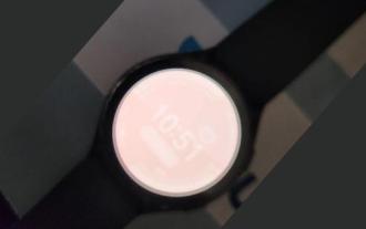 用戶遭遇罕見故障 三星 Watch 智慧手錶突現白螢幕問題
Apr 03, 2024 am 08:13 AM
用戶遭遇罕見故障 三星 Watch 智慧手錶突現白螢幕問題
Apr 03, 2024 am 08:13 AM
你可能遇到過智慧型手機螢幕出現綠色線條的問題,即使沒看過,也一定在網路上看過相關圖片。那麼,智慧手錶螢幕變白的情況你有遇見過嗎? 4月2日,CNMO從外媒了解到,一名Reddit用戶在社群平台上分享了一張圖片,展示了三星Watch系列智慧手錶螢幕變白的情況。該用戶寫道:"我離開時正在充電,回來時就這樣了,我嘗試重啟,但重啟過程中屏幕還是這樣。"三星Watch智能手錶屏幕變白這位Reddit用戶並未指明這款智能手錶的具體型號。不過,從圖片上看,應該是三星Watch5。此前,另一位Reddit用戶也報告
![動畫不工作在PowerPoint中[修復]](https://img.php.cn/upload/article/000/887/227/170831232982910.jpg?x-oss-process=image/resize,m_fill,h_207,w_330) 動畫不工作在PowerPoint中[修復]
Feb 19, 2024 am 11:12 AM
動畫不工作在PowerPoint中[修復]
Feb 19, 2024 am 11:12 AM
您是否正在嘗試製作演示文稿,但無法添加動畫?如果動畫在你的WindowsPC上的PowerPoint中不起作用,那麼這篇文章將會幫助你。這是一個常見的問題,許多人都在抱怨。例如,在Microsoft團隊中演示或在螢幕錄製期間,動畫可能會停止運作。在本指南中,我們將探索各種故障排除技術,以協助您修復在Windows上的PowerPoint中無法運作的動畫。為什麼我的PowerPoint動畫不起作用?我們注意到Windows上PowerPoint中的動畫可能無法運作問題的一些可能原因如下:由於個
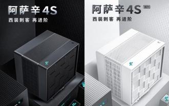 九州風神阿薩辛 4S 散熱器評測 風冷「刺客大師」範兒
Mar 28, 2024 am 11:11 AM
九州風神阿薩辛 4S 散熱器評測 風冷「刺客大師」範兒
Mar 28, 2024 am 11:11 AM
說起阿薩辛ASSASSIN,相信玩家們一定會想到《刺客信條》中的各位刺客大師,不僅身手了得,而且"躬身於黑暗、服務於光明"的信條,與國內知名機箱/電源/散熱器品牌九州風神(DeepCool)旗下的阿薩辛ASSASSIN系列旗艦級風冷散熱器不謀而合。最近,該系列的最新產品阿薩辛ASSASSIN4S重磅上線,"西裝刺客,再進階"為高級玩家帶來全新的風冷散熱體驗。外觀一覽細節滿滿阿薩辛4S散熱器採用雙塔構造+單風扇內嵌設計,外麵包覆立方體造型的整流罩,整體感極強,並提供白、黑兩種配色可選,滿足不同色系
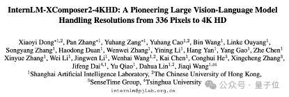 輕鬆拿捏 4K 高畫質影像理解!這個多模態大模型自動分析網頁海報內容,打工人簡直不要太方便
Apr 23, 2024 am 08:04 AM
輕鬆拿捏 4K 高畫質影像理解!這個多模態大模型自動分析網頁海報內容,打工人簡直不要太方便
Apr 23, 2024 am 08:04 AM
一個可以自動分析PDF、網頁、海報、Excel圖表內容的大模型,對於打工人來說簡直不要太方便。上海AILab,香港中文大學等研究機構提出的InternLM-XComposer2-4KHD(簡寫為IXC2-4KHD)模型讓這一切成為了現實。相較於其他多模態大模型不超過1500x1500的分辨率限制,該工作將多模態大模型的最大輸入影像提升到超過4K(3840x1600)分辨率,並支援任意長寬比和336像素~4K動態解析度變化。發布三天,模型就登頂HuggingFace視覺問答模型熱度排行榜第一。輕鬆拿捏
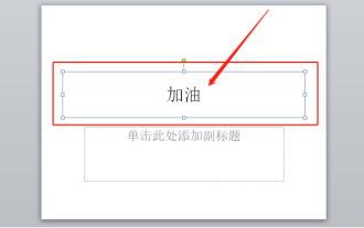 ppt動畫如何設定先進入再退出
Mar 20, 2024 am 09:30 AM
ppt動畫如何設定先進入再退出
Mar 20, 2024 am 09:30 AM
我們在日常的辦公中常常會使用到ppt,那麼你是否對ppt裡邊的每個操作功能都很了解呢?例如:ppt中怎麼設定動畫效果、怎麼設定切換效果、每個動畫的效果長度是多少?每個投影片能不能自動播放、ppt動畫先進入再退出等等,那麼今天這期我就先跟大家分享ppt動畫先進入再退出的具體操作步驟,就在下方,小伙伴們快來看一看吧! 1.首先,我們在電腦中開啟ppt,點選文字方塊外側選取文字框,(如下圖紅色圈出部分所示)。 2.然後,點選選單列中的【動畫】,選取【擦除】的效果,(如圖紅色圈出部分所示)。 3.接下來,點擊【
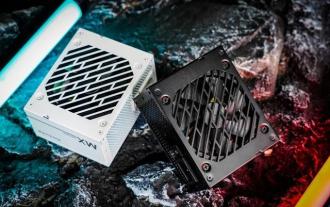 航空嘉 MX750P 全模組電源評測:750W 的白金實力濃縮
Mar 28, 2024 pm 03:20 PM
航空嘉 MX750P 全模組電源評測:750W 的白金實力濃縮
Mar 28, 2024 pm 03:20 PM
ITX平台以小巧的身形吸引了許多追求極致和獨特美感的玩家,隨著製程的提升和技術的進步,英特爾第14代酷睿和RTX40系顯卡都可以在ITX平台中發揮實力,遊戲玩家也對SFX電源有了更高的要求。遊戲愛好者航空嘉推出新的MX系列電源,在滿足高效能需求的ITX平台中,MX750P全模組電源的定額功率高達750W,同時通過了80PLUS白金級認證。以下我們就帶來這款電源的評測。航嘉MX750P全模組電源採用了簡約時尚的設計理念,共有黑白兩款供玩家選擇,均採用磨砂表面處理,搭配銀灰色和紅色的字體有很好的質感,
 跳票 2 年,國產 3D 動畫電影《二郎神之深海蛟龍》定檔 7 月 13 日
Jan 26, 2024 am 09:42 AM
跳票 2 年,國產 3D 動畫電影《二郎神之深海蛟龍》定檔 7 月 13 日
Jan 26, 2024 am 09:42 AM
本站1月26日消息,國產3D動畫電影《二郎神之深海蛟龍》發布一組最新劇照,正式宣布將於7月13日上映。據了解,《二郎神之深海蛟龍》是由迷狐星(北京)動漫有限公司、霍爾果斯眾合千澄影業有限公司、浙江橫店影業有限公司、浙江共贏影業有限公司、成都天火科技有限公司、華文映像(北京)影業有限公司出品,王君執導的動畫電影,原定2022年7月22日在中國大陸上映。本站劇情簡介:封神之戰後,姜子牙攜「封神榜」分封諸神,而後封神榜被天庭封印於九州祕境深海之下。事實上,除了分封神位,封神榜中還封緘著眾多強大的妖邪元
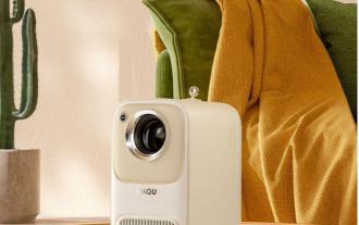 春日裡的精緻光影藝術,哈趣 H2 性價比之選
Apr 17, 2024 pm 05:07 PM
春日裡的精緻光影藝術,哈趣 H2 性價比之選
Apr 17, 2024 pm 05:07 PM
隨著春天的到來,萬物復甦,一切都充滿了生命與活力。在這個美好的季節裡,如何為居家生活增添一抹別樣的色彩?哈趣H2投影儀,以其精緻的設計和超高的性價比,成為了這個春天裡不可或缺的一道亮麗風景。這款H2投影機小巧玲瓏卻不失時尚。無論是放在客廳的電視櫃上,或是臥室的床頭櫃旁,都能成為一道明亮的風景線。它的機身採用了奶白色的磨砂質地,這種設計不僅讓投影機的外觀更顯高級,同時也增加了觸感的舒適度。米色仿皮紋材質,更為整體外觀增添了一抹溫馨與雅緻。這種色彩與材質的搭配,既符合現代家居的美感趨勢,又能融入
