

HTML5/CSS3專題 3D展示商品資訊的經典案例

強化下perspective和transform:translateZ的用法。傳統的商品展示或許並不能很好的吸引用戶的注意力,但是如果在展示中添加適當的3D元素,~說不定效果不錯哈~
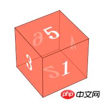
效果圖:
#說明:這個創意不是我想的,哈~模仿別人的,創意應該是w3cplus上的。當然了,重點是教大家如何做,就當高仿了~
首先,先教大家利用CSS3製作一個立方體:
<body>


<p class="wapper">
    <p class="cube">
        <p class="side  front">1</p>
        <p class="side   back">6</p>
        <p class="side  right">4</p>
        <p class="side   left">3</p>
        <p class="side    top">5</p>
        <p class="side bottom">2</p>
    </p>
</p>

</body>
登入後複製
wapper為此效果的舞台,即設定perspective的元素,如果多個元素共享一個舞台,那麼從一個視線觀察所以的元素的效果是不一樣的,就相當我們正常情況下,站在一排傾斜成45度的門前面,每個門對我們視線來說,角度是不同的;p#cube代表一個立方體,然後6個p分別代表每個面。
p#cube設定transform-style:preserve-3d,然後每個元素設定rotate和translateZ
font往前即Z軸方向移動半個邊長(translateZ(50px))的距離即50px;back先繞Y軸旋轉180度,這樣讓字體是對外的,然後translateZ (50px),因為此時已經旋轉了180度,所以tanslateZ是向下的,#同理,其他面分別繞X軸或Y軸旋轉90度,然後translateZ(50px)
CSS:
 .wapper
        {
            margin: 100px auto 0;
            width: 100px;
            height: 100px;
            -webkit-perspective: 1200px;
            font-size: 50px;
            font-weight: bold;
            color: #fff;
        }

        .cube
        {

            position: relative;
            width: 100px;
            -webkit-transform: rotateX(-40deg) rotateY(32deg);
            -webkit-transform-style: preserve-3d;
        }

        .side
        {
            text-align: center;
            line-height: 100px;
            width: 100px;
            height: 100px;
            background: rgba(255, 99, 71, 0.6);
            border: 1px solid rgba(0, 0, 0, 0.5);
            position: absolute;
        }

        .front
        {
            -webkit-transform: translateZ(50px);
        }

        .top
        {
            -webkit-transform: rotateX(90deg) translateZ(50px);
        }

        .right
        {
            -webkit-transform: rotateY(90deg) translateZ(50px);
        }

        .left
        {
            -webkit-transform: rotateY(-90deg) translateZ(50px);
        }

        .bottom
        {
            -webkit-transform: rotateX(-90deg) translateZ(50px);
        }

        .back
        {
            -webkit-transform: rotateY(-180deg) translateZ(50px);
        }
登入後複製
對於顯示效果,可以調節perspective的距離~
好了,立方體理解了,那麼這個商品展示就沒什麼難度了;兩個p分別代表兩個面,一個是圖片,一個是介紹,初始時,介紹繞X軸先旋轉90deg,然後當滑鼠移動時,將整個盒子繞x軸旋轉90deg即可。
###HTML:###<!DOCTYPE html>
<html>
<head>
<title></title>
<meta charset="utf-8">
<link href="css/reset.css" rel="stylesheet" type="text/css">
</head>
<body>
<ul id="content">
<li>
<p class="wrapper">
<img src="images/a.png">
<span class="information">
<strong>Contact Form</strong> The easiest way to add a contact form to your shop.
</span>
</p>
</li>
<li>
<p class="wrapper">
<img src="images/b.jpeg">
<span class="information">
<strong>Contact Form</strong> The easiest way to add a contact form to your shop.
</span>
</p>
</li>
<li>
<p class="wrapper">
<img src="images/c.png">
<span class="information">
<strong>Contact Form</strong> The easiest way to add a contact form to your shop.
</span>
</p>
</li>
</ul>
</body>
</html>登入後複製
<style type="text/css">
        body
        {
            font-family: Tahoma, Arial;
        }

        #content
        {
            margin: 100px auto 0;
        }

        #content li, #content .wrapper, #content li img, #content li span
        {
            width: 310px;
            height: 100px;
        }

        #content li
        {
            cursor: pointer;
            -webkit-perspective: 4000px;
            width: 310px;
            height: 100px;
            float: left;
            margin-left: 60px;
            /*box-shadow: 2px 2px 5px #888888;*/

        }

        #content .wrapper
        {
            position: relative;
            -webkit-transform-style: preserve-3d;
            -webkit-transition: -webkit-transform .6s;
        }

        #content li img
        {
            top: 0;
            border-radius: 3px;
            box-shadow: 0px 3px 8px rgba(0, 0, 0, 0.3);
            position: absolute;
            -webkit-transform: translateZ(50px);
            -webkit-transition: all .6s;
        }

        #content  li span
        {
            background: -webkit-gradient(linear, left top, left bottom, color-stop(0%, rgba(236, 241, 244, 1)), color-stop(100%, rgba(190, 202, 217, 1)));
            text-shadow: 1px 1px 1px rgba(255, 255, 255, 0.5);
            position: absolute;
            -webkit-transform: rotateX(-90deg) translateZ(50px);
            -webkit-transition: all .6s;
            display: block;
            top: 0;
            text-align: left;
            border-radius: 15px;
            font-size: 12px;
            padding: 10px;
            width: 290px;
            height: 80px;
            text-shadow: 1px 1px 1px rgba(255, 255, 255, 0.5);
            box-shadow: none;
        }

        #content li span strong
        {
            display: block;
            margin: .2em 0 .5em 0;
            font-size: 20px;
            font-family: "Oleo Script";
        }

        #content li:hover .wrapper
        {
            -webkit-transform: rotateX(95deg);
        }

        #content li:hover img
        {
            box-shadow: none;
            border-radius: 15px;
        }

        #content li:hover span
        {
            box-shadow: 0px 3px 8px rgba(0, 0, 0, 0.3);
            border-radius: 3px;
        }


    </style>
登入後複製
以上是HTML5/CSS3專題 3D展示商品資訊的經典案例的詳細內容。更多資訊請關注PHP中文網其他相關文章!
本網站聲明
本文內容由網友自願投稿,版權歸原作者所有。本站不承擔相應的法律責任。如發現涉嫌抄襲或侵權的內容,請聯絡admin@php.cn

熱AI工具

Undresser.AI Undress
人工智慧驅動的應用程序,用於創建逼真的裸體照片

AI Clothes Remover
用於從照片中去除衣服的線上人工智慧工具。

Undress AI Tool
免費脫衣圖片

Clothoff.io
AI脫衣器

Video Face Swap
使用我們完全免費的人工智慧換臉工具,輕鬆在任何影片中換臉!

熱門文章
<🎜>:種植花園 - 完整的突變指南
3 週前
By DDD
<🎜>:泡泡膠模擬器無窮大 - 如何獲取和使用皇家鑰匙
3 週前
By 尊渡假赌尊渡假赌尊渡假赌
如何修復KB5055612無法在Windows 10中安裝?
3 週前
By DDD
北端:融合系統,解釋
3 週前
By 尊渡假赌尊渡假赌尊渡假赌
藍王子:如何到達地下室
1 個月前
By DDD
熱工具

記事本++7.3.1
好用且免費的程式碼編輯器

SublimeText3漢化版
中文版,非常好用

禪工作室 13.0.1
強大的PHP整合開發環境

Dreamweaver CS6
視覺化網頁開發工具

SublimeText3 Mac版
神級程式碼編輯軟體(SublimeText3)


