

CSS實作Tab佈局實例展示
下面小編就為大家帶來一個CSS實作Tab佈局的簡單實例(必看)。小編覺得蠻不錯的,現在就分享給大家,也給大家做個參考。一起跟著小編過來看看吧
一、佈局方式
1、內容與tab分離
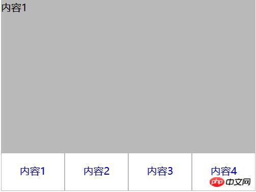
<p class="container">
   <p class="tab-content">
     <p id="item1" class="item">内容1</p>
     <p id="item2" class="item">内容2</p>
     <p id="item3" class="item">内容3</p>
     <p id="item4" class="item">内容4</p>
   </p>
   <p class="tab-control">
     <ul>
        <li><a href="#item1">内容1</a></li>
        <li><a href="#item2">内容2</a></li>
        <li><a href="#item3">内容3</a></li>
        <li><a href="#item4">内容4</a></li>
     </ul>
   </p>
</p>
ul,li{
  margin:0;
  padding:0;
  list-style:none;
}
.container{
  width:400px;
  height:300px;
  background-color:silver;
}
.tab-content{
  width:100%;
  height:80%;
  overflow:hidden;
}
.tab-content .item{
  width:100%;
  height:100%;
}
.tab-control{
  width:100%;
  height:20%;
}
.tab-control ul{
  height:100%;
}
.tab-control li{
  width:25%;
  height:100%;
  float:left;
  border:1px solid silver;
  box-sizing:border-box;
  background-color:white;
  cursor: pointer;
}
.tab-control li:hover{
  background-color:#7b7474
}
.tab-control a{
  display:inline-block;
  width:100%;
  height:100%;
  line-height:100%;
  text-align:center;
  text-decoration: none;
}
.tab-control a::after{
  content:"";
  display:inline-block;
  height:100%;
  vertical-align:middle;
}
.tab-content .item:target{
  background:yellow;
}
#2、內容與tab一體
<p class="container">
   <ul>
     <li class="item active">
       <p class="title">1</p>
       <p class="content">1</p>
     </li>
     <li class="item">
       <p class="title">2</p>
       <p class="content ml1">2</p>
     </li>
     <li class="item">
       <p class="title">3</p>
       <p class="content ml2">3</p>
     </li>
     <li class="item">
       <p class="title">4</p>
       <p class="content ml3">4</p>
     </li>
   </ul>
</p>
ul,li,p{
  margin:0;
  padding:0;
  list-style:none;
}
.container{
  width:400px;
  height:300px;
  background-color:silver;
  border:1px solid silver;
}
.container ul{
  width:100%;
  height:100%;
  overflow:hidden;
}
.container .item{
  float:left;
  width:25%;
  height:100%;
  background-color:white;
}
.container .item .title{
  line-height:40px;
  border:1px solid silver;
  box-sizing:border-box;
  text-align:center;
  cursor:pointer;
}
.container .item .content{
  width:400%;
  height:100%;
  background-color:yellow;
}
.ml1{
  margin-left:-100%;
}
.ml2{
  margin-left:-200%;
}
.ml3{
  margin-left:-300%;
}
.active{
  position:relative;
  z-index:1
}
.container .item:hover{
  position:relative;
  z-index:1
}
.container .item:hover .title{
  border-bottom:none;
  background-color:yellow;
}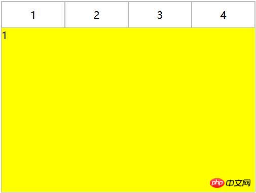
利用負margin,將內容區對齊,然後內容去加入背景色,避免不同tab對應的區域透視重疊。
二、CSS實作互動
#1、錨點實作(target)
#(1)針對佈局一:item從上往下排列,父元素tab-content加上overflow:hidden。利用錨點,點選不同a標籤的時候,有對應ID的item會切換到tab-content的視圖中,然後利用hover為tab按鈕加上切換樣式。
<p class="container">
   <p class="tab-content">
     <p id="item1" class="item">内容1</p>
     <p id="item2" class="item">内容2</p>
     <p id="item3" class="item">内容3</p>
     <p id="item4" class="item">内容4</p>
   </p>
   <p class="tab-control">
     <ul>
        <li><a href="#item1">内容1</a></li>
        <li><a href="#item2">内容2</a></li>
        <li><a href="#item3">内容3</a></li>
        <li><a href="#item4">内容4</a></li>
     </ul>
   </p>
</p>
ul,li{
  margin:0;
  padding:0;
  list-style:none;
}
.container{
  width:400px;
  height:300px;
  background-color:silver;
}
.tab-content{
  width:100%;
  height:80%;
  overflow:hidden;
}
.tab-content .item{
  width:100%;
  height:100%;
}
.tab-control{
  width:100%;
  height:20%;
}
.tab-control ul{
  height:100%;
}
.tab-control li{
  width:25%;
  height:100%;
  float:left;
  border:1px solid silver;
  box-sizing:border-box;
  background-color:white;
  cursor: pointer;
}
.tab-control li:hover{
  background-color:#7b7474
}
.tab-control a{
  display:inline-block;
  width:100%;
  height:100%;
  line-height:100%;
  text-align:center;
  text-decoration: none;
}
.tab-control a::after{
  content:"";
  display:inline-block;
  height:100%;
  vertical-align:middle;
}上述方法只是利用了錨點切換,沒有使用: target。修改CSS
ul,li{
  margin:0;
  padding:0;
  list-style:none;
}
.container{
  width:400px;
  height:300px;
  background-color:silver;
}
.tab-content{
  position:relative;
  width:100%;
  height:80%;
  overflow:hidden;
}
.tab-content .item{
  position:absolute;
  left:0;
  top:0;
  width:100%;
  height:100%;
}
.tab-control{
  width:100%;
  height:20%;
}
.tab-control ul{
  height:100%;
}
.tab-control li{
  width:25%;
  height:100%;
  float:left;
  border:1px solid silver;
  box-sizing:border-box;
  background-color:white;
  cursor: pointer;
}
.tab-control li:hover{
  background-color:#7b7474
}
.tab-control a{
  display:inline-block;
  width:100%;
  height:100%;
  line-height:100%;
  text-align:center;
  text-decoration: none;
}
.tab-control a::after{
  content:"";
  display:inline-block;
  height:100%;
  vertical-align:middle;
}

.tab-content .item:target{
  z-index:1;
  background-color:yellow;
}item使用絕對定位,然後使用:target修改元素z-index達到切換效果(其實也可以透過控制元素的display來達到切換效果)
(2)針對佈局二:
#
##
<p class="container">
   <ul>
     <li class="item active" id="item1">
       <p class="title"><a href="#item1">1</a></p>
       <p class="content">1</p>
     </li>
     <li class="item" id="item2">
       <p class="title"><a href="#item2">2</a></p>
       <p class="content ml1">2</p>
     </li>
     <li class="item" id="item3">
       <p class="title"><a href="#item3">3</a></p>
       <p class="content ml2">3</p>
     </li>
     <li class="item" id="item4">
       <p class="title"><a href="#item4">4</a></p>
       <p class="content ml3">4</p>
     </li>
   </ul>
</p>ul,
li,
p {
margin: 0;
padding: 0;
list-style: none;
}
.container {
width: 400px;
height: 300px;
background-color: silver;
border: 1px solid silver;
}
.container ul {
width: 100%;
height: 100%;
overflow: hidden;
}
.container .item {
float: left;
width: 25%;
height: 100%;
background-color: white;
}
.container .item .title {
line-height: 40px;
border: 1px solid silver;
box-sizing: border-box;
text-align: center;
cursor: pointer;
}
.container .item a {
display:inline-block;
width:100%;
height:100%;
text-decoration: none;
}
.container .item .content {
width: 400%;
height: 100%;
background-color: yellow;
}
.ml1 {
margin-left: -100%;
}
.ml2 {
margin-left: -200%;
}
.ml3 {
margin-left: -300%;
}
.active {
position: relative;
z-index: 1
}
.container .item:target {
position: relative;
z-index: 1
}
.container .item:target .title {
border-bottom: none;
background-color: yellow;
}#2、hover實作
#(1)針對佈局一:
無法簡單的透過CSS實作(2)針對佈局二:
<p class="container">
   <ul>
     <li class="item active">
       <p class="title">1</p>
       <p class="content">1</p>
     </li>
     <li class="item">
       <p class="title">2</p>
       <p class="content ml1">2</p>
     </li>
     <li class="item">
       <p class="title">3</p>
       <p class="content ml2">3</p>
     </li>
     <li class="item">
       <p class="title">4</p>
       <p class="content ml3">4</p>
     </li>
   </ul>
</p>ul,li,p{
margin:0;
padding:0;
list-style:none;
}
.container{
width:400px;
height:300px;
background-color:silver;
border:1px solid silver;
}
.container ul{
width:100%;
height:100%;
overflow:hidden;
}
.container .item{
float:left;
width:25%;
height:100%;
background-color:white;
}
.container .item .title{
line-height:40px;
border:1px solid silver;
box-sizing:border-box;
text-align:center;
cursor:pointer;
}
.container .item .content{
width:400%;
height:100%;
background-color:yellow;
}
.ml1{
margin-left:-100%;
}
.ml2{
margin-left:-200%;
}
.ml3{
margin-left:-300%;
}
.active{
position:relative;
z-index:1
}
.container .item:hover{
position:relative;
z-index:1
}
.container .item:hover .title{
border-bottom:none;
background-color:yellow;
}3、label與:checked實作
(1)針對佈局一:
<p class="container">
  <p class="tab-content">
    <input type="radio" name="item" class="radio-item" id="item1" checked/>
    <p class="item">内容1</p>
    <input type="radio" name="item" class="radio-item" id="item2" />
    <p class="item">内容2</p>
    <input type="radio" name="item" class="radio-item" id="item3" />
    <p class="item">内容3</p>
    <input type="radio" name="item" class="radio-item" id="item4" />
    <p class="item">内容4</p>
  </p>
  <p class="tab-control">
    <ul>
      <li><label for="item1">内容1</label></li>
      <li><label for="item2">内容2</label></li>
      <li><label for="item3">内容3</label></li>
      <li><label for="item4">内容4</label></li>
    </ul>
  </p>
</p>ul,
li {
margin: 0;
padding: 0;
list-style: none;
}
.container {
width: 400px;
height: 300px;
background-color: silver;
}
.tab-content {
position: relative;
width: 100%;
height: 80%;
overflow: hidden;
}
input {
margin: 0;
width: 0;
}
.tab-content .item {
position: absolute;
left: 0;
top: 0;
width: 100%;
height: 100%;
}
.tab-control {
width: 100%;
height: 20%;
}
.tab-control ul {
height: 100%;
}
.tab-control li {
width: 25%;
height: 100%;
float: left;
border: 1px solid silver;
box-sizing: border-box;
background-color: white;
}
.tab-control li:hover {
background-color: #7b7474
}
.tab-control label {
display: inline-block;
width: 100%;
height: 100%;
line-height: 100%;
text-align: center;
text-decoration: none;
cursor: pointer;
}
.tab-control label::after {
content: "";
display: inline-block;
height: 100%;
vertical-align: middle;
}
.tab-content .radio-item{
display:none;
}
.tab-content .radio-item:checked+.item {
z-index: 1;
background-color: yellow;
}(2)針對版面二:
#<p class="container">
<ul>
<li class="item active">
<input type="radio" name="item" class="radio-item" id="item1" checked/>
<label class="title" for="item1">1</label>
<p class="content">1</p>
</li>
<li class="item">
<input type="radio" name="item" class="radio-item" id="item2" />
<label class="title" for="item2">2</label>
<p class="content ml1">2</p>
</li>
<li class="item">
<input type="radio" name="item" class="radio-item" id="item3" />
<label class="title" for="item3">3</label>
<p class="content ml2">3</p>
</li>
<li class="item">
<input type="radio" name="item" class="radio-item" id="item4" />
<label class="title" for="item4">4</label>
<p class="content ml3">4</p>
</li>
</ul>
</p>
#
ul,li,p{
  margin:0;
  padding:0;
  list-style:none;
}
.container{
  width:400px;
  height:300px;
  background-color:silver;
  border:1px solid silver;
}
.container ul{
  width:100%;
  height:100%;
  overflow:hidden;
}
.container .item{
  float:left;
  width:25%;
  height:100%;
  background-color:white;
}
.container .item .title{
  display:inline-block;
  width:100%;
  line-height:40px;
  border:1px solid silver;
  box-sizing:border-box;
  text-align:center;
  cursor:pointer;
}
.container .item .content{
  position:relative;
  width:400%;
  height:100%;
  background-color:yellow;
}
.ml1{
  margin-left:-100%;
}
.ml2{
  margin-left:-200%;
}
.ml3{
  margin-left:-300%;
}
.radio-item{
  display:none;
}
.radio-item:checked~.title{
  background-color:yellow;
  border-bottom:none;
}
.radio-item:checked~.content{
  background-color:yellow;
  z-index:1;
}以上是CSS實作Tab佈局實例展示的詳細內容。更多資訊請關注PHP中文網其他相關文章!

熱AI工具

Undresser.AI Undress
人工智慧驅動的應用程序,用於創建逼真的裸體照片

AI Clothes Remover
用於從照片中去除衣服的線上人工智慧工具。

Undress AI Tool
免費脫衣圖片

Clothoff.io
AI脫衣器

Video Face Swap
使用我們完全免費的人工智慧換臉工具,輕鬆在任何影片中換臉!

熱門文章
熱工具

記事本++7.3.1
好用且免費的程式碼編輯器

SublimeText3漢化版
中文版,非常好用

禪工作室 13.0.1
強大的PHP整合開發環境

Dreamweaver CS6
視覺化網頁開發工具

SublimeText3 Mac版
神級程式碼編輯軟體(SublimeText3)


 vue中怎麼用bootstrap
Apr 07, 2025 pm 11:33 PM
vue中怎麼用bootstrap
Apr 07, 2025 pm 11:33 PM
在 Vue.js 中使用 Bootstrap 分為五個步驟:安裝 Bootstrap。在 main.js 中導入 Bootstrap。直接在模板中使用 Bootstrap 組件。可選:自定義樣式。可選:使用插件。
 了解HTML,CSS和JavaScript:初學者指南
Apr 12, 2025 am 12:02 AM
了解HTML,CSS和JavaScript:初學者指南
Apr 12, 2025 am 12:02 AM
WebDevelovermentReliesonHtml,CSS和JavaScript:1)HTMLStructuresContent,2)CSSStyleSIT和3)JavaScriptAddSstractivity,形成thebasisofmodernWebemodernWebExexperiences。
 HTML,CSS和JavaScript的角色:核心職責
Apr 08, 2025 pm 07:05 PM
HTML,CSS和JavaScript的角色:核心職責
Apr 08, 2025 pm 07:05 PM
HTML定義網頁結構,CSS負責樣式和佈局,JavaScript賦予動態交互。三者在網頁開發中各司其職,共同構建豐富多彩的網站。
 bootstrap怎麼寫分割線
Apr 07, 2025 pm 03:12 PM
bootstrap怎麼寫分割線
Apr 07, 2025 pm 03:12 PM
創建 Bootstrap 分割線有兩種方法:使用 標籤,可創建水平分割線。使用 CSS border 屬性,可創建自定義樣式的分割線。
 bootstrap怎麼插入圖片
Apr 07, 2025 pm 03:30 PM
bootstrap怎麼插入圖片
Apr 07, 2025 pm 03:30 PM
在 Bootstrap 中插入圖片有以下幾種方法:直接插入圖片,使用 HTML 的 img 標籤。使用 Bootstrap 圖像組件,可以提供響應式圖片和更多樣式。設置圖片大小,使用 img-fluid 類可以使圖片自適應。設置邊框,使用 img-bordered 類。設置圓角,使用 img-rounded 類。設置陰影,使用 shadow 類。調整圖片大小和位置,使用 CSS 樣式。使用背景圖片,使用 background-image CSS 屬性。
 bootstrap怎麼設置框架
Apr 07, 2025 pm 03:27 PM
bootstrap怎麼設置框架
Apr 07, 2025 pm 03:27 PM
要設置 Bootstrap 框架,需要按照以下步驟:1. 通過 CDN 引用 Bootstrap 文件;2. 下載文件並將其託管在自己的服務器上;3. 在 HTML 中包含 Bootstrap 文件;4. 根據需要編譯 Sass/Less;5. 導入定製文件(可選)。設置完成後,即可使用 Bootstrap 的網格系統、組件和样式創建響應式網站和應用程序。
 bootstrap按鈕怎麼用
Apr 07, 2025 pm 03:09 PM
bootstrap按鈕怎麼用
Apr 07, 2025 pm 03:09 PM
如何使用 Bootstrap 按鈕?引入 Bootstrap CSS創建按鈕元素並添加 Bootstrap 按鈕類添加按鈕文本
 bootstrap怎麼調整大小
Apr 07, 2025 pm 03:18 PM
bootstrap怎麼調整大小
Apr 07, 2025 pm 03:18 PM
要調整 Bootstrap 中元素大小,可以使用尺寸類,具體包括:調整寬度:.col-、.w-、.mw-調整高度:.h-、.min-h-、.max-h-
