

html實作一個動圖--哆啦A夢

我相信每個人的童年都有一個哆啦a夢,一個小小的肚皮裡裝滿了不可思議的哆啦a夢,一個在你無助傷心的時候陪在你身邊的哆啦a夢,一個陪你胡思亂想陪你吃銅鑼燒的哆啦a夢~今天我們就來畫一個我們心中的哆啦a夢吧~
#定義哆啦a夢的容器
-
千篇一律先定義一個畫哆啦a夢的大容器,確定它的大小和位置。
<!-- 哆啦A梦大容器 --><div class="doa"></div>
/*哆啦A梦*/
  .doa{position: relative;top: 100px;}
登入後複製
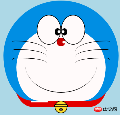
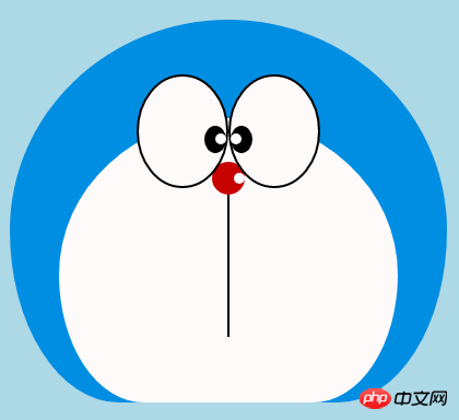
畫哆啦a夢的頭部(包括臉,臉部包括眼睛和鼻子)
頭部包含好幾塊部分:哆啦a夢的臉部和鼻子,臉部又包括兩隻眼睛,兩隻眼睛裡面還有眼珠和眼白部分,所以會有好幾層的dom嵌套,當然基本圖形都是由div+border -radius拼湊而成。
將畫好的各個部位品拼湊到對應的位置上即可。
看我前面畫的幾個圖畫就知道border-radius是一個非常常用的屬性,幾乎div的每一次變形都離不開它,其實border-radius的真面目應該是
border-radius: 300px 300px 300px 300px/300px 300px 300px 300px;醬紫的,我們一般不寫斜線後面的內容,斜線切面是水平長度,斜線切面是水平長度槓後面預設不寫就是水平和垂直大小是一樣的。我知道我這樣說不夠詳細,可以參考我鑫神的博客秋月何時了,CSS3 border-radius知多少? ,保證你分分鐘在老司機的帶領下徹底弄清楚border-radius,還不快上車?<!-- 头 --> <div class="head"> <!-- 存放脸部的容器 --> <div class="face"> <!-- 左眼大圈儿 --> <div> <!-- 左眼眼珠(黑色部分) --> <div> <!-- 左眼眼白,黑色里面的白色部分 --> <div></div> </div> </div> <!-- 右眼大圈儿 --> <div> <!--右眼眼珠(黑色部分) --> <div> <!-- 右眼眼白,黑色里面的白色部分 --> <div></div> </div> </div> </div> <!-- 红鼻子部分 --> <div class="nose"> <!-- 红鼻子里面的白圈儿 --> <div></div> </div> <!-- 红鼻子下面的那根黑线,也属于鼻子部分 --> <div class="nose1"></div> </div> .head{ margin: 0 auto; /*头部定义大小并居中显示*/ width: 400px; height: 350px; background: #008ee3; /*头部定义背景颜色*/ position: relative; border-radius: 50% 50% 25% 25% / 55% 55% 45% 45%; /*头部定义四个方向圆角大小*/ } .face{ width: 310px; /*脸部定义大小*/ height: 260px; background: snow; /*脸部定义背景颜色*/ border-radius: 50% 50% 25% 25% / 55% 55% 45% 45%; /*脸部定义四个方向的圆角大小*/ position: relative; /*脸部定义位置,是相对于head的位置*/ top: 90px; left: 45px; } /*左眼眶*/ .face>div:first-child{ width: 80px; /*左眼框定义大小*/ height: 100px; border-radius: 50%; /*左眼框定义与圆角大小*/ border:2px #000 solid; /*定义外边框*/ background: snow; float: left; /*为了使左右两个眼睛能在一排显示*/ position: relative; /*位置是相对于face的位置*/ top:-40px; left: 71px; z-index: 50; } /*右眼眶,画法跟左眼一样*/ .face>div:last-child{ width: 80px; height: 100px; border-radius: 50%; border:2px #000 solid; background: snow; float: left; position: relative; top:-40px; left: 71px; z-index: 50; } /*左眼珠1*/ .face>div:first-child div{ width: 20px; /*定义眼珠的大小*/ height: 25px; background: #000; border-radius: 50%; position: absolute; /*定义眼珠的位置,相对于眼眶的位置*/ top: 45px; left: 60px; } /*左瞳孔*/ .face>div:first-child div div{ width: 10px; /*定义黑色瞳孔的大小*/ height: 10px; background: #ffffff; border-radius: 50%; position: absolute; /*定义黑色瞳孔的位置,相对于眼珠的位置*/ top: 7px; left: 10px; } /*右眼珠和左眼珠画法一样*/ .face>div:last-child div{ width: 20px; height: 25px; background: #000; border-radius: 50%; position: absolute; top: 45px; } /*右瞳孔和左瞳孔的画法一样*/ .face>div:last-child div div{ width: 10px; height: 10px; background: #ffffff; border-radius: 50%; position: absolute; top: 7px; } .nose{ width: 30px; /*定义红鼻子的大小*/ height: 30px; border-radius: 50%; background: #c70000; position: absolute; top: 130px; left: 50%; margin-left: -15px; z-index: 10; } .nose div{ width: 10px; /*定义红鼻子里面白色圈圈的大小*/ height: 10px; border-radius: 50%; position: absolute; background: #ffffff; top: 10px; margin-left: 20px; z-index: 10; } .nose1{ width: 2px; /*定义红鼻子下面的那一条黑线*/ height: 130px; background: #000; position: absolute; top: 160px; left: 50%; margin-left: -1px; z-index: 10; }登入後複製
 哆啦a夢的頭部.png
- 嘴巴應該是很簡單的了吧,看一眼就知道是用邊框+border-radius實現的。
<div class="mouth"></div>
.mouth{      width: 250px;   /*定义嘴巴的大小*/      height: 200px;      border-radius: 50%;      background: snow;      border-bottom: 2px #000 solid;      margin: -230px auto;      position: relative;  /*定义嘴巴的位置*/
  }
登入後複製
哆啦a夢的嘴巴.png

- 鬍鬚部分其實在上一篇文章畫html打造動畫【連載3】- 小貓笑臉動畫裡面畫鬍鬚的時候就已經介紹了畫鬍鬚的方法,在這裡就不贅述了,基本想法都是一樣的。
<!-- 胡须 -->
  <div class="beard">
  <!-- 左边胡须部分 -->
      <div class="left">
      <!-- 第一根胡须 -->
          <div></div>
          <!-- 第二根胡须 -->
          <div></div>
          <!-- 第三根胡须 -->
          <div></div>
      </div>
      <div class="right">
          <div></div>
          <div></div>
          <div></div>
      </div>
      <!-- 脖子部分的小白条部分 -->
      <span></span>
  </div>/*胡须样式*/.beard .left div:first-child{      width: 120px;      height: 40px;      border-top: 2px #000 solid;      border-radius: 10% 90% 10% 90% / 10% 90% 10% 90%;      position: absolute;      left: 50%;      top: 140px;      margin-left: -170px;      z-index: 100;
  }  .beard .left div:nth-child(2){      width: 120px;      height: 40px;      border-top: 2px #000 solid;      border-radius: 10% 90% 10% 90% / 30% 70% 40% 60%;      position: absolute;      left: 50%;      top: 170px;      margin-left: -170px;      z-index: 100;
  }  .beard .left div:last-child{      width: 120px;      height: 40px;      border-top: 2px #000 solid;      border-radius: 10% 90% 10% 90% / 40% 60% 10% 90%;      position: absolute;      left: 50%;      top: 200px;      margin-left: -170px;      z-index: 100;
  }  .beard .right div:first-child{      width: 120px;      height: 40px;      border-top: 2px #000 solid;      border-radius: 90% 10% 90% 10% / 90% 10% 90% 10%;      position: absolute;      left: 50%;      top: 140px;      margin-left: 50px;      z-index: 100;
  }  .beard .right div:nth-child(2){      width: 120px;      height: 40px;      border-top: 2px #000 solid;      border-radius: 90% 10% 90% 10% / 70% 30% 60% 40%;      position: absolute;      left: 50%;      top: 170px;      margin-left: 50px;      z-index: 100;
  }  .beard .right div:last-child{      width: 120px;      height: 40px;      border-top: 2px #000 solid;      border-radius: 90% 10% 90% 10% / 60% 40% 90% 10%;      position: absolute;      left: 50%;      top: 200px;      margin-left: 50px;      z-index: 100;
  }  .beard span{      display: block;      width: 60px;      height: 3.5px;      background: #ffffff;      border-radius: 4px;      position: absolute;      top: 352px;      left: 50%;      margin-left: -105px;
  }
登入後複製
哆啦a夢的鬍鬚.png

- 脖子就是基本div變形之後的圖形,多餘的部分隱藏到頭部下面就可以了。
- 鈴鐺部分是各個很簡單的基本圖形組成。
<!-- 脖 -->
  <div class="neck">
  <!-- 铃铛的圆形 -->
      <div></div>
      <!-- 铃铛的小圆角矩形 -->
      <div></div>
      <!-- 铃铛的小圆形 -->
      <div></div>
      <!-- 铃铛的小竖线 -->
      <div></div>
  </div>
.neck{      width: 330px;      height: 200px;      border-radius: 50% 50% 20% 20% / 50% 50% 50% 50%;      background: #e30000;      margin: 80px auto;      z-index: 100;
  }  .neck div:first-child{      border: 2px #000 solid;      border-radius: 50%;      width: 40px;      height: 40px;      background: #ffdd2e;      position: absolute;      top: 350px;      left: 50%;      margin-left: -22px;      transition: all 1s;
  }  .neck div:nth-child(2){      border: 2px #000 solid;      width: 44px;      height: 5px;      background: #ffdd2e;      position: absolute;      left: 50%;      margin-left: -24px;      top: 363px;      border-radius: 5px;      transition: all 1s;
  }  .neck div:nth-child(3){      width: 8px;      height: 8px;      border: 2px #000 solid;      position: absolute;      background: #6c5844;      border-radius: 50%;      left: 50%;      margin-left: -6px;      top: 375px;      transition: all 1s;
  }  .neck div:nth-child(4){      width: 2px;      height: 8px;      background: #000;      position: absolute;      left: 50%;      margin-left: -1px;      top: 385px;      transition: all 1s;
  }
登入後複製
哆啦a夢的脖子.png

- 動起來的哆啦a夢才比較萌對吧,那我們就讓它動起來吧(transition屬性)。
- 滑鼠移動到眼睛部位左眼珠移動到左邊。
- 滑鼠移動到嘴巴部位,臉部表情變化。
- 滑鼠移動到鈴鐺部分,鈴鐺變大。
/*眼睛动效*/.head:hover .face>div:first-child div{      left: 0px;      transition: all 1s;
  }  .head:hover .face>div:first-child div div{      left: 0px;      transition: all 1s;
  }/*嘴巴动效,嘴巴的dom容器下面要加了个空的div容器*/.mouth div:first-child{      width: 82px;      height: 2px;      background: #000;      position: absolute;      z-index: 1000;      top: -25px;      left: 6px;      display: none;
  }  .mouth div:nth-child(2){      width: 82px;      height: 2px;      background: #000;      position: absolute;      z-index: 1000;      top: -25px;      left: 90px;      display: none;
  }  .mouth:hover{      border-radius: 0;      width: 180px;      height: 200px;
  }  .mouth:hover div:first-child,.mouth:hover div:nth-child(2){      display: block;
  }/*铃铛动效*/.neck:hover div:first-child{      width: 60px;      height: 60px;      left: 50%;      margin-left: -30px;
  }  .neck:hover div:nth-child(2){      width: 66px;      height: 7.5px;      left: 50%;      margin-left: -33px;
  }  .neck:hover div:nth-child(3){      width: 12px;      height: 12px;      left: 50%;      margin-left: -6px;      top: 385px;
  }  .neck:hover div:nth-child(4){      width: 2px;      height: 12px;      left: 50%;      margin-left: 1px;      top: 400px;
  }
登入後複製
哆啦a夢動圖.gif

以上是html實作一個動圖--哆啦A夢的詳細內容。更多資訊請關注PHP中文網其他相關文章!

熱AI工具

Undresser.AI Undress
人工智慧驅動的應用程序,用於創建逼真的裸體照片

AI Clothes Remover
用於從照片中去除衣服的線上人工智慧工具。

Undress AI Tool
免費脫衣圖片

Clothoff.io
AI脫衣器

Video Face Swap
使用我們完全免費的人工智慧換臉工具,輕鬆在任何影片中換臉!

熱門文章
熱工具

記事本++7.3.1
好用且免費的程式碼編輯器

SublimeText3漢化版
中文版,非常好用

禪工作室 13.0.1
強大的PHP整合開發環境

Dreamweaver CS6
視覺化網頁開發工具

SublimeText3 Mac版
神級程式碼編輯軟體(SublimeText3)


 您如何在PHP中解析和處理HTML/XML?
Feb 07, 2025 am 11:57 AM
您如何在PHP中解析和處理HTML/XML?
Feb 07, 2025 am 11:57 AM
本教程演示瞭如何使用PHP有效地處理XML文檔。 XML(可擴展的標記語言)是一種用於人類可讀性和機器解析的多功能文本標記語言。它通常用於數據存儲


