

bootstrap中關於表單的實例程式碼

1.基礎表單 :對於基礎表單,Bootstrap並未對其做太多的客製化效果設計,僅對表單內的fieldset、legend、label標籤進行了客製化。


fieldset {
min-width: 0;
padding: 0;
margin: 0;
border: 0;
}
legend {
display: block;
width: 100%;
padding: 0;
margin-bottom: 20px;
font-size: 21px;
line-height: inherit;
color: #333;
border: 0;
border-bottom: 1px solid #e5e5e5;
}

label {
display: inline-block;
margin-bottom: 5px;
font-weight: bold;
}#2.水平表單 類別名稱「form-horizontal」


.form-horizontal .control-label,
.form-horizontal .radio,
.form-horizontal .checkbox,
.form-horizontal .radio-inline,
.form-horizontal .checkbox-inline {
padding-top: 7px;
margin-top: 0;
margin-bottom: 0;
}
.form-horizontal .radio,
.form-horizontal .checkbox {
min-height: 27px;
}
.form-horizontal .form-group {
margin-right: -15px;
margin-left: -15px;
}
.form-horizontal .form-control-static {
padding-top: 7px;
}
@media (min-width: 768px) {
.form-horizontal .control-label {
text-align: right;
  }
}
.form-horizontal .has-feedback .form-control-feedback {
top: 0;
right: 15px;
}
3.內嵌表單 類別名稱「form-inline」


#表單控制項
1.輸入框input: 為了讓控制項在各種表單風格中樣式不出錯,需要新增類別名稱“form-control”,下面各個表單控制項都能加。


nbsp;html>


    <meta>
    <title>表单控件——输入框input</title>
    <link>


3.内联表单 类名“form-inline”


ea:添加了类名“form-control”类名,则无需设置cols属性。


示例
4.复选框checkbox和单选择按钮radio:水平排列加类名“checkbox-inline”||类名“radio-inline”


4.复选框checkbox和单选择按钮radio:水平排列加类名“checkbox-inline”||类名“radio-inline”


nbsp;html>


    <meta>
    <title>表单控件——表单控件大小</title>
    <link>


.radio,
.checkbox {
display: block;
min-height: 20px;
padding-left: 20px;
margin-top: 10px;
margin-bottom: 10px;
}
.radio label,
.checkbox label {
display: inline;
font-weight: normal;
cursor: pointer;
}
.radio input[type="radio"],
.radio-inline input[type="radio"],
.checkbox input[type="checkbox"],
.checkbox-inline input[type="checkbox"] {
float: left;
margin-left: -20px;
}
.radio + .radio,
.checkbox + .checkbox {
margin-top: -5px;
}

.radio-inline,
.checkbox-inline {
display: inline-block;
padding-left: 20px;
margin-bottom: 0;
font-weight: normal;
vertical-align: middle;
cursor: pointer;
}
.radio-inline + .radio-inline,
.checkbox-inline + .checkbox-inline {
margin-top: 0;
margin-left: 10px;
}5.控件大小:类名input-sm:让控件比正常大小更小;类名input-lg:让控件比正常大小更大;宽度配合Bootstrap的网格系统


.input-sm {
height: 30px;
padding: 5px 10px;
font-size: 12px;
line-height: 1.5;
border-radius: 3px;
}
select.input-sm {
height: 30px;
line-height: 30px;
}
textarea.input-sm,
select[multiple].input-sm {
height: auto;
}
.input-lg {
height: 46px;
padding: 10px 16px;
font-size: 18px;
line-height: 1.33;
border-radius: 6px;
}
select.input-lg {
height: 46px;
line-height: 46px;
}
textarea.input-lg,
select[multiple].input-lg {
height: auto;
}6.表单控件状态(焦点状态):类名form-control


.form-control:focus {
border-color: #66afe9;
outline: 0;
  -webkit-box-shadow: inset 0 1px 1pxrgba(0,0,0,.075), 0 0 8px rgba(102, 175, 233, .6);
box-shadow: inset 0 1px 1pxrgba(0,0,0,.075), 0 0 8px rgba(102, 175, 233, .6);
}7.表单控件状态(禁用状态):form-control别忘记加①在需要禁用的表单控件上加上“disabled”;②fieldset设置了disabled属性,整个域都将处于被禁用状态。


.form-control[disabled],
.form-control[readonly],
fieldset[disabled] .form-control {
cursor: not-allowed;
background-color: #eee;
opacity: 1;
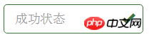
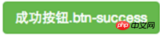
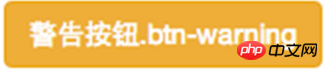
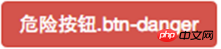
}8.表单控件状态(验证状态):1、.has-warning:警告状态(黄色) 2、.has-error:错误状态(红色) 3、.has-success:成功状态(绿色)


 :需要类名has-feedback +
9.表单提示信息:"help-block" 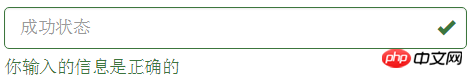


.help-block {
display: block;
margin-top: 5px;
margin-bottom: 10px;
color: #737373;
}按钮
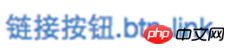
建议使用button或a标签来制作按钮
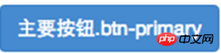
1.基本按钮:类名“btn”


.btn {
display: inline-block;
padding: 6px 12px;
margin-bottom: 0;
font-size: 14px;
font-weight: normal;
line-height: 1.42857143;
text-align: center;
white-space: nowrap;
vertical-align: middle;
cursor: pointer;
  -webkit-user-select: none;
     -moz-user-select: none;
      -ms-user-select: none;
user-select: none;
background-image: none;
border: 1px solid transparent;
border-radius: 4px;
}2.默认按钮: 类名“btn” + 类名“btn-default” 


.btn-default {
color: #333;
background-color: #fff;
border-color: #ccc;
}

4.按钮大小: .btn-lg:大型按钮 .btn-sm:小型按钮 .btn-cs:超小型按钮


.btn-lg,
.btn-group-lg> .btn {
padding: 10px 16px;
font-size: 18px;
line-height: 1.33;
border-radius: 6px;
}
.btn-sm,
.btn-group-sm> .btn {
padding: 5px 10px;
font-size: 12px;
line-height: 1.5;
border-radius: 3px;
}
.btn-xs,
.btn-group-xs> .btn {
padding: 1px 5px;
font-size: 12px;
line-height: 1.5;
border-radius: 3px;
}5.块状按钮: 类名“btn-block”
6.禁用状态: 使用disabled类或disabled属性
图像 1.img-responsive:响应式图片,主要针对于响应式设计 2.img-rounded:圆角图片 3.img-circle:圆形图片 4.img-thumbnail:缩略图片


img {
vertical-align: middle;
}
.img-responsive,
.thumbnail>img,
.thumbnail a >img,
.carousel-inner > .item >img,
.carousel-inner > .item > a >img {
display: block;
max-width: 100%;
height: auto;
}
.img-rounded {
border-radius: 6px;
}
.img-thumbnail {
display: inline-block;
max-width: 100%;
height: auto;
padding: 4px;
line-height: 1.42857143;
background-color: #fff;
border: 1px solid #ddd;
border-radius: 4px;
  -webkit-transition: all .2s ease-in-out;
transition: all .2s ease-in-out;
}
.img-circle {
border-radius: 50%;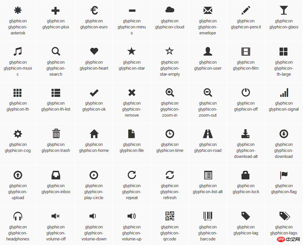
}图标
:查看全部图标

@font-face {
font-family: 'Glyphicons Halflings';
src: url('../fonts/glyphicons-halflings-regular.eot');
src: url('../fonts/glyphicons-halflings-regular.eot?#iefix') format('embedded-opentype'), url('../fonts/glyphicons-halflings-regular.woff') format('woff'), url('../fonts/glyphicons-halflings-regular.ttf') format('truetype'), url('../fonts/glyphicons-halflings-regular.svg#glyphicons_halflingsregular') format('svg');
}

<!--使用-->
.glyphicon {
position: relative;
top: 1px;
display: inline-block;
font-family: 'Glyphicons Halflings';
font-style: normal;
font-weight: normal;
line-height: 1;
  -webkit-font-smoothing: antialiased;
  -moz-osx-font-smoothing: grayscale;
}
.glyphicon-asterisk:before {
content: "\2a";
}
以上是bootstrap中關於表單的實例程式碼的詳細內容。更多資訊請關注PHP中文網其他相關文章!

熱AI工具

Undresser.AI Undress
人工智慧驅動的應用程序,用於創建逼真的裸體照片

AI Clothes Remover
用於從照片中去除衣服的線上人工智慧工具。

Undress AI Tool
免費脫衣圖片

Clothoff.io
AI脫衣器

Video Face Swap
使用我們完全免費的人工智慧換臉工具,輕鬆在任何影片中換臉!

熱門文章
熱工具

記事本++7.3.1
好用且免費的程式碼編輯器

SublimeText3漢化版
中文版,非常好用

禪工作室 13.0.1
強大的PHP整合開發環境

Dreamweaver CS6
視覺化網頁開發工具

SublimeText3 Mac版
神級程式碼編輯軟體(SublimeText3)


 vue中怎麼用bootstrap
Apr 07, 2025 pm 11:33 PM
vue中怎麼用bootstrap
Apr 07, 2025 pm 11:33 PM
在 Vue.js 中使用 Bootstrap 分為五個步驟:安裝 Bootstrap。在 main.js 中導入 Bootstrap。直接在模板中使用 Bootstrap 組件。可選:自定義樣式。可選:使用插件。
 bootstrap搜索欄怎麼獲取
Apr 07, 2025 pm 03:33 PM
bootstrap搜索欄怎麼獲取
Apr 07, 2025 pm 03:33 PM
如何使用 Bootstrap 獲取搜索欄的值:確定搜索欄的 ID 或名稱。使用 JavaScript 獲取 DOM 元素。獲取元素的值。執行所需的操作。
 bootstrap垂直居中怎麼弄
Apr 07, 2025 pm 03:21 PM
bootstrap垂直居中怎麼弄
Apr 07, 2025 pm 03:21 PM
使用 Bootstrap 實現垂直居中:flexbox 法:使用 d-flex、justify-content-center 和 align-items-center 類,將元素置於 flexbox 容器內。 align-items-center 類法:對於不支持 flexbox 的瀏覽器,使用 align-items-center 類,前提是父元素具有已定義的高度。
 bootstrap怎麼設置框架
Apr 07, 2025 pm 03:27 PM
bootstrap怎麼設置框架
Apr 07, 2025 pm 03:27 PM
要設置 Bootstrap 框架,需要按照以下步驟:1. 通過 CDN 引用 Bootstrap 文件;2. 下載文件並將其託管在自己的服務器上;3. 在 HTML 中包含 Bootstrap 文件;4. 根據需要編譯 Sass/Less;5. 導入定製文件(可選)。設置完成後,即可使用 Bootstrap 的網格系統、組件和样式創建響應式網站和應用程序。
 bootstrap怎麼寫分割線
Apr 07, 2025 pm 03:12 PM
bootstrap怎麼寫分割線
Apr 07, 2025 pm 03:12 PM
創建 Bootstrap 分割線有兩種方法:使用 標籤,可創建水平分割線。使用 CSS border 屬性,可創建自定義樣式的分割線。
 bootstrap怎麼插入圖片
Apr 07, 2025 pm 03:30 PM
bootstrap怎麼插入圖片
Apr 07, 2025 pm 03:30 PM
在 Bootstrap 中插入圖片有以下幾種方法:直接插入圖片,使用 HTML 的 img 標籤。使用 Bootstrap 圖像組件,可以提供響應式圖片和更多樣式。設置圖片大小,使用 img-fluid 類可以使圖片自適應。設置邊框,使用 img-bordered 類。設置圓角,使用 img-rounded 類。設置陰影,使用 shadow 類。調整圖片大小和位置,使用 CSS 樣式。使用背景圖片,使用 background-image CSS 屬性。
 bootstrap按鈕怎麼用
Apr 07, 2025 pm 03:09 PM
bootstrap按鈕怎麼用
Apr 07, 2025 pm 03:09 PM
如何使用 Bootstrap 按鈕?引入 Bootstrap CSS創建按鈕元素並添加 Bootstrap 按鈕類添加按鈕文本
 bootstrap怎麼調整大小
Apr 07, 2025 pm 03:18 PM
bootstrap怎麼調整大小
Apr 07, 2025 pm 03:18 PM
要調整 Bootstrap 中元素大小,可以使用尺寸類,具體包括:調整寬度:.col-、.w-、.mw-調整高度:.h-、.min-h-、.max-h-
