

Bootstrap擬態框+支付寶首頁

任務沒完成,繼續來!因為剛才網不好,我辛苦打了洋洋灑灑一大堆都沒了!
我們今天主要是說一個簡單的由Bootstrap和HTML5結合而成的小案例:
#首先:由標題可得知,這是移動端,所以需要這樣一串代碼:
##然後說Bootstrap擬態方塊,就還要有這樣的插件: 然後,有點基礎的都知道bootstrap,一定要和jquery一起使用,所以還要有jquery類別庫;
而且一定要放在bootstrap上邊哦!各位親們!
先來看一眼效果:有點醜!不要建議,因為是PC端敲得!我使用瀏覽器WEB響應格式看的效果,見諒,見諒!
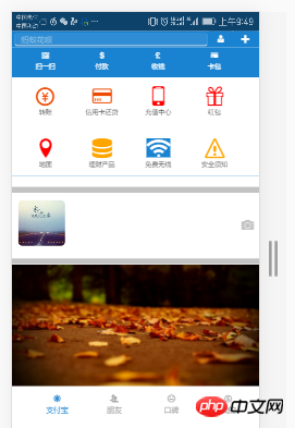

1 <style> 2 body{ 3 margin: 0 auto; 4 padding: 0; 5 } 6 nav{ 7 width: 100%; 8 height: 35px; 9 } 10 article{ 11 width: 100%; 12 background-color: #1983D1; 13 } 14 .div2{ 15 width: 100%; 16 height: 30px; 17 line-height: 30px; 18 background-color: #1983D1; 19 } 20 .div2>input{ 21 width: 78%; 22 height: 25px; 23 border: 0; 24 background-color: #2F8DD5; 25 /*border: 1px solid #2F8DD5;*/ 26 border-radius: 5px; 27 margin-left: 1vw;; 28 } 29 /*改变输入框 提示字体颜色*/ 30 input::placeholder{ 31 color: #8DC0E4; 32 } 33 .div2>button{ 34 width: 9%; 35 height: 25px; 36 background-color: #1983D1; 37 border: 0; 38 font-size: 3vw; 39 color: white; 40 } 41 .section1>ul{ 42 list-style: none; 43 display: flex; 44 justify-content:space-around; 45 align-items:center; 46 width: 100%; 47 height: 10vw; 48 margin-left: -30px; 49 } 50 .section1>ul>li{ 51 width: 24%; 52 color: white; 53 font-size: 2.5vw; 54 text-align: center; 55 margin-top: 2px; 56 } 57 .section2{ 58 background-color: white; 59 width: 100%; 60 } 61 62 .section2>ul{ 63 64 list-style: none; 65 display: flex; 66 justify-content:space-around; 67 align-items:center; 68 width: 100%; 69 height: 6rem; 70 margin-left: -30px; 71 } 72 .section2>ul>li{ 73 width: 24%; 74 /*color: white;*/ 75 font-size: 2vw; 76 text-align: center; 77 margin-top: 2px; 78 } 79 .section2>ul>li>span{ 80 font-size: 2.5rem; 81 } 82 .section3{ 83 width: 100%; 84 height: 90px; 85 line-height: 90px; 86 } 87 .section3 img{ 88 width: 20%; 89 height: 90px; 90 margin-top: -10px; 91 margin-left: 2vw; 92 border-radius: 15px; 93 } 94 .section4{ 95 margin-top: -4vw; 96 width: 100%; 97 height: 49vw; 98 } 99 .section4>img{100 width: 100%;101 height: 49vw;102 }103 footer>ul{104 width: 100%;105 height: 50px;106 /*line-height: 98px;*/107 list-style: none;108 display: flex;109 justify-content: space-between;110 margin-left: -1.5vw;111 }112 footer>ul>li{113 width: 24%;114 height: 48px;115 font-size: 3vw;116 text-align: center;117 color: #A9A9A9;118 margin-top: 3vw;119 }120 </style><body> <nav> <img src="1.png" style="width: 100%;height: 35px;" /> </nav> <div class="div1"></div> <div class="div2"> <input type="search" placeholder=" 蚂蚁花呗" /> <button><span class="icon icon-user-tie"></span></button> <button data-toggle="modal" data-target="#kuang" data-backdrop="true"><span class="icon icon-plus"></span></button> </div> <!--模态框--> <div class="modal fade modal-sm" id="kuang" style="width: 30%; margin-left: 65%;"> <div class="modal-dialog modal-sm"> <div class="modal-content"> <!--体--> <div class="modal-body"> <ul style="list-style: none; color:#6B6B6B;font-size: 2vw;"> <li><span class="icon icon-bubbles4" style="margin-left: -3vw;"></span> 发起群聊</li> <li><span class="icon icon-user-plus" style="margin-left: -3vw;"></span> 添加朋友</li> <li><span class="icon icon-qrcode" style="margin-left: -3vw;"></span> 扫 一 扫</li> <li><span class="icon icon-coin-euro" style="margin-left: -3vw;"></span> 我要收款</li> </ul> </div> </div> </div> </div> <article> <section class="section1"> <ul> <li> <span class="glyphicon glyphicon-qrcode"></span> <div>扫一扫</div> </li> <li> <span class="glyphicon glyphicon-usd"></span> <div>付款</div> </li> <li> <span class="glyphicon glyphicon-gbp"></span> <div>收钱</div> </li> <li> <span class="n glyphicon glyphicon-credit-card"></span> <div>卡包</div> </li> </ul> </section> <section class="section2"> <ul> <li> <span class="icon icon-coin-yen" style="color: #EE4A02;"></span> <div>转账</div> </li> <li> <span class="icon icon-credit-card" style="color: #EE4A02;"></span> <div>信用卡还贷</div> </li> <li> <span class="icon icon-mobile" style="color: red;"></span> <div>充值中心</div> </li> <li> <span class="icon icon-gift" style="color: red;"></span> <div>红包</div> </li> </ul> <ul> <li> <span class="icon icon-location" style="color: red;"></span> <div>地图</div> </li> <li> <span class="icon icon-database" style="color: orange;"></span> <div>理财产品</div> </li> <li> <span class="icon icon-connection" style="background-color: #1983D1;color: white;"></span> <div>免费无线</div> </li> <li> <span class="icon icon-warning" style="color: orange;"></span> <div>安全须知</div> </li> </ul> </section> </article> <hr style="background-color: #C3C3C3;width: 100%; height: 10px;" /> <section class="section3"> <img src="2.png" class="img-responsive" /> <span class="icon icon-camera pull-right" style="margin-top: -11.5vw;font-size: 5vw;margin-right: 2vw;color:#C3C3C3;"></span> </section> <hr style="background-color: #C3C3C3;width: 100%; height: 10px;" /> <section class="section4"> <img src="3.png" class="img-responsive" /> </section> <footer> <ul> <li style="color: #1983D1;"> <span class="icon icon-svg"></span> <div>支付宝</div> </li> <li> <span class="icon icon-users"></span> <div>朋友</div> </li> <li> <span class="icon icon-hipster"></span> <div>口碑</div> </li> <li> <span class="icon icon-coin-dollar"></span> <div>我的</div> </li> </ul> </footer> <script src="../jquery-3.1.1.min.js?1.1.10"></script> <script src="../dist/js/bootstrap.js?1.1.10"></script> </body>
<script>
(function(doc) {
function changeSize() {
var size = doc.documentElement.clientWidth / 320 * 10;
doc.querySelector('html').style.fontSize = size + 'px';
}
window.onresize = changeSize;
changeSize();
})(document)
</script>以上是Bootstrap擬態框+支付寶首頁的詳細內容。更多資訊請關注PHP中文網其他相關文章!

熱AI工具

Undresser.AI Undress
人工智慧驅動的應用程序,用於創建逼真的裸體照片

AI Clothes Remover
用於從照片中去除衣服的線上人工智慧工具。

Undress AI Tool
免費脫衣圖片

Clothoff.io
AI脫衣器

Video Face Swap
使用我們完全免費的人工智慧換臉工具,輕鬆在任何影片中換臉!

熱門文章
熱工具

記事本++7.3.1
好用且免費的程式碼編輯器

SublimeText3漢化版
中文版,非常好用

禪工作室 13.0.1
強大的PHP整合開發環境

Dreamweaver CS6
視覺化網頁開發工具

SublimeText3 Mac版
神級程式碼編輯軟體(SublimeText3)


 vue中怎麼用bootstrap
Apr 07, 2025 pm 11:33 PM
vue中怎麼用bootstrap
Apr 07, 2025 pm 11:33 PM
在 Vue.js 中使用 Bootstrap 分為五個步驟:安裝 Bootstrap。在 main.js 中導入 Bootstrap。直接在模板中使用 Bootstrap 組件。可選:自定義樣式。可選:使用插件。
 bootstrap搜索欄怎麼獲取
Apr 07, 2025 pm 03:33 PM
bootstrap搜索欄怎麼獲取
Apr 07, 2025 pm 03:33 PM
如何使用 Bootstrap 獲取搜索欄的值:確定搜索欄的 ID 或名稱。使用 JavaScript 獲取 DOM 元素。獲取元素的值。執行所需的操作。
 bootstrap垂直居中怎麼弄
Apr 07, 2025 pm 03:21 PM
bootstrap垂直居中怎麼弄
Apr 07, 2025 pm 03:21 PM
使用 Bootstrap 實現垂直居中:flexbox 法:使用 d-flex、justify-content-center 和 align-items-center 類,將元素置於 flexbox 容器內。 align-items-center 類法:對於不支持 flexbox 的瀏覽器,使用 align-items-center 類,前提是父元素具有已定義的高度。
 bootstrap怎麼寫分割線
Apr 07, 2025 pm 03:12 PM
bootstrap怎麼寫分割線
Apr 07, 2025 pm 03:12 PM
創建 Bootstrap 分割線有兩種方法:使用 標籤,可創建水平分割線。使用 CSS border 屬性,可創建自定義樣式的分割線。
 bootstrap怎麼設置框架
Apr 07, 2025 pm 03:27 PM
bootstrap怎麼設置框架
Apr 07, 2025 pm 03:27 PM
要設置 Bootstrap 框架,需要按照以下步驟:1. 通過 CDN 引用 Bootstrap 文件;2. 下載文件並將其託管在自己的服務器上;3. 在 HTML 中包含 Bootstrap 文件;4. 根據需要編譯 Sass/Less;5. 導入定製文件(可選)。設置完成後,即可使用 Bootstrap 的網格系統、組件和样式創建響應式網站和應用程序。
 bootstrap怎麼插入圖片
Apr 07, 2025 pm 03:30 PM
bootstrap怎麼插入圖片
Apr 07, 2025 pm 03:30 PM
在 Bootstrap 中插入圖片有以下幾種方法:直接插入圖片,使用 HTML 的 img 標籤。使用 Bootstrap 圖像組件,可以提供響應式圖片和更多樣式。設置圖片大小,使用 img-fluid 類可以使圖片自適應。設置邊框,使用 img-bordered 類。設置圓角,使用 img-rounded 類。設置陰影,使用 shadow 類。調整圖片大小和位置,使用 CSS 樣式。使用背景圖片,使用 background-image CSS 屬性。
 bootstrap按鈕怎麼用
Apr 07, 2025 pm 03:09 PM
bootstrap按鈕怎麼用
Apr 07, 2025 pm 03:09 PM
如何使用 Bootstrap 按鈕?引入 Bootstrap CSS創建按鈕元素並添加 Bootstrap 按鈕類添加按鈕文本
 bootstrap怎麼調整大小
Apr 07, 2025 pm 03:18 PM
bootstrap怎麼調整大小
Apr 07, 2025 pm 03:18 PM
要調整 Bootstrap 中元素大小,可以使用尺寸類,具體包括:調整寬度:.col-、.w-、.mw-調整高度:.h-、.min-h-、.max-h-
