學習前端有一段時間了,一直在看書上的理論知識,而實戰項目卻很少。師兄常說,想要知道自己的實力有多少,知識掌握了多少,最好的方法就是去實踐了,實踐出真知嘛。於是決定在這個假期裡,主要是透過專案的實踐以及理論知識的輔助來提高程式碼水準。首先是做幾個HTML5+CSS3靜態頁面佈局的練習,查缺補漏知識點並且總結在實踐過程中遇到的一些錯誤。頁面的設計稿主要是在網路上找來了的,也嘗試自己切圖、測量位置、獲得內容的屬性等等,假裝自己真的在完成一個專案。
第一個頁面是從設計達人這個平台上找來的,這個平台的頁面設計主要也是推薦的是國外的設計還有一些網頁設計上的教程,推薦頁面都比較簡潔、大方。比起內容爆炸的中國特色頁面來說,我也是欣賞國外的設計。
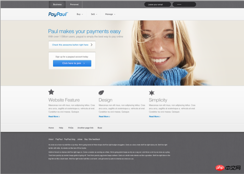
設計稿上的頁面寬度為1550像素的,頁面主體是960像素的12欄網格佈局。設計的整體寬度是遠遠超過了瀏覽器的視口寬度,因此我在設計的時候,因為是靜態頁面,也沒有使用響應式的設計,就將所有的寬高度都設置為以像素為單位的靜態尺寸了。使用div元素將寬度設為960px,並且將margin屬性為0px auto,就能保證頁面的主體內容在瀏覽器視窗中居中,而且不用再去介意頁面的總寬度了。
我的還原圖為:
根據這個思路,我也開始搭建頁面的框架了,分為了四大部分:header、section、main、footer。並且根據每個部分中的內容把所需的標籤也寫上,也根據需要添加上了class屬性。接著就是每一部分一點一點完成頁面內容以及使用CSS3添加樣式了。下面看我詳細的說明。
一、Header部分

<header> <nav class="firstnav"><div class="headerlimit"> <a href="#" class="firstnav1">Business</a><a href="#" class="firstnav2">Personal</a><input type="text" name="email" placeholder=" Leave your email" class="inputcase1" /><input type="text" name="omit" palaceholder="……" class="inputcase2" /></div><nav class="secondnav"> <div class="headerlimit"> <img src="images/Logo.png" /><div class="headnav"><ul><li><a href="#">Buy</a></li><li><a href="#">Sell</a></li><li><a href="#">Manage</a></li></ul></div></div></nav> </header>
.headnav {width: 280px;padding-left: 170px;margin-top: -70px;
}.headerlimit ul {list-style-type: none;padding-left: 0px;
}.headerlimit li a{text-decoration: none;border-left: 1px solid #fff;border-right: 1px solid #ebebeb;width: 90px;text-align: center;line-height: 25px;color: #68676a;float: left;font-family: PTSans;font-size: 14px;
}二、Banner部分
<section class="banner"><div class="backimg"><div class="bannercontent"> <div class="bannerintr"> <h1>Paul makes your payments easy</h1> <p>With over 1 Billion users, paypal is simply the best way to pay</p> </div> <div class="button1"> <a href="#"> <p>Check this awesome button right here</p> </a> </div> <div class="button2"> <p>Sign up for a paypaul account today</p> <button><a href="#">Click here to join</a></button></div></div></div></section>
.bannercontent {width: 960px;margin: 0px auto;position: absolute;left: 10px;top: 25px;
}.backimg {width: 1055px;height: 415px;margin-left: 195px;background-image: url(../images/banner.png);position: relative;
}
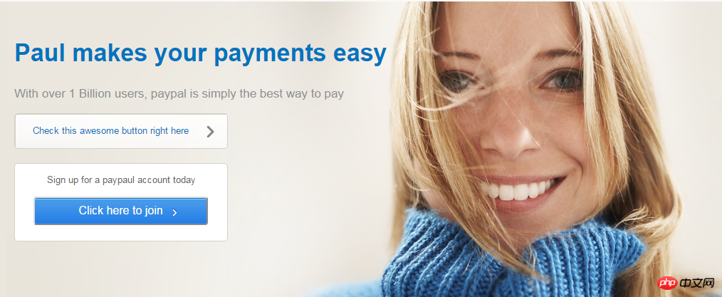
因为三个模块的布局是一模一样的,所以只要使用同一个class属性就能保证样式相同。图片和文字都处理都比较简单,没有特别需要指出的了,因此代码也省略了。
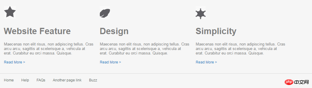
四、Footer部分
在footer部分,导航栏的部分同样是使用无序列表的方式,要注意的是,在设置的时候发现,因为无序列表中设置了向左浮动,因此会影响后面的两个段落在浏览器中的显示,需要使用clear: both; 清除两个段落的浮动,才能使得两个段落在导航栏的下方。问题产生和清除浮动的部分CSS代码如下:
.footernav li a{color: #fff;font-size: 12px;margin-right: 15px;margin-top: 35px;float: left;
}.footercontent {width: 960px;margin: 0px auto;padding: 25px 0px;clear: both;
}
Of course, you will also encounter some problems when implementing this static page according to the design draft, such as knowing the size and size of each element. It is a very troublesome operation such as the spacing between spaces, the size and color attributes of fonts, etc.(Tucao). Of course, the real problem you encounter is not this, but something that you think should look like this. As a result, it will look different when displayed in the browser. This is the source of headaches. Therefore, during the implementation process, we also recorded some problems encountered and tried to find out the reasons and solutions.
1. When text and images appear on the same line or in the same div element, the browser will run on different lines.
After querying the information, three solutions were given:
①In CSS, set vertical-align for the div: middle; attribute. This div contains pictures and text, so that the elements in the div can be vertically aligned in the center.
② When the picture is a background picture, set the picture using background-img and modify the padding of the text so that it can be on the same line.
③Place the image and text in two divs and set the margin value. This is the method I use, which is a little more troublesome than the first method.
2. Inline elements do not support margin and padding attribute values in the upper and lower directions. You need to use line-height to modify them.
3. Elements often have some extra margins inexplicably. This is actually the default effect of the browser. These effects need to be cleared manually before setting the CSS style. For example, the unordered list ul will have extra left margin.
以上是HTML5+CSS3靜態頁面專案經驗總結的詳細內容。更多資訊請關注PHP中文網其他相關文章!


