

行動端meta行的總結

<span class="xml"><span class="hljs-tag"><span style="font-size: 16px"><</span><span class="hljs-name"><span style="font-size: 16px">meta </span><span class="hljs-attr"><span style="font-size: 16px">name=</span><span class="hljs-string"><span style="font-size: 16px">"viewport" <br/></span><span class="hljs-attr"><span style="font-size: 16px">content=</span><span class="hljs-string"><span style="font-size: 16px">"width=device-width, initial-scale=1, user-scalable=no, minimal-ui" /></span> </span></span></span></span></span></span></span>
width: viewport 的寬度(範圍從200 到10,000 ,預設為980 像素)
height: viewport 的高度(範圍從223 到10,000 )
initial-## scale: 初始的縮放比例(範圍從>0到10 )
minimum-scale: 允許使用者縮放到的最小比例
maximum-scale: 允許使用者縮放到的最大比例
user-scalable: 使用者是否可以手動縮放
#
#<meta name="apple-mobile-web-app-capable" content="yes" />#
<meta name="renderer" content="webkit">
#
<meta http-equiv="X-UA-Compatible" content="IE=edge">
#
<meta name="HandheldFriendly" content="true">
####################################################################################################################################################### ########################################################### ########################################################### ############# ####################### ##################################################<meta name="MobileOptimized" content= "320">
## ################################################################################# ########################################################### ######################### <meta name="x5-orientation" content="portrait"> # # #<meta name="全螢幕"content="是"> <meta name="x5- fullscreen" content="true"> ## #<meta name="browsermode" content="application">## #< !-- QQ application mode--> <meta name="x5-page-mode" content="app"># # #<meta name="msapplication-tap-highlight" content= "no"> ## 1. apple-touch-icon 那么在苹果机的safari上可以通过添加到主屏按钮将网站添加到主屏幕上。 而设置相应 apple-touch-icon 标签,则添加到主屏上的图标就会使用我们指定的图片。 2. apple-touch-startup-image 可以为WebApp设置一个类似NativeApp的启动画面。 和 apple-touch-icon 不同, apple-mobile-web-app-capable 不支持sizes属性, 要使用media来加载不同的启动画面。 以上是行動端meta行的總結的詳細內容。更多資訊請關注PHP中文網其他相關文章!
< link rel= "apple-touch-icon" sizes= "76x76" href= "touch-icon-ipad.png">
如果 apple-mobile-web-app-capable 设置为 yes 了,
< link rel= "apple-touch-startup-image" href= "/startup.png">
基于 apple-mobile-web-app-capable 设置为 yes ,// iPhone
<link href="apple-touch-startup-image-320x460.png" media="(device-width: 320px)" rel="apple-touch-startup-image" />
<span class="hljs-comment">// iPhone Retina
<link href=<span class="hljs-string">"apple-touch-startup-image-640x920.png" media=<span class="hljs-string">"(device-width: 320px) and (-webkit-device-pixel-ratio: 2)"<br/> rel=<span class="hljs-string">"apple-touch-startup-image" /></span></span></span></span>

熱AI工具

Undresser.AI Undress
人工智慧驅動的應用程序,用於創建逼真的裸體照片

AI Clothes Remover
用於從照片中去除衣服的線上人工智慧工具。

Undress AI Tool
免費脫衣圖片

Clothoff.io
AI脫衣器

Video Face Swap
使用我們完全免費的人工智慧換臉工具,輕鬆在任何影片中換臉!

熱門文章
熱工具

記事本++7.3.1
好用且免費的程式碼編輯器

SublimeText3漢化版
中文版,非常好用

禪工作室 13.0.1
強大的PHP整合開發環境

Dreamweaver CS6
視覺化網頁開發工具

SublimeText3 Mac版
神級程式碼編輯軟體(SublimeText3)


 可以將appdata資料夾移到D盤嗎?
Feb 18, 2024 pm 01:20 PM
可以將appdata資料夾移到D盤嗎?
Feb 18, 2024 pm 01:20 PM
appdata資料夾可以移到d盤嗎隨著電腦使用的日益普及,使用者的個人資料和應用程式也越來越多地儲存在電腦上。在Windows作業系統中,有一個特定的資料夾,名為appdata資料夾,它用於儲存使用者的應用程式資料。許多用戶想知道是否可以將這個資料夾移到D碟或其他磁碟上,以便進行資料管理和安全性的考慮。在本文中,我們將討論這個問題並提供一些解決方案。首先,讓我
 6000 毫安矽負極電池!小米 15Pro 升級再曝料
Jul 24, 2024 pm 12:45 PM
6000 毫安矽負極電池!小米 15Pro 升級再曝料
Jul 24, 2024 pm 12:45 PM
7月23日消息,部落客數位閒聊站爆料稱,小米15Pro電池容量增大至6000mAh,支援90W有線閃充,這將是小米數位系列電池最大的Pro機型。先前數位閒聊站透露,小米15Pro的電池擁有超高能量密度,矽含量遠高於競品。矽基電池在2023年大規模試水後,第二代矽負極電池被認定為產業未來發展方向,今年將迎來直接競爭的高峰。 1.矽的理論克容量可達4200mAh/g,是石墨克容量的10倍以上(石墨的理論克容量372mAh/g)。對於負極而言,當鋰離子嵌入量達到最大時的容量為理論克容量,這意味著在相同重量下
 停止或允許此電腦在Windows 11上存取您的行動裝置
Feb 19, 2024 am 11:45 AM
停止或允許此電腦在Windows 11上存取您的行動裝置
Feb 19, 2024 am 11:45 AM
微軟在最新的Windows11版本中將PhoneLink的名稱更改為MobileDevice。這項變更使得使用者可以透過提示來控制電腦存取行動裝置的權限。本文將介紹如何在您的電腦上管理允許或拒絕行動裝置存取的設定。此功能讓您能夠配置行動裝置並與電腦連接,從而進行文字訊息的發送和接收、行動應用程式的控制、聯絡人的檢視、電話的撥打、圖庫的檢視等操作。將手機連接到PC是個好主意嗎?將手機連接到WindowsPC是一個方便的選擇,可以輕鬆傳輸功能和媒體。這對那些需要在行動裝置無法使用時使用電腦的人
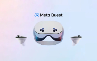 新款經濟實惠的 Meta Quest 3S VR 頭戴裝置出現在 FCC 上,暗示即將推出
Sep 04, 2024 am 06:51 AM
新款經濟實惠的 Meta Quest 3S VR 頭戴裝置出現在 FCC 上,暗示即將推出
Sep 04, 2024 am 06:51 AM
Meta Connect 2024 活動定於 9 月 25 日至 26 日舉行,在本次活動中,該公司預計將推出一款價格實惠的新型虛擬實境耳機。據傳這款 VR 耳機是 Meta Quest 3S,它似乎已經出現在 FCC 清單上。這個建議
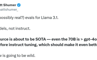 首個超越GPT4o級開源模型! Llama 3.1洩密:4050億參數,下載連結、模型卡都有了
Jul 23, 2024 pm 08:51 PM
首個超越GPT4o級開源模型! Llama 3.1洩密:4050億參數,下載連結、模型卡都有了
Jul 23, 2024 pm 08:51 PM
快準備好你的GPU! Llama3.1終於現身了,不過出處卻不是Meta官方。今日,Reddit上新版Llama大模型洩漏的消息遭到了瘋傳,除了基礎模型,還包括8B、70B和最大參數的405B的基準測試結果。下圖為Llama3.1各版本與OpenAIGPT-4o、Llama38B/70B的比較結果。可以看到,即使是70B的版本,也在多項基準上超過了GPT-4o。圖源:https://x.com/mattshumer_/status/1815444612414087294顯然,3.1版本的8B和70
 六年種方式快速體驗最新發布的 Llama 3!
Apr 19, 2024 pm 12:16 PM
六年種方式快速體驗最新發布的 Llama 3!
Apr 19, 2024 pm 12:16 PM
Meta昨晚發布了Llama38B和70B模型,Llama3指令調整模型針對對話/聊天用例進行了微調和優化,在常見基準測試中優於許多現有的開源聊天模型。例如,Gemma7B和Mistral7B。 Llama+3模型對數據和規模進行了提升,達到了新的高度。它是在Meta最近發布的兩個客製化的24KGPU叢集上,對超過15Ttoken的資料進行訓練的。這個訓練資料集比Llama2大7倍,包含多4倍的程式碼。這使得Llama模型的能力達到了目前的最高水平,它支援8K以上的文字長度,是Llama2的兩倍。下面
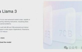 Llama3突然來襲!開源社群再次沸騰:GPT4級模式自由訪問時代到來
Apr 19, 2024 pm 12:43 PM
Llama3突然來襲!開源社群再次沸騰:GPT4級模式自由訪問時代到來
Apr 19, 2024 pm 12:43 PM
Llama3來了!就在剛剛,Meta官網上新,官方宣布了Llama380億和700億參數版本。並且推出即為開源SOTA:Meta官方數據顯示,Llama38B和70B版本在各自參數規模上超越一眾對手。 8B模型在MMLU、GPQA、HumanEval等多項基準上都勝過Gemma7B和Mistral7BInstruct。而70B模型則超越了閉源的當紅炸子雞Claude3Sonnet,和谷歌的GeminiPro1.5打得有來有回。 Huggingface連結一出,開源社群再次沸騰。眼尖的盲生還第一時間發現
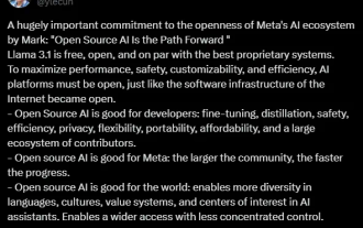 最強模型Llama 3.1 405B正式發布,祖克柏:開源引領新時代
Jul 24, 2024 pm 08:23 PM
最強模型Llama 3.1 405B正式發布,祖克柏:開源引領新時代
Jul 24, 2024 pm 08:23 PM
剛剛,大家期待已久的Llama3.1官方正式發售了! Meta官方發出了「開源引領新時代」的聲音。在官方部落格中,Meta表示:「直到今天,開源大語言模型在功能和效能方面大多落後於封閉模型。現在,我們正在迎來一個開源引領的新時代。我們公開發布MetaLlama3.1405B,我們認為這是世界上最大、功能最強大的開源基礎模型。長文《OpenSourceAIIsthePathForward》,
