

純Css程式碼美化checkbox複選框、radios單選框和滑動按鈕簡單方法

我们知道css可以美化前端页面,本文我们就和大家分享纯Css代码美化checkbox复选框、radios单选框和滑动按钮的简单方法,希望能帮助到大家。
效果预览
1. 复选框
<html>
<head>
<style type="text/css">
.switch {
margin: 20px 20px 0 0;
display: flex;
align-items: center;
width: auto;
}
.checkbox-input {
display: none
}
.checkbox {
-webkit-transition: background-color 0.3s;
transition: background-color 0.3s;
background-color: #fff;
border: 1px solid #d7d7d7;
border-radius: 3px;
width: 16px;
height: 16px;
vertical-align:middle;
margin: 0 5px;
}
.checkbox-input:checked+.checkbox {
background-color: #57ad68;
}
.checkbox-input:checked+.checkbox:after {
content: "\2714";
display: inline-block;
height: 100%;
width: 100%;
color: #fff;
text-align: center;
line-height: 16px;
font-size: 12px;
box-shadow: 0 0 4px #57ad68;
}
</style>
</head>
<body>
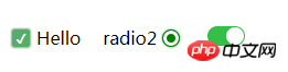
<label class="switch">
<input class="checkbox-input" id="checkbox" type="checkbox" name="demo-checkbox1">
<label class="checkbox" for="checkbox"></label>
<span>Hello</span>
</label>
</body>
</html>2. 单选框
<html>

<head>
    <style type="text/css">
        .switch {
            display: flex;
            align-items: center;
            width: auto;
            float: left;
        }
        .radio-beauty-container .radio-beauty {
            width: 16px;
            height: 16px;
            box-sizing: border-box;
            display: inline-block;
            border: 1px solid #d7d7d7;
            margin: 0 5px;
            border-radius: 50%;
            transition: 0.2s;
        }
        .radio-beauty-container input[type="radio"]:checked+.radio-beauty {
            border: solid 1px green;
            padding: 3px;
            background-color: green;
            background-clip: content-box;
            box-shadow: inset 0 0 1px rgba(0,128,0, 0.2), 0 0 3px green;
        }
    </style>
</head>

<body>
    <p class="radio-beauty-container">
        <label class="switch">
            <span class="radio-name">radio2</span>
            <input type="radio" name="radioName" id="radioName2" hidden/>
            <label for="radioName2" class="radio-beauty"></label>
        </label>
        <label class="switch">
            <span class="radio-name">radio3</span>
            <input type="radio" name="radioName" id="radioName3" hidden/>
            <label for="radioName3" class="radio-beauty"></label>
        </label>
    </p>
</body>

</html>3. 滑动按钮
<html>

<head>
    <style type="text/css">
        .switch-slide-label {
            display: block;
            width: 34px;
            height: 18px;
            background: #ccc;
            border-radius: 30px;
            cursor: pointer;
            position: relative;
            -webkit-transition: 0.3s ease;
            transition: 0.3s ease;
        }

        .switch-slide-label:after {
            content: '';
            display: block;
            width: 16px;
            height: 16px;
            border-radius: 100%;
            background: #fff;
            box-shadow: 0 1px 1px rgba(0, 0, 0, .1);
            position: absolute;
            left: 1px;
            top: 1px;
            -webkit-transform: translateZ(0);
            transform: translateZ(0);
            -webkit-transition:0.3s ease;
            transition:0.3s ease;
        }

        .switch-slide input:checked+label {
            background: #34bf49;
            transition: 0.3s ease;
        }
        .switch-slide input:checked+label:after {
            left: 17px;
        }

    </style>
</head>

<body>
    <p class="radio-beauty-container">
            <label class="switch-slide">
                <input type="checkbox" id="menu-right" hidden>
                <label for="menu-right" class="switch-slide-label"></label>
            </label>
    </p>
</body>

</html>
最简洁的代码美化复选框、单选框和滑动按钮
效果预览
1. 复选框
<html>

<head>
    <style type="text/css">
        .switch {
            margin: 20px 20px 0 0;
            display: flex;
            align-items: center;
            width: auto;
        }
        .checkbox-input {
            display: none
        }
        .checkbox {
            -webkit-transition: background-color 0.3s;
            transition: background-color 0.3s;
            background-color: #fff;
            border: 1px solid #d7d7d7;
            border-radius: 3px;
            width: 16px;
            height: 16px;
            vertical-align:middle;
            margin: 0 5px;
        }
        .checkbox-input:checked+.checkbox {
            background-color: #57ad68;
        }
        .checkbox-input:checked+.checkbox:after {
            content: "\2714";
            display: inline-block;
            height: 100%;
            width: 100%;
            color: #fff;
            text-align: center;
            line-height: 16px;
            font-size: 12px;
            box-shadow: 0 0 4px #57ad68;
        }
    </style>
</head>

<body>
    <label class="switch">
        <input class="checkbox-input" id="checkbox" type="checkbox" name="demo-checkbox1">
        <label class="checkbox" for="checkbox"></label>
        <span>Hello</span>
    </label>
</body>

</html>2. 单选框
<html>

<head>
    <style type="text/css">
        .switch {
            display: flex;
            align-items: center;
            width: auto;
            float: left;
        }
        .radio-beauty-container .radio-beauty {
            width: 16px;
            height: 16px;
            box-sizing: border-box;
            display: inline-block;
            border: 1px solid #d7d7d7;
            margin: 0 5px;
            border-radius: 50%;
            transition: 0.2s;
        }
        .radio-beauty-container input[type="radio"]:checked+.radio-beauty {
            border: solid 1px green;
            padding: 3px;
            background-color: green;
            background-clip: content-box;
            box-shadow: inset 0 0 1px rgba(0,128,0, 0.2), 0 0 3px green;
        }
    </style>
</head>

<body>
    <p class="radio-beauty-container">
        <label class="switch">
            <span class="radio-name">radio2</span>
            <input type="radio" name="radioName" id="radioName2" hidden/>
            <label for="radioName2" class="radio-beauty"></label>
        </label>
        <label class="switch">
            <span class="radio-name">radio3</span>
            <input type="radio" name="radioName" id="radioName3" hidden/>
            <label for="radioName3" class="radio-beauty"></label>
        </label>
    </p>
</body>

</html>3. 滑动按钮
<html>

<head>
    <style type="text/css">
        .switch-slide-label {
            display: block;
            width: 34px;
            height: 18px;
            background: #ccc;
            border-radius: 30px;
            cursor: pointer;
            position: relative;
            -webkit-transition: 0.3s ease;
            transition: 0.3s ease;
        }

        .switch-slide-label:after {
            content: '';
            display: block;
            width: 16px;
            height: 16px;
            border-radius: 100%;
            background: #fff;
            box-shadow: 0 1px 1px rgba(0, 0, 0, .1);
            position: absolute;
            left: 1px;
            top: 1px;
            -webkit-transform: translateZ(0);
            transform: translateZ(0);
            -webkit-transition:0.3s ease;
            transition:0.3s ease;
        }

        .switch-slide input:checked+label {
            background: #34bf49;
            transition: 0.3s ease;
        }
        .switch-slide input:checked+label:after {
            left: 17px;
        }

    </style>
</head>

<body>
    <p class="radio-beauty-container">
            <label class="switch-slide">
                <input type="checkbox" id="menu-right" hidden>
                <label for="menu-right" class="switch-slide-label"></label>
            </label>
    </p>
</body>

</html>相关推荐:
HTML页面中的的美化checkbox_html/css_WEB-ITnose
使用jquery与图片美化checkbox和radio控件的代码(打包下载)_jquery
以上是純Css程式碼美化checkbox複選框、radios單選框和滑動按鈕簡單方法的詳細內容。更多資訊請關注PHP中文網其他相關文章!

熱AI工具

Undresser.AI Undress
人工智慧驅動的應用程序,用於創建逼真的裸體照片

AI Clothes Remover
用於從照片中去除衣服的線上人工智慧工具。

Undress AI Tool
免費脫衣圖片

Clothoff.io
AI脫衣器

AI Hentai Generator
免費產生 AI 無盡。

熱門文章
熱工具

記事本++7.3.1
好用且免費的程式碼編輯器

SublimeText3漢化版
中文版,非常好用

禪工作室 13.0.1
強大的PHP整合開發環境

Dreamweaver CS6
視覺化網頁開發工具

SublimeText3 Mac版
神級程式碼編輯軟體(SublimeText3)
熱門話題


 vue中怎麼用bootstrap
Apr 07, 2025 pm 11:33 PM
vue中怎麼用bootstrap
Apr 07, 2025 pm 11:33 PM
在 Vue.js 中使用 Bootstrap 分為五個步驟:安裝 Bootstrap。在 main.js 中導入 Bootstrap。直接在模板中使用 Bootstrap 組件。可選:自定義樣式。可選:使用插件。
 HTML,CSS和JavaScript的角色:核心職責
Apr 08, 2025 pm 07:05 PM
HTML,CSS和JavaScript的角色:核心職責
Apr 08, 2025 pm 07:05 PM
HTML定義網頁結構,CSS負責樣式和佈局,JavaScript賦予動態交互。三者在網頁開發中各司其職,共同構建豐富多彩的網站。
 bootstrap怎麼寫分割線
Apr 07, 2025 pm 03:12 PM
bootstrap怎麼寫分割線
Apr 07, 2025 pm 03:12 PM
創建 Bootstrap 分割線有兩種方法:使用 標籤,可創建水平分割線。使用 CSS border 屬性,可創建自定義樣式的分割線。
 bootstrap怎麼調整大小
Apr 07, 2025 pm 03:18 PM
bootstrap怎麼調整大小
Apr 07, 2025 pm 03:18 PM
要調整 Bootstrap 中元素大小,可以使用尺寸類,具體包括:調整寬度:.col-、.w-、.mw-調整高度:.h-、.min-h-、.max-h-
 bootstrap怎麼插入圖片
Apr 07, 2025 pm 03:30 PM
bootstrap怎麼插入圖片
Apr 07, 2025 pm 03:30 PM
在 Bootstrap 中插入圖片有以下幾種方法:直接插入圖片,使用 HTML 的 img 標籤。使用 Bootstrap 圖像組件,可以提供響應式圖片和更多樣式。設置圖片大小,使用 img-fluid 類可以使圖片自適應。設置邊框,使用 img-bordered 類。設置圓角,使用 img-rounded 類。設置陰影,使用 shadow 類。調整圖片大小和位置,使用 CSS 樣式。使用背景圖片,使用 background-image CSS 屬性。
 bootstrap怎麼設置框架
Apr 07, 2025 pm 03:27 PM
bootstrap怎麼設置框架
Apr 07, 2025 pm 03:27 PM
要設置 Bootstrap 框架,需要按照以下步驟:1. 通過 CDN 引用 Bootstrap 文件;2. 下載文件並將其託管在自己的服務器上;3. 在 HTML 中包含 Bootstrap 文件;4. 根據需要編譯 Sass/Less;5. 導入定製文件(可選)。設置完成後,即可使用 Bootstrap 的網格系統、組件和样式創建響應式網站和應用程序。
 bootstrap怎麼看日期
Apr 07, 2025 pm 03:03 PM
bootstrap怎麼看日期
Apr 07, 2025 pm 03:03 PM
答案:可以使用 Bootstrap 的日期選擇器組件在頁面中查看日期。步驟:引入 Bootstrap 框架。在 HTML 中創建日期選擇器輸入框。 Bootstrap 將自動為選擇器添加樣式。使用 JavaScript 獲取選定的日期。
 bootstrap按鈕怎麼用
Apr 07, 2025 pm 03:09 PM
bootstrap按鈕怎麼用
Apr 07, 2025 pm 03:09 PM
如何使用 Bootstrap 按鈕?引入 Bootstrap CSS創建按鈕元素並添加 Bootstrap 按鈕類添加按鈕文本
