
本文主要介紹了jQueryMobile之窗體長內容的缺陷與解決方法,結合具體實例形式分析了jQueryMobile底部懸浮層遮擋情況下的解決方法,非常簡單實用,需要的朋友可以參考下,希望能幫助到大家。
一旦窗體中出現長內容,使用筆者那種固定header與footer的全螢幕佈局是存在缺陷的,
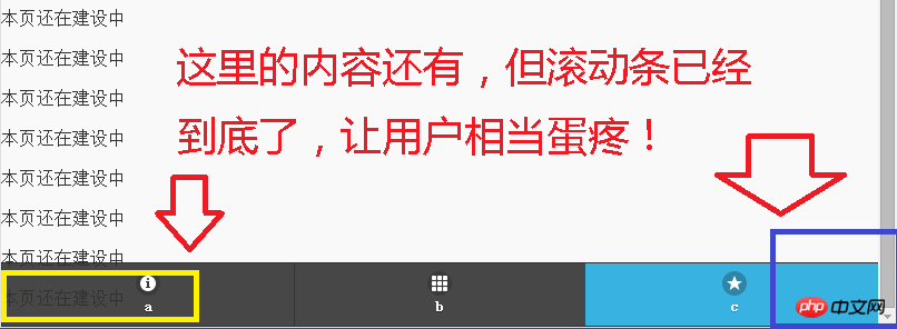
如圖所示,長內容最後的內容,直到滾動條拉到最底部也無法窮盡,
而且很有可能的是,雖然現在這個地方的內容是顯示為半透明,但往往這個位置是一些提交按鈕什麼的,
使用者根本就沒辦法,
因此,需要改進,把原來的程式碼:
##
<!DOCTYPE html PUBLIC "-//W3C//DTD XHTML 1.0 Transitional//EN" "http://www.w3.org/TR/xhtml1/DTD/xhtml1-transitional.dtd">
<html xmlns="http://www.w3.org/1999/xhtml">
<head>
<meta http-equiv="Content-Type" content="text/html; charset=utf-8" />
<title>a</title>
<meta name="viewport" content="width=device-width,initial-scale=1.0,user-scalable=no">
<link rel="stylesheet" href="jqmobile/jquery.mobile-1.4.5.css" rel="external nofollow" rel="external nofollow" >
<script src="jqmobile/jquery-1.11.1.js"></script>
<script src="jqmobile/jquery.mobile-1.4.5.js"></script>
</head>
<body>
<p data-role="page" data-position="fixed" data-fullscreen="true">
 <p data-role="header" data-theme="b" data-tap-toggle = "false">
  <h1>title</h1>
 </p>
 <p data-role="content">
  <p>本页还在建设中</p><p>本页还在建设中</p><p>本页还在建设中</p><p>本页还在建设中</p><p>本页还在建设中</p><p>本页还在建设中</p><p>本页还在建设中</p><p>本页还在建设中</p><p>本页还在建设中</p><p>本页还在建设中</p><p>本页还在建设中</p><p>本页还在建设中</p><p>本页还在建设中</p><p>本页还在建设中</p><p>本页还在建设中</p>
 </p>
 <p data-role="footer" data-position="fixed" data-fullscreen="true" data-theme="b" data-tap-toggle = "false">
   <p data-role="navbar">
   <ul>
    <li><a href="a.html" rel="external nofollow" rel="external nofollow" target="_self" data-icon="info">a</a></li>
    <li><a href="b.html" rel="external nofollow" rel="external nofollow" target="_self" data-icon="grid">b</a></li>
    <li><a href="#" rel="external nofollow" rel="external nofollow" class="ui-btn-active ui-state-persist" data-icon="star">c</a></li>
   </ul>
  </p>
 </p>
</p>
</body>
</html>
#
<!DOCTYPE html PUBLIC "-//W3C//DTD XHTML 1.0 Transitional//EN" "http://www.w3.org/TR/xhtml1/DTD/xhtml1-transitional.dtd">
<html xmlns="http://www.w3.org/1999/xhtml">
<head>
<meta http-equiv="Content-Type" content="text/html; charset=utf-8" />
<title>a</title>
<meta name="viewport" content="width=device-width,initial-scale=1.0,user-scalable=no">
<link rel="stylesheet" href="jqmobile/jquery.mobile-1.4.5.css" rel="external nofollow" rel="external nofollow" >
<script src="jqmobile/jquery-1.11.1.js"></script>
<script src="jqmobile/jquery.mobile-1.4.5.js"></script>
</head>
<body>
<p data-role="page" data-position="fixed" data-fullscreen="true">
 <p data-role="header" data-theme="b" data-tap-toggle = "false">
  <h1>title</h1>
 </p>
 <p data-role="content" style="margin-bottom:50px">
  <p>本页还在建设中</p><p>本页还在建设中</p><p>本页还在建设中</p><p>本页还在建设中</p><p>本页还在建设中</p><p>本页还在建设中</p><p>本页还在建设中</p><p>本页还在建设中</p><p>本页还在建设中</p><p>本页还在建设中</p><p>本页还在建设中</p><p>本页还在建设中</p><p>本页还在建设中</p><p>本页还在建设中</p><p>本页还在建设中</p>
 </p>
 <p data-role="footer" data-position="fixed" data-fullscreen="true" data-theme="b" data-tap-toggle = "false">
   <p data-role="navbar">
   <ul>
    <li><a href="a.html" rel="external nofollow" rel="external nofollow" target="_self" data-icon="info">a</a></li>
    <li><a href="b.html" rel="external nofollow" rel="external nofollow" target="_self" data-icon="grid">b</a></li>
    <li><a href="#" rel="external nofollow" rel="external nofollow" class="ui-btn-active ui-state-persist" data-icon="star">c</a></li>
   </ul>
  </p>
 </p>
</p>
</body>
</html>
JQERY limittext 外掛程式0.2版(長內容限制顯示)_jquery
關於jQueryMobile表單提交Servlet問題_html/css_WEB-ITnose
以上是實例詳解jQueryMobile窗體長內容的缺陷與解決方法的詳細內容。更多資訊請關注PHP中文網其他相關文章!


