

css實現愛心版載入效果

本文主要和大家介紹純css寫出愛心版加載效果的範例程式碼的相關資料,小編覺得挺不錯的,現在分享給大家,也給大家做個參考。一起跟著小編過來看看吧,希望能幫助大家。
愛心等待效果如下:
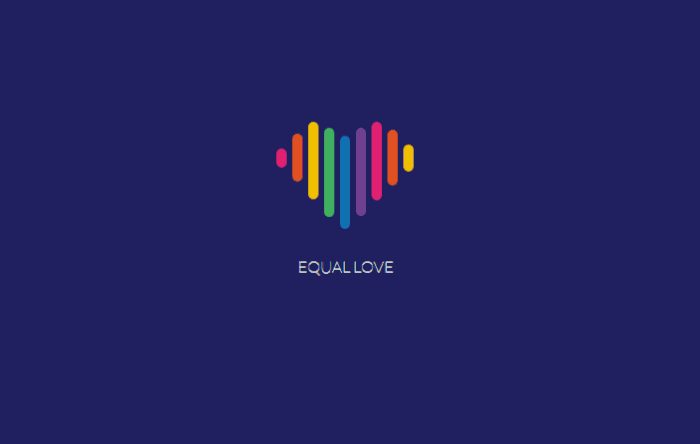
現在網路時代網站何其多,各有各得風格,但是什麼樣的風格能留住使用者的停留觀看呢?就從加載來說,很多加載效果都是同一種風格可能用戶經常逛網站早已經習慣,要是你的加載時間比其他網站時間長,效果還是一樣的,可能就會關掉你的網站去其他網站觀看,但是如果你的載入效果別具一格,有特點,可能用戶看你載入效果的時候你的網站就打開了,這樣用戶也就不會立刻關掉你的網站。
今天的這個愛心版載入效果是用純css程式碼寫出來的,只需要花點心思,少量的程式碼就能留住你的用戶,那麼為什麼不去做呢。
文章分享之前小編推薦我的前端學習群:542827633,裡面都是學習前端的,如果你想製作酷炫的特效,想學習前端知識,小編歡迎你的加入。小編會在群組中不定期分享乾貨原始碼,包括我精心整理的一份前端教學。歡迎各位有興趣的朋友。
html程式碼:
<p class="flex-container">
  <p class="unit">
    <p class="heart">
      <p class="heart-piece-0"></p>
      <p class="heart-piece-1"></p>
      <p class="heart-piece-2"></p>
      <p class="heart-piece-3"></p>
      <p class="heart-piece-4"></p>
      <p class="heart-piece-5"></p>
      <p class="heart-piece-6"></p>
      <p class="heart-piece-7"></p>
      <p class="heart-piece-8"></p>
    </p>
    <p>equal love</p>
  </p>
</p>css程式碼:
<style>
@import url("https://fonts.googleapis.com/css?family=Lato:100");
html,
body {
width: 100%;
height: 100%;
}
.flex-container {
width: 100%;
height: 100%;
position: relative;
display: -webkit-box;
display: -ms-flexbox;
display: flex;
-ms-flex-wrap: wrap;
flex-wrap: wrap;
-webkit-box-pack: center;
-ms-flex-pack: center;
justify-content: center;
-webkit-box-align: center;
-ms-flex-align: center;
align-items: center;
}
body {
background-color: #262e6f;
}
.unit {
text-align: center;
}
.unit p {
margin-top: 100px;
font-family: 'Lato', sans-serif;
font-weight: 100;
text-transform: uppercase;
color: #fff;
}
.heart {
position: relative;
font-size: 0;
width: 138px;
}
[class*="heart-piece-"] {
position: absolute;
top: -5px;
width: 10px;
height: 10px;
border-radius: 5px;
}
.heart-piece-4 {
-webkit-animation: piece-4 3.2s infinite;
animation: piece-4 3.2s infinite;
}
.heart-piece-3,
.heart-piece-5 {
-webkit-animation: piece-3 3.2s infinite;
animation: piece-3 3.2s infinite;
}
.heart-piece-2,
.heart-piece-6 {
-webkit-animation: piece-2 3.2s infinite;
animation: piece-2 3.2s infinite;
}
.heart-piece-1,
.heart-piece-7 {
-webkit-animation: piece-1 3.2s infinite;
animation: piece-1 3.2s infinite;
}
.heart-piece-0,
.heart-piece-8 {
-webkit-animation: piece-0 3.2s infinite;
animation: piece-0 3.2s infinite;
}
.heart-piece-0 {
left: 0px;
-webkit-animation-delay: 0s;
animation-delay: 0s;
background-color: #ec2d73;
}
.heart-piece-1 {
left: 16px;
-webkit-animation-delay: 0.15s;
animation-delay: 0.15s;
background-color: #eb5324;
}
.heart-piece-2 {
left: 32px;
-webkit-animation-delay: 0.3s;
animation-delay: 0.3s;
background-color: #fdc800;
}
.heart-piece-3 {
left: 48px;
-webkit-animation-delay: 0.45s;
animation-delay: 0.45s;
background-color: #47b264;
}
.heart-piece-4 {
left: 64px;
-webkit-animation-delay: 0.6s;
animation-delay: 0.6s;
background-color: #1470bd;
}
.heart-piece-5 {
left: 80px;
-webkit-animation-delay: 0.75s;
animation-delay: 0.75s;
background-color: #76469a;
}
.heart-piece-6 {
left: 96px;
-webkit-animation-delay: 0.9s;
animation-delay: 0.9s;
background-color: #ec2d73;
}
.heart-piece-7 {
left: 112px;
-webkit-animation-delay: 1.05s;
animation-delay: 1.05s;
background-color: #eb5324;
}
.heart-piece-8 {
left: 128px;
-webkit-animation-delay: 1.2s;
animation-delay: 1.2s;
background-color: #fdc800;
}
@-webkit-keyframes piece-4 {
0%, 10%, 90%, 100% {
height: 10px;
top: -5px;
}
45%, 55% {
height: 94px;
top: -23px;
}
}
@keyframes piece-4 {
0%, 10%, 90%, 100% {
height: 10px;
top: -5px;
}
45%, 55% {
height: 94px;
top: -23px;
}
}
@-webkit-keyframes piece-3 {
0%, 10%, 90%, 100% {
height: 10px;
top: -5px;
}
45%, 55% {
height: 90px;
top: -31px;
}
}
@keyframes piece-3 {
0%, 10%, 90%, 100% {
height: 10px;
top: -5px;
}
45%, 55% {
height: 90px;
top: -31px;
}
}
@-webkit-keyframes piece-2 {
0%, 10%, 90%, 100% {
height: 10px;
top: -5px;
}
45%, 55% {
height: 80px;
top: -37px;
}
}
@keyframes piece-2 {
0%, 10%, 90%, 100% {
height: 10px;
top: -5px;
}
45%, 55% {
height: 80px;
top: -37px;
}
}
@-webkit-keyframes piece-1 {
0%, 10%, 90%, 100% {
height: 10px;
top: -5px;
}
45%, 55% {
height: 60px;
top: -31px;
}
}
@keyframes piece-1 {
0%, 10%, 90%, 100% {
height: 10px;
top: -5px;
}
45%, 55% {
height: 60px;
top: -31px;
}
}
@-webkit-keyframes piece-0 {
0%, 10%, 90%, 100% {
height: 10px;
top: -5px;
}
45%, 55% {
height: 30px;
top: -15px;
}
}
@keyframes piece-0 {
0%, 10%, 90%, 100% {
height: 10px;
top: -5px;
}
45%, 55% {
height: 30px;
top: -15px;
}
}
</style>相關推薦:
以上是css實現愛心版載入效果的詳細內容。更多資訊請關注PHP中文網其他相關文章!

熱AI工具

Undresser.AI Undress
人工智慧驅動的應用程序,用於創建逼真的裸體照片

AI Clothes Remover
用於從照片中去除衣服的線上人工智慧工具。

Undress AI Tool
免費脫衣圖片

Clothoff.io
AI脫衣器

Video Face Swap
使用我們完全免費的人工智慧換臉工具,輕鬆在任何影片中換臉!

熱門文章
熱工具

記事本++7.3.1
好用且免費的程式碼編輯器

SublimeText3漢化版
中文版,非常好用

禪工作室 13.0.1
強大的PHP整合開發環境

Dreamweaver CS6
視覺化網頁開發工具

SublimeText3 Mac版
神級程式碼編輯軟體(SublimeText3)


 vue中怎麼用bootstrap
Apr 07, 2025 pm 11:33 PM
vue中怎麼用bootstrap
Apr 07, 2025 pm 11:33 PM
在 Vue.js 中使用 Bootstrap 分為五個步驟:安裝 Bootstrap。在 main.js 中導入 Bootstrap。直接在模板中使用 Bootstrap 組件。可選:自定義樣式。可選:使用插件。
 HTML,CSS和JavaScript的角色:核心職責
Apr 08, 2025 pm 07:05 PM
HTML,CSS和JavaScript的角色:核心職責
Apr 08, 2025 pm 07:05 PM
HTML定義網頁結構,CSS負責樣式和佈局,JavaScript賦予動態交互。三者在網頁開發中各司其職,共同構建豐富多彩的網站。
 了解HTML,CSS和JavaScript:初學者指南
Apr 12, 2025 am 12:02 AM
了解HTML,CSS和JavaScript:初學者指南
Apr 12, 2025 am 12:02 AM
WebDevelovermentReliesonHtml,CSS和JavaScript:1)HTMLStructuresContent,2)CSSStyleSIT和3)JavaScriptAddSstractivity,形成thebasisofmodernWebemodernWebExexperiences。
 bootstrap怎麼寫分割線
Apr 07, 2025 pm 03:12 PM
bootstrap怎麼寫分割線
Apr 07, 2025 pm 03:12 PM
創建 Bootstrap 分割線有兩種方法:使用 標籤,可創建水平分割線。使用 CSS border 屬性,可創建自定義樣式的分割線。
 bootstrap怎麼設置框架
Apr 07, 2025 pm 03:27 PM
bootstrap怎麼設置框架
Apr 07, 2025 pm 03:27 PM
要設置 Bootstrap 框架,需要按照以下步驟:1. 通過 CDN 引用 Bootstrap 文件;2. 下載文件並將其託管在自己的服務器上;3. 在 HTML 中包含 Bootstrap 文件;4. 根據需要編譯 Sass/Less;5. 導入定製文件(可選)。設置完成後,即可使用 Bootstrap 的網格系統、組件和样式創建響應式網站和應用程序。
 bootstrap怎麼插入圖片
Apr 07, 2025 pm 03:30 PM
bootstrap怎麼插入圖片
Apr 07, 2025 pm 03:30 PM
在 Bootstrap 中插入圖片有以下幾種方法:直接插入圖片,使用 HTML 的 img 標籤。使用 Bootstrap 圖像組件,可以提供響應式圖片和更多樣式。設置圖片大小,使用 img-fluid 類可以使圖片自適應。設置邊框,使用 img-bordered 類。設置圓角,使用 img-rounded 類。設置陰影,使用 shadow 類。調整圖片大小和位置,使用 CSS 樣式。使用背景圖片,使用 background-image CSS 屬性。
 bootstrap按鈕怎麼用
Apr 07, 2025 pm 03:09 PM
bootstrap按鈕怎麼用
Apr 07, 2025 pm 03:09 PM
如何使用 Bootstrap 按鈕?引入 Bootstrap CSS創建按鈕元素並添加 Bootstrap 按鈕類添加按鈕文本
 bootstrap怎麼調整大小
Apr 07, 2025 pm 03:18 PM
bootstrap怎麼調整大小
Apr 07, 2025 pm 03:18 PM
要調整 Bootstrap 中元素大小,可以使用尺寸類,具體包括:調整寬度:.col-、.w-、.mw-調整高度:.h-、.min-h-、.max-h-
