

css3的聊天氣泡樣式
這次帶給大家css3的聊天氣泡樣式,做出css3的聊天氣泡樣式的注意事項有哪些,下面就是實戰案例,一起來看一下。
在聊天的場景中,聊天內容需要用到氣泡修飾,如下圖。下面一一講解。
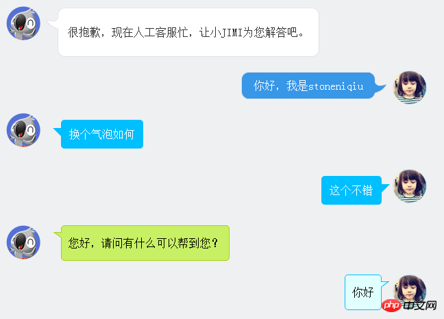
圖片式:
第一個樣式是京東客服,氣泡的圓角和鉤子都是用圖片了。使用了一個table組合成了一個圓角的框框。 lm樣式拼出了鉤子。
 <p class="jimi_lists clearfix">
                <p class="header_img jimi3 fl"></p>
                <table class="msg" cellspacing="0" cellpadding="0">
                    <tbody><tr><td class="lt"></td><td class="tt"></td><td class="rt"></td></tr>
                    <tr><td class="lm"><span></span></td><td class="mm"><span class="wel"><span class="visitor"><p>很抱歉,现在人工客服忙,让小JIMI为您解答吧。</p></span></span></td><td class="rm"></td></tr>
                    <tr><td class="lb"></td><td class="bm"></td><td class="rb"></td></tr><tr><td></td></tr>
                    </tbody>
                </table>
            </p>
            <p class="customer_lists clearfix">
                <p class="header_img jimi3" style="background: url(img/mine.jpg) no-repeat center;">
                    <p class="header_img_hover"></p>
                </p>
                <table class="msg" cellspacing="0" cellpadding="0"><tbody><tr><td class="lt"></td><td class="tt"></td><td class="rt"></td></tr><tr><td class="lm"></td><td class="mm">你好,我是stoneniqiu</td><td class="rm"><span></span></td></tr><tr><td class="lb"></td><td class="bm"></td><td class="rb"></td></tr><tr><td></td><td class="time"></td><td></td></tr></tbody></table>
            </p>
樣式:
 .jimi_lists {
    margin: 0 -10px 20px 10px;
    position: relative;
}
 .jimi_lists .header_img.jimi3 {
    background: url(../img/jimi_50_3.png) no-repeat 0 0;
}
 .jimi_lists .header_img {
    width: 50px;
    height: 50px;
    position: absolute;
    top: 0;
    left: 0;
}.fl {
    float: left;
}
 .jimi_lists .msg {
    margin-left: 59px;
    margin-right: 40px;
    margin-top: 2px;
    float: left;
    display: inline;
}
 .jimi_lists .lt {
    background: url(../img/msg_bg_lr.png) no-repeat 0 0;
    width: 26px;
    height: 10px;
}
 .jimi_lists .tt {
    background: url(../img/msg_bg_tb.png) repeat-x 0 -23px;
    height: 10px;
}.jimi_lists .rt {
    background: url(../img/msg_bg_lr.png) no-repeat -35px 0;
    width: 10px;
    height: 10px;
}.jimi_lists .lm {
    background: url(../img/msg_bg_lr.png) repeat-y -94px 0;
    width: 26px;
    vertical-align: top;
    position: relative;
}.jimi_lists .mm {
    padding: 0 5px;
    background-color: #FFF;
    word-break: break-all;
    word-wrap: break-word;
    color: #333;
    line-height: 20px;
}.jimi_lists .lm span {
    background: url(../img/msg_bg_lr.png) no-repeat 0 -14px;
    display: inline-block;
    width: 26px;
    height: 16px;
    position: absolute;
    top: 5px;
}.jimi_lists .rm {
    background: url(../img/msg_bg_lr.png) repeat-y -113px 0;
    width: 10px;
}.jimi_lists .lb {
    background: url(../img/msg_bg_lr.png) no-repeat 0 -43px;
    width: 10px;
    height: 10px;
}.jimi_lists .bm {
    background: url(../img/msg_bg_tb.png) repeat-x 0 -25px;
    height: 10px;
}.jimi_lists .rb {
    background: url(../img/msg_bg_lr.png) no-repeat -35px -43px;
    width: 10px;
    height: 10px;
}.customer_lists {
    position: relative;
    margin: 0 12px 20px 20px;
}.customer_lists .msg {
    float: right;
    margin-right: 73px;
    _margin-right: 38px;
    margin-top: 2px;
}.customer_lists .lt {
    background: url(../img/msg_bg_lr.png) no-repeat -47px -0;
    width: 10px;
    height: 10px;
}.customer_lists .tt {
    background: url(../img/msg_bg_tb.png) repeat-x 0 0;
    height: 10px;
}.customer_lists .rt {
    background: url(../img/msg_bg_lr.png) no-repeat -63px 0;
    width: 26px;
    height: 10px;
}.customer_lists .lm {
    background: url(../img/msg_bg_lr.png) repeat-y -126px 0;
    width: 10px;
}.customer_lists .mm {
    padding: 1px 8px;
    background-color: #3897E7;
    word-break: break-all;
    word-wrap: break-word;
    color: #FFF;
}.customer_lists .rm {
    background: url(../img/msg_bg_lr.png) repeat-y -129px 0;
    width: 26px;
    vertical-align: top;
    position: relative;
}.customer_lists .lb {
    background: url(../img/msg_bg_lr.png) no-repeat -47px -36px;
    width: 10px;
    height: 10px;
}.customer_lists .bm {
    background: url(../img/msg_bg_tb.png) repeat-x -106px -4px;
    height: 10px;
}.customer_lists .rb {
    background: url(../img/msg_bg_lr.png) no-repeat -63px -36px;
    width: 26px;
    height: 10px;
}.customer_lists .rm span {
    background: url(../img/msg_bg_lr.png) no-repeat -63px -14px;
    display: inline-block;
    width: 26px;
    height: 16px;
    position: absolute;
    top: 5px;
}.customer_lists .header_img_hover {
    position: absolute;
    background: url(../img/avatar_mask_01.png);
    top: 0;
    width: 50px;
    height: 50px;
}.customer_lists .header_img {
    position: absolute;
    top: 0;
    right: 14px;
    width: 50px;
    height: 50px;
}
 .clearfix:after {
    content: " .";
    display: block;
    clear: both;
    visibility: hidden;
    height: 0;
}View Code
背景式:
第二種主要是使用了:before偽類別畫出了三角形,然後用定位拼在了一起。
  <p class="jimi_lists clearfix">
                <p class="header_img jimi3 fl"></p>
                <p class="bkbubble right">
                     <p>换个气泡如何</p>
                </p>
            </p>
            <p class="customer_lists clearfix">
                <p class="header_img jimi3" style="background: url(img/mine.jpg) no-repeat center;">
                    <p class="header_img_hover"></p>
                </p>
                <p class="bkbubble left">
                    <p>这个不错</p>
                </p>
            </p>
樣式:
  .bkbubble.right p:before, .bkbubble.left p:before {
      width: 0;
    position: absolute;
    top: 12px;
    border-style: solid;
    content: "";
  }
  .bkbubble.left {
      text-align: right;
  }
 .bkbubble.right p:before {
     left: -12px;
    border-color: transparent #00bfff;
    border-width: 0 12px 12px 0; }
 .bkbubble.left p:before {
     right: -12px;
    border-color: transparent #00bfff;
border-width: 0 0 12px 12px ; }更多三角形:http://www.cnblogs.com/lhb25/p/css-and-css3-triangle.html
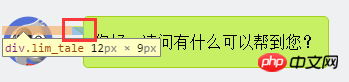
#邊框式:
如果要求邊框顏色和背景顏色不一樣呢?上面的方法就不行了,因為用:before畫三角形是利用border的原理,也就是說,在上面這種方式下,氣泡邊上的小三形是無法呈現兩種顏色的,因為他只有一個border的顏色。那就要想辦法湊出一個有邊框的三角形了。
  <p class="jimi_lists lim_operator clearfix">
                <p class="header_img jimi3 fl"></p>
                <p class="lim_bubble lim_shadow"><p class="lim_dot">您好,请问有什么可以帮到您?</p></p>
                <p class="lim_tale"><p class="radiusborder"></p></p>
            </p>
1.先畫一個小矩形。
.lim_operator .lim_tale {
    left: -1px;
    background-color: #c8f064;
    border-color: #a5d01b;
    margin-left: 70px;
}.lim_tale {
    position: absolute;
    width: 12px;
    height: 8px;
    overflow: hidden !important;
    top: 10px;
    z-index: 2;
    border-top-style: solid;
    border-top-width: 1px;
}
2.畫出斜線。
css裡面是沒有斜線的,這裡是用了一個園的弧形拼出來的。在一個大圓上,截取一段弧,就是一條斜線了。
.lim_operator .radiusborder {
    position: absolute;
    background-color: #EFF0F2;
    top: -29px;
    left: -94px;
    height: 160px;
    width: 160px;
    border-top-style: solid;
    border-top-width: 1px;
    border-right-style: solid;
    border-right-width: 1px;
    border-top-right-radius: 154px;
    border-color: #a5d01b;
}疊加式:
原理就是相當於用before先畫出一個有色背景,再用after畫出一個白色背景,然後疊加錯開頂部1-2px,這樣就出現了一個有邊框有背景的三角形。 web 微信就是這種做法
.expression:before {
    content: '';
    position: absolute;
    left: 16px;
    top: 100%;
    margin-left: -7px;
    border: 7px solid transparent;
    border-top-color: #CFCFCF}.expression:after {
    content: '';
    position: absolute;
    left: 16px;
    top: 100%;
    margin-left: -7px;
    margin-top: -1px;
    border: 7px solid transparent;
border-top-color: #FFF}相信看了本文案例你已經掌握了方法,更多精彩請關注php中文網其它相關文章!
推薦閱讀:
JavaScript的var與this,{}與function
以上是css3的聊天氣泡樣式的詳細內容。更多資訊請關注PHP中文網其他相關文章!

熱AI工具

Undresser.AI Undress
人工智慧驅動的應用程序,用於創建逼真的裸體照片

AI Clothes Remover
用於從照片中去除衣服的線上人工智慧工具。

Undress AI Tool
免費脫衣圖片

Clothoff.io
AI脫衣器

Video Face Swap
使用我們完全免費的人工智慧換臉工具,輕鬆在任何影片中換臉!

熱門文章
熱工具

記事本++7.3.1
好用且免費的程式碼編輯器

SublimeText3漢化版
中文版,非常好用

禪工作室 13.0.1
強大的PHP整合開發環境

Dreamweaver CS6
視覺化網頁開發工具

SublimeText3 Mac版
神級程式碼編輯軟體(SublimeText3)


 vue中怎麼用bootstrap
Apr 07, 2025 pm 11:33 PM
vue中怎麼用bootstrap
Apr 07, 2025 pm 11:33 PM
在 Vue.js 中使用 Bootstrap 分為五個步驟:安裝 Bootstrap。在 main.js 中導入 Bootstrap。直接在模板中使用 Bootstrap 組件。可選:自定義樣式。可選:使用插件。
 HTML,CSS和JavaScript的角色:核心職責
Apr 08, 2025 pm 07:05 PM
HTML,CSS和JavaScript的角色:核心職責
Apr 08, 2025 pm 07:05 PM
HTML定義網頁結構,CSS負責樣式和佈局,JavaScript賦予動態交互。三者在網頁開發中各司其職,共同構建豐富多彩的網站。
 了解HTML,CSS和JavaScript:初學者指南
Apr 12, 2025 am 12:02 AM
了解HTML,CSS和JavaScript:初學者指南
Apr 12, 2025 am 12:02 AM
WebDevelovermentReliesonHtml,CSS和JavaScript:1)HTMLStructuresContent,2)CSSStyleSIT和3)JavaScriptAddSstractivity,形成thebasisofmodernWebemodernWebExexperiences。
 bootstrap怎麼設置框架
Apr 07, 2025 pm 03:27 PM
bootstrap怎麼設置框架
Apr 07, 2025 pm 03:27 PM
要設置 Bootstrap 框架,需要按照以下步驟:1. 通過 CDN 引用 Bootstrap 文件;2. 下載文件並將其託管在自己的服務器上;3. 在 HTML 中包含 Bootstrap 文件;4. 根據需要編譯 Sass/Less;5. 導入定製文件(可選)。設置完成後,即可使用 Bootstrap 的網格系統、組件和样式創建響應式網站和應用程序。
 bootstrap怎麼寫分割線
Apr 07, 2025 pm 03:12 PM
bootstrap怎麼寫分割線
Apr 07, 2025 pm 03:12 PM
創建 Bootstrap 分割線有兩種方法:使用 標籤,可創建水平分割線。使用 CSS border 屬性,可創建自定義樣式的分割線。
 bootstrap怎麼插入圖片
Apr 07, 2025 pm 03:30 PM
bootstrap怎麼插入圖片
Apr 07, 2025 pm 03:30 PM
在 Bootstrap 中插入圖片有以下幾種方法:直接插入圖片,使用 HTML 的 img 標籤。使用 Bootstrap 圖像組件,可以提供響應式圖片和更多樣式。設置圖片大小,使用 img-fluid 類可以使圖片自適應。設置邊框,使用 img-bordered 類。設置圓角,使用 img-rounded 類。設置陰影,使用 shadow 類。調整圖片大小和位置,使用 CSS 樣式。使用背景圖片,使用 background-image CSS 屬性。
 bootstrap按鈕怎麼用
Apr 07, 2025 pm 03:09 PM
bootstrap按鈕怎麼用
Apr 07, 2025 pm 03:09 PM
如何使用 Bootstrap 按鈕?引入 Bootstrap CSS創建按鈕元素並添加 Bootstrap 按鈕類添加按鈕文本
 bootstrap怎麼調整大小
Apr 07, 2025 pm 03:18 PM
bootstrap怎麼調整大小
Apr 07, 2025 pm 03:18 PM
要調整 Bootstrap 中元素大小,可以使用尺寸類,具體包括:調整寬度:.col-、.w-、.mw-調整高度:.h-、.min-h-、.max-h-
