
現在html5 css3已經越來越流行,用CSS3實現p漸變已經不是什麼難事了,這篇文章給大家整理了現在常用的三種顏色漸變模式,包括線性漸變、徑向漸變和重複的線性漸變,文中透過範例程式碼介紹的很詳細,有需要的朋友們可以參考借鑒,下面來一起看看吧。
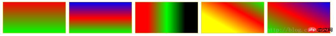
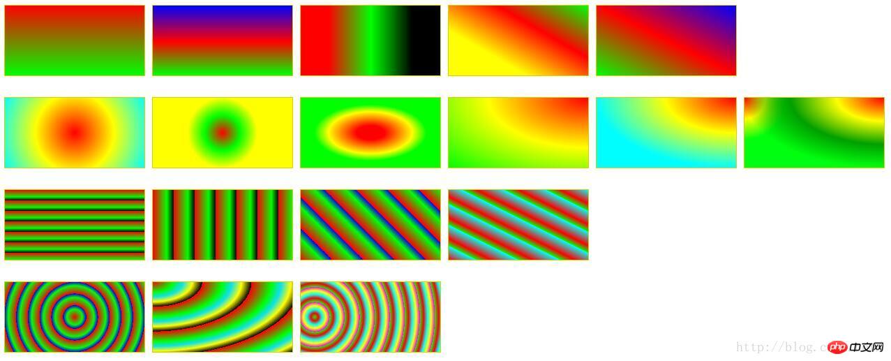
一、線性漸進:linear-gradient
#語法:
  <linear-gradient> = linear-gradient([ [ <angle> | to <side-or-corner] ,]? <color-start>[, <color-end>]+)
        <side-or-corner> = [left | right] || [top | bottom]
<color-start|end> = <color>[ <length>|<percentage>]? 下述值用來表示漸變的方向,可以用角度或關鍵字來設定:
#
to left:設定漸層為由右至左。相當於: 270deg
to right:設定漸層從左到右。相當於: 90deg
to top:設定漸層由下往上。相當於: 0deg
to bottom:設定漸層從上到下。相當於: 180deg。這是預設值,等同於留空不寫。
範例:
p {
    width: 200px;
    height: 100px;
    margin: 10px 5px;
    border: 1px solid #ddd000;
}
#LinearStartToEnd {
  float:left;
  background: linear-gradient(#ff0000, #00ff00);
}
#LinearPercentage {
  float:left;
  background: linear-gradient(#0000ff, #ff0000 52%, #00ff00);
}
#LinearAnglePercentage {
  float:left;
  background: linear-gradient(90deg, #ff0000 20%, #00ff00 50%, #000000 80%);
}
#LinearAngle {
  float:left;
  background: linear-gradient(30deg, #ffff00 30%, #ff0000, #00ff00);
}
#LinearTopRight {
  float:left;
  background: linear-gradient(to right top, #00ff00, #ff0000 50%, #0000ff);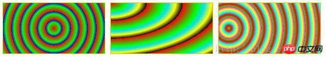
}二、徑向漸進:radial-gradient
語法:
  <position> = [ <length>① | <percentage>① | left | center① | right ]? [ <length>② | <percentage>② | top | center② | bottom ]?
     <shape> = circle | ellipse
     <size> = <extent-keyword>|[<circle-size>||<ellipse-size>]
     <extent-keyword> = closest-side | closest-corner | farthest-side | farthest-corner
     <circle-size> = <length>
     <ellipse-size> = [ <length>| <percentage> ]{2}
     <shape-size> = <length>| <percentage>
     <radial-gradient> = radial-gradient([ [ <shape>|| <size> ] [ at <position> ]? , | at <position> , ]?<color-start>[[ , <color-end>]]+)
center①:以徑向漸層圓心設定為徑向圓心的橫座標值。
center②:以徑向漸層圓心設定為中心的縱座標值。
left:將左邊設為徑向漸層圓心的橫座標值。
right:以右邊設定為徑向圓心的橫座標值。
top:將頂部設為徑向漸變圓心的縱座標值。
bottom:以徑向漸層圓心設定為徑向圓心的縱座標值。
circle:指定圓形的徑向漸變
ellipse:指定橢圓形的徑向漸層。
closest-side:以圓心到離圓心最近的邊指定徑向。
closest-corner:以圓心到離圓心最近指定放射心的角。
以 farthest-side:指定徑向漸層的半徑長度為從圓心到離圓心最遠的邊。
以 farthest-corner:指定徑向漸層的半徑長度為圓心到離圓心最遠的角。
示例:

#RadialCenterCircle {
  float:left;
    background: radial-gradient(circle at center, #ff0000, #ffff00, #00ffff);
}
#RadialClosestSide {
  float:left;
    background: radial-gradient(circle closest-side, #ff0000, #00ff00, #ffff00);
}
#RadialFarthestSide {
  float:left;
    background: radial-gradient(farthest-side, #ff0000 20%, #ffff00 60%, #00ff00 80%);
}
#RadialRightTop {
  float:left;
    background: radial-gradient(at right top, #ff0000, #ffff00, #00ff00);
}
#RadialRadiusCenter {
  float:left;
    background: radial-gradient(farthest-side at top right, #ff0000, #ffff00, #01fefe);
}
#RadialGroup {
  float:left;
    background:
        radial-gradient(farthest-side at top right, #ff0000, #ffff00, #009f00, transparent),
        radial-gradient(60px at top left, #ff0000, #ffff00, #00ff0e);
}三、重复的线性渐变:repeating-linear-gradient
语法和参数类似线性渐变,这里不在赘述。详情请参考CSS手册。
示例:
#RepeatingLinearPercentage{
  float:left;
    background: repeating-linear-gradient(#ff0000, #00ff00 10%, #000000 15%);
}
#RepeatingLinearRight {
  float:left;
    background: repeating-linear-gradient(to right, #ff0000, #00ff00 10%, #000000 15%);
}
#RepeatingLinearAngle {
  float:left;
    background: repeating-linear-gradient(45deg, #ff0000, #00ff00 10%, #0000ff 15%);
}
#RepeatingLinearBottomLeft {
  float:left;
    background: repeating-linear-gradient(to bottom left, #00ffff, #ff0000 10%, #00ff00 15%);
}四、重复的径向渐变:repeating-radial-gradient
语法和参数类似径向渐变,这里不在赘述。详情请参考CSS手册。
示例:
#RepeatingRadialCircle {
  float:left;
    background: repeating-radial-gradient(circle, #ff0000 0, #00ff00 10%, #0000ff 15%);
}
#RepeatingRadialTopLeft {
  float:left;
    background: repeating-radial-gradient(at top left, #ff0000, #00ff00 10%, #0de0f0 15%, #ffff00 20%, #000000 25%);
}
#RepeatingRadialClosestCorner {
  float:left;
    background: repeating-radial-gradient(circle closest-corner at 20px 50px, #00ff00, #ff0000 10%, #00ffff 20%, #ffff00 30%, #ff00ff 40%);
}完整的例子:
<!DOCTYPE html>
<html>
<head>
<meta charset="utf-8" />
<title>ImageCSS3</title>
<style>
p {
    width: 200px;
    height: 100px;
    margin: 10px 5px;
    border: 1px solid #ddd000;
}
#LinearStartToEnd {
  float:left;
  background: linear-gradient(#ff0000, #00ff00);
}
#LinearPercentage {
  float:left;
  background: linear-gradient(#0000ff, #ff0000 52%, #00ff00);
}
#LinearAnglePercentage {
  float:left;
  background: linear-gradient(90deg, #ff0000 20%, #00ff00 50%, #000000 80%);
}
#LinearAngle {
  float:left;
  background: linear-gradient(30deg, #ffff00 30%, #ff0000, #00ff00);
}
#LinearTopRight {
  float:left;
  background: linear-gradient(to right top, #00ff00, #ff0000 50%, #0000ff);
}

#RadialCenterCircle {
  float:left;
    background: radial-gradient(circle at center, #ff0000, #ffff00, #00ffff);
}
#RadialClosestSide {
  float:left;
    background: radial-gradient(circle closest-side, #ff0000, #00ff00, #ffff00);
}
#RadialFarthestSide {
  float:left;
    background: radial-gradient(farthest-side, #ff0000 20%, #ffff00 60%, #00ff00 80%);
}
#RadialRightTop {
  float:left;
    background: radial-gradient(at right top, #ff0000, #ffff00, #00ff00);
}
#RadialRadiusCenter {
  float:left;
    background: radial-gradient(farthest-side at top right, #ff0000, #ffff00, #01fefe);
}
#RadialGroup {
  float:left;
    background:
                radial-gradient(farthest-side at top right, #ff0000, #ffff00, #009f00, transparent),
                radial-gradient(60px at top left, #ff0000, #ffff00, #00ff0e);
}

#RepeatingLinearPercentage{
  float:left;
    background: repeating-linear-gradient(#ff0000, #00ff00 10%, #000000 15%);
}
#RepeatingLinearRight {
  float:left;
    background: repeating-linear-gradient(to right, #ff0000, #00ff00 10%, #000000 15%);
}
#RepeatingLinearAngle {
  float:left;
    background: repeating-linear-gradient(45deg, #ff0000, #00ff00 10%, #0000ff 15%);
}
#RepeatingLinearBottomLeft {
  float:left;
    background: repeating-linear-gradient(to bottom left, #00ffff, #ff0000 10%, #00ff00 15%);
}

#RepeatingRadialCircle {
  float:left;
    background: repeating-radial-gradient(circle, #ff0000 0, #00ff00 10%, #0000ff 15%);
}
#RepeatingRadialTopLeft {
  float:left;
    background: repeating-radial-gradient(at top left, #ff0000, #00ff00 10%, #0de0f0 15%, #ffff00 20%, #000000 25%);
}
#RepeatingRadialClosestCorner {
  float:left;
    background: repeating-radial-gradient(circle closest-corner at 20px 50px, #00ff00, #ff0000 10%, #00ffff 20%, #ffff00 30%, #ff00ff 40%);
}

</style>
</head>
<body>
<!-- 指定线性渐变起止色 -->
<p id="LinearStartToEnd"></p>
<!-- 指定线性渐变起止色位置 -->
<p id="LinearPercentage"></p>
<!-- 指定线性渐变颜色渐变方向和起止色位置 -->
<p id="LinearAnglePercentage"></p>
<!-- 指定线性渐变颜色渐变方向 -->
<p id="LinearAngle"></p>
<!-- 设置渐变从右上到左下 -->
<p id="LinearTopRight"></p>

<!-- 浮动p换行,此处指定p宽高和边界,是为了覆盖前面定义的p统一CSS样式,
 可以尝试去掉指定的p宽高和边界,看看效果 -->
<p style="width:0; height:0; border:none; clear:both"></p>
<!-- 以中心点为圆心的圆形径向渐变 -->
<p id="RadialCenterCircle"></p>
<!-- 径向渐变半径长度:圆心到离圆心最近边的长度 -->
<p id="RadialClosestSide"></p>
<!-- 径向渐变半径长度:圆心到离圆心最远边的长度 -->
<p id="RadialFarthestSide"></p>
<!-- 左边为径向渐变圆心的横坐标值,顶边为径向渐变圆心的纵坐标值 -->
<p id="RadialRightTop"></p>
<!-- 同时指定径向渐变的圆心和半径 -->
<p id="RadialRadiusCenter"></p>
<!-- 径向渐变组合 -->
<p id="RadialGroup"></p>

<p style="width:0; height:0; border:none; clear:both"></p>
<!-- 指定颜色起止色位置的重复线性渐变 -->
<p id="RepeatingLinearPercentage"></p>
<!-- 从左到右渐变的重复线性渐变 -->
<p id="RepeatingLinearRight"></p>
<!-- 渐变角度为45度的重复线性渐变 -->
<p id="RepeatingLinearAngle"></p>
<!-- 从左下到右上的重复线性渐变 -->
<p id="RepeatingLinearBottomLeft"></p>

<p style="width:0; height:0; border:none; clear:both"></p>
<!-- 圆形重复径向渐变 -->
<p id="RepeatingRadialCircle"></p>
<!-- 渐变方向为左上到右下的重复径向渐变 -->
<p id="RepeatingRadialTopLeft"></p>
<!-- 重复径向渐变:渐变半径长度为从圆心到离圆心最近的角的距离 -->
<p id="RepeatingRadialClosestCorner"></p>

</body>
</html>以上就是本文的全部内容,希望对大家的学习有所帮助,更多相关内容请关注PHP中文网!
相关推荐:
以上是在CSS3中常用的幾種顏色漸變模式的詳細內容。更多資訊請關注PHP中文網其他相關文章!


