

css實現箭頭和帶缺口提示框
一、實作如圖所示箭頭
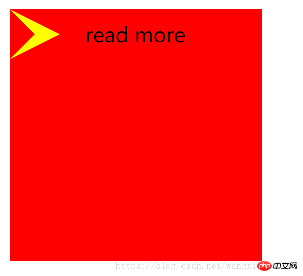
<!DOCTYPE html>
<html>
<head>
	<title></title>
<style type="text/css">
.out{
	width: 200px;
	height: 200px;
	background: #f00;
	position: relative;
}
.word{
	position: absolute;
	left: 60px;
	line-height: 40px;
}
.triangle-out{
	position: absolute;
	top: 0px;
	left: 0px;
	width: 0px;
	height: 0px;
	display: block;
	border-top: 20px solid #f00;
	border-right: 20px solid #f00;
	border-bottom: 20px solid #f00;
	border-left: 40px solid #ff0;
}
.triangle-in{
	position: absolute;
	top: 0px;
	left: 0px;
	width: 0px;
	height: 0px;
	display: block;
	border-top: 20px solid transparent;
	border-right: 20px solid transparent;
	border-bottom: 20px solid transparent;
	border-left: 20px solid #f00;
}
</style>
</head>
<body>
	<p class="out">
		<span class="triangle-out"></span>
		<span class="triangle-in"></span>
		<span class="word">read more</span>
	</p>
</body>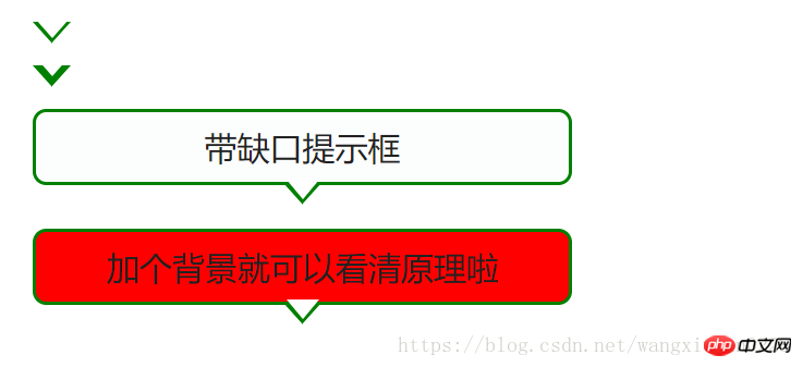
</html>二、實作帶缺口提示框
<!DOCTYPE html PUBLIC "-//W3C//DTD XHTML 1.0 Transitional//EN" "http://www.w3.org/TR/xhtml1/DTD/xhtml1-transitional.dtd">
<html xmlns="http://www.w3.org/1999/xhtml">
<head>
<meta http-equiv="Content-Type" content="text/html; charset=utf-8" />
<title>带缺口的提示框-/</title>
<style>
.wrap{
	font-size: 12px;
	margin:40px auto;
	width:600px;
}
.ui-slider-tooltip{
	background:#FCFDFD;
	border:1px solid green;
	color:#222222;
	display: block;
	text-align: center;
	padding: 5px 3px 5px 3px;
	width: 190px;
	position: relative;
}
.ui-corner-all {
	-moz-border-radius-bottomleft:5px;
	-moz-border-radius-bottomright:5px;
	-moz-border-radius-topleft:5px;
	-moz-border-radius-topright:5px;
	-webkit-border-top-left-radius:5px 5px;
	-webkit-border-top-right-radius:5px 5px;
	-webkit-border-bottom-right-radius:5px 5px;
	-webkit-border-bottom-left-radius:5px 5px;
}
.ui-tooltip-pointer-down {
	border-bottom-width: 0;
	border-left: 7px dashed transparent;
	border-right: 7px dashed transparent;
	border-top: 8px solid green;
	bottom:	-8px;
	display: block;
	height:0;
	left: 50%;
	margin-left: -7px;
	position: absolute;
	width:0;
}

.ui-tooltip-pointer-down-inner {
	border-left: 6px dashed transparent;
	border-right: 6px dashed transparent;
	border-top: 7px solid #fff;
	left: -6px;
	top: -9px;
	position: absolute;
}

.a{
	display: block;width:0;height:0;
	border-left: 7px dashed transparent;
	border-right: 7px dashed transparent;
	border-top: 8px solid green;
	border-bottom: 0;
	position: absolute;
}
.b{
	position: absolute;
	border-left: 6px dashed transparent;
	border-right: 6px dashed transparent;
	border-top: 7px solid #fff;
	top: -9px;
	left: -6px;
}
</style>
</head>
<body>
<p class="wrap">
	<h1>用CSS实现带缺口的提示框</h1>
	<span class="a">
		<span class="b"></span>
	</span>
	<br/>
	<span class="a">
		<span class="b" style="top:-11px;"></span>
	</span>
	<br/>


	<span class="ui-slider-tooltip  ui-corner-all">
		<span>带缺口提示框</span>
		<span class="ui-tooltip-pointer-down">
		<span class="ui-tooltip-pointer-down-inner" ></span>
		</span>
	</span>
	<br/>
	<span class="ui-slider-tooltip  ui-corner-all" style="background: #f00">
		<span>加个背景就可以看清原理啦</span>
		<span class="ui-tooltip-pointer-down">
		<span class="ui-tooltip-pointer-down-inner" ></span>
		</span>
	</span>
</p>
</p>
</body>
</html>其實就是利用寬度高度為0的box,設定border,得到想要的三角形,透過三角形的疊加顯示製作出箭頭的效果~
本文講解了css實現箭頭和帶缺口提示框,更多相關內容請關注php中文網。
相關推薦:
################################# ###關於物件導向設計的相關講解######的相關講解######以上是css實現箭頭和帶缺口提示框的詳細內容。更多資訊請關注PHP中文網其他相關文章!

熱AI工具

Undresser.AI Undress
人工智慧驅動的應用程序,用於創建逼真的裸體照片

AI Clothes Remover
用於從照片中去除衣服的線上人工智慧工具。

Undress AI Tool
免費脫衣圖片

Clothoff.io
AI脫衣器

Video Face Swap
使用我們完全免費的人工智慧換臉工具,輕鬆在任何影片中換臉!

熱門文章
熱工具

記事本++7.3.1
好用且免費的程式碼編輯器

SublimeText3漢化版
中文版,非常好用

禪工作室 13.0.1
強大的PHP整合開發環境

Dreamweaver CS6
視覺化網頁開發工具

SublimeText3 Mac版
神級程式碼編輯軟體(SublimeText3)


 vue中怎麼用bootstrap
Apr 07, 2025 pm 11:33 PM
vue中怎麼用bootstrap
Apr 07, 2025 pm 11:33 PM
在 Vue.js 中使用 Bootstrap 分為五個步驟:安裝 Bootstrap。在 main.js 中導入 Bootstrap。直接在模板中使用 Bootstrap 組件。可選:自定義樣式。可選:使用插件。
 了解HTML,CSS和JavaScript:初學者指南
Apr 12, 2025 am 12:02 AM
了解HTML,CSS和JavaScript:初學者指南
Apr 12, 2025 am 12:02 AM
WebDevelovermentReliesonHtml,CSS和JavaScript:1)HTMLStructuresContent,2)CSSStyleSIT和3)JavaScriptAddSstractivity,形成thebasisofmodernWebemodernWebExexperiences。
 HTML,CSS和JavaScript的角色:核心職責
Apr 08, 2025 pm 07:05 PM
HTML,CSS和JavaScript的角色:核心職責
Apr 08, 2025 pm 07:05 PM
HTML定義網頁結構,CSS負責樣式和佈局,JavaScript賦予動態交互。三者在網頁開發中各司其職,共同構建豐富多彩的網站。
 bootstrap怎麼寫分割線
Apr 07, 2025 pm 03:12 PM
bootstrap怎麼寫分割線
Apr 07, 2025 pm 03:12 PM
創建 Bootstrap 分割線有兩種方法:使用 標籤,可創建水平分割線。使用 CSS border 屬性,可創建自定義樣式的分割線。
 bootstrap怎麼插入圖片
Apr 07, 2025 pm 03:30 PM
bootstrap怎麼插入圖片
Apr 07, 2025 pm 03:30 PM
在 Bootstrap 中插入圖片有以下幾種方法:直接插入圖片,使用 HTML 的 img 標籤。使用 Bootstrap 圖像組件,可以提供響應式圖片和更多樣式。設置圖片大小,使用 img-fluid 類可以使圖片自適應。設置邊框,使用 img-bordered 類。設置圓角,使用 img-rounded 類。設置陰影,使用 shadow 類。調整圖片大小和位置,使用 CSS 樣式。使用背景圖片,使用 background-image CSS 屬性。
 bootstrap怎麼設置框架
Apr 07, 2025 pm 03:27 PM
bootstrap怎麼設置框架
Apr 07, 2025 pm 03:27 PM
要設置 Bootstrap 框架,需要按照以下步驟:1. 通過 CDN 引用 Bootstrap 文件;2. 下載文件並將其託管在自己的服務器上;3. 在 HTML 中包含 Bootstrap 文件;4. 根據需要編譯 Sass/Less;5. 導入定製文件(可選)。設置完成後,即可使用 Bootstrap 的網格系統、組件和样式創建響應式網站和應用程序。
 bootstrap怎麼調整大小
Apr 07, 2025 pm 03:18 PM
bootstrap怎麼調整大小
Apr 07, 2025 pm 03:18 PM
要調整 Bootstrap 中元素大小,可以使用尺寸類,具體包括:調整寬度:.col-、.w-、.mw-調整高度:.h-、.min-h-、.max-h-
 bootstrap按鈕怎麼用
Apr 07, 2025 pm 03:09 PM
bootstrap按鈕怎麼用
Apr 07, 2025 pm 03:09 PM
如何使用 Bootstrap 按鈕?引入 Bootstrap CSS創建按鈕元素並添加 Bootstrap 按鈕類添加按鈕文本
