

關於CSS如何實現多行多列佈局的方法

這篇文章主要介紹了CSS實作多行多列的佈局的實例程式碼,需要的朋友可以參考下
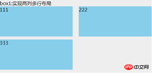
1.兩列多行:
#HTML:
<p class="box1">
    box1:实现两列多行布局
    <ul>
        <li>111</li>
        <li>222</li>
        <li>333</li>
    </ul>
</p>CSS:
.box1 {
  width: 500px;
  background: #EEEEEE;
}
.box1 ul {
  clear: both;
  overflow: hidden;
}
.box1 ul li {
  width: 48%;
  height: 100px;
  margin-bottom: 10px;
  background: skyblue;
  float: left;
}
.box1 ul li:nth-child(even) {
  margin-left: 4%;
}這用到了nth-child(),相容ie9以上的瀏覽器,中間的空隙就是兩個並排p寬度之和,100%減去後剩下的寬度;
既然提到了nth-child(),那麼就要說一下nth-of-type (),也是只相容於ie9及以上的瀏覽器。它與nth-child的區別是:
<p class="box">
    <h1></h1>
    <h1></h1>
    <p></p>
    <p></p>
    <p></p>
</p>如果要讓第二個p標籤背景為紅色,那麼,p: nth-child(4)這個能實現效果;而p:nth-of-type(2),就能實現。所以nth-of-type不管p標籤前面有多少內容,都只認p的第二個元素。而nth-child卻是找它父級的第幾個元素。在這種情況下nth-of-type的優點就體現出來了。
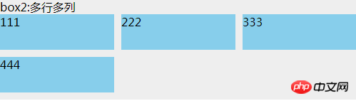
2.多行多列
 #
#
HTML:
<p class="box2">
    box2:多行多列
    <ul>
        <li>
            <p class="com">
                111
            </p>
        </li>
        <li>
            <p class="com">
                222
            </p>
        </li>
        <li>
            <p class="com">
                333
            </p>
        </li>
        <li>
            <p class="com">
                444
            </p>
        </li>
    </ul>
</p>CSS:
#.box2 {
background: #EEEEEE;
margin-top: 20px;
width: 500px;
}
.box2 ul {
overflow: hidden;
margin-left: -10px;
background: #EEEEEE;
}
.box2 ul li {
width: 33.3333%;
height: 50px;
float: left;
padding-left: 10px;
box-sizing: border-box;
margin-bottom: 10px;
}
.box2 ul li .com {
height: inherit;
background: skyblue;
}這裡實作的原理是:子等級使用padding-left(元素間的間隙)和box-sizing:border-box,父級使用margin-left負值,這個值和子級padding-left是一樣的。 li裡面加p只是為了讓效果明顯,不然給li加上背景,由於box-sizing:border-box的存在,li看起來就是沒效果全部連在一起的。
如果要實作2列,4列,5列等多列,只要修改li的寬度(平均分配)就行了。
這種做法相容ie8以上的瀏覽器,在ie7下,每個li的寬度大概比正常的少2%左右,例如3列,正常顯示的話,每個li寬度是33.333% ,但是ie7下需設定31.333%,才能基本正常顯示。 。 。這具體的原因沒深究,後面有時間再來補這個坑×××
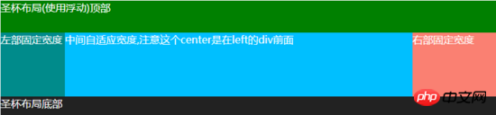
#3.聖杯佈局:
HTML:
<p class="box3">
    <p class="header">圣杯布局(使用浮动)顶部</p>
    <p class="container">
        <p class="center">
            中间自适应宽度,注意这个center是在left的p前面
        </p>
        <p class="left">
            左部固定宽度
        </p>
        <p class="right">
            右部固定宽度
        </p>
    </p>
    <p class="footer">圣杯布局底部</p>
</p>CSS:
##
.box3 {
  background: #EEEEEE;
  color: white;
  margin-top: 20px;
}
.box3 .header {
  width: 100%;
  background: #008000;
  height: 50px;
}
.box3 .container {
  clear: both;
  overflow: hidden;
  padding: 0 130px 0 100px;
}
.box3 .container .left {
  width: 100px;
  float: left;
  background: #008B8B;
  height: 100px;
  margin-left: -100%;
  position: relative;
  left: -100px;
}
.box3 .container .center {
  background: #00BFFF;
  height: 100px;
  float: left;
  width: 100%;
}
.box3 .container .right {
  width: 130px;
  float: left;
  background: #FA8072;
  height: 100px;
  margin-left: -130px;
  position: relative;
  right: -130px;
}
.box3 .footer {
  width: 100%;
  background: #222222;
  height: 30px;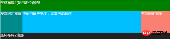
}4.仿聖杯版面
<p class="box4">
    <p class="header">圣杯布局2(使用定位)顶部</p>
    <p class="container">
        <p class="left">
            左部固定宽度
        </p>
        <p class="center">
            中间自适应宽度,无需考虑顺序
        </p>
        <p class="right">
            右部固定宽度
        </p>
    </p>
    <p class="footer">圣杯布局2底部</p>
</p>#
.box4 {
  background: #EEEEEE;
  color: white;
  margin-top: 20px;
}
.box4 .header {
  width: 100%;
  background: #008000;
  height: 50px;
}
.box4 .container {
  clear: both;
  overflow: hidden;
  padding: 0 130px 0 100px;
  position: relative;
}
.box4 .container .left {
  width: 100px;
  background: #008B8B;
  height: 100px;
  position: absolute;
  top: 0px;
  left: 0px;
}
.box4 .container .center {
  background: #00BFFF;
  height: 100px;
  width: 100%;
}
.box4 .container .right {
  width: 130px;
  background: #FA8072;
  height: 100px;
  position: absolute;
  top: 0px;
  right: 0px;
}
.box4 .footer {
  width: 100%;
  background: #222222;
  height: 30px;
}5.雙飛翼佈局
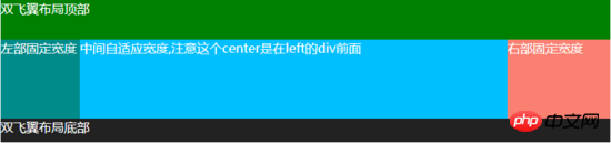
<p class="box5">
    <p class="header">双飞翼布局顶部</p>
    <p class="container">
        <p class="center">
            <p class="center-in">
                中间自适应宽度,注意这个center是在left的p前面
            </p>
        </p>
        <p class="left">
            左部固定宽度
        </p>
        <p class="right">
            右部固定宽度
        </p>
    </p>
    <p class="footer">双飞翼布局底部</p>
</p>.box5 {
background: #EEEEEE;
color: white;
margin-top: 20px;
}
.box5 .header {
width: 100%;
background: #008000;
height: 50px;
}
.box5 .container {
clear: both;
overflow: hidden;
}
.box5 .container .left {
width: 100px;
float: left;
background: #008B8B;
height: 100px;
margin-left: -100%;
}
.box5 .container .center {
background: #00BFFF;
height: 100px;
float: left;
width: 100%;
}
.box5 .container .center .center-in {
margin: 0 130px 0 100px;
}
.box5 .container .right {
width: 130px;
float: left;
background: #FA8072;
height: 100px;
margin-left: -130px;
}
.box5 .footer {
width: 100%;
background: #222222;
height: 30px;
}雙飛翼佈局和聖杯佈局看起來都差不多,但是最大的不同就是:雙飛翼佈局中center中間的這個p裡面還有一個p,主要透過這個p的margin值來達到佈局的目的。然後left和right這兩個p都不用再設定相對定位relative。其它的都基本一樣
相容ie7,ie6未測試過。
還有許多多行多列的佈局方式,例如css3的flex,inline-block等等。 。只要有思路,再難的佈局都能實現。
以上就是本文的全部內容,希望對大家的學習有所幫助,更多相關內容請關注PHP中文網!
相關推薦:
#
以上是關於CSS如何實現多行多列佈局的方法的詳細內容。更多資訊請關注PHP中文網其他相關文章!

熱AI工具

Undresser.AI Undress
人工智慧驅動的應用程序,用於創建逼真的裸體照片

AI Clothes Remover
用於從照片中去除衣服的線上人工智慧工具。

Undress AI Tool
免費脫衣圖片

Clothoff.io
AI脫衣器

Video Face Swap
使用我們完全免費的人工智慧換臉工具,輕鬆在任何影片中換臉!

熱門文章
熱工具

記事本++7.3.1
好用且免費的程式碼編輯器

SublimeText3漢化版
中文版,非常好用

禪工作室 13.0.1
強大的PHP整合開發環境

Dreamweaver CS6
視覺化網頁開發工具

SublimeText3 Mac版
神級程式碼編輯軟體(SublimeText3)


 vue中怎麼用bootstrap
Apr 07, 2025 pm 11:33 PM
vue中怎麼用bootstrap
Apr 07, 2025 pm 11:33 PM
在 Vue.js 中使用 Bootstrap 分為五個步驟:安裝 Bootstrap。在 main.js 中導入 Bootstrap。直接在模板中使用 Bootstrap 組件。可選:自定義樣式。可選:使用插件。
 HTML,CSS和JavaScript的角色:核心職責
Apr 08, 2025 pm 07:05 PM
HTML,CSS和JavaScript的角色:核心職責
Apr 08, 2025 pm 07:05 PM
HTML定義網頁結構,CSS負責樣式和佈局,JavaScript賦予動態交互。三者在網頁開發中各司其職,共同構建豐富多彩的網站。
 了解HTML,CSS和JavaScript:初學者指南
Apr 12, 2025 am 12:02 AM
了解HTML,CSS和JavaScript:初學者指南
Apr 12, 2025 am 12:02 AM
WebDevelovermentReliesonHtml,CSS和JavaScript:1)HTMLStructuresContent,2)CSSStyleSIT和3)JavaScriptAddSstractivity,形成thebasisofmodernWebemodernWebExexperiences。
 bootstrap怎麼設置框架
Apr 07, 2025 pm 03:27 PM
bootstrap怎麼設置框架
Apr 07, 2025 pm 03:27 PM
要設置 Bootstrap 框架,需要按照以下步驟:1. 通過 CDN 引用 Bootstrap 文件;2. 下載文件並將其託管在自己的服務器上;3. 在 HTML 中包含 Bootstrap 文件;4. 根據需要編譯 Sass/Less;5. 導入定製文件(可選)。設置完成後,即可使用 Bootstrap 的網格系統、組件和样式創建響應式網站和應用程序。
 bootstrap怎麼寫分割線
Apr 07, 2025 pm 03:12 PM
bootstrap怎麼寫分割線
Apr 07, 2025 pm 03:12 PM
創建 Bootstrap 分割線有兩種方法:使用 標籤,可創建水平分割線。使用 CSS border 屬性,可創建自定義樣式的分割線。
 bootstrap怎麼插入圖片
Apr 07, 2025 pm 03:30 PM
bootstrap怎麼插入圖片
Apr 07, 2025 pm 03:30 PM
在 Bootstrap 中插入圖片有以下幾種方法:直接插入圖片,使用 HTML 的 img 標籤。使用 Bootstrap 圖像組件,可以提供響應式圖片和更多樣式。設置圖片大小,使用 img-fluid 類可以使圖片自適應。設置邊框,使用 img-bordered 類。設置圓角,使用 img-rounded 類。設置陰影,使用 shadow 類。調整圖片大小和位置,使用 CSS 樣式。使用背景圖片,使用 background-image CSS 屬性。
 bootstrap按鈕怎麼用
Apr 07, 2025 pm 03:09 PM
bootstrap按鈕怎麼用
Apr 07, 2025 pm 03:09 PM
如何使用 Bootstrap 按鈕?引入 Bootstrap CSS創建按鈕元素並添加 Bootstrap 按鈕類添加按鈕文本
 bootstrap怎麼調整大小
Apr 07, 2025 pm 03:18 PM
bootstrap怎麼調整大小
Apr 07, 2025 pm 03:18 PM
要調整 Bootstrap 中元素大小,可以使用尺寸類,具體包括:調整寬度:.col-、.w-、.mw-調整高度:.h-、.min-h-、.max-h-
