

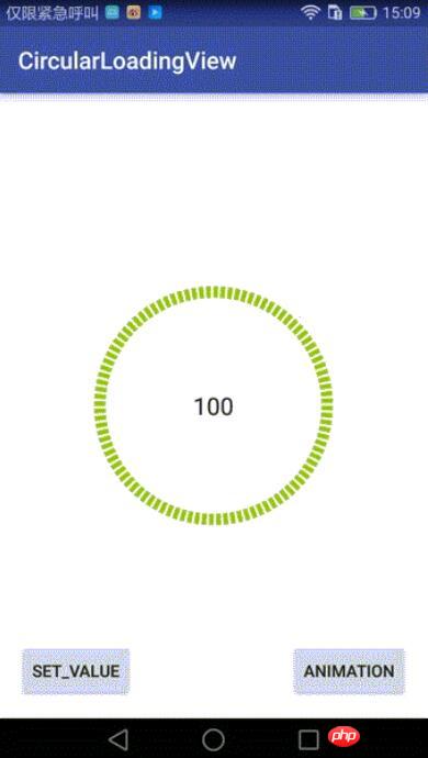
Android自訂環形LoadingView效果

這篇文章主要為大家詳細介紹了Android自訂環形LoadingView效果的方法,具有一定的參考價值,有興趣的小夥伴們可以參考一下
最近專案有要用到環形的進度條,Github上有一個類似的DashedCircularProgress控制,但是他畫的進度是透過設定畫筆的虛線效果來實現間隔的:progressPaint.setPathEffect(new DashPathEffect(new float[]{dashWith, dashSpace}, dashSpace));如果內層還有一層圓環,在動態設定時,內層和外層有細微的偏差.於是我在原有基礎上改了一個,實現了我要的效果(設定進度時可以選擇加動畫或不加動畫):
控制實作:
這個控制項繼承RelativeLayout,在onDraw時做了兩件事:
1、先畫出底部的黑色環形;
2、按照當時的進度值畫出對應比例的外層綠色環形.
對外提供一個接口,回調當前進度值:
public interface OnValueChangeListener {
  void onValueChange(float value);
}核心繪製類別:
InternalCirclePainterImp2,繪製內層的黑色的環形:
/**
 * @author Chuck
 */
public class InternalCirclePainterImp2 implements InternalCirclePainter {

  private RectF internalCircle;//画出圆弧时,圆弧的外切矩形
  private Paint internalCirclePaint;
  private int color;
  private float startAngle = 270f;
  int arcQuantity=100;//等分(圆弧加间隔),比如arcQuantity=100时,表示将有100个圆弧,和100个空白间隔
  float ratio=0.5f;//每段圆弧与圆弧加间隔之和的比例,ratio=0.5表示每个圆弧与相邻的间隔弧度比是1:1
  private int width;
  private int height;
  private int internalStrokeWidth = 48;//圆环宽度

  public InternalCirclePainterImp2(int color, int progressStrokeWidth, int arcQuantity,float ratio) {
    this.color = color;
    this.internalStrokeWidth = progressStrokeWidth;
    this.arcQuantity = arcQuantity;
    if(ratio>0&&ratio<1){
      this.ratio = ratio;
    }

    init();
  }

  private void init() {
    initExternalCirclePainter();
  }

  private void initExternalCirclePainter() {
    internalCirclePaint = new Paint();
    internalCirclePaint.setAntiAlias(true);
    internalCirclePaint.setStrokeWidth(internalStrokeWidth);
    internalCirclePaint.setColor(color);
    internalCirclePaint.setStyle(Paint.Style.STROKE);

  }

  //圆弧外切矩形
  private void initExternalCircle() {
    internalCircle = new RectF();
    float padding = internalStrokeWidth * 0.5f;
    internalCircle.set(padding, padding , width - padding, height - padding);
    initExternalCirclePainter();
  }


  @Override
  public void draw(Canvas canvas) {

    float eachAngle=360f/arcQuantity;

    float eachArcAngle=eachAngle*ratio;

    for(int i=0;i<arcQuantity*2;i++){
      if(i%2==0){//遇到偶数就画圆弧,基数则跳过
        canvas.drawArc(internalCircle, startAngle+eachAngle*i/2, eachArcAngle, false, internalCirclePaint);
      }
      else{
        continue;
      }
    }

  }

  public void setColor(int color) {
    this.color = color;
    internalCirclePaint.setColor(color);
  }

  @Override
  public int getColor() {
    return color;
  }

  @Override
  public void onSizeChanged(int height, int width) {
    this.width = width;
    this.height = height;
    initExternalCircle();
  }
}ProgressPainterImp2,繪製內層的黑色的環形:
/**
 * @author Chuck
 */
public class ProgressPainterImp2 implements ProgressPainter {

  private RectF progressCircle;
  private Paint progressPaint;
  private int color = Color.RED;
  private float startAngle = 270f;
  private int internalStrokeWidth = 48;
  private float min;
  private float max;
  private int width;
  private int height;

  private int currentPecent;//当前的百分比

  int arcQuantity=100;//等分(圆弧加间隔),比如arcQuantity=100时,表示将有100个圆弧,和100个空白间隔
  float ratio=0.5f;//每段圆弧与圆弧加间隔之和的比例,ratio=0.5表示每个圆弧与相邻的间隔弧度比是1:1

  public ProgressPainterImp2(int color, float min, float max, int progressStrokeWidth, int arcQuantity,float ratio) {
    this.color = color;
    this.min = min;
    this.max = max;
    this.internalStrokeWidth = progressStrokeWidth;
    this.arcQuantity = arcQuantity;
    this.ratio = ratio;
    init();
    Log.e("ProgressPainterImp","构造函数执行");
  }

  private void init() {
    initInternalCirclePainter();

  }

  private void initInternalCirclePainter() {
    progressPaint = new Paint();
    progressPaint.setAntiAlias(true);
    progressPaint.setStrokeWidth(internalStrokeWidth);
    progressPaint.setColor(color);
    progressPaint.setStyle(Paint.Style.STROKE);

  }

  //初始化外切的那个矩形
  private void initInternalCircle() {
    progressCircle = new RectF();
    float padding = internalStrokeWidth * 0.5f;
    progressCircle.set(padding, padding , width - padding, height - padding);

    initInternalCirclePainter();
  }

  @Override
  public void draw(Canvas canvas) {

    float eachAngle=360f/arcQuantity;

    float eachArcAngle=eachAngle*ratio;

    int quantity=2*arcQuantity*currentPecent/100;
    for(int i=0;i<quantity;i++){
      if(i%2==0){//遇到偶数就画圆弧,基数则跳过
        canvas.drawArc(progressCircle, startAngle+eachAngle*i/2, eachArcAngle, false, progressPaint);
      }
      else{
        continue;
      }
    }
  }

  public float getMin() {
    return min;
  }

  public void setMin(float min) {
    this.min = min;
  }

  public float getMax() {
    return max;
  }

  public void setMax(float max) {
    this.max = max;
  }

  public void setValue(float value) {
    this.currentPecent = (int) (( 100f * value) / max);
  }

  @Override
  public void onSizeChanged(int height, int width) {
    Log.e("ProgressPainterImp","onSizeChanged执行");

    this.width = width;
    this.height = height;
    initInternalCircle();
  }

  public int getColor() {
    return color;
  }

  public void setColor(int color) {
    this.color = color;
    progressPaint.setColor(color);
  }
}#可以自訂的屬性:
<declare-styleable name="CircularLoadingView">
  <attr name="base_color" format="color" /> <!--内层圆环的颜色-->
  <attr name="progress_color" format="color" /><!--进度圆环的颜色-->
  <attr name="max" format="float" /><!--最小值-->
  <attr name="min" format="float" /><!--最大值-->
  <attr name="duration" format="integer" /><!--动画时长-->
  <attr name="progress_stroke_width" format="integer" /><!--圆环宽度-->

  <!--等分(圆弧加间隔),比如arcQuantity=100时,表示将有100个圆弧,和100个空白间隔-->
  <attr name="argQuantity" format="integer" />

  <!--每段圆弧与圆弧加间隔之和的比例,ratio=0.5表示每个圆弧与相邻的间隔弧度比是1:1-->
  <attr name="ratio" format="float" />
</declare-styleable>
#呼叫:
main_activity.xml:
<?xml version="1.0" encoding="utf-8"?>
<RelativeLayout
  xmlns:android="http://schemas.android.com/apk/res/android"
  android:layout_width="match_parent"
  android:layout_height="match_parent"
  android:paddingBottom="@dimen/activity_vertical_margin"
  android:paddingLeft="@dimen/activity_horizontal_margin"
  android:paddingRight="@dimen/activity_horizontal_margin"
  android:paddingTop="@dimen/activity_vertical_margin"
  xmlns:custom="http://schemas.android.com/apk/res-auto"
  android:background="#ffffff"
  >

  <!--自定义控件,继承RelativeLayout-->
  <qdong.com.mylibrary.CircularLoadingView
    android:id="@+id/simple"
    custom:base_color="@color/pager_bg"
    custom:min="0"
    custom:max="100"
    custom:argQuantity="100"
    custom:ratio="0.6"
    custom:progress_color="@android:color/holo_green_light"
    custom:progress_icon="@mipmap/ic_launcher"
    custom:duration="1000"
    custom:progress_stroke_width="28"
    android:layout_centerInParent="true"
    android:layout_width="200dp"
    android:layout_height="200dp">

    <RelativeLayout
      android:layout_centerInParent="true"
      android:layout_width="match_parent"
      android:layout_height="match_parent">


        <TextView
          android:layout_centerInParent="true"

          android:textSize="20sp"
          android:layout_centerHorizontal="true"
          android:id="@+id/number"
          android:text="0"
          android:gravity="center"
          android:textColor="@color/pager_bg"
          android:layout_width="wrap_content"
          android:layout_height="wrap_content" />

    </RelativeLayout>

  </qdong.com.mylibrary.CircularLoadingView>

  <Button
    android:layout_width="wrap_content"
    android:layout_height="wrap_content"
    android:text="Set_Value"
    android:id="@+id/button"
    android:layout_alignParentBottom="true"
    android:layout_alignParentStart="true"/>

  <Button
    android:layout_width="wrap_content"
    android:layout_height="wrap_content"
    android:text="Animation"
    android:id="@+id/button3"
    android:layout_alignTop="@+id/button"
    android:layout_alignParentEnd="true"/>
</RelativeLayout>#MainActivity:
findViewById(R.id.button).setOnClickListener(new View.OnClickListener() {
  @Override
  public void onClick(View view) {
    try {
      mDashedCircularProgress.setValue(66);//没有动画的,直接设置
    } catch (Exception e) {
      e.printStackTrace();
    }
  }
});
findViewById(R.id.button3).setOnClickListener(new View.OnClickListener() {
  @Override
  public void onClick(View view) {
    try {
      mDashedCircularProgress.setValue(0);//无动画,归零
      mDashedCircularProgress.setValueWithAnimation(100,2000);//带动画
    } catch (Exception e) {
      e.printStackTrace();
    }
  }
});Github位址:https://github.com/506954774/AndroidCircularLoadingView
以上就是本文的全部內容,希望對大家的學習有所幫助,更多相關內容請關注PHP中文網!
相關推薦:
#
以上是Android自訂環形LoadingView效果的詳細內容。更多資訊請關注PHP中文網其他相關文章!

熱AI工具

Undresser.AI Undress
人工智慧驅動的應用程序,用於創建逼真的裸體照片

AI Clothes Remover
用於從照片中去除衣服的線上人工智慧工具。

Undress AI Tool
免費脫衣圖片

Clothoff.io
AI脫衣器

Video Face Swap
使用我們完全免費的人工智慧換臉工具,輕鬆在任何影片中換臉!

熱門文章
熱工具

記事本++7.3.1
好用且免費的程式碼編輯器

SublimeText3漢化版
中文版,非常好用

禪工作室 13.0.1
強大的PHP整合開發環境

Dreamweaver CS6
視覺化網頁開發工具

SublimeText3 Mac版
神級程式碼編輯軟體(SublimeText3)


 新報告對傳聞中的三星 Galaxy S25、Galaxy S25 Plus 和 Galaxy S25 Ultra 相機升級進行了嚴厲的評估
Sep 12, 2024 pm 12:23 PM
新報告對傳聞中的三星 Galaxy S25、Galaxy S25 Plus 和 Galaxy S25 Ultra 相機升級進行了嚴厲的評估
Sep 12, 2024 pm 12:23 PM
最近幾天,Ice Universe 不斷披露有關 Galaxy S25 Ultra 的詳細信息,人們普遍認為這款手機將是三星的下一款旗艦智慧型手機。除此之外,洩密者聲稱三星只計劃升級一台相機
 三星 Galaxy S25 Ultra 洩漏了第一張渲染圖,傳聞中的設計變化被曝光
Sep 11, 2024 am 06:37 AM
三星 Galaxy S25 Ultra 洩漏了第一張渲染圖,傳聞中的設計變化被曝光
Sep 11, 2024 am 06:37 AM
OnLeaks 現在與 Android Headlines 合作,首次展示了 Galaxy S25 Ultra,幾天前,他試圖從他的 X(以前的 Twitter)粉絲那裡籌集到 4,000 美元以上的資金,但失敗了。對於上下文,嵌入在 h 下面的渲染圖像
 IFA 2024 | TCL 的 NXTPAPER 14 在性能上無法與 Galaxy Tab S10 Ultra 相媲美,但在尺寸上幾乎可以與之媲美
Sep 07, 2024 am 06:35 AM
IFA 2024 | TCL 的 NXTPAPER 14 在性能上無法與 Galaxy Tab S10 Ultra 相媲美,但在尺寸上幾乎可以與之媲美
Sep 07, 2024 am 06:35 AM
除了發布兩款新智慧型手機外,TCL 還發布了一款名為 NXTPAPER 14 的新 Android 平板電腦,其大螢幕尺寸是其賣點之一。 NXTPAPER 14 採用 TCL 標誌性品牌霧面液晶面板 3.0 版本
 Vivo Y300 Pro 在 7.69 毫米纖薄機身中配備 6,500 mAh 電池
Sep 07, 2024 am 06:39 AM
Vivo Y300 Pro 在 7.69 毫米纖薄機身中配備 6,500 mAh 電池
Sep 07, 2024 am 06:39 AM
Vivo Y300 Pro剛剛全面亮相,它是最薄的中階Android手機之一,配備大電池。準確來說,這款智慧型手機厚度僅為 7.69 毫米,但配備 6,500 mAh 電池。這與最近推出的容量相同
 三星 Galaxy S24 FE 預計將以低於預期的價格推出,有四種顏色和兩種記憶體選項
Sep 12, 2024 pm 09:21 PM
三星 Galaxy S24 FE 預計將以低於預期的價格推出,有四種顏色和兩種記憶體選項
Sep 12, 2024 pm 09:21 PM
三星尚未就何時更新其 Fan Edition (FE) 智慧型手機系列提供任何提示。目前來看,Galaxy S23 FE 仍然是該公司的最新版本,於 2023 年 10 月年初推出。
 新報告對傳聞中的三星 Galaxy S25、Galaxy S25 Plus 和 Galaxy S25 Ultra 相機升級進行了嚴厲的評估
Sep 12, 2024 pm 12:22 PM
新報告對傳聞中的三星 Galaxy S25、Galaxy S25 Plus 和 Galaxy S25 Ultra 相機升級進行了嚴厲的評估
Sep 12, 2024 pm 12:22 PM
最近幾天,Ice Universe 不斷披露有關 Galaxy S25 Ultra 的詳細信息,人們普遍認為這款手機將是三星的下一款旗艦智慧型手機。除此之外,洩密者聲稱三星只計劃升級一台相機
 小米紅米 Note 14 Pro Plus 上市,成為首款配備 Light Hunter 800 相機的高通 Snapdragon 7s Gen 3 智慧型手機
Sep 27, 2024 am 06:23 AM
小米紅米 Note 14 Pro Plus 上市,成為首款配備 Light Hunter 800 相機的高通 Snapdragon 7s Gen 3 智慧型手機
Sep 27, 2024 am 06:23 AM
Redmi Note 14 Pro Plus 現已正式成為去年 Redmi Note 13 Pro Plus 的直接後繼產品(亞馬遜售價 375 美元)。正如預期的那樣,Redmi Note 14 Pro Plus與Redmi Note 14和Redmi Note 14 Pro一起成為Redmi Note 14系列的主角。李
 摩托羅拉 Razr 50s 在早期洩漏中顯示自己可能是新的預算可折疊手機
Sep 07, 2024 am 09:35 AM
摩托羅拉 Razr 50s 在早期洩漏中顯示自己可能是新的預算可折疊手機
Sep 07, 2024 am 09:35 AM
摩托羅拉今年發布了無數設備,儘管其中只有兩款是可折疊的。就上下文而言,雖然世界上大多數地區都收到了 Razr 50 和 Razr 50 Ultra,但摩托羅拉在北美提供了 Razr 2024 和 Razr 2
