

css中怎麼設定三角形

css中設定三角形的方法:先建立一個HTML範例檔案;然後設定一個span元素為區塊級元素,並分別設定border的四邊都為不同的顏色;最後透過設定上邊框和左右邊框寬度實現三角形即可。
本教學操作環境:windows7系統、HTML5&&CSS3版、Dell G3電腦。
使用css設定三角形
1.在開發中,有時會用到一些小三角形來強調或標記元素,這樣以便區分不同的項目,然後把三角形畫成比較明顯的顏色,就達到效果了,那怎麼才能畫出三角形呢,之前我也不清楚,最近看到了有些網頁在使用,在進行標記的時候,都是使用的是背景圖片進行標記,這樣在網頁顯示的時候,感覺有點生硬,畢竟圖片的加載沒有css加載那麼順暢
下面看一段代碼:這裡設置了一個span 元素為塊級元素,分別設置border的四邊都為不同的顏色:
<!DOCTYPE html>
<html>
<head>
<meta charset="UTF-8">
<meta name="viewport" content="width=device-width, initial-scale=1.0">
<meta http-equiv="X-UA-Compatible" content="ie=edge">
<title>Document</title>
<style>
div {
width: 100%;
margin: 50px 0;
text-align: center;
}
span {
position: relative;
margin: 0 auto;
display: block;
width: 50px;
height: 50px;
border-style: solid;
border-width: 50px;
border-top-color: red;
border-left-color: blue;
border-bottom-color: yellow;
border-right-color: black;
}
</style>
</head>
<body>
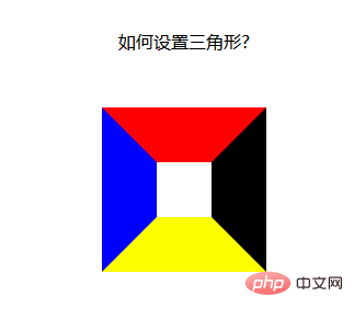
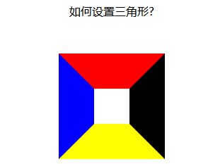
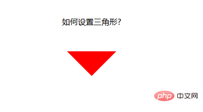
<div>如何设置三角形?</div>
<div>
<span>
</span>
</div>
</body>
</html>運行結果:發現四面的邊框,居然是這種梯形的結構,如果把梯形上底變為0,不就是我們想要的三角形了麼,而且這是使用html 和css做不來的,不存在使用靜態頁面就可以實行,不存在圖片的不連續顯示問題;
接下來就是把梯形的上底變為0 了【推薦:《 css影片教學」】
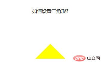
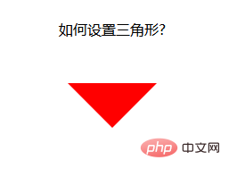
上底變成0 很簡單,只要把元素的高和寬設為0就可以了
width:----->0 得到上下兩種箭頭
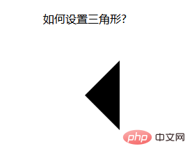
height:------->0 得到左右兩種箭頭
#
1.當我們想要上箭頭的時候,就把元素的左右邊框和下邊框去掉
2.當我們想要下箭頭的時候,就把元素的左右邊框和上邊框去掉
3.當我們想要左箭頭的時候,就把上下邊框和右邊框去掉
4.當我們想要右箭頭的時候,就把上下邊框和左邊框去掉
想法是好的,試了一下,想要上加箭頭:設定css如下:
span {
            position: relative;
            margin: 0 auto;
            display: block;
            width: 0px;
            height: 0px;
            border-style: solid;
            border-width: 50px;

            /* 设置上边框和左右边框宽度为0 开始*/
            border-top-width: 0;
            border-left-width: 0;
            border-right-width: 0;
            /* 设置上边框和左右边框宽度为0 开始*/

            border-top-color: red;
            border-left-color: blue;
            border-bottom-color: yellow;
            border-right-color: black;
}運行結果:發現不行啊,什麼都沒有
那我們換個方法:既然設定寬度不行,那我們就設定顏色吧,只要把上,左,右邊框的顏色設定為透明的,不就可以了麼,css 中,剛好有一個設定顏色為透明的值
span {
            position: relative;
            margin: 0 auto;
            display: block;
            width: 0px;
            height: 0px;
            border-style: solid;
            border-width: 50px;

            /* 设置上边框和左右边框宽度为0 开始*/
            border-top-color: transparent;
            border-left-color: transparent;
            border-right-color: transparent;
            /* 设置上边框和左右边框宽度为0 开始*/

            /* border-top-color: red;
            border-left-color: blue; */
            border-bottom-color: yellow;
            /* border-right-color: black; */
}運行結果:OK,大功告成! ! !
設定下箭頭:
span {
            position: relative;
            margin: 0 auto;
            display: block;
            width: 0px;
            height: 0px;
            border-style: solid;
            border-width: 50px;

            /* 设置上边框和左右边框宽度为0 开始*/
            border-bottom-color: transparent;
            border-left-color: transparent;
            border-right-color: transparent;
            /* 设置上边框和左右边框宽度为0 开始*/

            border-top-color: red;
            /* border-left-color: blue;
            border-bottom-color: yellow;
            border-right-color: black; */
        }
設定左箭頭:
span {
            position: relative;
            margin: 0 auto;
            display: block;
            width: 0px;
            height: 0px;
            border-style: solid;
            border-width: 50px;

            /* 设置上边框和左右边框宽度为0 开始*/
            border-top-color: transparent;
            border-bottom-color: transparent;
            /* border-left-color: transparent; */
            border-right-color: transparent;
            /* 设置上边框和左右边框宽度为0 开始*/

            /* border-top-color: red; */
            border-left-color: blue;
            /* border-bottom-color: yellow;
            border-right-color: black; */
        }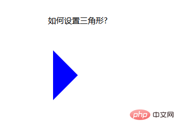
設定右箭頭:
span {
            position: relative;
            margin: 0 auto;
            display: block;
            width: 0px;
            height: 0px;
            border-style: solid;
            border-width: 50px;

            border-top-color: transparent;
            border-bottom-color: transparent;
            border-left-color: transparent;
            /* border-right-color: transparent; */

            /* border-top-color: red;
            border-left-color: blue;
            border-bottom-color: yellow; */
            border-right-color: black;
        }
當然,css 還可寫在一起,這樣看起來要簡單:
span {
            position: relative;
            margin: 0 auto;
            display: block;
            width: 0px;
            height: 0px;
            /* 先后设置上右下左的border-color属性都是一样的,需要哪个箭头,再设置哪个方向的颜色属性,这样,最后设置的属性覆盖了前面的属性,就变成箭头了 */
            border: 50px solid transparent;
            border-top-color: red;
        }
以上,是使用html和css兩項綜合起來設定的箭頭,可以不可以再設定簡單一點呢?
下面,我採用class 屬性來設定箭頭,當需要箭頭的時候,直接加上這個class 屬性就可以,當不想要箭頭的時候,去除調這個類別就好了
#下面來看一個例子:
<!DOCTYPE html>
<html>

<head>
    <meta charset="UTF-8">
    <meta name="viewport" content="width=device-width, initial-scale=1.0">
    <meta http-equiv="X-UA-Compatible" content="ie=edge">
    <title>Document</title>
    <style>
        div {
            width: 100%;
            margin: 50px 0;
            text-align: center;
        }

        .jindaobox {
            position: relative;
            width: 980px;
            margin: 20px auto;

        }

        li {
            list-style: none;
            float: left;
            position: relative;
            border: 1px solid #eee;
            margin-right: 30px;
            padding: 10px 20px;
            border-radius: 5px;
            -webkit-border-radius: 5px;
            -moz-border-radius: 5px;
            -ms-border-radius: 5px;
            -o-border-radius: 5px;
        }

        .active {
            border: 1px solid red !important;

        }

        .active::after {
            position: absolute;
            content: "";
            height: 0;
            width: 0;

            border: 8px solid transparent;
            border-top-color: red;

            top: 0;
            left: 0;
            right: 0;
            margin: auto;
        }
    </style>
</head>

<body>
    <div>请选择你喜欢的电影</div>
    <ul>
        <li>飞龙在天</li>
        <li class="lis  active">紫川</li>
        <li>封神演义</li>
        <li class="lis  active">风云第一刀</li>
        <li>天外飞仙</li>
    </ul>

</body>

</html>運行結果:
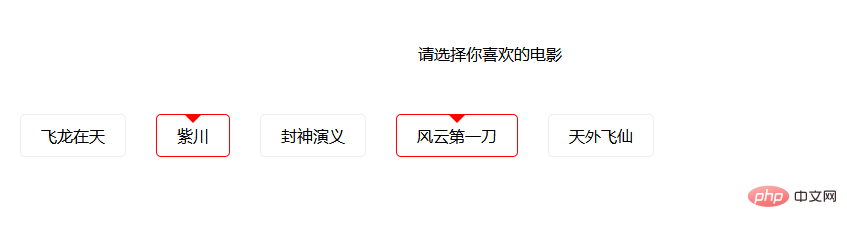
這樣,就實作了使用class 屬性控制箭頭的方式,當需要選取時,為li 元素加上一個active class 屬性即可,當不需要時,就移除active class 屬性。
以上是css中怎麼設定三角形的詳細內容。更多資訊請關注PHP中文網其他相關文章!

熱AI工具

Undresser.AI Undress
人工智慧驅動的應用程序,用於創建逼真的裸體照片

AI Clothes Remover
用於從照片中去除衣服的線上人工智慧工具。

Undress AI Tool
免費脫衣圖片

Clothoff.io
AI脫衣器

Video Face Swap
使用我們完全免費的人工智慧換臉工具,輕鬆在任何影片中換臉!

熱門文章
熱工具

記事本++7.3.1
好用且免費的程式碼編輯器

SublimeText3漢化版
中文版,非常好用

禪工作室 13.0.1
強大的PHP整合開發環境

Dreamweaver CS6
視覺化網頁開發工具

SublimeText3 Mac版
神級程式碼編輯軟體(SublimeText3)


 vue中怎麼用bootstrap
Apr 07, 2025 pm 11:33 PM
vue中怎麼用bootstrap
Apr 07, 2025 pm 11:33 PM
在 Vue.js 中使用 Bootstrap 分為五個步驟:安裝 Bootstrap。在 main.js 中導入 Bootstrap。直接在模板中使用 Bootstrap 組件。可選:自定義樣式。可選:使用插件。
 了解HTML,CSS和JavaScript:初學者指南
Apr 12, 2025 am 12:02 AM
了解HTML,CSS和JavaScript:初學者指南
Apr 12, 2025 am 12:02 AM
WebDevelovermentReliesonHtml,CSS和JavaScript:1)HTMLStructuresContent,2)CSSStyleSIT和3)JavaScriptAddSstractivity,形成thebasisofmodernWebemodernWebExexperiences。
 HTML,CSS和JavaScript的角色:核心職責
Apr 08, 2025 pm 07:05 PM
HTML,CSS和JavaScript的角色:核心職責
Apr 08, 2025 pm 07:05 PM
HTML定義網頁結構,CSS負責樣式和佈局,JavaScript賦予動態交互。三者在網頁開發中各司其職,共同構建豐富多彩的網站。
 bootstrap怎麼寫分割線
Apr 07, 2025 pm 03:12 PM
bootstrap怎麼寫分割線
Apr 07, 2025 pm 03:12 PM
創建 Bootstrap 分割線有兩種方法:使用 標籤,可創建水平分割線。使用 CSS border 屬性,可創建自定義樣式的分割線。
 bootstrap怎麼插入圖片
Apr 07, 2025 pm 03:30 PM
bootstrap怎麼插入圖片
Apr 07, 2025 pm 03:30 PM
在 Bootstrap 中插入圖片有以下幾種方法:直接插入圖片,使用 HTML 的 img 標籤。使用 Bootstrap 圖像組件,可以提供響應式圖片和更多樣式。設置圖片大小,使用 img-fluid 類可以使圖片自適應。設置邊框,使用 img-bordered 類。設置圓角,使用 img-rounded 類。設置陰影,使用 shadow 類。調整圖片大小和位置,使用 CSS 樣式。使用背景圖片,使用 background-image CSS 屬性。
 bootstrap怎麼設置框架
Apr 07, 2025 pm 03:27 PM
bootstrap怎麼設置框架
Apr 07, 2025 pm 03:27 PM
要設置 Bootstrap 框架,需要按照以下步驟:1. 通過 CDN 引用 Bootstrap 文件;2. 下載文件並將其託管在自己的服務器上;3. 在 HTML 中包含 Bootstrap 文件;4. 根據需要編譯 Sass/Less;5. 導入定製文件(可選)。設置完成後,即可使用 Bootstrap 的網格系統、組件和样式創建響應式網站和應用程序。
 bootstrap按鈕怎麼用
Apr 07, 2025 pm 03:09 PM
bootstrap按鈕怎麼用
Apr 07, 2025 pm 03:09 PM
如何使用 Bootstrap 按鈕?引入 Bootstrap CSS創建按鈕元素並添加 Bootstrap 按鈕類添加按鈕文本
 bootstrap怎麼調整大小
Apr 07, 2025 pm 03:18 PM
bootstrap怎麼調整大小
Apr 07, 2025 pm 03:18 PM
要調整 Bootstrap 中元素大小,可以使用尺寸類,具體包括:調整寬度:.col-、.w-、.mw-調整高度:.h-、.min-h-、.max-h-
