本篇文章透過程式碼範例介紹一下使用純CSS畫圓環的方法。有一定的參考價值,有需要的朋友可以參考一下,希望對大家有幫助。

畫圓環思想很簡單:先畫兩個圓,設定不同的背景色;然後讓兩個圓的圓心重合即可。
難度係數
☆☆
#HTML
1 2 3 | <div class="container">
<span class="ring-style"></span>
</div>
|
登入後複製
解析:

##################################################################################### ###這裡有父容器############CSS######
1 2 3 4 5 6 7 8 9 10 11 12 13 14 15 16 17 18 19 20 21 22 23 24 25 26 27 28 29 30 31 | .container {
position: relative;
top: 0;
left: 0;
width: 300px;
height: 300px;
background-color: lightgrey;
}
.ring-style {
display: inline-block;
position: absolute;
top: 50%;
left: 50%;
transform: translate(-50%, -50%);
background-color: blue;
width: 260px;
height: 260px;
border-radius: 260px;
}
.ring-style::before {
content: ' ';
display: inline-block;
position: absolute;
top: 50%;
left: 50%;
transform: translate(-50%, -50%);
background-color: white;
width: 200px;
height: 200px;
border-radius: 200px;
}
|
登入後複製
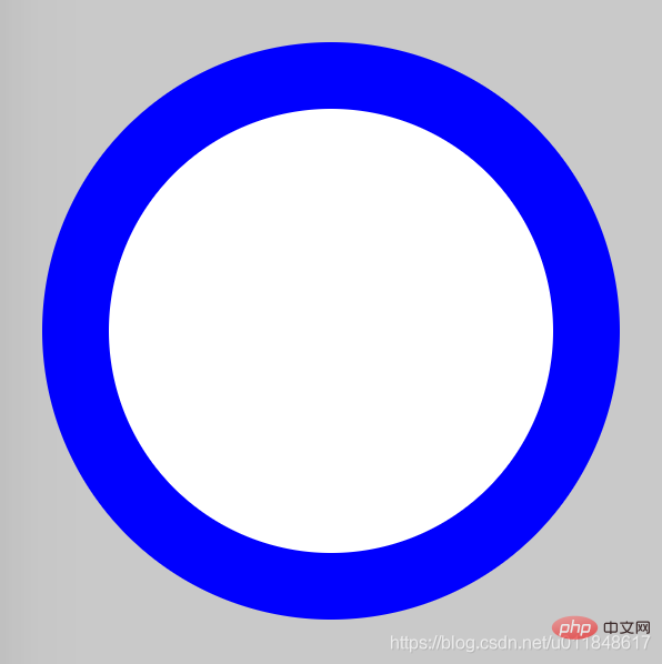
###解析:#########設定元素的寬高、圓角效果,即可畫出一個圓######透過::before 偽元素和本體元素,建立兩個圓######透過基於父容器的絕對定位,設定top、left、translate 屬性,讓元素基於父容器水平、垂直居中,即可讓兩個圓的圓心重合#########【推薦教學:###CSS影片教學### 】####### ##效果圖#####################知識點#############border-radius######:: before && ::after######元素水平、垂直居中#########更多程式相關知識,請造訪:###程式設計影片###! ! ###
以上是使用純CSS畫一個圓環(程式碼範例)的詳細內容。更多資訊請關注PHP中文網其他相關文章!


