

css3怎麼達到3d翻轉效果

在css3中,可以使用transform屬性來配合rotateY()、rotateX()等3d旋轉函數來實現3d翻轉效果。 rotateX()可以使元素繞其X軸旋轉給定角度,rotateY()可以使元素繞其Y軸旋轉給定角度。
本教學操作環境:windows7系統、CSS3&&HTML5版、Dell G3電腦。
一、實作一張圖片的翻轉
1、HTML結構
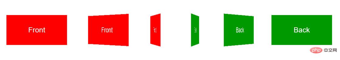
<div class="stage">
    <div class="flipBox">
        <figure class="pic front">Front</figure>
        <figure class="pic back">Back</figure>
    </div>
</div>上述HTML的結構是:
- p.stage規定了一個3D舞台,基本上所有使用CSS3 3D變換的實作都會這麼做,規定perspective樣式從而達到透視效果 ##p.flipBox是真正實現翻面的容器,稍後將對它進行3D變換figure代表兩張圖片,一張是正面,一張是背面
3、CSS結構
body,figure {
    margin: 0;
    padding: 0;
}
.stage {
    width: 200px;
    height: 100px;
    margin: 40px;
    perspective: 1000px;
}
.flipBox {
    width: 200px;
    height: 100px;
    position: relative;
    transform-style: preserve-3d;
    transition: transform 1s;
}
.pic {
    width: 200px;
    height: 100px;
    font-size: 24px;
    color: #fff;
    line-height: 100px;
    text-align: center;
    position: absolute;
    top: 0;
    left: 0;
    backface-visibility: hidden;
}
.front {
    background: #f00;
}
.back {
    background: #090;
    transform: rotateY(180deg);
}body,figure {
margin: 0;
padding: 0;
}.stage {
width: 200px;
height: 100px;
margin: 40px;
perspective: 1000px;
}.flipBox {
width: 200px;
height: 100px;
position: relative;
transform-style: preserve-3d;
transition: transform 1s;
}.pic {
width: 200px;
height: 100px;
font-size: 24px;
color: #fff;
line-height: 100px;
text-align: center;
position: absolute;
top: 0;
left: 0;
backface-visibility: hidden;
}.front {
background: #f00;
}.back {
background: #090;
transform: rotateY(180deg);
}3、開始旋轉圖片
.stage:hover .flipBox {
 transform: rotateY(-180deg);
}
二、案例
#1、圖片準備
為減少HTTP請求,這裡使用精靈圖。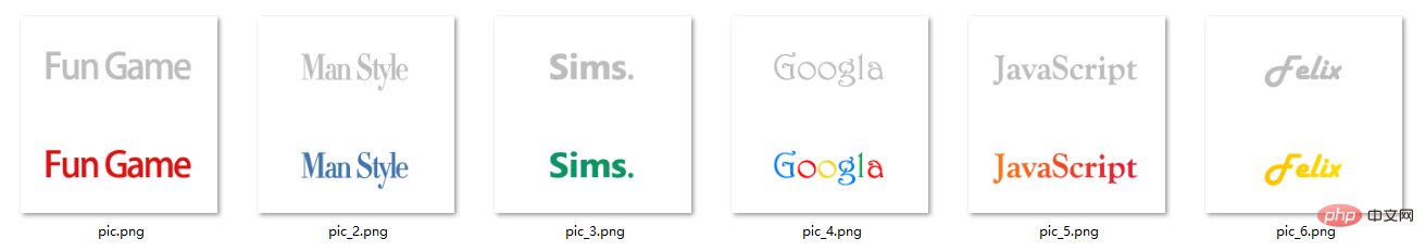 圖片大小為200*200,分上下兩部分,上方為翻轉圖片的正面(黑白),下方為翻轉圖片的背面(彩色)。上方和下方的logo都經過水平居中和垂直居中,以確保翻轉前後logo位置一致。
2、程式碼實作
<!doctype html>
<html>
<head>
<meta charset="UTF-8">
<title>JavaScript Study</title>
<style>
html,body,ul,li,a,figure,h4 {
padding: 0;
margin: 0;
}
ul {
list-style: none;
}
h4 {
display: none;
}
.Stage {
width: 604px;
height: 203px;
margin: 50px;
border-left: 1px solid #f5f5f5;
border-top: 1px solid #f5f5f5;
perspective: 10000px;
}
.trigger {
display: block;
float: left;
width: 200px;
height:100px;
border-right: 1px solid #f5f5f5;
border-bottom: 1px solid #f5f5f5;
position: relative;
}
.flipBox {
display: block;
width: 100%;
height: 100%;
transform-style: preserve-3d;
transition: transform 1.2s;
transition-delay: 0.03s;
}
.trigger:hover .flipBox {
transform: perspective(10000px) rotateY(-180deg); /*这里的perspective为每个flipBox规定单独的视点距离,解决Chrome中统一视点的问题*/
}
.plane {
width: 200px;
height: 100px;
position: absolute;
top: 0;
left: 0;
backface-visibility: hidden;
}
.back {
transform: rotateY(180deg);
}
.logo1 figure.front {
background: url("pic.png") center 0 no-repeat;
}
.logo2 figure.front {
background: url("pic_2.png") center 0 no-repeat;
}
.logo3 figure.front {
background: url("pic_3.png") center 0 no-repeat;
}
.logo4 figure.front {
background: url("pic_4.png") center 0 no-repeat;
}
.logo5 figure.front {
background: url("pic_5.png") center 0 no-repeat;
}
.logo6 figure.front {
background: url("pic_6.png") center 0 no-repeat;
}
.logo1 figure.back {
background: url("pic.png") center -100px no-repeat;
}
.logo2 figure.back {
background: url("pic_2.png") center -100px no-repeat;
}
.logo3 figure.back {
background: url("pic_3.png") center -100px no-repeat;
}
.logo4 figure.back {
background: url("pic_4.png") center -100px no-repeat;
}
.logo5 figure.back {
background: url("pic_5.png") center -100px no-repeat;
}
.logo6 figure.back {
background: url("pic_6.png") center -100px no-repeat;
}
</style>
</head>
<body>
<div>
<ul>
<li>
<a class="flipBox logo1" href="#">
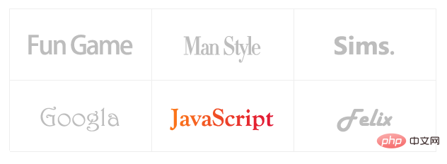
<h4 id="Fun-nbsp-Games">Fun Games</h4>
<figure class="plane front"></figure>
<figure class="plane back"></figure>
</a>
</li>
<li>
<a class="flipBox logo2" href="#">
<h4 id="Man-nbsp-Style">Man Style</h4>
<figure class="plane front"></figure>
<figure class="plane back"></figure>
</a>
</li>
<li>
<a class="flipBox logo3" href="#">
<h4 id="Sims">Sims.</h4>
<figure class="plane front"></figure>
<figure class="plane back"></figure>
</a>
</li>
<li>
<a class="flipBox logo4" href="#">
<h4 id="Googla">Googla</h4>
<figure class="plane front"></figure>
<figure class="plane back"></figure>
</a>
</li>
<li>
<a class="flipBox logo5" href="#">
<h4 id="JavaScript">JavaScript</h4>
<figure class="plane front"></figure>
<figure class="plane back"></figure>
</a>
</li>
<li>
<a class="flipBox logo6" href="#">
<h4 id="Felix">Felix</h4>
<figure class="plane front"></figure>
<figure class="plane back"></figure>
</a>
</li>
</ul>
</div>
</body>
</html>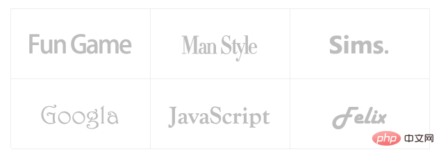
css影片教學)
以上是css3怎麼達到3d翻轉效果的詳細內容。更多資訊請關注PHP中文網其他相關文章!

熱AI工具

Undresser.AI Undress
人工智慧驅動的應用程序,用於創建逼真的裸體照片

AI Clothes Remover
用於從照片中去除衣服的線上人工智慧工具。

Undress AI Tool
免費脫衣圖片

Clothoff.io
AI脫衣器

Video Face Swap
使用我們完全免費的人工智慧換臉工具,輕鬆在任何影片中換臉!

熱門文章
熱工具

記事本++7.3.1
好用且免費的程式碼編輯器

SublimeText3漢化版
中文版,非常好用

禪工作室 13.0.1
強大的PHP整合開發環境

Dreamweaver CS6
視覺化網頁開發工具

SublimeText3 Mac版
神級程式碼編輯軟體(SublimeText3)


 vue中怎麼用bootstrap
Apr 07, 2025 pm 11:33 PM
vue中怎麼用bootstrap
Apr 07, 2025 pm 11:33 PM
在 Vue.js 中使用 Bootstrap 分為五個步驟:安裝 Bootstrap。在 main.js 中導入 Bootstrap。直接在模板中使用 Bootstrap 組件。可選:自定義樣式。可選:使用插件。
 HTML,CSS和JavaScript的角色:核心職責
Apr 08, 2025 pm 07:05 PM
HTML,CSS和JavaScript的角色:核心職責
Apr 08, 2025 pm 07:05 PM
HTML定義網頁結構,CSS負責樣式和佈局,JavaScript賦予動態交互。三者在網頁開發中各司其職,共同構建豐富多彩的網站。
 了解HTML,CSS和JavaScript:初學者指南
Apr 12, 2025 am 12:02 AM
了解HTML,CSS和JavaScript:初學者指南
Apr 12, 2025 am 12:02 AM
WebDevelovermentReliesonHtml,CSS和JavaScript:1)HTMLStructuresContent,2)CSSStyleSIT和3)JavaScriptAddSstractivity,形成thebasisofmodernWebemodernWebExexperiences。
 bootstrap怎麼寫分割線
Apr 07, 2025 pm 03:12 PM
bootstrap怎麼寫分割線
Apr 07, 2025 pm 03:12 PM
創建 Bootstrap 分割線有兩種方法:使用 標籤,可創建水平分割線。使用 CSS border 屬性,可創建自定義樣式的分割線。
 bootstrap怎麼設置框架
Apr 07, 2025 pm 03:27 PM
bootstrap怎麼設置框架
Apr 07, 2025 pm 03:27 PM
要設置 Bootstrap 框架,需要按照以下步驟:1. 通過 CDN 引用 Bootstrap 文件;2. 下載文件並將其託管在自己的服務器上;3. 在 HTML 中包含 Bootstrap 文件;4. 根據需要編譯 Sass/Less;5. 導入定製文件(可選)。設置完成後,即可使用 Bootstrap 的網格系統、組件和样式創建響應式網站和應用程序。
 bootstrap怎麼插入圖片
Apr 07, 2025 pm 03:30 PM
bootstrap怎麼插入圖片
Apr 07, 2025 pm 03:30 PM
在 Bootstrap 中插入圖片有以下幾種方法:直接插入圖片,使用 HTML 的 img 標籤。使用 Bootstrap 圖像組件,可以提供響應式圖片和更多樣式。設置圖片大小,使用 img-fluid 類可以使圖片自適應。設置邊框,使用 img-bordered 類。設置圓角,使用 img-rounded 類。設置陰影,使用 shadow 類。調整圖片大小和位置,使用 CSS 樣式。使用背景圖片,使用 background-image CSS 屬性。
 bootstrap按鈕怎麼用
Apr 07, 2025 pm 03:09 PM
bootstrap按鈕怎麼用
Apr 07, 2025 pm 03:09 PM
如何使用 Bootstrap 按鈕?引入 Bootstrap CSS創建按鈕元素並添加 Bootstrap 按鈕類添加按鈕文本
 bootstrap怎麼調整大小
Apr 07, 2025 pm 03:18 PM
bootstrap怎麼調整大小
Apr 07, 2025 pm 03:18 PM
要調整 Bootstrap 中元素大小,可以使用尺寸類,具體包括:調整寬度:.col-、.w-、.mw-調整高度:.h-、.min-h-、.max-h-
