本篇文章為大家帶來了關於python的相關知識,其中主要介紹了關於Seaborn的相關問題,包括了資料視覺化處理的散點圖、折線圖、長條圖等等內容,下面一起來看一下,希望對大家有幫助。

推薦學習:python影片教學
安裝:
pip install seaborn
導入:
import seaborn as sns
正式開始之前我們先用如下程式碼準備一組數據,方便展示使用。
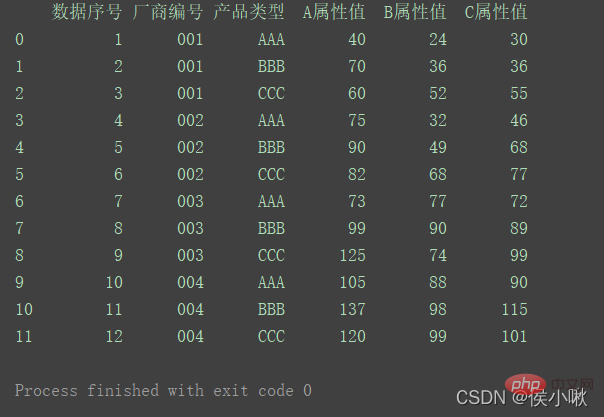
import pandas as pdimport numpy as npimport matplotlib.pyplot as pltimport seaborn as snspd.set_option('display.unicode.east_asian_width', True)df1 = pd.DataFrame( {'数据序号': [1, 2, 3, 4, 5, 6, 7, 8, 9, 10, 11, 12], '厂商编号': ['001', '001', '001', '002', '002', '002', '003', '003', '003', '004', '004', '004'], '产品类型': ['AAA', 'BBB', 'CCC', 'AAA', 'BBB', 'CCC', 'AAA', 'BBB', 'CCC', 'AAA', 'BBB', 'CCC'], 'A属性值': [40, 70, 60, 75, 90, 82, 73, 99, 125, 105, 137, 120], 'B属性值': [24, 36, 52, 32, 49, 68, 77, 90, 74, 88, 98, 99], 'C属性值': [30, 36, 55, 46, 68, 77, 72, 89, 99, 90, 115, 101] })print(df1)產生一組資料如下:
#
設定風格使用的是sns.set_style()方法,且這裡內建的風格,是用背景色表示名字的,但是實際內容不限於背景色。
sns.set_style()
#
可以選擇的背景風格有:
sns.set()
sns.set_style( “darkgrid”)
sns.set_style(“whitegrid”)
sns.set_style(“dark”)
sns.set_style(“white”)
sns.set_style(“ticks”)
其中sns.set()表示使用自訂樣式,如果沒有傳入參數,則預設表示灰色網格背景風格。如果沒有set()也沒有set_style(),則為白色背景。
一個可能的bug:使用relplot()方法繪製出的圖像,"ticks"樣式無效。
seaborn庫是基於matplotlib庫而封裝的,其封裝好的風格可以更方便我們的繪圖工作。而matplotlib函式庫常用的語句,在使用seaborn函式庫時也依然有效。
關於設定其他風格相關的屬性,如字體,這裡有一個細節需要注意的是,這些程式碼必須寫在sns.set_style()的後方才有效。如將字體設定為黑體(避免中文亂碼)的程式碼:
#plt.rcParams['font.sans-serif'] = [' SimHei']
如果在其後方設定風格,則設定好的字體會設定的風格覆蓋,從而產生警告。其他屬性也同理。
sns.despine()方法
# 移除顶部和右部边框,只保留左边框和下边框sns.despine()# 使两个坐标轴相隔一段距离(以10长度为例)sns.despine(offet=10,trim=True)# 移除左边框sns.despine(left=True)# 移除指定边框 (以只保留底部边框为例)sns.despine(fig=None, ax=None, top=True, right=True, left=True, bottom=False, offset=None, trim=False)
使用seaborn庫繪製散佈圖,可以使用replot()方法,也可以使用scatter()方法。
replot方法的參數kind預設是’scatter’,表示繪製散佈圖。 hue參數表示在該一維度上,用顏色區分
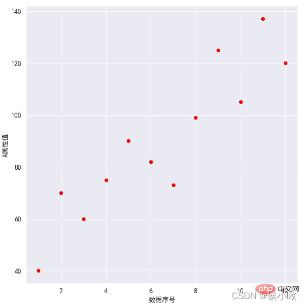
①對A屬性值和資料序號繪製散佈圖,紅色散點,灰色網格,保留左、下邊框
sns.set_style('darkgrid')
plt.rcParams['font.sans-serif'] = ['SimHei']
sns.relplot(x='資料序號', y='A屬性值', data=df1, color='red') plt.show()
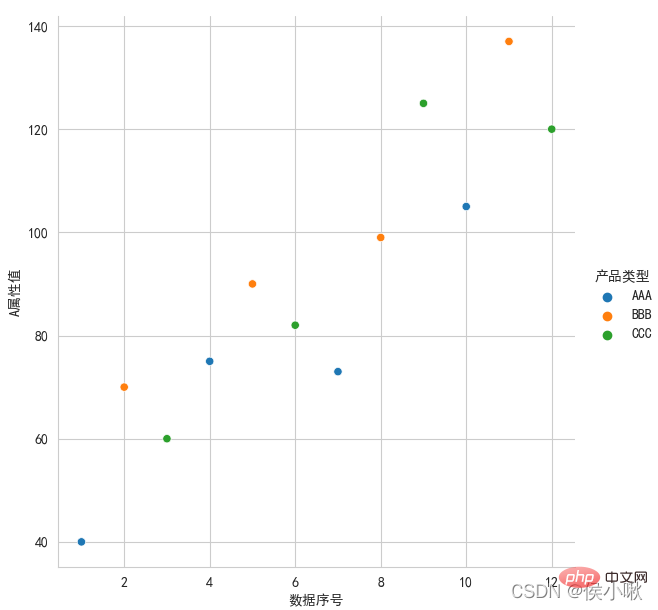
②對A屬性值和資料序號繪製散點圖,散佈圖根據產品類型的不同顯示不同的顏色,
白色網格,左、下邊框:
sns.set_style('whitegrid')
plt.rcParams['font.sans-serif'] = ['SimHei']
sns.relplot(x='資料序號', y='A屬性值', hue='產品類型', data=df1)
plt.show()
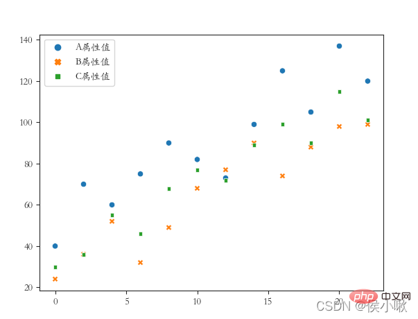
#③將A屬性、B屬性、C屬性三個欄位的值用不同的樣式繪製在同一張圖上(繪製散佈圖),x軸資料是[0,2,4 ,6,8…] ticks風格(四個方向的框線都要),字體使用楷體
df2 = df1.copy() df2.index = list(range(0, len(df2)*2, 2 ))
dfs = [df2['A屬性值'], df2['B屬性值'], df2['C屬性值']] sns.scatterplot(data=dfs)
plt .show()
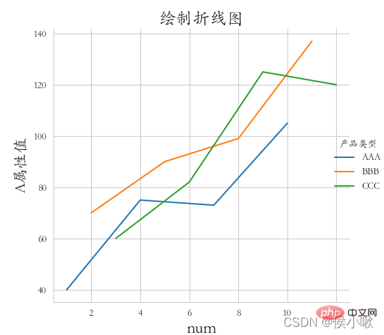
5. 繪製折線圖
使用seaborn庫繪製折線圖,可以繪製折線圖
使用seaborn庫繪製折線圖,可以繪製折線圖, 可以繪製使用replot()方法,也可以使用lineplot()方法。
5.1 使用replot()方法
sns.replot()預設繪製的是散點圖,繪製折線圖只需吧參數kind改為"line" 。 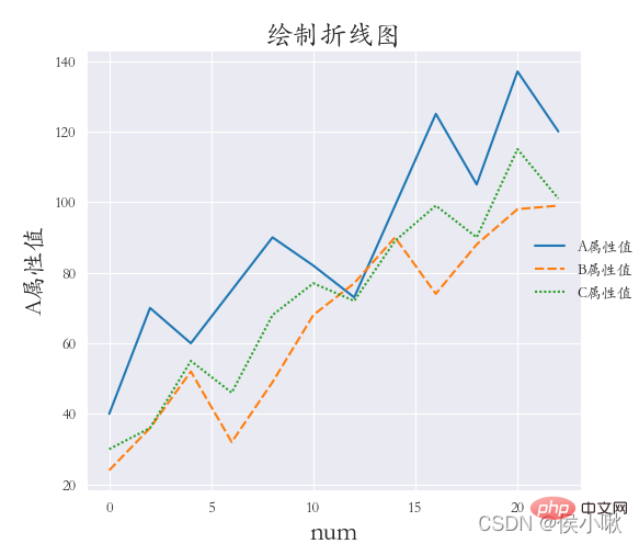
灰色網格,全域字體為楷體;並調整標題、兩軸標籤的字體大小, 以及座標系與畫布邊緣的距離(設定該距離是因為字體沒有顯示完全):
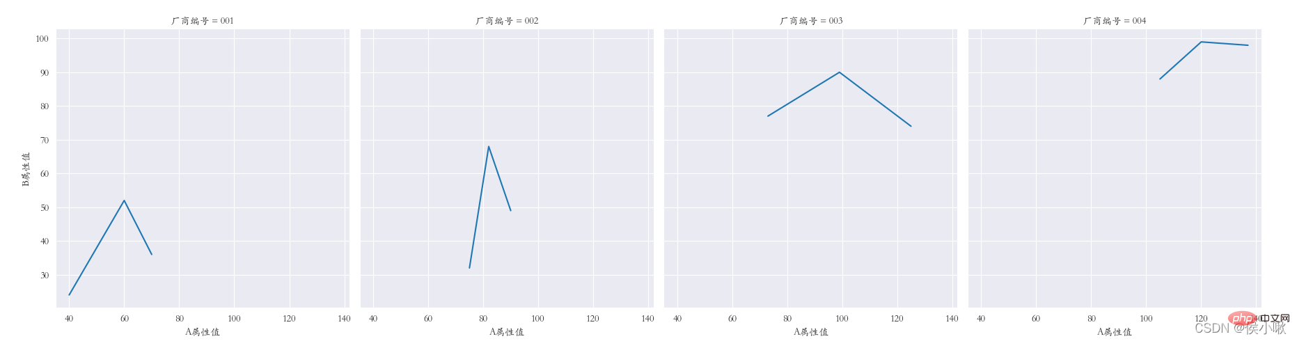
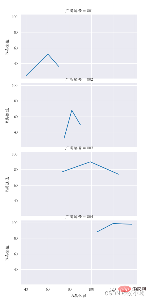
橫向多重子圖col
sns.set_style('darkgrid')
plt.rcParams['font.sans-serif'] = [ 'STKAITI']
sns.relplot(data=df1, x=“A屬性值”, y=“B屬性值”, kind=“line”, col=“廠商編號”)
plt.subplots_adjust (left=0.05, right=0.95, bottom=0.1, top=0.9)
plt.show()
縱向多重子圖row
##sns.set_style('darkgrid')
plt.rcParams['font.sans-serif'] = ['STKAITI']
sns.relplot(data=df1, x=“A屬性值”, y=“B屬性值”, kind=“line”, row=“廠商編號”)
plt.subplots_adjust(left=0.15, right= 0.9, bottom=0.1, top=0.95)
plt.show()
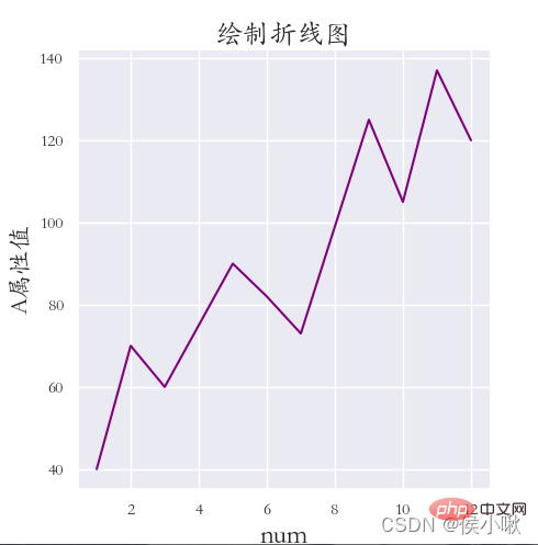
 #使用lineplot()方法繪製折線圖,其他細節基本上同上,範例程式碼如下:
sns.set_style('darkgrid') plt.rcParams['font.sans-serif'] = ['STKAITI'] sns.lineplot(x='資料序號', y='A屬性值', data=df1, color='purple' )
plt.title(“繪製折線圖”, fontsize=18)plt.xlabel('num', fontsize=18)plt.rcParams['font.sans-serif'] = ['STKAITI']plt.ylabel('A屬性值', fontsize=16) plt.subplots_adjust(left=0.15, right=0.9, bottom=0.1, top=0.9)
sns.set_style('darkgrid')
plt.show()
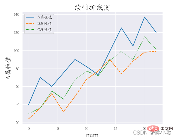
# ₃
df2 = df1.copy() 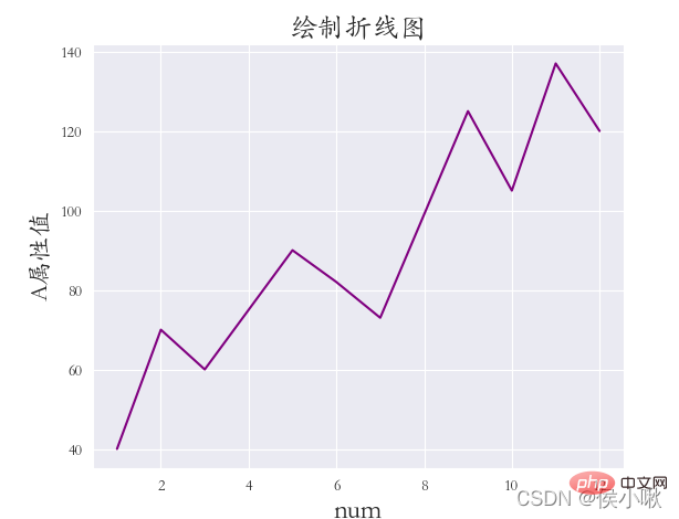 df2.index = list(range(0, len(df2)*2, 2))
plt.title(“繪製折線圖”, fontsize=18)繪製直方圖使用的是sns.displot()方法plt.xlabel('num', fontsize=18) plt.ylabel('A屬性值', fontsize=16)
plt.subplots_adjust(left=0.15, right=0.9, bottom=0.1, top=0.9)
plt.show()
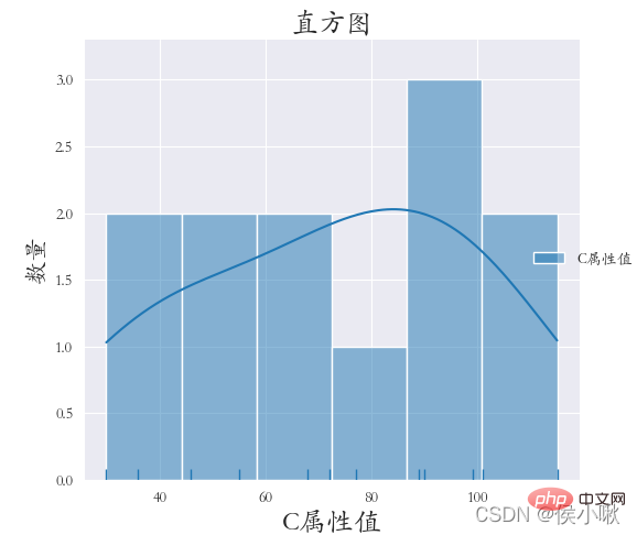
6. 繪製直方圖displot()
sns.set_style('darkgrid') plt.rcParams['font.sans-serif'] = ['STKAITI']
sns.displot(data =df1[['C屬性值']], bins=6, rug=True, kde=True)
plt.title(「直方圖」, fontsize=18) plt.xlabel('C屬性值', fontsize=18)
plt.subplots_adjust(left=0.15, right=0.9, bottom=0.1, top=0.9)plt. show()
隨機產生300個常態分佈數據,並繪製直方圖,顯示核密度曲線
np.random.seed (13) Y = np.random.randn(300) sns.displot(Y, bins=9, rug=True, kde=True)
plt.title(「直方圖」, fontsize =18)plt.xlabel('C屬性值', fontsize=18)plt.ylabel('數量', fontsize=16) plt.subplots_adjust(left=0.15, right=0.9, bottom=0.1, top=0.9)
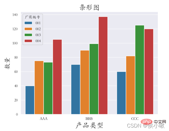
繪製長條圖使用的是barplot()方法
plt.show()
#nlot
以產品類型欄位資料作為x軸數據,A屬性值資料作為y軸資料。依照廠商編號欄位的不同進行分類。 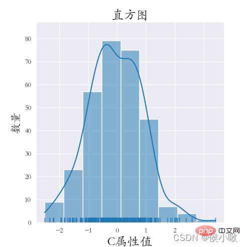 具體如下:
具體如下:
sns.set_style('darkgrid')
plt.rcParams['font.sans-serif'] = ['STKAITI']
sns.barplot(x=「產品類型”, y='A屬性值', hue=“廠商編號”, data=df1)
plt.title(“長條圖”, fontsize=18)
plt.xlabel('產品類型', fontsize=18)
plt.ylabel('數量', fontsize=16)
plt.subplots_adjust(left=0.15, right=0.9, bottom=0.15, top=0.9)
plt.show()
#繪製線性迴歸模型使用的是lmplot()方法方法。 主要的參數為x, y, data。分別表示x軸資料、y軸資料和資料集資料。
除此之外,同上述所講,還可以透過hue指定分類的變數;
透過col指定列分類變量,以繪製橫向多重子圖;
透過row指定行分類變量,以繪製縱向多重子圖;
透過col_wrap控制每行子圖的數量;
透過size可以控制子圖的高度;
透過markers可以控制點的形狀。
下邊對X屬性值和Y屬性值做線性迴歸,程式碼如下:
# #sns.set_style('darkgrid') plt. rcParams['font.sans-serif'] = ['STKAITI']
sns.lmplot(x=“A屬性值”, y='B屬性值', data=df1)
plt.title( 「線性迴歸模型」, fontsize=18)
plt.xlabel('A屬性值', fontsize=18)
plt.ylabel('B屬性值', fontsize=16)
plt.subplots_adjust (left=0.15, right=0.9, bottom=0.15, top=0.9)
plt.show()
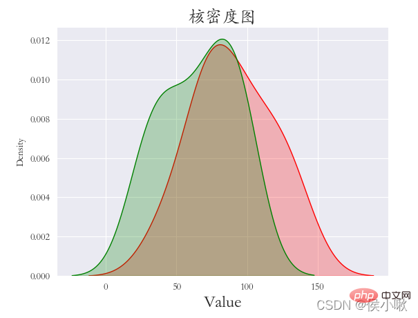
#9. 繪製核密度圖kdeplot()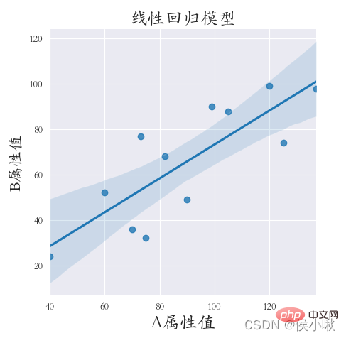
sns.set_style('darkgrid') plt.rcParams['font.sans-serif'] = ['STKAITI']
sns.kdeplot(df1[“B屬性值”], shade=True, data=df1, color= 'g')9.2 邊際核密度圖plt.title(“核密度圖”, fontsize=18) plt.xlabel('Value', fontsize=18)
plt.subplots_adjust(left=0.15, right=0.9 , bottom=0.15, top=0.9)
plt.show()
plt.rcParams['font.sans-serif'] = ['STKAITI'] sns.jointplot(x=df1[「A屬性值」] , y=df1[“B屬性值”], kind=“kde”, space=0)
plt.show()
#
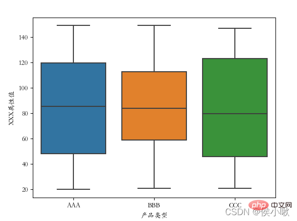
#10. 繪製箱線圖boxplot()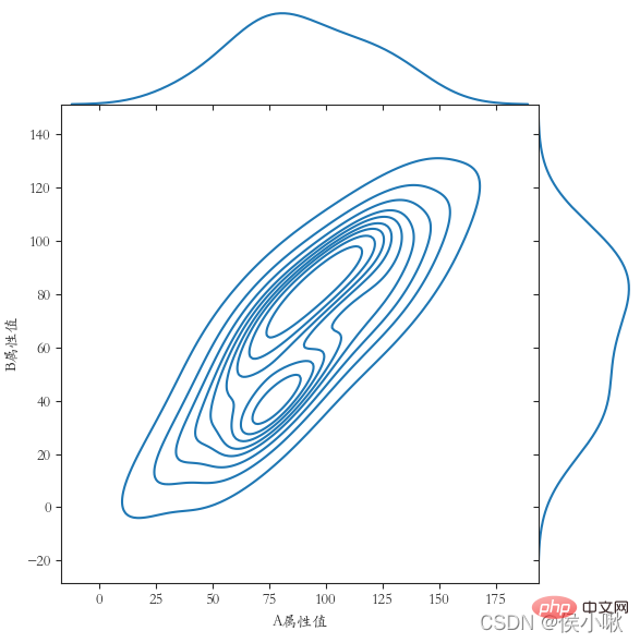
hue 表示分類欄位 width 可以調整箱體的寬度
notch 表示中間箱體是否顯示缺口,預設False不顯示。
鑑於前邊的資料資料量較不方便展示,這裡再產生一組資料:
##np.random.seed (13) Y = np.random.randint(20, 150, 360) df2 = pd.DataFrame(
{'廠商編號': ['001', '001', '001' , '002', '002', '002', '003', '003', '003', '004', '004', '004'] * 30,'產品類型': [' AAA', 'BBB', 'CCC', 'AAA', 'BBB', 'CCC', 'AAA', 'BBB', 'CCC', 'AAA', 'BBB', 'CCC'] * 30,'XXX屬性值': Y }
)
#
產生好後,開始繪製箱型圖:
#plt.rcParams['font.sans-serif'] = ['STKAITI']
sns.boxplot(x='產品類型', y='XXX屬性值', data=df2)
plt.show()
# 
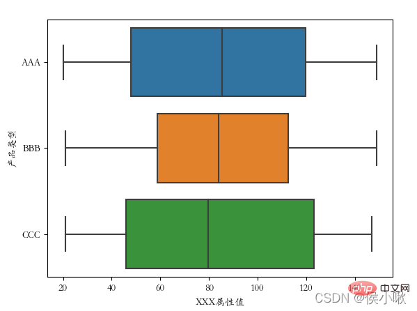
交換x、y軸資料後:
plt.rcParams[' font.sans-serif'] = ['STKAITI']
sns.boxplot(y='產品類型', x='XXX屬性值', data=df2)
plt.show()
可以看到箱型圖的方向也隨之改變
# 
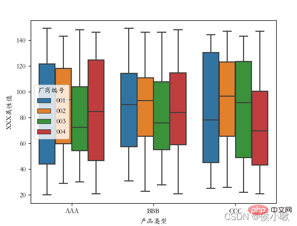
將廠商編號作為分類欄位:
plt.rcParams['font.sans-serif'] = ['STKAITI']sns.boxplot (x='產品類型', y='XXX屬性值', data=df2, hue=“廠商編號”) plt.show()
##
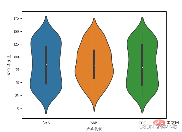
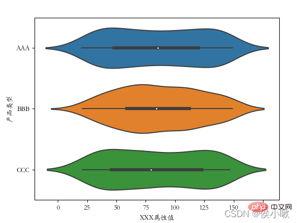 11. 繪製提琴圖violinplot()
#提琴圖結合了箱線圖和核密度圖的特徵,用於展示資料的分佈形狀。sns.violinplot(x='產品型別', y=' XXX屬性值', data=df2)使用violinplot()方法繪製提琴圖。
plt.rcParams['font.sans-serif'] = ['STKAITI']
plt.show()
以上是詳細講解Python之Seaborn(數據視覺化)的詳細內容。更多資訊請關注PHP中文網其他相關文章!