根據時間軸進行tab頁面內容切換?以下這篇文章跟大家介紹一下jquery時間軸tab切換效果實現結合swiper實現滑動顯示效果的方法,希望對大家有幫助!

需求:根據時間軸進行tab頁面內容切換(時間軸需要滑動查看並選擇)
#實現想法:
結合swiper插件實現滑動顯示效果
根據transform: translateX進行左側切換效果的實現(具體實現css如下),實現非滾動的點擊切換效果,結合swiper進行修改。 【相關教學建議:jQuery教學】
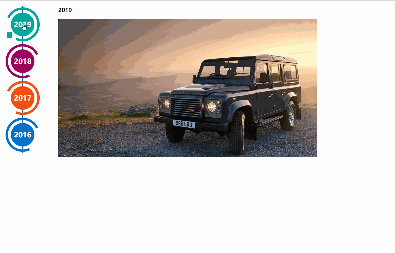
實作效果:
實作程式碼: 需要配合swiper元件使用;左側導覽是依據html結構和css3程式碼,來產生的時間軸效果效果來自http://www.htmleaf.com/css3/ui-design/201911275850.html
Swiper基礎示範網址:https://www.swiper.com.cn/demo/index.html
  <div>
    <div>
      <div>
        <a>
          <div>
            <span>2019</span>
          </div>
        </a>
        <div></div>
      </div>
      <div>
        <a>
          <div>
            <span>2018</span>
          </div>
        </a>
        <div></div>
      </div>
      <div>
        <a>
          <div>
            <span>2017</span>
          </div>
        </a>
        <div></div>
      </div>
      <div>
        <a>
          <div>
            <span>2016</span>
          </div>
        </a>
        <div></div>
      </div>
      <div>
        <a>
          <div>
            <span>2015</span>
          </div>
        </a>
        <div></div>
      </div>
      <div>
        <a>
          <div>
            <span>2014</span>
          </div>
        </a>
        <div></div>
      </div>
    </div>
  </div>


#所需外部連結檔:
<script></script>
<script></script>
<link>
.page {
  width: 100%;
}

.main-timeline {
  font-family: 'Roboto', sans-serif;
  width: 200px;
  position: relative;
  float: left;
}

.main-timeline:after {
  content: '';
  display: block;
  clear: both;
}

.main-timeline:before {
  /* content: '';
  height: calc(100% + 80px);
  width: 0px;
  border: 2px solid #0870C5;
  transform: translateX(-50%);
  position: absolute;
  left: 114px;
  top: 0px; */
}

.main-timeline .timeline {
  width: 4%;
  /* padding: 140px 70px 0 25px; */
  margin: 0 50px 0 0;
  float: left;
  position: relative;
}

.main-timeline .timeline-content {
  /* padding: 15px 15px 15px 40px;
  border: 2px solid #00A79B; */
  border-radius: 15px 0 15px 15px;
  display: block;
  position: relative;
}

.main-timeline .timeline-content:hover {
  text-decoration: none;
}

.fd-active-line .timeline-content:after {
  content: '';
  background-color: #00A79B;
  height: 18px;
  width: 15px;
  position: absolute;
  right: -43px;
  top: 27px;
  /* clip-path: polygon(100% 0, 0 0, 0 100%); */
}

.main-timeline .timeline-year {
  color: #fff;
  background-color: #00A79B;
  font-size: 24px;
  font-weight: 900;
  text-align: center;
  line-height: 80px;
  height: 80px;
  width: 80px;
  border-radius: 50%;
  position: absolute;
  right: -120px;
  top: -40px;
}

.main-timeline .timeline-year:after {
  content: '';
  height: 100px;
  width: 100px;
  border: 8px solid #00A79B;
  border-left-color: transparent;
  border-radius: 50%;
  transform: translateX(-50%) translateY(-50%) rotate(-20deg);
  position: absolute;
  left: 50%;
  top: 50%;
}

.main-timeline .timeline-icon {
  color: #fff;
  background-color: #00A79B;
  font-size: 35px;
  text-align: center;
  line-height: 50px;
  height: 50px;
  width: 50px;
  border-radius: 50%;
  transform: translateY(-50%);
  position: absolute;
  top: 50%;
  left: -25px;
  transition: all 0.3s;
}

.main-timeline .title {
  color: #222;
  font-size: 20px;
  font-weight: 900;
  text-transform: uppercase;
  letter-spacing: 1px;
  margin: 0 0 7px 0;
}

.main-timeline .description {
  color: #222;
  font-size: 15px;
  letter-spacing: 1px;
  text-align: justify;
  margin: 0 0 5px;
}

.main-timeline .timeline:nth-child(even) .timeline-content {}

.main-timeline .timeline:nth-child(even) .timeline-content:after {
  transform: rotateY(180deg);
  right: auto;
  left: 123px;
}

.main-timeline .timeline:nth-child(even) .timeline-year:after {
  transform: translateX(-50%) translateY(-50%) rotate(200deg);
}

.main-timeline .timeline:nth-child(even) .timeline-icon {
  left: auto;
  right: -25px;
}

.timeline:nth-child(4n+2) .timeline-content,
.timeline:nth-child(4n+2) .timeline-year:after {
  border-color: #9E005D;
}

.timeline:nth-child(4n+2) .timeline-year:after {
  border-left-color: transparent;
}

.timeline:nth-child(4n+2) .timeline-content:after,
.timeline:nth-child(4n+2) .timeline-icon,
.timeline:nth-child(4n+2) .timeline-year {
  background-color: #9E005D;
}

.timeline:nth-child(4n+3) .timeline-content,
.timeline:nth-child(4n+3) .timeline-year:after {
  border-color: #f24f0e;
}

.timeline:nth-child(4n+3) .timeline-year:after {
  border-left-color: transparent;
}

.timeline:nth-child(4n+3) .timeline-content:after,
.timeline:nth-child(4n+3) .timeline-icon,
.timeline:nth-child(4n+3) .timeline-year {
  background-color: #f24f0e;
}

.timeline:nth-child(4n+4) .timeline-content,
.timeline:nth-child(4n+4) .timeline-year:after {
  border-color: #0870C5;
}

.timeline:nth-child(4n+4) .timeline-year:after {
  border-left-color: transparent;
}

.timeline:nth-child(4n+4) .timeline-content:after,
.timeline:nth-child(4n+4) .timeline-icon,
.timeline:nth-child(4n+4) .timeline-year {
  background-color: #0870C5;
}

@media screen and (max-width:767px) {
  .main-timeline:before {
    display: none;
  }

  .main-timeline .timeline {
    width: 100%;
    padding-top: 80px;
    padding-right: 12px;
    margin-bottom: 20px;
  }

  .main-timeline .timeline:nth-child(even) {
    padding-left: 10px;
    padding-top: 80px;
    margin-bottom: 20px;
  }

  .main-timeline .timeline-content,
  .main-timeline .main-timeline .timeline:nth-child(even) .timeline-content {
    background-color: #fff;
    padding-top: 25px;
  }

  .main-timeline .timeline-content:after {
    display: none;
  }

  .main-timeline .timeline-year {
    font-size: 24px;
    line-height: 70px;
    height: 70px;
    width: 70px;
    right: 0;
    top: -65px;
  }

  .main-timeline .timeline-year:after {
    display: none;
  }

  .main-timeline .timeline:nth-child(even) .timeline-year {
    left: 3px;
  }
}

@media screen and (max-width:567px) {
  .main-timeline .title {
    font-size: 18px;
  }
}

.swiper-container {
  width: 205px;
  height: 500px;
  float: left;
}

.swiper-slide {
  text-align: center;
  font-size: 18px;
  background: #fff;

  /* Center slide text vertically */
  display: -webkit-box;
  display: -ms-flexbox;
  display: -webkit-flex;
  display: flex;
  -webkit-box-pack: center;
  -ms-flex-pack: center;
  -webkit-justify-content: center;
  justify-content: center;
  -webkit-box-align: center;
  -ms-flex-align: center;
  -webkit-align-items: center;
  align-items: center;
}

@media (max-width: 760px) {
  .swiper-button-next {
    right: 20px;
    transform: rotate(90deg);
  }

  .swiper-button-prev {
    left: 20px;
    transform: rotate(90deg);
  }
}
.event_list img {
  width: 880px;
  height: 470px;
  object-fit: cover;
}
.xians {
  width: 3px;
  height: 100%;
  background: #0870C5;
  position: absolute;
  left: 82px;
  z-index: -1;
} <script>
$(function () {
$(".main-timeline .timeline").click(function () {
var TAG = $(this).siblings().length;
if (TAG >= 1) {
var index = $(this).index()
$(this).addClass('fd-active-line').siblings().removeClass('fd-active-line')
$(this).parent().parent().siblings('.event_list').children().eq(index).show().siblings().hide()
}
})
var swiper = new Swiper('.swiper-container', {
slidesPerView: 4,
direction: 'vertical',
navigation: {
nextEl: '.swiper-button-next',
prevEl: '.swiper-button-prev',
},
on: {
resize: function () {
swiper.changeDirection(getDirection());
}
}
});
});
</script>1.先載入插件,需要用到的文件有swiper-bundle.min.js和swiper-bundle.min.css文件,不同Swiper版本用到的檔名略有不同。可下載Swiper檔案或使用CDN。
<link>
<script></script>
2.HTML內容。
<div>
	<div>
		<div>Slide 1</div>
		<div>Slide 2</div>
		<div>Slide 3</div>
	</div>
	<!-- 如果需要分页器 -->
	<div></div>

	<!-- 如果需要导航按钮 -->
	<div></div>
	<div></div>

	<!-- 如果需要滚动条 -->
	<div></div>
</div>
导航等组件可以放在container之外
3.你可能想要為Swiper定義一個大小,當然不要也行。
.swiper-container {
    width: 600px;
    height: 300px;
}4.初始化Swiper。 Swiper6之前的預設容器是'.swiper-container',Swiper7以後是'.swiper'。
<script>
var mySwiper = new Swiper('.swiper-container', {
direction: 'vertical', // 垂直切换选项
loop: true, // 循环模式选项
// 如果需要分页器
pagination: {
el: '.swiper-pagination',
},
// 如果需要前进后退按钮
navigation: {
nextEl: '.swiper-button-next',
prevEl: '.swiper-button-prev',
},
// 如果需要滚动条
scrollbar: {
el: '.swiper-scrollbar',
},
})
</script>5.完成。恭喜你,現在你的Swiper應該已經可以正常切換了。
如果引入CommonJs 或ES 模組
//CommonJs
var Swiper = require('swiper');
var mySwiper = new Swiper('.swiper-container', { /* ... */ });

//ES
import Swiper from 'swiper';
var mySwiper = new Swiper('.swiper-container', { /* ... */ });【推薦學習:jQuery影片教學、web前端影片】
以上是jquery+swiper實現時間軸tab滑動切換顯示效果的詳細內容。更多資訊請關注PHP中文網其他相關文章!